Using Framer's NEW 3D Transform Tools! TUTORIAL
Skills:
UI Design90%
Key Takeaways
The video tutorial demonstrates how to use Framer's new 3D Transform Tools to create a cool card interaction with depth and 3D effects, utilizing Framer's components and variables, and designing with Figma templates.
Full Transcript
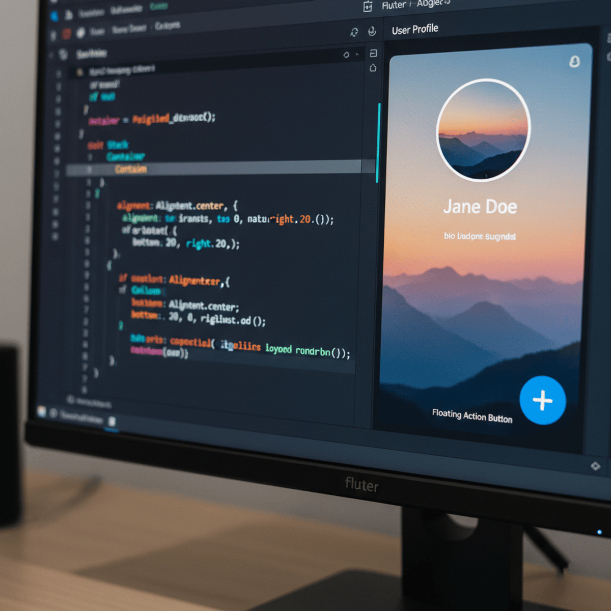
a few days ago framer just released an update that is awesome basically you're able to now create 3D transforms and create really cool interactions and animations with them so I'm going to show you how to create this cool little card Effect and I'm going to show you how to do it from scratch so this means building this entire layout from scratch making them components also utilizing variables so that we can make unique cards uh using the same component and then also how to create an interaction that takes and utilizes this new 3D transform ability so as always make sure to subscribe and let's get started if you enjoyed this video check out designc course.com where you can learn uiux CSS and more with my custom interactive platform that makes learning fun and easy okay so to get started here in figma is just a real quick design of the card that I wanted to create and I will link this project for you guys to be able to clone it within figma if you wish um now we could take this and right click and just take the plugins and just go to figment HTML with framer um I'm going to show you how to just recreate this from scratch within framer itself um and then we'll just reference um this document to get the colors and the icons and stuff like that so here I have a new document in framer and the first thing we want to do is just match up the background color essentially uh so we're going to grab this real quick and that's a color code of 13 13 13 and we'll just click over here under Styles paste that in and we're ready to rock now of course I'm also going to add a layout right here to the actual main starting point frame and these um settings by default will work just fine but you do want to click layout now next we're going to hit the F for the frame tool on your keyboard and just left click and drag out um that's actually pretty big probably a size you know right around maybe like there I think that's pretty good now because we made that a layout it's going to bind that to the middle and now what I want to do is we want to match up the colors here now we could take this and Center this by the way that's fine and let's go back to our document here and let's grab these colors so this lighter color is 009 3 FD and I'm going to go back we're just going to put that in here in the fill section we're going to give it a little bit of a border radius so I'm just going to select in here and use my keyboard up Arrow key to add just some rounded Corners right there and next up I'm going to hit the frame tool again just hit F and within it just draw out a size roughly that shape and then we'll go back to Figo real quickly to grab that color code so it's a darker color that's 059 de and I'm going to paste that in for the colors right here and we'll give this some um rounded Corners as well all right so so your design should look pretty similar to this so far um looks pretty good to me now with this element selected if we click over layers we'll see it's frame let's just call uh double click that and call that card and then we have H our header up top all right and with card selected we don't have a layout added but we want to add a layout because we're going to have this element this darker blue element and then another text based element underneath it so we're just going to create kind of like a uh a what do you call a flex box sort of layout in this in the context of the stack here so now we can see the the white space is screwed up and that's because this doesn't really have uh any padding anyways uh if I click right here so if we increase this padding we'll get that leveled up however we also want to make sure that this inner element this header element is 100% of the parent container now we can leave the height at a fixed heght that's fine and now if we Zoom or drag this out you'll see it is responsive okay so now that we have that I we're going to go back and I'm going to grab this element over here in our figma document so I'm just going to take this element right here this Vector element right click F figma to HTML with framer this is what you want if you don't have this plugin yet just install it here with within figma and make sure I do that actually that commits there there will say copied one layers you can paste in framer now we'll go back we're select inside of the header and just paste that in now we're going to take the header element itself and click layout and voila there we go awesome now if we were to move this like outside of it for instance if we notice that um overflow is hidden this means that I when we take this element and I if we wanted to like hide it outside of this El maybe like animate it in you could change this to position absolute and notice how it hides that's just for an interaction thing if you wanted we're going to do that in a bit with but with a different element like a tag here um I just wanted to show you that real quick we can leave that at relative here all right and there is an element as well that I did not design for um in this figma document but I want to have a tag like right here that pops up on Hover so it'll come out from nowhere and this is going to be overflow hidden as it is currently so we're just going to design that straighten framer itself all right so to do that I'm just going to take the frame tool hit F and we're just going to click like right around here and notice it didn't stay there because it's treating it like an actual element in the Dom uh we want to break outside of the box model so to speak and change this to Absolute all right so now we can kind of fine-tune the position of this and notice that it's pinned into the bottom left bottom and left right there so inside of here I want to have actual text but before I do that I'm going to go ahead and we're going to add a layout to it which doesn't change it doesn't change anything at this point because there's no elements inside of it so but we're setting it up for the future because we're going to have a piece of text inside of it and then we're also going to take our radius and we're going to bump that way up into a pill uh shape essentially so now we can take our type tool hit T left click and of it and I'm going to typee in framer doccom all right and we're going to go down to the type section we're going to make this really small type like size 12 and we'll make it bold there we go and I think we're going to make it white as well all righty and now what we want to do is take the stack that's the parent container which we'll double click then change that name to something like tag and we want to make sure that I we have padding around here that's being applied so I'm going to add the padding on the left here right around 16 and then we'll do the same thing and paste it on the right value as well uh actually let's see if we okay well let's see here oh the reason this is messed up is because we don't have fit content so there we go so now I have like way too much white space on the left and right okay so 10 will work on the right and left here pretty well kind of like that okay so that's cool um and you know again if we left click this it's it's going to respond how we want it to because we pinned it to the um left and bottom okay uh next up we're just going to have another frame underneath here and we'll just reorder these there we go so this Frame at the bottom we don't want a fill uh but we do want to make sure it's 100% and we'll do fit content here which there's no content inside of it so we can't yet and then I'm going to take a type tool and just uh left click inside of this Frame now this Frame right here we want to give it a layout and we'll just do start and we'll Center it as well because we want this text to be centered now real quickly I'm just going to grab this text and we're going to go back we're going to paste this in all right right and then we're going to make sure that this element is not with autofit it's going to be 100% relative okay so we're starting to make some progress let's go ahead and Center that and we'll make this regular and let's go ahead and increase the font size here we'll just go to like say 14 line height right around there okay and then this element this stack notice as uh it is fixed so we're going to do fit content all right and then this the height of this element the overall card uh can now be fit content as well all right and I might actually want to take this stack and instead of making 100% we might do 90% just to give a little bit of white space or perhaps 95% on the left and right okay so that's not looking too bad I yeah fairly happy with that so let's just say this is our card and now what we want to do in order to make this structured properly because we want to have two different cards we should turn this into a component so we're going to write click and create component make sure it says card all righty and under our card component now we have to create some uh Properties or variables essentially so that we can be able to modify the second instance of this card which means being able to change the colors and the icon and stuff like that um and also doing a um hover based interaction on this so let's do the hover based interaction first so if we select variant one we click down here to hover and pressed we'll do a hover variation and for this hover variation we'll take this top card and notice if we come up here the bottom value is going to change if I hold shift and just left click and drag down so it's negative it's a 27 or so for me now that will change it on this instance as well so we want to bring that tag back and position it where it was before so if we click uh this and we put like 27 here now we can just drag it into a better location I think that looks good there we go so now we have our hover State and if we go to hit play we'll see it shows up nice okay awesome I do want to add a little bit more white space I think between the card uh itself and the text so I think right there is better there we go and maybe a little bit more white space um at the bottom n i I don't want to get too uh specific right now but we're good so far so now what I want to do is basically take I the overall variant one itself and notice it says fill we want to create variable a color variable and we'll just call this card BG and then we'll also grab this color we'll call this another color variable and that's going to be called header BG outside of that we're going to take this element and we are going to modify this let's see here it says framer symbol um we need to be able to to to create a actual so if we if we double click into this you're going to see real quickly there we go now we have access to the group itself and it says join and path and all that good stuff um we're not able to to do what we want here in this context so what I'll do is I we're going to select this element and I'm just going to hit delete and then we're going to hit a uh the f tool frame in the middle here now once we do that then what we can do is get rid of the fill but add a uh add aill again and we just want to choose an image and the image is going to be that same exact SVG element which you can export from figma that document itself which I've already done and so I have one called log as in logo that's actually the wrong one let me let me get the right one so this one is log two there we go okay so here's our framer and we want to change this to fit okay so now we've essentially fixed that issue so now that we have have our fill and it's an image we can create an image variable so I'm going to call this I logo all right so now that we've done that uh the only other thing we need to be able to adjust is the content here so this is going to be a plain text so we'll just call this description and I think that's pretty good so far and oh no it's not we want to be able to also take our our tag and our tag also has a color that we need to add a a variable for so we'll call this tag BG and then also the content itself um and so if we click on framer click content plain text and this should be the last one so this is just going to call tag uh text or something like that okay so um if I bring that back up you'll see these are all the the properties that we basically need the variables so now we can go back and what we could do before I replicate this to make the second card um let's do the the actual part where we're skewing it or the 3D transform so in order to do that I there's a section called transforms right here when we select a card itself and if we click plus you can see we have a bunch of options here so we can skew it rotate it depth P perspective origin back pH all this stuff some of these things work in in tandem with each other so you'll have multiple properties um working together so we want to rotate this and we want to change this to 3D and we're going to adjust the Y value so if I use my keyboard up Arrow key you could see how it's kind of tilting but that doesn't look very good so you use this in tandem with the perspective element there we go so notice when we change this it's really changing you know the degree to which it's being rotated in the perspective so just find something that you think works well based on tinkering with these properties you don't want it to to be too extreme by default just a a slight little angle is what I'm looking for and that's good right there I'm happy with that um so in order to also do this thing where where you hover and it kind of just shifts up we need to make this element a position absolute element um and that will allow that transformation to occur a lot easier so right now it's not position absolute it's it's a relative as you can see but I want to give this a parent frame first before I change it into a position absolute element so I'm just going to give this a frame hit F and just wrap it around everything so now the card is inside of the frame we'll just call this container we don't need a background and now I'm going to grab the card itself and we're going to change it oh it's already position absolute for us okay so that's great um now if we come down and we click on effects and we do a hover then here's it's showing us what the hover variation is going to going to look like essentially um so this is the end state of when you're hovering so what I want to do is just lift it up a little bit okay and then and by the way when I do that and I click out let's see here I thought it was going to persist that unfortunately it doesn't look like it is oh the offset we could do it here so um the offset y value there we go so now we can push this up I was trying to do it manually and that was not working so I'm doing 51 here on the offset so now if we click out of here and we click play and we hover over it notice how it's coming up just slightly and notice also how it's just automatically removing that skew um if we wanted it to maintain that skew of course we click on effect and then you add it over here under 3D so you could take this um into a different value like this way if you wanted to so notice how it just kind of transforms and flips the other way which I think is really cool but I don't really like I think it's a little bit too much so you don't want to go too crazy with these things so I'm just going to put zero and just make it as easy as possible to read on Hover just for a fun little effect so now um we could take this element duplicate it and because these are position absolute they're sitting on top of each other so we could take this element right here I can take both of them now and get them centered up and then take this element and we'll do the opposite effect um over here so we could put like - 28 so that they're kind of facing towards each other now if we hit play all right now they're also growing so I don't like that cuz the grow Factor was set to 1.1 we're just going to leave that at one and leave this one at one as well all right so hit play very cool so now it's justly a matter of taking these uh this element and making some adjustments so the card background maybe want we want this one to be uh more of like this type of tone like a purplish um we'll grab this get this darker let's actually grab this color right here and then just drag it down ah there we go I like the way that looks um and then there's also the tag background so if I just copy this color code and get the tag BG paste that in we can't see it now but I'm just going to make it a little bit darker and we'll call this one like github.com and then we'll change our logo by choosing image and I think it was log log yep look at that so now look at github.com and our framer dcom and just look how fun and cool this is all right everybody hopefully you enjoyed that I know I did I am actively working on the from figma to framer course I've been working on it for a few months now and we're going to be having a pre-launch uh I think next week so you're going to be able to start taking it while I'm building it and it should be finished by May essentially so look out for that make sure to subscribe and I'll see you soon goodbye [Music] oh
Original Description
https://bit.ly/4aWhQvA 👈 Design & code like me. Use "UI2024" for 25% Off!
-- Today, we're going to create a really cool card interaction while utilizing Framer's new 3D transform tools. This makes adding depth and 3D into your layouts a breeze, with *no code*.
Figma template mentioned:
https://www.figma.com/community/file/1361694763013021692/framer-transform-tutorial
0:00 - Intro
0:43 - Creating the Basic Card
9:35 - Component and Label Interaction
11:27 - Creating Variables
13:58 - Working with Framer's Transforms
17:29 - Duplicating the Card
18:53 - Final Result
19:04 - Final Thoughts
Let's get started!
#framer #nocode
- - - - - - - - - - - - - - - - - - - - - -
Subscribe for NEW VIDEOS!
Learn UI/UX: https://designcourse.com
My personal FB account: http://fb.com/logodesigner
Coursetro FB: http://fb.com/coursetro
Coursetro's Twitter: http://twitter.com/designcoursecom
Join my Discord! https://discord.gg/a27CKAF
^-Chat with me and others
- - - - - - - - - - - - - - - - - - - - - -
Who is Gary Simon? Well, I'm a full stack developer with 2+ decades experience and I teach people how to design and code. I've created around 100+ courses for big brands like LinkedIn, Lynda.com, Pluralsight and Envato Network.
Now, I focus all of my time and energy on this channel and my website Designcourse.com.
Come to my discord server or add me on social media and say Hi!
Watch on YouTube ↗
(saves to browser)
Sign in to unlock AI tutor explanation · ⚡30
Playlist
Uploads from DesignCourse · DesignCourse · 0 of 60
← Previous
Next →
1
 2
2
 3
3
 4
4
 5
5
 6
6
 7
7
 8
8
 9
9
 10
10
 11
11
 12
12
 13
13
 14
14
 15
15
 16
16
 17
17
 18
18
 19
19
 20
20
 21
21
 22
22
 23
23
 24
24
 25
25
 26
26
 27
27
 28
28
 29
29
 30
30
 31
31
 32
32
 33
33
 34
34
 35
35
 36
36
 37
37
 38
38
 39
39
 40
40
 41
41
 42
42
 43
43
 44
44
 45
45
 46
46
 47
47
 48
48
 49
49
 50
50
 51
51
 52
52
 53
53
 54
54
 55
55
 56
56
 57
57
 58
58
 59
59
 60
60

Photoshop Pen Tool Tutorial (Tattoo Design)
DesignCourse
How to Design the Microsoft Logo in Photoshop
DesignCourse
Photoshop Gradients Video Tutorial
DesignCourse
Your Guide to Layer Styles
DesignCourse
Layer Masks in Photoshop
DesignCourse
iOS App Icon Design Tutorial in Illustrator CS6
DesignCourse
Illustrator CS6 Logo Design Tutorial - Archfold
DesignCourse
Photoshop CS6 3D Tutorial - Magic Tent Illustration
DesignCourse
How to Design a Tshirt Tutorial - Adobe Illustrator
DesignCourse
Types of Logos - Lettermark & Monogram Logo Type
DesignCourse
Banner Design in Photoshop CS6
DesignCourse
How to Design a Logo in Illustrator CC
DesignCourse
Designing a Logo in Photoshop CC
DesignCourse
1. Launch & Market a Web Based Business - Introduction
DesignCourse
2. Launch & Market a Web Based Business - Logo Design
DesignCourse
3. Home Page Mockup in PS : Part 1
DesignCourse
4. Home Page Mockup in PS : Part 2
DesignCourse
5. Home Page Mockup in PS : Part 3
DesignCourse
6. Home Page Mockup in PS : Part 4
DesignCourse
7. Home Page HTML & CSS - Part 1
DesignCourse
8. Home Page HTML & CSS - Part 2
DesignCourse
Using Photoshop to Showcase Mobile Projects
DesignCourse
Flat Icon Design Tutorial in Illustrator CC
DesignCourse
Illustrator CC Logo Design Tutorial - A Logo That "Pops"!
DesignCourse
Logo Design Follow Along 1: Emblem Logo Design
DesignCourse
Showcasing Logos in 3D with Blender
DesignCourse
How to Design an Effective Lettermark Logo
DesignCourse
Squeeze Page Design Tutorial in Photoshop (Part 1)
DesignCourse
Squeeze Page Design Tutorial in Photoshop (Part 2)
DesignCourse
Mobile GUI Element Design in Adobe Photoshop CC (Part 1)
DesignCourse
Mobile GUI Element Design in Adobe Photoshop CC (Part 2)
DesignCourse
Flat Mobile App Design in Photoshop CC - Weather App
DesignCourse
Create Reflective 3D Text in Blender (Beginner)
DesignCourse
Animating a Logo with Adobe After Effects CC (Beginner)
DesignCourse
Design a Game Website Mockup in Photoshop CC (Part 1)
DesignCourse
Design a Game Website Mockup in Photoshop CC (Part 2)
DesignCourse
Photo Manipulation Tutorial in Photoshop CC (Beginner)
DesignCourse
Advertising Illustration Tutorial in Photoshop CC
DesignCourse
Perspective Warp Tool Tutorial in Photoshop CC
DesignCourse
Free Giveaway Contest. (WiseBanner Banner Maker).
DesignCourse
Design an Animated Loading/Download Icon (GIF)
DesignCourse
Contest Winners (WiseBanner)
DesignCourse
Model & Animate a 3D Push Button in Blender (Beginner)
DesignCourse
Mega Tutorial - iPhone Breathalyzer - Project Introduction
DesignCourse
Part 1 - iPhone Breathalyzer - Blender
DesignCourse
Part 2 - iPhone Breathalyzer - Rendering & GUI Design
DesignCourse
Part 3 - iPhone Breathalyzer - UI Animation in After Effects
DesignCourse
Part 4 - iPhone Breathalyzer - Website Design in Photoshop CC
DesignCourse
Part 5 - iPhone Breathalyzer - HTML Part 1
DesignCourse
Part 6 - iPhone Breathalyzer - HTML/CSS Part 2
DesignCourse
Part 7 - iPhone Breathalyzer - HTML/CSS Part 3
DesignCourse
Part 7 - iPhone Breathalyzer - Finishing Touches
DesignCourse
Square Space Logo Maker - C'mon People.
DesignCourse
Design a Bloody Knife in Photoshop CC
DesignCourse
Typographic Poster Design Tutorial in Illustrator (Part 1)
DesignCourse
Typographic Poster Design Tutorial in Illustrator (Part 2)
DesignCourse
Modern Business Card Design in Illustrator CC (Part 1)
DesignCourse
Modern Business Card Design in Illustrator CC (Part 2)
DesignCourse
Parallax Tutorial using Parallax.JS
DesignCourse
Interview: Andrew Price of BlenderGuru.com
DesignCourse
More on: UI Design
View skill →


Related AI Lessons
Chapters (8)
Intro
0:43
Creating the Basic Card
9:35
Component and Label Interaction
11:27
Creating Variables
13:58
Working with Framer's Transforms
17:29
Duplicating the Card
18:53
Final Result
19:04
Final Thoughts
🎓
Tutor Explanation

 DeepCamp AI