Part 4 - iPhone Breathalyzer - Website Design in Photoshop CC
Key Takeaways
Designs a home page mockup for the iPhone Breathalyzer website in Adobe Photoshop CC using a 12 column grid
Full Transcript
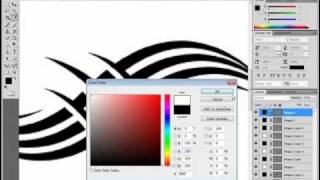
hello Gary Simon here of design course comm today is January 28th with again our 28th video of the year and we are going to take our iPhone breathalyzer and create a homepage design mock-up and Photoshop CC so it's gonna be based on a 12 grid system and if you have no idea what that means basically we have the intention of making this responsive in a grid system helps organize the HTML and CSS and basically we're going to try to stick within using two grids to format and structure our layout so again if this is confusing don't worry you'll understand as we progress into the HTML and CSS in the next couple days so as always check out design course calm the project files are available for free and you will need them I for the grid and all that stuff so anyhow let's go ahead and get started alright so the first thing you want to do is go ahead and download the project files I either on design course comm or YouTube here in the description and once you download that zip file and extract it and these will be the files you see we want to open up grid and so this is going to be the document where we design the actual site so unfortunately I'm not on a bigger resolution for this tutorial so I'm at 66.7% basically I want to see the whole thing and right here we see these these guides they're basically the grid system that we're gonna use for HTML and CSS to make it responsive and also try to basically just line everything up here so if you don't understand what this is you'll see how it all comes together at the end of the tutorial when we get to the HTML and CSS part all right so to get rid of the guides I'm going to be hitting ctrl H and basically what that does is view extras it'll show and hide that so that's just a for your reference so the web the website background we're gonna we're going to leave white so or just leave it at that now the next thing we want to do is in the credits when the description of this five video and YouTube here you can go ahead and bring up where the hell is at one second this right here okay so this is I found this image first bike let me hit this by this site this is a handy site if you need to try to find images that are under the Creative Commons license so I just typed in bar I think and that image came up and so what we want to do is download this and come over here hit download and then we want the one that's original so it's click on that wait for it to load right click and copy image here in chrome and we'll come back or you could save it to your desktop do whatever and then we want to open that up or paste it in rather ctrl-v alright so as you can see i we're not gonna be leaving we're gonna be pretty heavily blurring this thing out so what I want to do is go to filter blur and then Gaussian blur and we're gonna want something that's around twenty seven point eight pixels you have to be exact but just something around here and then I'm also going to apply an adjustment layer so if you click on this for adjustments and we go to a hue and saturation and then click this little icon this means it will only apply to this layer not all the layers will take down this hue just or the saturation rather just around there all right so now what I want to do is open up the phone top alright so as you can see I cut it out from my top render and also this is not the the version of the phone that I created during in the tutorial in the previous lessons the the one I created first before I record everything I think that one worked out kind of better but no big deal if you want to use this one you know it's in the project files you can use it or you can use your own that you did for your renders I and all you have to do to cut yours out I mean it's very simple here's all I did you know you zoom up pretty close you take that pen tool make sure path is selected and then you just go around the entire outline with the pen tool you know in using you know shift to make a perfect vertical and horizontal lines and then just go around the whole thing once you have it all cut out for example let's just assume R so as just go to right click make selection make sure anti-alias is selected hit OK and if it inverts your selection like that go to select inverse and then ctrl C to copy and that cuts it out of the background all right so what we want to do is control a and then control C and control V to paste that thing in all right so let's see here now I'm gonna work on the actual navigation so I'm gonna call this phone top first and I'm going to take the rectangle tool and black is selected that's what we'll use and hold alt and come down you know maybe right around here ctrl H to get rid of that view twice and we're going to give it an opacity around 62% I'll call this navbar and I'm just going to I'm not going to really focus on creating a logo it's just gonna be a type of logo and make sure white is selected and I'm just going to bring up a grid I'm gonna click right here in this first one and I'm going to type in BAC STR and right now left align that and let me go ahead and get rid of the grid view I'm gonna go 100% and we want this to be smooth and control t hold shift and scale it up right around there and I'm going to use a font called sort a coarser T or whatever and that's right here okay and then I'm going to also duplicate that control shift D or right click and hit duplicate layer and if you don't if yours hockey isn't set up for that you can just go to edit keyboard shortcuts and find your way through there to create your shortcuts I'm just gonna scale it up ctrl T shift alt and second move tool hit apply all right get rid of this let's zoom out here alright so far so good now let's take a look at this grid here basically the position of this let me find the Baxter copy and phone top will just take both of those and hit ctrl G all right and I'll just type the phone top now if we take auto select group can move this oops I'm gonna lock that we can move this around and so you know this will span the width of one two three four five and we'll Center this image when we get to the HTML CSS so it right around there and then we're going to have some text over here but first I want to get the nav up there going so we'll go ahead and take the type tool and we're going to use source sans Pro that's kind of the free font that I use in most of my videos it works well and before I change that we're going to I think roughly you're right around here starting at the sixth lord it wait one two three four five six yeah right here just drag out all the way the width of those six columns and I'm just going to type in some navigation menu links so I'm typing shop for my first and we'll be adjusting the size of all this and I'm just going to space out some arbitrary you know amount and then take all that and copy it and then just paste it in five to four more times so one two three four all right I'm going to get rid of the gridview for a second here we want to put this up top I'm gonna go to 100% just so I can see what's going on I'm going to quickly adjust these details back add some frequently asked questions help and contact you know whatever and I'm going to go to source and SPRO and we'll leave it at white I believe and then we'll change the font size I'm gonna try 16 zoom out here get up our grid and let me do you like that and just push this over here to the beginning one right there all right so that's the nav and now down here we want to get started with our main headline and so what we'll do is move zoom back out so I can't because I can't see everything it's a pain recording this tutorials with this smaller resolution and used I'm used to a lot bigger but anyhow no big deal let's get a grid out here and with a type tool and I'm going to select I think right around here and just drag out left click all the way to the right I think right here would be good and I'm going to type in the first oh wait I my caps set the first iPhone breathalyzer alright take this we're gonna make this pretty big maybe not 36 48 I think that'll work well yeah I'm gonna take that down to like 40 I think no 44 alright and then I'm going to just duplicate that ctrl shift d pull this down take the font size to just try like 18 maybe it's got a small yeah it does try like 21 and I'm just going to type in real quick never again take a chance on the streets without knowing your blood alcohol content BAC let's say 99 I'm making us all up obviously 0.5 percent accuracy Baxter as you were back okay exciting alright so make sure we change this to sharp and that changes it you know more realistic to what it would how the text would render in a browser alright and so come down oops ctrl + left click will kind of do the same thing if auto select were selected so that lets you select the layer let me just zoom out a bit use your up and down arrow keys a spaces out and then I'm going to have a call to action button which is simply you know something the user can interact with and a button is certainly that so take the grit up here and with a 3% or 3 pixel radius will alt and drag out to the width of 4 I believe yeah we'll see if that works well hide that get this out of the way and we want to make the color something that will stick out pretty well hit okay and then hit ctrl H to get rid of that or hit it twice rather and then we want to go ahead and just put the text here order your Baxter now ctrl T shift scale that down select the move tool it apply and if you want to make that regular so it's six out just a little bit more that would probably work ctrl T scale it back down again hit apply alright so I think I want to move some things around vertically so auto select group right here will take these layers holding shift and selecting them all and just kind of moving them up a little bit alright so you know this view this design that we're doing is kind of the design the appearance that will be presented in the viewport the browser on a larger screen and so when it comes to responsive web design we will also be with the HTML CSS we have to kind of imagine you know how this is going to look when the browser or the viewport is smaller so going from like a desktop size maximized window and then going to like a tablet size you know how are these things going to be adjusted well this will get smaller a little bit on a on a tablet type of viewport and so will this and they'll space between these these two elements basically will also shorten and then on a phone when you get to that type of width things will kind of get stacked on top of each other so we'll see what you know how that works when we get to that point all right so real quick I'm gonna click on the background layer and I'm going to create take a rectangle rectangle rectangle tool and just click at the very top left outside of the document hold alt and I'm going to go right around here I kind of want there to be an even space between the top of this and the bottom of this and then we're going to right-click on this and select create clipping mask so the only thing that gets shown in here is you know based on the height and width right here so that's what a clipping mask does alright so now we have this top portion basically done now we want to come down here and add some more content so let's go to file open from the project files and we want the phone perspective now this was you know again the one that I did before I recorded this tutorial but it's basically but very close to whatever you know we did when we when we went through the tutorial so just ctrl a ctrl C copy that control V to paste ctrl T scale down hold shift so we want to go pretty small but before I do that I should have got the grid up let's get that grid ok ctrl T scale this down and I want this to be the width of two of the grids or columns rather so I think right here hit apply and now I want to take the type tool and I'm going to drag out to four right there okay and I'll just type in if you're but first let me switch back and just so we can see this text get black so it's pretty large so let me hide that we'll go to light change this to let's think here maybe like 16 and why is it doing that so messed up let me see 20 leave it there for now if you're under your limit you're good to know and your and your Baxter will be lit green I'm just thinking of this stuff off the top of my head okay I wanted three lines and into what else to put that's it all right all right so yeah you know what I think I'm gonna get this down a bit more to 18 and actually I'm going to move this again makes more sense to get that line fill it up over there a little bit more so I'm gonna move a here nor two vertically in the center here and I'm going to zoom out um now we're going to duplicate these two so I'm going to select with auto-select layer on here the text and hold shift and take that layer duplicate it or them rather and we'll take the grid up and make sure this is aligned properly so let's just use my left arrow keys and get rid of the grid view take this and now ordinarily if this is a serious product I would get a screenshot of the video when we had the red thing going and use a different number but just for the purposes of this we can just go ahead image adjustment hue/saturation take this down to a reddish or a red color rather right around there and then well let me zoom up so we can see this if you're over your limit you'll know certain with this is so stupid this add coffee I but that's okay are this copy rather you'll know it for certain with behind a card okay or behind a car who's the idiot alright wheel you're an idiot okay let me move this over it's a little bit purple in there it's what happens sometimes these weren't the same exact colors but that's fine alright so let me zoom out here just kind of get an idea what things look like right away I think these are too big so I'm gonna scale this down a control T select both of them right around there so I'm holding shift and all scaling goes down hit apply get her grid out just so we can make sure this is all aligned properly now basically even though this isn't the exact width to grid columns we could still Center it like that and we'll do that in the HTML and CSS CSS rather and now things you know this is a little bit too big it was squished up a little bit so now we fixed that now I just want to take these four layers I want to shift and just move them up a little bit you do I do want a lot of wave space but too much and it doesn't make sense alright so around there and then we want to go ahead and take the rectangle tool and we're going to work on our final section and we'll make it right around there we could adjust aside the size if we need to in a bit and ctrl H to get rid of that twice and we want to take the color and just I'm going to use ePHI v5e five for the hex code and then we're going to open up phone side so it's relay and then control C to copy that and then control V to paste that in now here's what I did basically I did what I did with the other one and I just cut it out with a pen tool but I also added a shadow underneath it and just real quickly show you if you you know if you really did want to use your own phone and you want the same kind of effect all I did was take the brush tool and you would create a new layer underneath your phone that was cut out like this control-shift-n and then you would take black color and then with a large feathered brush like 600 you just click once there hit ctrl T and then drag it down holding alt you know something I write around there and then you could just a size like this holding alt and then you move it kind of underneath hit apply and then you could adjust the opacity as needed and then you take both of those layers hit ctrl e to merge them that's all I did alright so now let's move this down and we are going to want this to be a little bit bigger ctrl T right around there put this near the bottom ok so just what everything looks like so far and up here I'm gonna have like three sort of testimonial type things so what I'm gonna do is go to file open and I'm gonna open up my image ctrl a ctrl C to copy that close it out and then go ahead and get our grid up and I want my head to be basically I try to think about this here are three yeah these are going to be four columns each because we're gonna have three of them and so in this in air all going to be centered so I right in between these for we can hold shift and take out this ellipse maybe right around here let me just hide that temporarily and then I'm going to hit ctrl shift and for a new layer select create clipping mask hit okay and then I'm going to ctrl V to paste in my image usually it just paces right in the center if you take this lasso tool you'll see it's right there the reason we can't see it though is because this is a clipping mask it will only showing there so we could take the move tool just unselect that ctrl T scale is down shift and alt you know whatever right there alright and then if we wanted to you don't have to do this I'm going to though stroke will take it up to like five I think make it white hit okay and hit okay okay so now let's get our grid back and we're gonna have some text and it's gonna need to be centered and we're gonna drag out to the width of four of these columns so we'll Center it and then we'll put Gary's story now we don't see it because it is accidentally a clipping mask so if you just drag it to the top it'll drag it back down that'll work and then zoom up here to a hundred percent and get rid of the grid and then down here I'm just gonna hit enter and type in it's literally saved my life I could have died alright in quotation there and then let's take this when I move over here and go ahead take this and we're going to make it just a slightly lighter color here and yeah let me see if we're using eighteen I think that would be fine it's kind of hard to visualize the scale things when you're working in such a small resolution you can see the whole thing at a hundred percent but I think that'll work so I'm gonna take auto-select layer here take these layers and move them a little bit holding shift vertically and then I'm going to get the grid deselect auto-select layer control shift D to copy those and then just do the same thing right here and then duplicate it again and put this over over here alright and then this is not centered this image which oops just controlling left click to select that and I think right around there it's fine alright so what's going to happen with these you know when you take the viewport window and you pull it in or you're looking at on a like a some type of mobile device and by the way I'm looking at this I'm gonna fix this real quick take this and that'll allow us to use auto select layer and then just take all of these layers and you want to not select that that bar scene so just hit ctrl left-click now it selected all these layers I could move them up because this was not even and let's see here you want to even distance between the bottom of this at the top of that and it looks pretty good alright and me just this again I think that it's look looks pretty good and so what I was saying you know if you're looking at this through like a tablet this would kind of gets it's gonna get a little bit smaller and then a phone these will get stacked on top of each other same thing with this and this will just kind of automatically scale down so I'm gonna end the design there obviously we could create a footer and stuff but just for the purpose of getting your feet wet with responsive web design this is more than enough to get started all right so of course I tomorrow I will be releasing the first part of the HTML and you know that might be a 2-person step process because before we even get to the HTML we have to say about our images and get those kind of extracted from this document in a sense and then probably just get the HTML document set up and ready to go all right so of course check out design course comm if you haven't yet subscribe here on YouTube and I will see you tomorrow all right good bye
Original Description
http://goo.gl/BBse40 - Design + Code a Professional Android App from Scratch
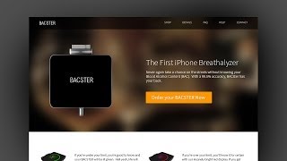
Project Files: http://www.designcourse.com/videos/iphone-breathalyzer-website-design-mockup-in-photoshop-cc-part-4/35
- Now we'll start working on designing a home page mockup in Adobe Photoshop CC using a 12 column grid.
Bar Scene Resource/Credit:
http://www.flickr.com/photos/sonya/2310486160/
Fonts (Source Sans Pro):
http://sourceforge.net/projects/sourcesans.adobe/
Fonts (Sertig):
http://www.dafont.com/sertig.font
Follow us:
Facebook: http://www.facebook.com/designcourses
Twitter: http://twitter.com/designcoursecom
Google+: http://plus.google.com/+DesignCourse
Dribbble: http://dribbble.com/designcourse
- - - - - - - - - - - - - - - - - - - - - -
Subscribe for NEW VIDEOS weekly!
My site: https://designcourse.com
My personal FB account: http://fb.com/logodesigner
Coursetro FB: http://fb.com/coursetro
Coursetro's Twitter: http://twitter.com/designcoursecom
Join my Discord! https://discord.gg/a27CKAF
^-Chat with me and others
- - - - - - - - - - - - - - - - - - - - - -
Who is Gary Simon? Well, I'm a full stack developer with 2+ decades experience and I teach people how to design and code. I've created around 100+ courses for big brands like LinkedIn, Lynda.com, Pluralsight and Envato Network.
Now, I focus all of my time and energy on this channel and my website Coursetro.com.
Come to my discord server or add me on social media and say Hi!
Watch on YouTube ↗
(saves to browser)
Sign in to unlock AI tutor explanation · ⚡30
Playlist
Uploads from DesignCourse · DesignCourse · 48 of 60
1
 2
2
 3
3
 4
4
 5
5
 6
6
 7
7
 8
8
 9
9
 10
10
 11
11
 12
12
 13
13
 14
14
 15
15
 16
16
 17
17
 18
18
 19
19
 20
20
 21
21
 22
22
 23
23
 24
24
 25
25
 26
26
 27
27
 28
28
 29
29
 30
30
 31
31
 32
32
 33
33
 34
34
 35
35
 36
36
 37
37
 38
38
 39
39
 40
40
 41
41
 42
42
 43
43
 44
44
 45
45
 46
46
 47
47
 ▶
▶
 49
49
 50
50
 51
51
 52
52
 53
53
 54
54
 55
55
 56
56
 57
57
 58
58
 59
59
 60
60

Photoshop Pen Tool Tutorial (Tattoo Design)
DesignCourse
How to Design the Microsoft Logo in Photoshop
DesignCourse
Photoshop Gradients Video Tutorial
DesignCourse
Your Guide to Layer Styles
DesignCourse
Layer Masks in Photoshop
DesignCourse
iOS App Icon Design Tutorial in Illustrator CS6
DesignCourse
Illustrator CS6 Logo Design Tutorial - Archfold
DesignCourse
Photoshop CS6 3D Tutorial - Magic Tent Illustration
DesignCourse
How to Design a Tshirt Tutorial - Adobe Illustrator
DesignCourse
Types of Logos - Lettermark & Monogram Logo Type
DesignCourse
Banner Design in Photoshop CS6
DesignCourse
How to Design a Logo in Illustrator CC
DesignCourse
Designing a Logo in Photoshop CC
DesignCourse
1. Launch & Market a Web Based Business - Introduction
DesignCourse
2. Launch & Market a Web Based Business - Logo Design
DesignCourse
3. Home Page Mockup in PS : Part 1
DesignCourse
4. Home Page Mockup in PS : Part 2
DesignCourse
5. Home Page Mockup in PS : Part 3
DesignCourse
6. Home Page Mockup in PS : Part 4
DesignCourse
7. Home Page HTML & CSS - Part 1
DesignCourse
8. Home Page HTML & CSS - Part 2
DesignCourse
Using Photoshop to Showcase Mobile Projects
DesignCourse
Flat Icon Design Tutorial in Illustrator CC
DesignCourse
Illustrator CC Logo Design Tutorial - A Logo That "Pops"!
DesignCourse
Logo Design Follow Along 1: Emblem Logo Design
DesignCourse
Showcasing Logos in 3D with Blender
DesignCourse
How to Design an Effective Lettermark Logo
DesignCourse
Squeeze Page Design Tutorial in Photoshop (Part 1)
DesignCourse
Squeeze Page Design Tutorial in Photoshop (Part 2)
DesignCourse
Mobile GUI Element Design in Adobe Photoshop CC (Part 1)
DesignCourse
Mobile GUI Element Design in Adobe Photoshop CC (Part 2)
DesignCourse
Flat Mobile App Design in Photoshop CC - Weather App
DesignCourse
Create Reflective 3D Text in Blender (Beginner)
DesignCourse
Animating a Logo with Adobe After Effects CC (Beginner)
DesignCourse
Design a Game Website Mockup in Photoshop CC (Part 1)
DesignCourse
Design a Game Website Mockup in Photoshop CC (Part 2)
DesignCourse
Photo Manipulation Tutorial in Photoshop CC (Beginner)
DesignCourse
Advertising Illustration Tutorial in Photoshop CC
DesignCourse
Perspective Warp Tool Tutorial in Photoshop CC
DesignCourse
Free Giveaway Contest. (WiseBanner Banner Maker).
DesignCourse
Design an Animated Loading/Download Icon (GIF)
DesignCourse
Contest Winners (WiseBanner)
DesignCourse
Model & Animate a 3D Push Button in Blender (Beginner)
DesignCourse
Mega Tutorial - iPhone Breathalyzer - Project Introduction
DesignCourse
Part 1 - iPhone Breathalyzer - Blender
DesignCourse
Part 2 - iPhone Breathalyzer - Rendering & GUI Design
DesignCourse
Part 3 - iPhone Breathalyzer - UI Animation in After Effects
DesignCourse
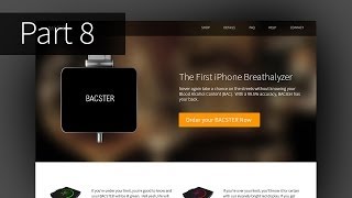
Part 4 - iPhone Breathalyzer - Website Design in Photoshop CC
DesignCourse
Part 5 - iPhone Breathalyzer - HTML Part 1
DesignCourse
Part 6 - iPhone Breathalyzer - HTML/CSS Part 2
DesignCourse
Part 7 - iPhone Breathalyzer - HTML/CSS Part 3
DesignCourse
Part 7 - iPhone Breathalyzer - Finishing Touches
DesignCourse
Square Space Logo Maker - C'mon People.
DesignCourse
Design a Bloody Knife in Photoshop CC
DesignCourse
Typographic Poster Design Tutorial in Illustrator (Part 1)
DesignCourse
Typographic Poster Design Tutorial in Illustrator (Part 2)
DesignCourse
Modern Business Card Design in Illustrator CC (Part 1)
DesignCourse
Modern Business Card Design in Illustrator CC (Part 2)
DesignCourse
Parallax Tutorial using Parallax.JS
DesignCourse
Interview: Andrew Price of BlenderGuru.com
DesignCourse
Related AI Lessons
⚡
⚡
⚡
⚡
Career choice with the advent of AI - pure Computer Science or learn software with a background of core engineering area
Dev.to AI
The AI Hype Cycle: Calm Before the Next Breakthrough?
Medium · Programming
AI won’t replace scientists. It will make the current model of science obsolete
Medium · Data Science
The End of Knowledge: Why Artificial Intelligence Is Changing Not Only What We Know, but What It…
Medium · AI
🎓
Tutor Explanation