EDA Toolkit Tutorial on Streamlining Exploratory Data Analysis in Jupyter - Leon Shpaner & Oscar Gil
Key Takeaways
The EDA Toolkit is a comprehensive Python library for exploratory data analysis in Jupyter, providing tools such as Data Doctor for data profiling, transformation, and visualization, and generating table one for continuous and categorical summaries. The toolkit simplifies and accelerates EDA in Python, making it faster, more visual, and consistent.
Full Transcript
All right, welcome everyone. Thank you for joining us. So before we get into who we are and what we're about, so we're going to present to you our library, the EDA toolkit. Um the EDA toolkit, we only have 25 minutes, so we'll try to make this a little bit of a marriage between a demo and a tutorial. So the EDA toolkit came out of a simple need. uh we didn't see a comprehensive all-in-one EDA library in Python, especially one that could handle both tables and visuals the way that we needed it to. So, we built it ourselves. We combined the most useful functions that we've been using across our projects into one cohesive toolkit. So, every project, as I'm sure you know, whether it's research, healthcare, business analytics, and the sort, starts with the same challenge. getting a reliable overview of the data before modeling. And the EDA toolkit makes the uh that step simple and consistent. So, it gives you ready to share results that fit right into your workflow. So, let's start by introducing ourselves sort of. Uh on the left, that's me, Leon Spanner. Uh let's see here on the right it's my colleague Oscar Gil. Oscar introduce yourself. >> Hi everyone. Oscar Gil data scientist UC Riverside. >> I'm a data scientist with UCLA Health. So in the middle that's our honorary co-author and debugging companion, the grey alien. Uh we figured every project needs at least one extraterrestrial reviewer. Uh but really this slide captures kind of who we are, what we're all about. We're a little bit playful, a little bit technical, uh and truly command line powered. So everything you'll see today, figures, tables, everything you'll see visually can be generated straight, uh from Python. There's no manual edits or anything like that. So for this presentation, we're using the adult income data set from the UCI machine learning repository. This is a classic data set based on the 1994 US census data. Uh it has about 49,000 records and 14 features. The goal is to predict whether someone earns more or less than 50k a year uh based on demographic and employment factors. But for this tutorial, we're focusing only on exploratory data analysis, not uh predictive modeling. All right. Now that we've seen our data set, let's kick things off with generate table one. Maybe you need this for a baseline summary, a reproducible report, or just to get a feel for your data before diving deeper. This is the tool that sets the tone for the whole toolkit. Think of it as your one-stop summary. You run a single line of code and instantly you get this clean, powerful breakdown of both continuous and categorical variables. So here we're using generate table one. Uh this function quickly summarizes a few continuous variables and automatically gives you key stats like the mean, median, standard deviation and range along with missing values and proportions. This is the kind of summary you'd usually have uh to build manually and it's very time consuming consuming but this is done instantly and formatted cleanly in one step. Now we do the same by passing in the categorical columns. So if you want to see everything in one fell swoop in one report you can have that. And here we turn on value counts true. So this adds categorical breakdowns directly into the same table. Along with continuous summaries, we also see proportions uh for variables like sex, race, work class. This is a quick way to get both numeric and categorical summaries side by side uh without having to rewrite separate code for each. Here we're showing how generate table one can also handle statistical testing automatically. In this example, we're grouping by income and the function runs kaiquare test for each categorical variable to check for any significant differences between the income groups. And you can see those results on the right where the p values are listed next to each variable. And that means we're not just summarizing data anymore. We're adding statistical context to it. And from a code standpoint, the logic is all handled inside the same call. Group by call equals income. You can group it by whichever column you want. Um, and this triggers the tests and the output includes everything in one clean markdown ready table. So now that we've got our baseline summaries from generate table one, the next natural step in the pipeline and the EDA exploration pipeline is to start comparing groups. That's where this stacked cross tab plot comes into play. Instead of just looking at averages or counts, this one lets us visualize how categories relate to each other like gender by age group or income by education. So what we do here is we take what would normally be a bunch of manual cross tabs and plotting code and turn it into a clean reusable call. So it looks like this. Here we use the stack cross tab plot function from our EDA toolkit. And on the left we define three key lists that drive the loop logic. The funk call is a list uh that specifies which categorical variables we're analyzing. In this case, sex and income. Legend labels is a list that defines the labels that appear in the legend for each variable. And this holds the corresponding plot titles where you see titled equals in that list of sex and income. And on the right, we call the function itself. We pass in the data frame. We specify the age group. That's the main column of interest. And then loop through each variable in uh that list function calls. So the variable returned at the bottom cross tab age sex represents the separate output for each plot. So not only are you going to see plots, you can also retrieve the data frame with the uh numeric representations. Uh that's what the return dict equals true flag allows us to do um is to access the plots programmatically so we can easily extract and reuse them later in the workflow. Each plot shows the age group distribution stacked by either sex or income using consistent colors and formatting. You can change them up as you see fit. The top uh shows the raw counts of males and females across age groups while the bottom chart normalizes them by percentages and highlights uh their relative uh prevalence rather than the population size. This is the table that summarizes the data numerically. It shows the count the percentage of males and females in each age group. You can see the female proportion increases steadily with age uh reaching around 70% in the middle uh and older age brackets. So that matches what we saw earlier in the stacked plots. This displays the underlying cross tab in the notebook and shows the same counter percentages that we saw uh in the plots. So once we've looked at categorical relationships, the next step is to understand how numerical features relate to each other. That's where this flex core matrix comes into play. Uh instead of running separate correlation calculations and doing things manually, building a heat map manually, uh this function does it all in one shot. It builds the table, plots it, and tweaks the look instantly as you'll see here. Um just a quick overview, each cell represents the correlation strength between two numerical variables in the US census data set. Here the values are mostly weekly correlated. We do see a modest uh positive relationship between education level and hours worked per week. And the code on the right demonstrates how easily we can generate this heat map, customize the titles, labels, and color scale. Then we can simply change the boolean to true for the triangular option. Um, and that displays only one half of the heat map versus the entire thing. And this removes redundant information if uh you need to do this for your paper for example. Um, and doing this manually is a bit of a pain repetitively. So now that we've explored relationships between variables, uh, the next step is to look at how each variable behaves on its own. That's where the KDE distributions comes in. We start simple. We have a histogram. We want to see the overall shape of the data. We use the KDE distributions with plot type equals hist. That's the input parameter. And varss of interest equals age. So we get this clean view of how age is distributed. Uh most people fall between 20 and 50. And the drop off after that shows a clear right skew. Uh so this gives us a a quick baseline before we layer in more detail like density curves or subgroup comparisons. There's that kernel density estimate. We get that by specifying plot type equals both. So that allows you to see both the histogram and the kernel density estimate. Um when you add plot mean equals true, you get that blue line for the mean. And uh this dash line gives us a clearer picture of the data central tendency overall distribution shape and uh combines the visual density and numerical context in one step. Similarly, we can add plot median equals true. And now you see both the mean and the median. You can plot one or the other or none. It's up to you. It's fully customizable. Next, we can also customize whether we have one, two, or three standard deviations to be displayed. And that's that. So, so far we've looked at individual variables and pair-wise relationships. But if you want to go broader uh to see every possible combination of features in one go without manually looping or writing custom summaries each time, that's pretty much why we did this. We um wanted to build summarize all combinations to pick your variables, run it once and automatically create all the different summary tables for u format them and export everything out straight to Excel because you never know when you need to work with Excel and have everything ready in that format to send over to somebody else. Some people find it easier to each their own. So what this does is we include the data frame inside summarize all combinations. uh we list the unique variables that we wish to compare. If you want to output it to Excel, you include the output path and voila, there's what we end up with right here. Um and you see some of that printed below. But in Excel, as you can see, when we export and pop it back open, everything's fully automated. It even builds a clickable table of contents. Um so each tab takes you straight to a different variable combination. Every sheet includes counts, proportions. Um, so basically gives you a full exploratory map of your data set and it's ready to navigate without writing a single extra line of code. And so now that we've uncovered summaries and distributions, left let's shift gears a bit to relationships because once you know how your variables behave individually, the next step is seeing how they interact. I mean, sure, you can have your standard run-of-the-mill scatter plots. Why not? But here, the scatter fit plot function gives you control over what's displayed. In this in this first example, we enable add best fit line equals true, and show correlation equals true. So, each subplot includes a red regression line, the line equation in the legend, and the correlation value in the title. In the second example, we turn those off and instead introduce categorical hue using income levels. Pretty standard stuff so far. But this not only highlights how the same function can instantly switch from analytical mode to comparative visualization, it shows how ours worked varies across different income groups. And last but not least on this piece is we want to build from what we've already shown. And so in this example, we take the idea even further by summarizing all numerical combinations in the data set. Instead of manually specifying pairs, we use df. select dtypes np number columns to list. So we get all the numeric uh data types and we pass that in. Uh we get an automatic generation of every possible numeric pairing because sometimes you just don't know what numeric relationships you need to plot. So why not plot them all? And so, um, that's what this would look like in full with respect to this data set. And now I'm going to pass it over to my colleague, Oscar to introduce data doctor. >> Thank you, Leon. Okay, so next we're going to look at uh the data doctor function. And the data doctor function consolidates repetitive EDA uh steps uh such as analysis, transformation of of a feature, visualization and optional right back to the uh data frame itself. Excuse me. Uh and this works for any numeric feature in the data frame. So what does doc data doctor do in one go? It uh profiles a feature. First thing it does it looks at one numeric uh feature in the data frame provides a summary of min max mean uh median standard deviation cortiles IQR and also the 1.5 times IQR outlier bounds. So that may sound very much like the pandas described which it is in certain ways uh except that it's also providing us some of that IQR uh outlier bound information. Uh number two, it plots the same way every time. So as you'll see right now, data doctor produces a plot uh the same plot every time. It's a KDE, a histogram, and a box violin plot. And it's a in a consistent layout. And um some of the magic that starts to happen in data doctor is that we're able to uh tell it to scale the data. We can tell it to transform the data to uh one of several scalar options such as log, minm, max, uh standardize, robust and several others. And finally uh it writes back to the data frame so that we have uh the original uh raw feature and also the transformed versions of uh that same feature. So uh let's look at this demo. We're going to look at one feature which is uh the age column from the UCI census income data set. We're going to run it through the data doctor and show how it profiles, plots, and uh transforms a single feature. Okay, so let's start with the raw age uh at the top. As you can see, we're running data doctor. Uh our data frame here is X and the feature name is H. So this here is our our raw profile of of H. the the way uh uh it it uh it's reflected in in the data set itself. The next thing uh we're going to do here is we're going to uh apply transformation. So as you can see there at the top uh we've added a flag of scale conversion equal to log and and apply as new column to uh data frame equal to true. So as you can see well first let me go back a slide you can see our shape of our raw data some outliers there on the box plot but once we've applied that log transformation those visuals are are showing us that now we have more of a normal uh curve there in the in the KDE uh the box plot itself uh took care of those outliers and since we're doing apply as new column to DF true we get a new column um indicator here. So our new column that's been added to that same data frame is named H log in this particular case. Next we're going to do a different scaler. We're going to do minmax. And uh so here it it it retains the the same shape of the original uh uh feature itself. However, what the advantage here on the minmax as you can see at the very bottom, it it gives a a low cut off of zero and an upper cutff of uh one. And uh we also have outliers which is very important to to um observe right here. And let me draw your attention to the histogram plot. The very far right of that histogram plot has a very small spike. That's important uh in our next slide. And uh again we applied uh the flag apply as new column to df true. And so we're going to get a new column out of this named age minmax. Now before I go to the next slide, let's look at that outlier bound in the data summary uh data doctor summary report. Our upper bound is at 8356. So let's just make a mental note of that because we're going to use it on the next uh slide. Okay. So I'm calling in my new feature that that was created in the previous slide. I'm applying a new flag upper cutff equal to 8356. Uh and also the flag apply cutff equal to true. And the the same flag we've been seeing to write this back to the data frame. That creates a new column name for us h minmax with cutoff. And uh as you can see now in the in the box plot those outliers got compressed which are is also visible now in the histogram very uh a taller spike versus the previous slide and that's exactly the outcome we want for for the calls that we uh did in the flags. So now that we've got all four versions of H, the raw one, the log scale, the minmax, and the cut off version, uh we're now going to compare them side by side. So on the the plot on the left hand side are the original scales. And as you can see, our original H has uh quite the range there, while all all of our other transformed versions are compressed a lot closer to zero. However, when we compare them under a normalized uh uh status, we can see that they all are their means are all within zero, which tells us that they all retained their uh their data signal. It it wasn't distorted by these transformations. So, that's actually really good. And one quick note, this uh box spot here is not something that EDA toolkit creates. It's something I created separately just to show uh possible next steps after using the data doctor tool for further analysis. Okay. So here we have a a heat map of sorts. But before we read read this heat map, I just want to give quick heads up. This is not the standard Pearson correlation matrix. Uh normally a Pearson correlation matrix uh shows how every feature relates to other features. uh in this case what I what I did is uh on our y-axis we have all the all of the other feature numeric features in the data frame and then in our x-axis we have our raw age the log version the minmax and that minmax cutoff and these are all reflecting normalized uh uh equivalence. So when we see 0 96 for example that's not that doesn't mean it's a 0 96 correlation it's it's just relative in terms of a percentage. So really what we're looking to get out of this is which of our transformations has better signal with each of these uh y-axis uh features. As you can see here the log version one in in many of these uh uh rows except for the final weight uh feature. So this is really helpful in terms of of comparing transformations versus the remainder of the features. So this last slide here just shows a quick animation that cycles through some of the plotting options inside of data doctor. Uh you can focus on just one of the three plot types. For example, uh say you only want to see the KDE or only the box plot instead of the full layout with those three plots. Um you can see as it cycles through this animated uh uh image, you can change those flags to do that. And so the flexibility of this tool is consistent and so are the visuals. And that's what makes data doctor feel like a complete tool. Uh it's not just automating steps. It gives users control without uh complexity. So that's where data doctor ends. It's a consistent, extensible and customizable tool. So in conclusion, uh the functions that we shared today, we uh are just a few highlights from the EDA toolkit. Uh we designed them to make exploratory data analysis faster, more visual, uh more consistent. uh the kind of tools we wish we had when uh we first started every project back during our M's program. Uh but there's more in the library. Uh we uh encourage everyone here to go uh uh import the EDA toolkit uh play with it and and uh because at the end of the day, the goal of the EDA toolkit is simple. It's make uh exploitation reproducible, sharable and open. And uh before we get into our thank yous, I also want to add that EDA is not a one-sizefits-all solution for everybody. It's not a very quantitative process, although it can be at times because it's blended with pre-processing. And sometimes those uh areas are blended and murky. But uh like my colleague Oscar said, we invite all of you to visit our GitHub repo and um pip install ED8 toolkit, play around with it and submit a pull request. Um but yeah, we want to thank um Dr. Ibrahim Taresi. He's the academic director of the masters of science and applied data science program at the University of San Diego where we we completed our masters several years ago and um you know that's where we first met and uh that's where this collaboration really started and uh you know we just want to also take the time to thank our uh home institutions UCLA Health and the University of California Riverside they've supported our applied data science work that connects analytics research and real operations. And of course, a big thank you to Jupiter Con for the opportunity to share this work, for creating a space uh where open-source tools like this can reach people across organizations and disciplines. Thank you. >> Thank you.
Original Description
EDA Toolkit Tutorial on Streamlining Exploratory Data Analysis in Jupyter - Leon Shpaner, UCLA Health & Oscar Gil, University of California, Riverside
EDA Toolkit (https://www.pypi.org/project/eda_toolkit) is an open source Python library that simplifies and accelerates exploratory data analysis in Jupyter notebooks. Through standardized functions for summary tables, automated profiling, and advanced visualizations, EDA Toolkit helps practitioners produce reproducible, publication-ready outputs with minimal code. In this hands-on 3 hour tutorial, attendees will work with a real-world dataset to: install and configure EDA Toolkit; generate descriptive tables; create profiling reports; visualize distributions and crosstabs; and export results to Excel. By the end, participants will integrate EDA Toolkit into their workflow, customize features, and contribute to the open source ecosystem.
Watch on YouTube ↗
(saves to browser)
Sign in to unlock AI tutor explanation · ⚡30
Playlist
Uploads from JupyterCon · JupyterCon · 0 of 60
← Previous
Next →
1
 2
2
 3
3
 4
4
 5
5
 6
6
 7
7
 8
8
 9
9
 10
10
 11
11
 12
12
 13
13
 14
14
 15
15
 16
16
 17
17
 18
18
 19
19
 20
20
 21
21
 22
22
 23
23
 24
24
 25
25
 26
26
 27
27
 28
28
 29
29
 30
30
 31
31
 32
32
 33
33
 34
34
 35
35
 36
36
 37
37
 38
38
 39
39
 40
40
 41
41
 42
42
 43
43
 44
44
 45
45
 46
46
 47
47
 48
48
 49
49
 50
50
 51
51
 52
52
 53
53
 54
54
 55
55
 56
56
 57
57
 58
58
 59
59
 60
60

Interview Joshua Patterson NVIDIA
JupyterCon
Dave Stuart - Jupyter as an Enterprise “Do It Yourself” (DIY) Analytic Platform | JupyterCon 2020
JupyterCon
Jeffrey Mew - Supercharge your Data Science workflow | JupyterCon 2020
JupyterCon
Michelle Ufford- Supercharging SQL Users with Jupyter Notebooks | JupyterCon 2020
JupyterCon
Alan Yu - What we learned from introducing Jupyter Notebooks to the SQL community | JupyterCon 2020
JupyterCon
Chris Holdgraf- 2i2c: sustaining open source through hosted Jupyter infrastructure | JupyterCon 2020
JupyterCon
Yiwen Li - Intro to Elyra - an AI centric extension for JupyterLab | JupyterCon 2020
JupyterCon
Luciano Resende - What's new on Elyra - A set of AI centric JupyterLab extensions | JupyterCon 2020
JupyterCon
Alan Chin - Explore and Extend AI Pipeline Runtimes with Elyra and JupyterLab | JupyterCon 2020
JupyterCon
Eduardo Blancas- Streamline your Data Science projects with Ploomber | JupyterCon 2020
JupyterCon
Thorin Tabor - Democratizing the accessibility of computational workflows | JupyterCon 2020
JupyterCon
Simon Willison- Using Datasette with Jupyter to publish your data | JupyterCon 2020
JupyterCon
Brendan O'Brien - Using Qri (“query”) to fetch, query, combine and publish datasets.|JupyterCon 2020
JupyterCon
Georgiana Dolocan - Putting the JupyterHub puzzle pieces together | JupyterCon 2020
JupyterCon
Yuvi Panda- Running nonjupyter applications on JupyterHub with jupyter-server-proxy| JupyterCon 2020
JupyterCon
Richard Wagner- The Streetwise Guide to JupyterHub Security | JupyterCon 2020
JupyterCon
TamNguyen- Handling Custom Jupyter Data Sources | JupyterCon 2020
JupyterCon
Immanuel Bayer- ipyannotator - the infinitely hackable annotation framework | JupyterCon 2020
JupyterCon
Rebecca Kelly- A shared Python, R and Q Jupyter Notebook - A Quant Sandbox Dream |JupyterCon 2020
JupyterCon
Itay Dafna - Leap of faith: Transitioning from Excel to Jupyter-based applications | JupyterCon 2020
JupyterCon
Damián Avila - Using the Jupyterverse to power MADS | JupyterCon 2020
JupyterCon
Chiin Rui Tan- From Zero to Hero | JupyterCon 2020
JupyterCon
Firas Moosvi- Teaching an Active Learning class with Jupyter Book| JupyterCon 2020
JupyterCon
Daniel Mietchen- Jupyter in the Wikimedia ecosystem | JupyterCon 2020
JupyterCon
Qiusheng Wu- How Jupyter and geemap enable interactive mapping and analysis | JupyterCon 2020
JupyterCon
Stephanie Juneau- Jupyterenabled astrophysical analysis for researchers and students|JupyterCon 2020
JupyterCon
Denton Gentry- The Care and Feeding of JupyterHub for Climate Solution Models| JupyterCon 2020
JupyterCon
Tingkai Liu- FlyBrainLab: Interactive Computing in the Connectomic/Synaptomic Era | JupyterCon 2020
JupyterCon
Kunal Bhalla- A Notebook Style Guide| JupyterCon 2020
JupyterCon
Julia Wagemann - How to avoid 'Death by Jupyter Notebooks' | JupyterCon 2020
JupyterCon
David Pugh - Best practices for managing Jupyter-based data science | JupyterCon 2020
JupyterCon
Karla Spuldaro - Debugging notebooks and python scripts in JupyterLab | JupyterCon 2020
JupyterCon
Shreyas Dalia - assert browserTest == True # Frontend Testing JupyterLab | JupyterCon 2020
JupyterCon
Chris Holdgraf - The new Jupyter Book stack | JupyterCon 2020
JupyterCon
Hamel Husain - Fastpages - A new, open source Jupyter notebook blogging system | JupyterCon 2020
JupyterCon
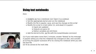
Marc Wouts - Jupytext: Jupyter Notebooks as Markdown Documents | JupyterCon 2020
JupyterCon
Sheeba Samuel- ProvBook |JupyterCon 2020
JupyterCon
Philipp Rudiger - To Jupyter and back again | JupyterCon 2020
JupyterCon
Jacob Tomlinson - What is my GPU doing? | JupyterCon 2020
JupyterCon
Afshin Darian - A visual debugger in Jupyter | JupyterCon 2020
JupyterCon
Eric Charles - Jupyter Real Time Collaboration| JupyterCon 2020
JupyterCon
Devin Robison - Optimizing model performance | JupyterCon 2020
JupyterCon
Junhua zhao - PayPal Notebooks: ML & Data Science experience | JupyterCon 2020
JupyterCon
April Wang - Redesigning Notebooks for Better Collaboration | JupyterCon 2020
JupyterCon
Bryan Weber - Distributing and Collecting Jupyter Notebooks for Manual Grading| JupyterCon 2020
JupyterCon
Georgiana Dolocan - The Littlest JupyterHub distribution | JupyterCon 2020
JupyterCon
Tim Metzler - Electronic Examination using Jupyter Notebook | JupyterCon 2020
JupyterCon
Blaine Mooers - Why develop a snippet library for Jupyter in your subject domain? | JupyterCon 2020
JupyterCon
Ryan Abernathey - Cloud Native Repositories for Big Scientific Data | JupyterCon 2020
JupyterCon
Tanya Rai - Introducing Bento: Jupyter Notebooks @ Facebook | JupyterCon 2020
JupyterCon
Kenton McHenry - From Papers to Notebooks | JupyterCon 2020
JupyterCon
Ryan Herr - After model.fit, before you deploy| JupyterCon 2020
JupyterCon
Ana Ruvalcaba - Community building is a sustainability strategy | JupyterCon 2020
JupyterCon
Martin Renou - Xeus: an ecosystem of Jupyter kernels | JupyterCon 2020
JupyterCon
Michael Wilson - Teaching teenagers to understand Dark Energy | JupyterCon 2020
JupyterCon
Davide De Marchi - Voilà dashboards for policy support | JupyterCon 2020
JupyterCon
Marcos Lopez Caniego - ESASky's JupyterLab widget| JupyterCon 2020
JupyterCon
Praveen Kanamarlapud - Kernel Life Cycle Management | JupyterCon 2020
JupyterCon
Aaron Bray - Pulse Physiology Engine | JupyterCon 2020
JupyterCon
Aaron Watters - Using WebGL2 transform/feedback in Jupyter widgets | JupyterCon 2020
JupyterCon
More on: Data Literacy
View skill →









Related Reads
📰
📰
📰
📰
How I Built a Blank Page Detector for PDFs with Vue 3 and Canvas
Dev.to · sunshey
What I Learned Building an AI Resume Optimizer — And What Recruiters Actually Told Me
Dev.to · dayu2333-jinyul
The Language Barrier That Made Me Use AI Better
Dev.to · FromZeroToShip
I Stopped Running Playwright in Cron and Built a Screenshot Archive Instead
Dev.to · Cizze R
🎓
Tutor Explanation

 DeepCamp AI