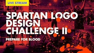
🔴 Logo Design Process— Live feat. Spartan Logo Design Challenge
Key Takeaways
The video discusses the logo design process for the Spartan Logo Design Challenge, covering topics such as research, typography, and design composition. The challenge requires designers to create a word mark or symbol using the word Spartan race and a provided t-shirt template mockup.
Full Transcript
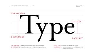
[Applause] [Music] You are listening to handcurated music from artlist.io. This track is called Launched and it's by Garrett Beavens from his album Growth. Artlist.io is music licensing reimagined. Support this channel by getting royalty-free music from artlist.io. And on today's episode of the future live stream, ladies and gentlemen, ladies and gentlemen, there I am. All right. I'm Chris Doe and you're watching the future live stream. And next to me, Mr. Ben Burns. What's up, guys? We just got back from NAB in Las Vegas and uh I'm all rested up, ready to roll. I am not rested, but I'm ready to rock. And I guess rock and roll, we can do that. Let's first get us started by checking the audio. You guys that are tuning in on Facebook and on YouTube, let's make sure that you guys can hear us loudly. Luis Fernando, how you doing? Katherine, hi. Kenny Fischer, what up though? Roy, what's up? What's good? All right, you guys, you guys made the live chat. Awesome. Let me Oh, new live streaming. Let me tune in on that. Where is it? Hold on. Manufacturer as always. Good to see you. Who's manufacturer? He's the one with the M and the I know who it is. Do you know who it is? No, it's Mario. Mario Ranchie. Oh, what's up, Mario? From the group, man. Yeah. All right. I'm going to look at um the YouTube channels for Ben cover for a second. James audio is mint. Thank you. Appreciate it. Uh Robert Dhy says, "Chris, hit me up soon." Hit you up. Hit you up for what? Guys, let's do a roll call. Where are you calling in for? Where are you joining us from? You bet it's going to break the internet again. Yeah. Type in the uh the city, state, country. I want to see where you guys are uh from. It's because we've been in the convention center for so long. No, we don't look pale. You know what it is? This lighting setup. M we we're filming in my office and you guys can see behind us there's the window and it's really bright outside. It's Southern California. It's 72 and sunny. It's beautiful. It's gorgeous. All right, here comes everybody. Hello, Guatemala. Read California. Kentucky, Apple Valley, Serbia, Alaska, NYC. Nice. LA's in the house. Jamaica, Portugal, the Batcave, Brazil, Frogtown. That's uh What is that? Silver Lake. Is frog time silver lake Aaron Olympia Philippines late night UK Serbia 2:35 a.m. Portugal. All right. Vancouver. Yay. All right, guys. Let's get on with the show. What are we talking about today? Let's cut to the screen. We're going to be doing the Spartan logo design challenge. I got a right couple little extra bits in here for you guys. Check this out. Okay, so first for a lot of you guys that don't know what's going on, let's talk about the recap of the Spartan logo design challenge. I'm going to spend a few minutes about that and there's really good things and then we're going to critique your work at the very end. So stick around for the show. Okay guys, now are we judging like the winner right now? No, no, we're not judging the winner. It's just kind of like a midway like check, right? Yeah, it's not even midway because you still have another 30 days to submit your work, but we want to give you some direction and some feedback and hopefully that'll help you guys that'll work on this challenge. And there's some people who are still reluctant and are on the fence and maybe this will get you off the fence, but if not, don't worry about it. So, who are the judges? You're looking at two of the judges right now uh from the future and basically this team, our team will pick one winner from the future and there are two other judges that you guys need to know about. One judge is Jonathan Rudolph. He's from Logo Inspirations. Uh he's got a big Instagram account and also a website. And Will Patterson, you guys all know and love Will Patterson. He's awesome. Does a lot of handleting logos. He's a he's another YouTube creator. And here's some information about them because people were asking about this last time. So, here's the full information, you guys. There's this wonderful thing. You guys can screen capture it, so you don't have to ask me in the questions afterwards. Command shift 4 or three, depending on what computer you're on. Yeah. Okay. So, Jonathan Rudolph, logo inspirations, and if you want to go check out his website, it's logo inspiration.net. He's got close to 400,000 followers. Last I checked, he's probably over that mark already. That's one of the judges. And the other judge is Will Patterson, and he's at Willpat Hopefully. Hopefully I got the his Instagram account correct. And he's got a company called Break Designs Company and he's got over 102,000 YouTube subscribers. We're chasing Will. We're like really close to catching up to Will. And then he I think we caught him. Did we catch him yet? Yeah. We're really close. We're really close. All right. So, here are the details. We'll include the details below in the description, you guys. You guys can get all that information. And I have to apologize. I was kind of rallying a little bit that all this information was there and then Ben told me whispered in my ear. It's like, "No, we don't have that done yet." So, we quickly got it up. So, how do you how can you guys get more information on the Spartan logo design challenge? Go to the future.com/blog. All right. And you're going to go down to the bottom right there and click here for full contact details. Ben and I are going to work on this so that it's a little clear as to that. That's a button that you need to click on. That'll take you to a Dropbox and you get the full file. Well, what's in the full file? It looks something like this. It's a four-page PDF and it has very specific instructions on how to participate. Tells you that this is not a sanctioned completely unauthorized design challenge that we're doing. Mostly because I run the Spartan race myself. And I think there's an opportunity here to get this design right and sell some merch, but they're not capitalizing on it. And sorry, we're going to have to cut a little issue here. And what's the problem, guys? Who cares? Keep rolling. Don't cut. Just YouTube. Just YouTube. I don't care. Let's go. Sorry. Our team's on the on thing. We're not going to worry about that. All right, guys. Sorry for that momentary pause there. Are we broadcasting still? We are on YouTube. Okay, that's fine. Uh, no matter. Our audience is on YouTube right now. Anyways, check this guys out. Um, check this out, guys. Okay, here's what to design. You can basically do just about anything. You're going to create a word mark. Wordmark is critical cuz some of you guys only submitted a symbol. Yeah, you have to include a word mark and or a symbol. Symbol is optional. You have to use the word Spartan race. So, if you just show an abstract mark, it's not going to qualify uh even if you have a brilliant symbol. Okay, guys. And you're going to use this t-shirt template mockup that we've already provided. Some of you guys are not doing that. And some people are getting really creative with changing the backgrounds and changing the shirt color to make it impossible to read. That's not helping you at all. Okay? So, don't get too creative here. If you throw a lot of imagery in the background and it's not supporting your design, you're doing yourself a disservice. Okay? You can also include additional typography or any elements that you think are appropriate based on research. I gave you a suggestion. One is called Prepare for Glory. All right. And the the prize, oops, I'm sorry. The prize is we're going to print a book like a real physical book like a like a coffee table book, but it's not going to be that big. people assume a coffee table book a a a coffee table book for small people. We're gonna take all the pages that we think are really good including sketches, grids, process, all the things that you guys submit and provide to us, we'll include in the book and of course three winners uh we will also make sure that that's clearly denoted. It'll show you the futures pick, Will Patterson's pick, and also uh Jonathan Rudolph's pick. All right, that's how that's going to work. And so the rules are there for a reason because you know when we print this book, we want it to look nice. And so if everybody uses the same template, it'll just look great. You'll be able to flip through and see your entries in there. So do so. Follow the rules. All right. So those of you guys that are dyslexic like Scott J says he always reads it as spray tan and not Spartan. Now, oddly enough, some of the designs do look like spray tan. And so we we kind of have to watch out for that. The other thing that you guys need to know that it's the deadline. The deadline is May 31st, 2017 at midnight Pacific Standard Time. Anything that comes in after that, I'm sorry you you missed the deadline and them the breaks. Okay. You also need to post this on Instagram. Some people are complaining, don't post it on Hog. They don't like that. They don't want to deal with it. I'm sorry. That's the way we're doing it. We created the competition. We're giving away the prize. We're critiquing your work. So, we get to write the rules, you guys. If you don't like the rules, create your own competition and everything will work out just fine. All right. The reason why we need to do that is Instagram makes it easy for us to scrape. We can then pull the images off the internet by searching for the keyword. So the keyword is the next thing that's really important by hashtagging Spartan logo design challenge. I know it's a mouthful. You can hate him. He's the one who came up with it. It's very specific. I don't think anybody else is going to use that hashtag. Yeah, it's a mother of a hashtag. Spartan logo design challenge. Hopefully you guys can spell correctly. Otherwise, we will not see it. So, for in preparation for this particular episode, we did a search for that exact keyword. All right? And we're going to show you some of the results of that. The other thing you need to do is to tag and follow the future is here at Logo Inspirations and at Willpat. That's critical. All right. What do you want to say? Catherine's asking, do you pick a winner and is there a prize? Catherine, were you not listening to the broadcast? Homeg girl. Yes, there is a prize. It's the book that we're talking about and there will be three winners because each of the judges will pick one winner. And we might have a fourth winner. We might have the audience choice award. So the whoever gets the most votes when we kind of narrow down to the finalist, maybe we can do something like that. Okay. Audience choice awards. Jason, you're asking where you can get the shirt. It's on the website, man. It's in the keyword. Here's what the shirt looks like. Let's cut to this slide. Oh, he's talking about my shirt. Oh, this shirt. This shirt. Ben, this shirt's too big for you. It is. It is a little bit. Why Why'd you ask for such a big shirt? We couldn't find the other one. So, this is a This is one size up than I normally wear. Oh, okay. Yeah. And you're still slimming down. Every every week you guys tune in, you're going to see a little bit. It's not a lesson. Little bit thinner. Ben Burns. He's on the diet. He's on the exercise. He's full-on California now. That's right. Okay. Anyways, this is what the template looks like, you guys. So, if you post something that doesn't look like this, meaning it's full-frame graphic, we're just not going to consider you. So, a lot of you guys have really good designs. Make sure you use the template. We've already done the hard work of including the PSD file. Uh, a question that we get a lot is, "Can I enter more than once?" Yes, you can. Enter as many times as you like, but avoid showing us slight iterations. I'm seeing that, too. Like, you'll change one thing and then you'll call it a new design. Well, I'm not going to consider that. And that actually might hurt you because then I might overlook the one that you want me to look at and I might pick something totally different. Okay. Make sure your designs are distinctly different when you submit. And try not to break out your post into like 50 different poses. Yeah, 50 different posts. It's cool to show process that way, but we want one single final piece. Well, the thing about Instagram is you can upload multiple images and you can show process that way. Don't don't do one post uh per sketch or something. It's just too much for us to look at. All right, you're just flooding the whole internet. Anyways, so the question is, are you Spartan? Are you Spartan, you guys? Well, Cheryl, are you Spartan? Are you sleeping? I I when I repeat it and there's troubleshooting. Don't troubleshoot on the job. All right. Are you Spartan? So, we've gotten 201 posts so far and it looks like this. You guys check it out. There's a lot of you guys that have submitted work and it's really cool to see that. Okay. And it's growing. And as Ben and I were Oops. As Ben and I were going through this, there's like a lot of diverse ideas. Mhm. There's some like really amateur designs and there's some really high level and a lot of stuff in between. So, we picked out some images to talk about some of your work. Uh, but before we get into that, I have a surprise for you guys cuz you know me, I'm always about trying to educate our audience to help everybody that's in tier one to move out of tier one. And so, this is like the foundation that we need to learn. And this is an ongoing thing that I'm going to be doing. I'm going to be sharing things that I've learned at Art Center, things that I may have forgotten, but I'm going to bring it back for you guys. Okay? So, here's a preview of the typographic terminology document we're working on that will also animate just for you guys. Check this out. All right. So, first this is the cover page that men design. It's all centered, but it's really beautiful and it's using the type face Mrs. Eves. And I remember posting this and somebody saying, "I didn't know Chris likes Sarif tight faces." I love Sarif tight faces. You just don't see me using it often. But Mrs. thieves is definitely on the list of type bases to use and to choose. So here we go. This is what type looks like. Okay, so we'll get into a little bit of type terminology here. All right, so you guys, and the reason why we need to do this and Ben, there is a test after this. So pay attention here. When we're talking about your logo, we're going to try to use very specific language. The reason why we use language is because it says or terminology is because it says we're an expert, that we know what we're talking about. you know, we're talking about very specific things. So, there's the baseline and the X height. And the way that you calculate the baseline and X height is based on the lowercase X because it's the only letter that sits on both the baseline and X height because of the seraps. They're flat on the top and the bottom. That's why it's called X height. Okay? And we learned from last time all the curves of curved letter forms overshoot the X height and the baseline because it's optically feels like it's sitting on the baseline. Right? If you were to actually stop it at the baseline it would feel small. Okay. So then from there you go up to the cap height. So any serif type face like the T, the X or the I uppercase I will determine the cap height because it's flat on the top. It's also flat on the bottom. H okay. And below the X height is the descender and above the cap height is the ascender. I think if it breaks the cap height line. All right. Couple of bits. The stroke. Okay. The stroke is what's in red right there, you guys. That's called a stroke. And the vertical stroke is called a stem. What's the difference? One's on an angle. Oh, I think I think you can use both terms, but the stroke and the stem. Now, some type Nazi in the audience is going to correct me cuz I don't know what I'm talking about. But anyways, let's keep moving on. The stress. Okay, the stress is where it transitions from thick to thin. A lot of self-taught quote unquote designers don't understand where the stress points are, like where it should be the thickest. Ben, you and I talked about this. The stress point, the thickest point should not be at the top of the letter form. It should probably be in the middle section. And depending on the style of the letter form, it's usually in the middle or a slight angle. Okay. And it's it's it's because when Neils gave that lettering instruction, you remember how he held the chalk at a very specific angle? That determines where the thick and thin points are. I see. Okay. And it's never held vertically. So held vertically like straight up and down. When you draw the letter form, then the top and the bottom would be the thickest point. Okay. H. All right. The foot. The foot is where the stem touches the baseline. That's it. It's right there in red for you guys. Okay? And these are arms. All three parts are arms. So there's the stem, the vertical part, and the things that shoot out to the right. Those are called the arm. All right. The shoulder. The shoulder is the curved stroke attached to the stem. So far so good, you guys? All right. These are called anatomical so far. Yeah, this is the anatomy of typography. Yeah, those are easy to remember. The shoulder arounds your you know right there. So you can you guys can remember that the apex that makes sense the tip. All right. And the vertex is the bottom the top and bottom points where the two strokes meet. So where two strokes meet you get the vertex or the apex. Okay. Few more terms and we're going to move on with the next part. The lowercase N here you can see in red. This is referred to as a counter. And this is an open counter because it extends uh past the baseline. An example of a closed counter is the letter O. So it's trapped within the letter form itself. Okay, a counter. This is a counter. I'm going to forget that one. Okay, we'll figure out a way to remember it. Okay, and the red stroke across the horizontal thing is called bar or crossbar. We'll refer to as the bar. Okay. All right. You guys have a little little extra little bit of video that I'm going to tease you guys. It's drawing letter forms. You guys remember this gentleman, Niels Lindström. Last time I showed you guys a video and Niels was drawing on the chalkboard and he was doing a sif type face. And this time he's going to do a black letter type face. I'm going to play just a little bit of that just to get you guys all crazy. All right. And then we're going to stop the video. So here we go. We're going to need audio for this, you guys. Okay. Okay. You guys ready? All right. Here we go. black letter uh was really an attempt to pay more attention to the figure ground, the white spaces and the black spaces that the letter forms made. And they wanted to have them equal as often as possible. Not not every letter combination would allow that. And I'll point that out as I draw it. But black letter was also an attempt to make hand drawing the letter forms much easier and simpler because there are less curves. Most of the strokes are straight. So, I'll start with the A. And the pen is held instead of a 23° angle, it's more like 35, about like that. Come down strictly 35°. This is the tail. And we come over here. We want to make sure that the space between the strokes equals the thickness of the stroke. Then with the tip of the pen, we draw that. The ascenders on a lot of black letter characters are split. So they have these little rabbit ears here at the top. Here's the B, for example. And then when this lines up with that, that should create a simple straight line between this stroke and that stroke. When you draw letters like the C, you start below the X height line and you come back up and you match it here. And this usually has a little curl that comes down. The D, um, you also start lower. It'll come about right there. And the D has this fun little piece that comes down like so. The E also starts below the base, the X height line, excuse me, comes up, down, and then with the tip of the pen, this connects to the stem and creates the E shape. So, it's very similar to the C, except there's an openness here, the F. And this serif at the bottom is centered on the stem like so. Here's the F and the crossbar. The G you start below the X height move in this comes across like so up and then that comes down. This comes out this direction. This joins it and then you have a thin line right there. The H is an ascender. So it's split at the top. There we are. And we center the serif at the bottom. Here's the eye. Very, very rational. We center the serif at the bottom of both the top and both the top and the bottom of the eye. And the jotss are just a simple little stroke like that. Here's the J. And notice how close the points get on these seraps to each other. They almost touch. They can't completely touch because if they did, it would be very hard to read the letters. Here's the K split ascender again. And this comes up, down, and straight out. Down and out. All right. JKL split a center. Oh, I broke my chalk. Center the serap at the bottom. Do the rabbit ear. The M. This gets a little complicated here because the entrance serap to the M comes in like this. And then this is centered at the bottom, but that's not centered at the top. So, I like to draw them like this. Then come back and pull the stems down and then center the seraps at the bottom so that we make sure we understand that's an M. The N does the same thing. We center this at the bottom. This comes out down the O. Pretty straightforward. I like drawing the P's because the P's have what we call what I call a three corner turn here on the descender. Kind of a one, two, three. Like that. It's got a little Oh, did we cut off that thing already? All right, you guys. What did you guys think? You can turn the sound on without cutting the screen, y'all. Holy mother of God. Audio is working just fine. All right, we got a lot of questions. A couple funny comments. You guys are hilarious on YouTube right now and on Facebook, I suppose. Somebody said, "3D scan Neil's hand and then cut my hand off and replace it." But then you be like that guy on Game of Thrones. You just have a dead hand. It doesn't work that way. Obviously, Niel Mills has been teaching lettering for a really, really long time. He was my teacher and I've been out of school for over 20 years. So, after a while, you could just do this in your sleep. And he makes it look easy. I've tried it myself and it's part of the assignment. Use chisel point then draw these letter forms. But after you draw the letter forms with a chiselpoint pen or calligraphy pen. You start to learn how fonts were designed, how type faces were designed. It's all based on this and it's quite wonderful. It's amazing. So somebody had this question about what's the difference between black letter and gothic. And thankfully Mr. Ben Burns is a quick study. He has the answer to that question. Mr. Ben Burns. Yeah. So, I didn't know. Um, so I just Googled it. And basically, Gothic is the is the period of time where black letter is actually the style of the type. Um, and it's called black letter because it's just overpowers the amount of white on the page. Fills it with black. All right. Excellent. And there's some really funny comments. And Alec Miller, I think, said, "Don't tease us, Chris." You guys know me. I'm such a tease. Are you kidding me? I'm going to just give you guys little bits of pieces of things that are coming out just to wet your appetite, if you will. Now, this course has six or seven videos in it, and it's amazing. We're just showing you two of his handdrawing demos just so you guys can learn and it's it's really awesome, you guys. Uh I apologize. It should be available sooner than it is. It's just I haven't been able to QC yet because he goes into a lot of terminology, things that we're talking about, overshoot, how to draw letter forms. He talks about sexy dangerous curves. Uh he gives homage to the master dold young. Okay. All right. And he is amazing. He is and he does definitely have a very soothing comforting voice. He'll lull you into a typographic trap. All right. Design process, you guys. Design process. All right. Here we go. You guys heard me say this many times before. I want you guys to think more and to do less. There's a tendency for us to just get rolling. We we barely understand the brief. We don't know what we're doing. We don't understand the brand and we start designing right away. So, I'm going to tell you guys right now, don't be the cheetah in this case, slow down. I like to think more. I want to be more contemplative. And when I'm ready to design because I have a solution in mind, then I go. So, we look at it like this. It's not an escalator ride up to the top. And the top is your finished logo where your client's super happy, gives you high fives, and writes you a big fat check. Before we get there, we want to take little steps. This is referred to as scaffolding. And we want to scaffold with the client preferably. Okay? In this case, there is no client. There's just you. So, we start by doing research. Now, by research, I don't mean you start collecting images and start designing. I don't mean that you're collecting patterns and motifs or looking at fonts. That's not research. The research I'm talking about is you try to learn as much about the project and about the brand as you can do humanly. Okay? whatever is humanly possible. So I want you to know about the history of Sparta uh the the time in which existed anything that you can start to mine because I look at every project and every problem as an opportunity to learn something new why not embrace that part. Okay so that's step one research. Step two based on your research now you kind of have a general direction uh a compass bearing if you will. So we refer to them as creating image buckets. So, you're going to create a couple of folders based on ideas that you might have. For example, you might create a bucket for ancient Sparta artifacts. Uh, you might create a bucket for patterns. Maybe you look at um textiles. Oh, so not just logos. No, no, no, no, no, no, no, no. This is just understanding history where things come from first. Uh, because you're going to condense a lot of history and story into a singular mark or letter form hopefully, right? That's the idea. But if you don't know what you're doing, you don't know what it's based on. Well, what are you doing? You're just making up stuff. And the designs really tell me that you don't know what you're doing. The designs I've seen so far. Next up is we're going to use stylescapes. Okay, this is where I might look at actual logos designed by other people that have nothing to do with what we're doing. And we might start to kind of shape where we could take this. Is it a clean modern thing? Is it retro? Is it serif? Is it sans serif? Is it black letter? Is it brush script? I don't know. and I want to create a stylescape. So, you're going to curate the images and you're going to start to drive it down this funnel. So, we're getting narrower and narrower as we go. All right. If you guys don't know what a stylescape is, we do have a whole video series on it. It's on the channel. Look it up. There's at least two videos and the people that are in the Facebook pro group have a third video. It's called the revenge of the stylescape where I go really deep into what that is. Now, now you can start to sketch. Now, this is the process. We're gonna hang on the slide for a little bit. When you do the stylescape, if you have a client, I'm going to encourage you to present this with your client. Maybe two or three styles scapes. And Jose will refer to this as mild, spicy, or mild, medium, or spicy. Mild being what you think the client wants, the most predictable thing that's safest, but it's still going to be a good direction to go in. And then spicy on the other end is something that's radically different. just in case the client wants that X factor. Present this to them. Show them this. Okay. And then based on their feedback and you guiding them through the process, then you begin the sketch ideation process. And then and only then do you actually put pen to paper and really kind of tighten things up. There's a whole process you need to respect. And this is what they're going to teach you in design school. So you're going to go through a series of thumbnails and tissues. and your and tissues. I mean, like laying tracing paper over it, drawing it, flipping it backwards and forwards, upside down. Sometimes when you flip the tracing paper over, you get a whole sense of space that you didn't appreciate before. This is a good trick, you guys. Flip the logo over, flip it upside down. Look at the letter forms. Then you'll see things like in the counter. You remember the counter, Ben? The counter is the opening in the end on the bottom. That's right. It's a space that's kind of captured within the letter form. Sometimes it's closed and sometimes it's open. All right, let's come back to the slide. Here we go. History. So, here's some things I just dug up really quickly. And admittedly, I did this kind of rushed for this show, so it's not really complete, but Mark Cassie cashed me outside. He's done some research and I grill him because the first thing that he did was he went straight to the sketchbook and he said, "No, no, no. Slow your roll, dude. I'm going to teach you how to do this the right way." So, there's a lot of history here. I'm not going to read into it, okay? Um but basically we do know that Sparta is this um political system that's really just military base. We know that. So they're well-known and renowned legendary fighters. Okay, we know that. Okay, so here are some image buckets that I've created for you guys. So I'm doing a little bit of the research with you and by all means create your own. This is not to say that these are only possible solutions. These are just some things I dug up prior to starting this whole process myself. The first thing I want to do is I want to look at history as much as possible and I I don't want to have an interpretation of history if I can. Now, there are limited number of artifacts that have been scanned in. So, I believe the left image, the left image here is a CG render. I feel like it's CG, right? And I'm not sure if any of these other ones are CG, but I'm trying to find things that are real. So, the ones that have uh the patina, the grayish green thing, the helmets at the bottom, I get a sense that they might be real or they might have been aged for film, but I want to look at the different kinds of helmets because I don't want to depend on an artist um depiction. I want to look at history, okay? I want to look at their armor. I want to look at their art and all that kind of stuff. So, I also found some Spartan coins. All right? So, I'm looking at that. The shield, I believe, is a replica from the film itself. Mhm. All right. So, that's what I'm looking at right now, you guys. Next, um I'm looking at images now. Now, you can see that there are many different kinds of rendering types of a Spartan helmet, and it's all over the place. And I love that, and I want to see that. And why would I want to do this, Ben? Why would we want to do this? Sorry about that. I was answering questions online. Okay. Why would we want to look at these images? Because we don't want to reinvent something that's already been designed and not know that that's the case, right? And I also now because I know what the foundation looks like, I can then look at these interpretations, see like the decisions that they made. So you can see there's a quite a variety of different interpretations of the Spartan helmet itself. Mhm. And during the research, I also found other symbols and flags and things like that and the idea of two swords crossing over uh the two-headed uh eagle or whatever that thing is. Now, something that's interesting here is a lot of times when I did research, I would start with this with the um looking at what other designers did. And uh I think it's probably smarter to start with the actual historical um stuff that you know your process is better. Okay. It's always helpful to start at the source. Yeah. So, if you're looking at an artist, don't look at somebody else's derivative work if you can. So, what I'm seeing here also is some kind of um Greek letters, which is kind of cool. I'm I'm seeing the Greek key, which is that repeating symbol at the top. Um it's over there somewhere, you guys. Yeah, it's like 1 2 3 4 in from the top. Okay, you can see the Greek key and the laurels. Interesting. That's very Greek, right? If you ever wanted to use laurels, this would be the time to use it. I like this kind of bird that's incorporated and the upside down. It's a a without the crossbar on it. And I don't know what that means, but I know that's relevant uh to the Spartan army. That shape, that symbol. Okay. And the bird. The bird is awesome. It's Yeah, that's cool. All right. And you can see here there's a couple different things going on. And there are different teams that have raced or mascots that people have designed before. So, they have their own t-shirts t-shirt design. So, it's kind of interesting to look at that. Okay. Now, I'm going to look at the brand. Now, this is where a lot of you guys might have screwed up, you guys. The brand. And I pulled out some copy from the Spartan race. And I want to read some of this to you, and hopefully you guys are going to figure out where this is all going. Okay, so here's one. Your time is limited, so don't waste it living someone else's life. That's Steve Jobs. So, they're pulling a quote from famous people and they're attaching it to the Spartan race. The brave do not live forever, but the cautious do not live at all. Okay, there's another one. You ain't going to get the butt you want by sitting on the one you got. Oh, I like that. You like that, huh? Yeah. Do today what others won't so tomorrow you can do what others can't. And look at this guy. He's got a mohawk. He's covered up in dirt. He's climbing up this rope upside down. And he's just trying to ring that bell. I suspect he's trying to kick the bell. Maybe that's a technique. Next one. Believe in the burpee. Anybody that knows about the Spartan race understands the burpee. The burpee is the penalty for not completing a challenge. Sometimes I feel like giving up. Then I remember I have lots of other lots of mother efforts to prove wrong. So there's an edge to this. There's a tone. There's a grit, too. There's a grit. There's a grit in the letter forms. It's distressed. Here's another one. Conquer your obstacles literally and figuratively. Okay, last one. be so good they can't ignore you. A quote from Steve Martin. Okay, you guys understand? Overconfident. There's swagger in it. It's It's almost a little salty, you know. Well, there's this whole idea about proving other people wrong. Mhm. And there it's a rallying cry. The Spartan race for some of you guys that may have never tried it, it is rather tough. You are crawling through under in mud pits and through barb wire and you're submerged underneath water and you're climbing up walls and hanging on things. your hands are bleeding, all that kind of stuff. I'm super psyched. I want to do it this year. You're going to do it? Yeah. We'll do it together and maybe we'll broadcast a little bit of that live for you guys. That'd be cool, right? All right. Here's the critique, guys. Let's jump into the critique. So, or you know what? Before we get into the critique, let's answer some questions. Let's let's go to the internet. So, who's monitoring Facebook? All right, you guys. All right, go ahead. Let's fire some questions off. MaxBI asks, "Is this design process that we just saw in the core book? Does it show you how to do stylescapes there? No. No. Core is everything before you get here. That's a more it's a facilitated discovery session. But this is this process is really well documented on our YouTube channel. It is. And it doesn't exactly walk you through every single step. That's why in the pro group we created the revenge of the stylescapes where I really get into it. And if ultimately that's not the answer you're looking for, we will create a kit specifically just to teach you guys how to do stylescapes. I have a very specific formula and my team has been trained on how to do it. And when you hold up our stylescapes compared to other people's stylescapes, you can see the difference. We really work on these things. All right, next question. So, we have a question. Are you doing mic? Yep. Okay. And this is from Ryan Wallace. He's asking about stress points and if they are still trending with type faces. still trending. If I guess if it's that's not a trend, dude. This is how you draw letter forms. You guys need to understand something. Some some people say, uh, the hexagon is a trend. The hexagon is not a trend. It's a geometric shape. A circle is not a trend. You guys, a box, a square is not a trend. They're just staples of design. Okay? It's like saying, "Is kerning or letting a trend?" No, it's not. Next question. [Music] All right. Where do we go to the to get in the pro group? Okay, let me skip to that slide if I can. No, I can't. Whatever. We we'll talk about it later. At the end of the show, I'm going to talk a little bit more about the pro group. But if you guys just go to the future.com and go to the shop is the shop or what do we call it? Shop. Go to the shop and you can see the future pro group. It's 75 bucks a month. You guys can join. There's over 100 people in it and it's growing every single day. I think we're up to like 120. Some of them are on this call today. Mhm. So you guys can chat with them. If you guys are in the pro group, go ahead and comment below. Um or over there. Yeah, Mario's in the pro group. Manufacturer. Uh Lance Mayfield is in the pro group and he's online somewhere. I saw him. I know Ben Burns is in the pro group. I'm in that that scywag. Who else? Hit me up with another question, you guys. I don't see any more questions. other questions. Whoa. All right, just in case. Cut to my camera. Just so you guys know that there's my deck and then I'm also monitoring your questions here on YouTube, you guys. All right. Well, whatever. Hey, welcome Marino. Your first future live stream. Excellent. So, let's let's get into the critique. This is where uh Ben Burns is going to stop being the nice guy. He's going to break out his surgical tools and let's see what happens. Here's the first one, and we have quite a few to get through you guys. And some people wonder like, why should I participate in this? I'm just doing free work. Well, that's one way to look at it. We look at it like this is an online classroom that you get to take for free and there's a prize at the end. Okay, check this out. When you guys take a class, don't you have to pay them to take the class? You do. You do. Here's here's an experiment we're running. We're we're having a public classroom without walls. Okay. So, let's look at this first logo here. Spartan race. Mhm. What do you want to say about it, Ben? Can you see the screen? Yeah, you can see it, right? You're seeing my screen. I think the type face is right. I think it's on brand with what they have now. Um, and then the use of the negative space in the in the A and actually both A's um to form that spear is actually kind of cool. However, I don't think it's there yet. The alignment of the word race below um Spartan, it's just it I don't know. It's messing with my eye. It's is it attached to the P? Should it be more to the to the left? And I know that the reason why it was done that way is so that the spear could align. Um but it's just not there yet. Okay. For me, I actually like this quite a bit. It's a nice condensed tight face. It looks like um Oh, what is this? Trade Gothic bold condensed number 20. If I'm guessing it feels like that. He's got a little bit of texture through it, so it's got just enough grit, but it's not to a point in which you can't read it anymore. I think if anything, you should just try looking at this as black and white cuz I think calling out the red is making it harder to read, right? Interesting. This is where the spray tan might start coming in. Okay. I like that you got this one singular spear and is this What's the spear called? Is it called the dory? Where's Mark? Cash me outside. Who knows what it's called? The spear. And we looked into it. It's like seven or eight ft long. But I like that it's it's a nice compact thing. This is a pretty solid execution in my opinion. And you know, like I said, it's super on brand, which is it feels right, guys. It's modern. It's clean. It's aggressive. I'm I'm liking where this is going. Okay. All right. Here's the next one, Ben. The Spartan Race. Prepare for glory. So, this has um a a baseline that's kind of at an angle and the type face is skewed a little bit, right? So, it could be one of these designs where you kind of type set it all the way like horizontally and then you skew it a little bit. Okay. So, you know, it's almost itallic, which I actually kind of like because it communicates motion, right? So, it's it's it's moving forward. Um, what I don't like about it is it's super busy. And, uh, I think separating the icon out is probably a good thing and then losing the tagline altogether. Um, and then having two icons with the helmet and the spear. It's just it causes a lot of like visual confusion in my brain. Okay, there's a couple things going on here. You have three lines of copies, Spartan, Race, and Prepare for Glory, and you have three point sizes. That's a lot of changing in point sizes. You guys know how I feel about this. Just be careful of that, okay? I I'm not sure that that was needed. I think the other thing you could have done was to take the helmet and tuck it underneath under the negative space under the A and the N to tighten up this unit. Uh I I see what you're doing here in that you got these three triangular shards shooting off the bottom of the of the helmet uh to fill in the negative space. You wouldn't need to if that was already down there. Yeah. So the those triangular shards are a little distracting to me. And you really have to be careful about negative space, especially negative space that looks like a letter because it almost looks like Spartan ray C where there's an extra E at the end. Yes, that's a good one. Okay. Uh the way that you can check for that sometimes is just try inverting your design. Sometimes that helps your eye to see that. Yeah. And we know that prepare for glory can be used as a tagline and it's in terms of like when you look at a design, ask yourself what do I see first? That's my primary read. What's my secondary read? And what's the tertiary read, the third read? And right now, generally speaking, the things that are the biggest and that have the most contrast would be considered your primary read. So your primary read right now is prepare for glory in the spear because it's white. It's white against the dark gray background. Now, if you squint your eyes, guys, remember the squint eye test. If you squint your eyes and compress the values in which you're able to see, the red and the gray are similar in shade or value that it starts to disappear. And I actually see the negative space, that weird negative space in between the E and the helmet. And then the prepare for glory. Now, what is working in this logo for me? That it's a nice compact unit. I can see this being scaled down for lots of different purposes. All right. So, let's do this. Let's fix the spacing issues. I'm not sure you need to change the scale, the type face, the point size. Keep it the same and work with that and see what happens. And then make sure the tagline is a secondary or third read and not the primary read. Okay, let's keep going on. Do we have to um are there any questions? No questions. Everybody's critiquing as well. Okay, beautiful. You guys are doing a great job. Here's the next design. Um first I'm going to call it violation on this one. A foul. Throw the flag down on the field. This is not this is not the t-shirt template we gave you. You guys do understand we give you all the materials that you need. We're thoughtful in that even though sometimes we don't give you the links and then yell at you online, but you have the file. You need to use the file. Please use the file if you want us to consider you for the competition. All right, Ben, have at it. Tight face. I don't mind it. It's actually kind of condensed. You know what type face this is? I don't. I do. What is it? It's called Bank Gothic. Oh, yeah. Okay. This is Bank Gothic. Yeah. So, I don't mind it. It's like it's squat. It's it's it it's heavy, right? Um, but then you pair it with this kind of thin wispy S inside this circle and there's a there's a severe conflict there visually. I think that it's totally off-brand. Number one, um, what does it feel like? It just feels like corporate almost. Feels a little corporate. This is anti-corporate, you guys. This is against working in a cubicle 9 to5, you know, putting in your 40 hours a week. This is your escape. And also, you know, when you think of racing, you're moving, right? You're you're just running. And if you look at that shape, Cheryl, can we pull that up again? If you look at this shape, it's almost like a do not enter sign where it's like, "Thank you. No, no smoking here." Yeah. And so it just kind of stops all the motion. Okay. What I'm seeing here, I did not see the S at all until Ben mentioned it. I have to be honest, I thought it was just an abstract symbol, and that could be okay. And it's a little reminiscent of like the the Green Lantern symbol. And there's something that's just funky about it. It feels modern. It feels tech and it doesn't feel on brand. All right, you remember all those ads I pulled up you guys? And that's why I did that so that you would know what feels on brand. Okay, we're not changing the brand. We're just freshening up the logo. Okay, we got a great question here. All right, hit me. Jason Tam, for the logo challenge, do we need to conform to the Spartan Challenge branding? This is where I think we get into a definition issue. You need to conform to the Spartan rac's brand, but not necessarily their visual design. So, we're not asking you to the same type faces. We're not asking you to use the same icon, but you have to communicate what they're trying to communicate. And that's that grit, that determination, that kind of stuff. Yeah. We're not reinventing the company, guys. We're just giving the logo a facelift. Yeah. To make it more appealing for merchandise or for whatever else. Okay. All right. Next up, Spartan Race. Now, there's a whole process to this submission. I've seen it online on Instagram. They're trying to combine the helmet and a foot. Helmet and foot. All right. Oh, that's what it is. So, it looks like a footprint a little bit. So, here's my critique on this. Okay. This is a very modern type face. I believe this is avantgard. It looks like avantgard or some version of a guard. Maybe you guys have the bootleg version. And if you guys recognize that tie face, it's very much the type face that Adidas uses. I was just looking that up all day. I dream about sports. Okay, Adidas. And so it has that sport vibe to it. And this is kind of funny because this is owned by Reebok, their competitor. Their competitor. So there's a Don't walk into the meeting and say, "Guys, I got this beautiful tie face. It's avantgard." And they're like looking at you like you idiot. So we need to change that. But let's look at the hierarchy here. What do you see first, Ben? A bird. The helmet icon. I see a bird as well. So, there's this weird shape that looks like a beak. It reminds me a little bit of Tony Hawk uh skateboard brand a little bit. So, it's funky as heck. So, sometimes when you try to combine two things together, you get this abomination in the middle. Yeah. And I'm thinking that this is not clear. It doesn't read like a foot. It doesn't read like a helmet. It reads like a bird. Yeah. Okay. So, that's the problem there. Don't try and get too clever with these things. The other thing, too, is I want to remind you when you have the foot, and I'm being literal here. It's not a barefoot race, guys. All right? You're just running with shoes and it's muddy and it's dirty. It's nasty, but you're not running barefoot. Some people do, but it's crazy to do that cuz there's rocks and crazy things you got to get over. The next thing is this is you see the bird helmet. Mhm. And then you see the word race. Where is Spartan in all of this? It's a Spartan brand, you guys. That should be the primary read. Spartan Spartan race. Okay, so you have three elements that don't really work well together yet. I don't know why it's kind of scaled in and offset. So, it's not even lined up because imagine this you guys. Sometimes when you design a logo with a lockup like this, you need to break the elements apart. Okay? So, when I take away the icon, the helmet, if you just close your put your hand over that part, guys, everybody do this right now. Cover up and close one eye and cover up the helmet. Look at that thing. Okay, it also looks like Nordstrom's rack. Nordstrom rack, right? The thing is that now it's offset and it's totally not balanced, right? And this is a strange lock up. So, let's work on that. Easily solved if you worked with one tight face, one point size justified left. Okay, let's keep going. All right, look at this one. Okay, so a couple of things I like
Original Description
Attention! If you are a finalist in the Spartan Logo Design Challenge, please submit your work here to be featured in the book: https://www.thefutur.com/submit/
Stop making. Start thinking. Why having a process that includes thorough research and involving your client will not only save you from doing unnecessary work, but it will also make what you do more valuable to your clients. Logo Design process explained along with updates and critique on the Spartan Logo Design Challenge.
Spartan Logo Design Challenge details here:
https://www.thefutur.com/spartan-logo-design-challenge/
Deadline is May 30, 2017
Annotations
--
03:45 Who are the judges for the Spartan Logo Design Challenge?
05:08 How to get more information on the spartan logo design challenge
06:22 What should you design for the challenge?
07:20 Design Challenge Prizes
11:44 Are you Spartan?
12:48 A guide to typographic terminology (preview)
17:08 Scrolling Letterforms - Nils Lindstrom Masterclass preview
23:14 Q: What's the difference between "Black Letter'" and Gothic?
24:32 Design Process - Think More, do less.
25:04 Research Phase: Learning about the project, brand, and history
26:00 Image Buckets Phase: Reviewing motifs, patterns, and textiles
26:45 Stylescapes Phase: Curating images and compiling varying sets of ideas
27:30 Sketch Ideation Phase: Based on clients feedback from the stylescapes, you narrow down the feel/main ideas.
28:12 Design Phase: Putting pen to paper
28:54 History & Image Bucket Examples
30:50 You don't want to reinvent something that's already been designed
33:04 Brand Examples
35:06 Q: Is this design process included in the CORE kit?
36:00 Q: Are stress points still trending in typefaces?
37:50 Logo Critiques
44:58 Q: For the logo challenge, do we conform to the spartan race's brand?
54:20 Motion Graphic logo design process critique
1:29:36 Q: If we are documenting our work, how should we show the process?
1:30:35 Q: Do you show clients multiple concept drawings before going
Watch on YouTube ↗
(saves to browser)
Sign in to unlock AI tutor explanation · ⚡30
Playlist
Uploads from The Futur · The Futur · 7 of 60
1
 2
2
 3
3
 4
4
 5
5
 6
6
 ▶
▶
 8
8
 9
9
 10
10
 11
11
 12
12
 13
13
 14
14
 15
15
 16
16
 17
17
 18
18
 19
19
 20
20
 21
21
 22
22
 23
23
 24
24
 25
25
 26
26
 27
27
 28
28
 29
29
 30
30
 31
31
 32
32
 33
33
 34
34
 35
35
 36
36
 37
37
 38
38
 39
39
 40
40
 41
41
 42
42
 43
43
 44
44
 45
45
 46
46
 47
47
 48
48
 49
49
 50
50
 51
51
 52
52
 53
53
 54
54
 55
55
 56
56
 57
57
 58
58
 59
59
 60
60

The Importance of Keeping a Journal—Track everything. Big Changes Start Small 📞 The Futur Pro Group
The Futur
🔴 How to Handle Bad Client Calls | The Futur Live
The Futur
What do companies look for in a design portfolio? How do you show passion?
The Futur
🔴 What Does it Mean To Be a Self Taught Graphic Designer? The Futur Live w/ Ben Burns & Chris Do
The Futur
How Your Beliefs and Behavior Define Your Personal Brand
The Futur
How do designers create solutions for business goals? How can I best empathize with my client?
The Futur
🔴 Logo Design Process— Live feat. Spartan Logo Design Challenge
The Futur
Is strategy for creatives who can't design? Is there too much hype around strategy? Pt. 1/3
The Futur
Is strategy HOPE for creatives who want to play a more important role with the Client? part 2/3
The Futur
Blair Enns Interview | Author of "Win Without Pitching Manifesto" 🎙 The Futur Podcast w/ Chris Do
The Futur
Design Strategy: Hope or Hype — The conclusion 3/3 | How do we market our creative services?
The Futur
🔴 Customer Service for Creatives - Live | Advice For Dealing With Difficult Clients
The Futur
Branding Identity Design w/ Yo Santosa 😊😂 AIGA LA Hecho en LA speaker series
The Futur
What is User Experience Design? What is the difference between UX Design and UI Design in 2018?
The Futur
Weighting Type | Art Center type & lettering professor, Nils Lindstrom, breaks it down for The Futur
The Futur
What Does It Mean To Be Passionate? Chris Do Explains | Motivational Video for Designers & Creatives
The Futur
🔴 Spartan Logo Design Challenge pt. 2— Recap and Critique Live!
The Futur
Never Too Late Or Old To Get Started In Design: CSUN portfolio review
The Futur
How to Deal with Defeat— Losing a Million Dollar Job (Pt.1) | Chris Do and Blind proposal postmortem
The Futur
Lettering 01 Course: Design Master Nils Lindstrom | Learn Typography From A Master Letterform Artist
The Futur
Tell your Brand Story. Increase your value exponentially 📈 Chris Do LIVE @ NAB 2017 in Las Vegas
The Futur
Amateur Mistakes That Experts Don't Make — Dealing w/ Defeat (pt. 2) Losing a $1 Million Proposal
The Futur
Trust Experts To Do Their Job— Dealing w/ Defeat (pt. 3) Losing a $1 Million Proposal
The Futur
Designer as Entrepreneur, Going Beyond Design: CSUN Portfolio review
The Futur
How & Why To Use Layer Masks vs Multiply? Adobe Photoshop Tutorial | Perfect grunge design texture!
The Futur
🔴 Year One of Growing Our Design Studio. How I Got Work & Built Relationships
The Futur
How To Make Your Type Look Distressed and Add Texture PSD Tutorial
The Futur
Motion Design Graduate Portfolio Review - Tips For Presenting Design Work During An Interview
The Futur
🔴 How to Qualify Design Clients & Position Your Work - AMA with Chris Do | Live
The Futur
Stop Selling. Start Closing. How To Win More Jobs Without Pitching
The Futur
Surfacing Unspoken Objections— No time to whine about a loss— The Conclusion pt. 4
The Futur
Win More Clients — Build Empathy to Earn Trust
The Futur
🔴 What is Strategy and How Do You Sell It? AMA w/ Chris Do live stream
The Futur
How Does Pitching Work When Trying To Get Work From Advertising Agencies?
The Futur
Typographic Terminology A to Z: Our list of typography terms that every designer should know.
The Futur
How To Run A Creative Business: In-depth breakdown w/ Melinda Livsey
The Futur
Creatively Recalculating | Overcoming The Fears of Being Creative - Von Glitschka
The Futur
Reinventing Creativity - An Evening With Von Glitschka Vector Logo Design
The Futur
🔴 RAW: First Client Meeting— What should you do? AMA w/ Chris Do
The Futur
Goal Setting and How To Achieve Your Goals (4 minutes)
The Futur
Day in the Life of a Designer - Digital Creative Director Ben Burns
The Futur
🔴 How To Get More Sales— Selling Through Curiosity
The Futur
Can You Charge To Diagnose A Creative Problem?
The Futur
🔴 Shift In Design Thinking and Problem Solving For Creatives
The Futur
🔴 RAW: Spartan Logo Design Winner Announcement & Design Critique
The Futur
Overcome Fears, Insecurity, Feeling Overwhelmed & Start Posting on Social Media
The Futur
How To Charge More For A Logo— Deep Dive ep. 4
The Futur
Document and Show Your Creative Process— Here's How in 3 Minutes
The Futur
🔴 The Importance of Being Perceived as Being Helpful
The Futur
🔴 How to Overcome Price Objections— AMA Marathon
The Futur
How Will Customers Find You— Build Awareness by Informing or Inspiring
The Futur
🔴 Mentorship - How To Find A Great Mentor
The Futur
Grow Your Business— Have Clear Goals Ep. 5
The Futur
Life Inside a Design Studio: Blind Ep 01
The Futur
Day In The Life Of A Designer - 24 Hours With Creative Director Greg Gunn
The Futur
Feeling Overwhelmed— Information Overload ep. 6 w/ Melinda Livsey
The Futur
🔴 RAW: Logo Pricing Challenges Roleplay & Selling Design W/ Social Proof | Live Stream
The Futur
Motivation, Focus & Grind - 7 Days Till Delivery
The Futur
How To Respond To A RFP (Request for Proposal)? What Should You Include In Your Proposal?
The Futur
How To Build A Social Media Following— Get Started
The Futur
More on: Reading ML Papers
View skill →


Related AI Lessons
⚡
⚡
⚡
⚡
I Spent Weeks Looking for a Research Gap Before I Realized I Was Searching the Wrong Way
Medium · AI
ICMI 2026 Reviews [D]
Reddit r/MachineLearning
Workshop submission for main conference paper under review [D]
Reddit r/MachineLearning
Kept context-switching between arxiv, OpenReview, GitHub, and HuggingFace for every paper, so I built this. Chrome extension + website with everything inline, plus citation graph + SPECTER2 neighbors. 3M papers, free, feedback welcome [P]
Reddit r/MachineLearning
Chapters (24)
3:45
Who are the judges for the Spartan Logo Design Challenge?
5:08
How to get more information on the spartan logo design challenge
6:22
What should you design for the challenge?
7:20
Design Challenge Prizes
11:44
Are you Spartan?
12:48
A guide to typographic terminology (preview)
17:08
Scrolling Letterforms - Nils Lindstrom Masterclass preview
23:14
Q: What's the difference between "Black Letter'" and Gothic?
24:32
Design Process - Think More, do less.
25:04
Research Phase: Learning about the project, brand, and history
26:00
Image Buckets Phase: Reviewing motifs, patterns, and textiles
26:45
Stylescapes Phase: Curating images and compiling varying sets of ideas
27:30
Sketch Ideation Phase: Based on clients feedback from the stylescapes, you narro
28:12
Design Phase: Putting pen to paper
28:54
History & Image Bucket Examples
30:50
You don't want to reinvent something that's already been designed
33:04
Brand Examples
35:06
Q: Is this design process included in the CORE kit?
36:00
Q: Are stress points still trending in typefaces?
37:50
Logo Critiques
44:58
Q: For the logo challenge, do we conform to the spartan race's brand?
54:20
Motion Graphic logo design process critique
1:29:36
Q: If we are documenting our work, how should we show the process?
1:30:35
Q: Do you show clients multiple concept drawings before going
🎓
Tutor Explanation