Best Practices for Effective Data Visualization In Machine Learning!
Key Takeaways
Explains best practices for effective data visualization in machine learning
Full Transcript
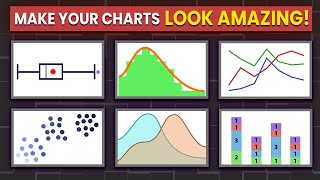
data visualization is one of the most powerful ways to communicate information quickly and effectively bad visualizations do not only just make data look ugly but they can actually mislead your audience hi welcome to the channel AI for beginners today I am going to show you how to make your charts clear and impossible to ignore if you are interested in data and artificial intelligence press the Subscribe button to be the first to watch our videos also we post quizzes for each new video on our Instagram page it's a great way to test your knowledge after watching let's get started what is the purpose of data visualization we often use data visualization techniques for answering predefined questions about our data set and sometimes extend them by generating new questions it's a lot easier for our brains to detect patterns in plots rather than by looking into the raw numbers depending on the quality of the plot your intended message can be either effectively conveyed or leave the audience confused over time several techniques have evolved to enhance plots and graphs making them more effective for storytelling let's start with a blank canvas and go over each component step by step but before designing a visualization consider who will be viewing it technical audiences may prefer detailed more professional charts while non-technical a audiences may require simpler more explanatory visuals for example adding direct labels instead of Legends can improve readability for non-technical viewers the first thing that catches the viewer's eye is the chart type for summarizing just one variable there are several charts you can use bar charts are used for categorical variables to plot the counts or sum if percentages are more relevant counts can be replaced with percentages often sorting is used to highlight the larger and smaller values adding labels directly on top of bars can make the plot even more effective pie charts can also be considered but they often cause issues since quantity is represented by slices humans aren't that good at estimating quantity from angles aligning labels with slices can also be tricky and small values or data sets with many categories become hard to read additionally pie charts cannot display negative values sorting is also not very intuitive generally pie charts can be used with small number of categories for non-technical presentations line charts are preferred if there is natural ordering between the categories on x-axis for example dates in a Time series data avoid using them for independent categories for example colors as connecting unrelated values does not make sense for continuous variables histograms are commonly used to plot distributions but you need to choose appropriate bin sizes yourself additionally the result resulting plot is not smooth which is typical for continuous variables overall histograms are often used for non-technical audiences for a technical audience density plots are often more effective providing a smoother and more intuitive view of the data distribution you can add vertical lines for the mean and median which provide additional insights into the distribution another alternative that contains more information about the distribution is the box plot a box plot displays the median first quartile third quartile inter quartile range whiskers and outliers you can also include the mean in the graph for added Clarity these components pass lots of information about the distribution one major downside is that we don't see individual points which can also be misleading as these two data distributions have the same box plot violin plots are another effective way to describe distributions it is simply a density plot mirrored to form a violin shape the density shows where most of the data points are concentrated and where the concentration is low as for box plots you can add mean and or other information about the distribution if needed multivariate cases involve more than one variable since there are many plot types to choose from we'll focus on the most popular options and key considerations first avoid using bar charts for summarizing the mean of one variable across the categories of another variable this hides the underlying distribution of the data instead consider a point plot with ticks as individual points to show the spread of the data other options include a box plot or a violin plot stacked bar plots can be misleading if you rely only on bar length as humans struggle to compare minor changes in lengths accurately additionally more than three to four categories can make interpretation difficult it is always a good ide aide to include the annotations for each piece next avoid overlapping histograms better use density plots you can add areas to make it more visually appealing but add transparency to make it effective however they can distract the viewer if you have too many categories additionally if you want to highlight something on the plot add transparency for other components or separate the main component with a unique color but what colors to use there are three main types of pettes in data visualization categorical sequential and diverging categorical as the name suggests is used for categorical variables never use categorical coloring when having too many categories at some point it is hard to compare colors having a similar Hue in addition the most popular mistake is to use different colors when you don't really need them for instance it is reasonable to use different colorings for separate data points in a scatter plot indicating different classes but but it doesn't always make sense to color bar plot into different colors when they do not add any value effective sequential color schemes typically use gradients that represent a clear progression from low to high values ensuring that the change in color reflects the magnitude of the data for example the blues lighter colors correspond to lower values darker ones to higher values diverging color schemes are useful when you want to highlight deviations from a central point like from a zero or mean you often choose two colors that are visually distinct to represent opposing ends of the spectrum with a neutral color in the middle for example you can use that to describe correlation ranging from minus1 to 1 additionally try to match colors with natural associations for example red represents something negative while green is something positive next axis labels try to have short and concise axis labels that describe both both X and Y variables properly be sure that they are large enough to read easily don't be afraid to increase the size do not be in a hurry when creating a plot always properly adjust the sizes and the text of the labels title should provide a takeaway message don't write just variable one versus variable 2 try to summarize the message of the graph in one sentence always include the legends of every additional visual element that is present never leave the audience in uncertainty when Poss possible integrate the legend into the plot I hope this video helped improve your understanding of effective data visualization you are my audience and I do my best to provide the best content to you the video covered lots of fundamentals but there is still so much to learn that's why I would recommend you to First subscribe to our Channel and then test your knowledge with the quiz on our Instagram page let me know in the comments what you liked and what could be done better I read all of them and your feedback really helps me improve thanks for watching see you next time
Original Description
#ai #ml #datascience #datavisualization #presentation #artificialintelligence #machinelearning #education #visualization
🔥 Data visualization is an important component of a successful data science, machine learning or deep learning project. It makes easier to understand patterns, relationships, detect trends that might not be obvious in raw numbers. Most importantly, it improves communication, allowing technical and non-technical audiences to understand the story behind the visual elements. In this video, I will go through some types of charts (for univariate and multivariate analysis) and discuss when and how to use them effectively. Additionally, good visualizations stand out by readable axis labels, inclusion of legends, and proper titles.
Be sure to follow us on Instagram, where you can find a quiz with questions for this video! Keep track of your progress and challenge yourself!
Instagram:
https://www.instagram.com/easyaiforall/
🔍 Key points covered:
0:00 - Introduction.
0:39 - What is the purpose of data visualization?
1:23 - Know your audience first!
1:47 - Univariate analysis, bar charts.
2:05 - Univariate analysis, pie charts.
2:35 - Univariate analysis, line charts.
2:49 - Univariate analysis, histograms.
3:10 - Univariate analysis, density plots.
3:23 - Univariate analysis, boxplots.
3:55 - Univariate analysis, violin plots.
4:15 - Multivariate analysis, bar charts.
4:44 - Multivariate analysis, stacked bar charts.
5:03 - Multivariate analysis, overlapping density plots.
5:24 - Main Types of Palettes.
5:34 - Categorical Color Schemes.
6:07 - Sequential Color Schemes.
6:25 - Diverging Color Schemes.
6:45 - Natural Color Choices.
6:55 - Axis Labels.
7:12 - Titles and Legends.
7:33 - Subscribe to us!
🔔 Don't forget to like, subscribe, and hit the bell icon to stay updated with our latest videos!
🤖 Note that we use synthetic generations, such as AI-generated images and voices, to enhance the appeal and engagement of our content.
🌐 If you have a
Watch on YouTube ↗
(saves to browser)
Sign in to unlock AI tutor explanation · ⚡30
Playlist
Uploads from AI For Beginners · AI For Beginners · 27 of 32
1
 2
2
 3
3
 4
4
 5
5
 6
6
 7
7
 8
8
 9
9
 10
10
 11
11
 12
12
 13
13
 14
14
 15
15
 16
16
 17
17
 18
18
 19
19
 20
20
 21
21
 22
22
 23
23
 24
24
 25
25
 26
26
 ▶
▶
 28
28
 29
29
 30
30
 31
31
 32
32
Artificial Intelligence Explained In Simple Words | What Is AI? | Explained On A Real World Example!
AI For Beginners
AI vs. ML vs. DL vs. DS - Difference Explained | On Real World Examples | AI For Beginners
AI For Beginners
Types Of Machine Learning Algorithms | Explained On Real World Examples | ML For Beginners
AI For Beginners
Best AI Music Generator | Music Generation Tool for FREE | MusicGen developed by Meta AI
AI For Beginners
The Ultimate Guide To Supervised Learning | Explained On Binary Classification Example | Part 1
AI For Beginners
The Ultimate Guide To Supervised Learning | Classification And Regression | Part 2
AI For Beginners
Linear Regression Explained | A Beginner's Guide To Regression | The Basics You Need to Know!
AI For Beginners
Assumptions Of Linear Regression | What To Do If The Assumptions Do Not Hold? | Part 1
AI For Beginners
Checking The Assumptions Of Linear Regression | Statistical And Visual Methods | Part 2
AI For Beginners
The Purpose of Train-Test Split in Machine Learning | How to Correctly Split Data?
AI For Beginners
The Role of Validation Sets in Model Training | Train-Test-Validation Splits | Clearly explained!
AI For Beginners
Overfitting and Underfitting | Bias and Variance Tradeoff in Machine Learning | Clearly Explained!
AI For Beginners
Gradient Descent Explained | How Do ML and DL Models Learn? | Simple Explanation!
AI For Beginners
Main Types of Gradient Descent | Batch, Stochastic and Mini-Batch Explained! | Which One to Choose?
AI For Beginners
The Role of Loss Functions | Most Common Loss Functions in Machine Learning | Explained!
AI For Beginners
How to Evaluate Your ML Models Effectively? | Evaluation Metrics in Machine Learning!
AI For Beginners
8 Best Tips For Cleaning Your Data | Data Cleaning | Machine Learning, Data Preparation.
AI For Beginners
Numerical vs. Categorical Data | Represent Your Dataset Correctly!
AI For Beginners
3 Main Types of Missing Data | Do THIS Before Handling Missing Values!
AI For Beginners
7 PROVEN Strategies To Become An AI Engineer (2025 Updated)
AI For Beginners
Easiest Guide to K-Fold Cross Validation | Explained in 2 Minutes!
AI For Beginners
Normalization and Standardization | Why to Scale the Features? | ML Basics
AI For Beginners
The Ultimate Guide to Hyperparameter Tuning | Grid Search vs. Randomized Search
AI For Beginners
How is Artificial Intelligence different from Traditional Programming?
AI For Beginners
All Machine Learning Models Clearly Explained!
AI For Beginners
6 Mistakes to Avoid When Learning Machine Learning in 2025
AI For Beginners
Best Practices for Effective Data Visualization In Machine Learning!
AI For Beginners
Central Limit Theorem Intuition Explained Like You're 5!
AI For Beginners
Which Door Would You Choose? | Monty Hall Problem Explained!
AI For Beginners
All Machine Learning Concepts Explained in 18 Minutes!
AI For Beginners
What’s the Probability That Two Randomly Drawn Chords in a Circle Intersect?
AI For Beginners
Causation vs Correlation | The Most Confused Concept in Data Science
AI For Beginners
More on: Data Literacy
View skill →









Related Reads
Chapters (21)
Introduction.
0:39
What is the purpose of data visualization?
1:23
Know your audience first!
1:47
Univariate analysis, bar charts.
2:05
Univariate analysis, pie charts.
2:35
Univariate analysis, line charts.
2:49
Univariate analysis, histograms.
3:10
Univariate analysis, density plots.
3:23
Univariate analysis, boxplots.
3:55
Univariate analysis, violin plots.
4:15
Multivariate analysis, bar charts.
4:44
Multivariate analysis, stacked bar charts.
5:03
Multivariate analysis, overlapping density plots.
5:24
Main Types of Palettes.
5:34
Categorical Color Schemes.
6:07
Sequential Color Schemes.
6:25
Diverging Color Schemes.
6:45
Natural Color Choices.
6:55
Axis Labels.
7:12
Titles and Legends.
7:33
Subscribe to us!
🎓
Tutor Explanation
 DeepCamp AI