How You Can Learn Design Without School
Key Takeaways
Explains how to learn design without going to school
Full Transcript
What is up everybody? Happy Friday. Welcome inside the dojo. I'm dojo. Chris Doe and this is the dojo. On today's episode, it's going to be heavy. So, you know, if you're hungry, go get a sandwich or something. Hang out with us, guys. It's Friday. It's Friday. Yay. Today, today we're going to learn how you you who's watching this can learn how to design without going to design school. Is that possible? Well, if you're watching this channel, there's a good chance it is possible and this is what you want. So, you're wondering, well, who's who's this for? Who's going to tune in to this episode? Well, I'm going to tell you right now. We make episodes for you, the career switcher, the late bloomer, the young guns who are still in high school or beyond or earlier who want to learn how to become a designer. The do-it-yourselfers like I can piece this together myself. I don't need to go the route of the man. you're a rule breaker. And then there's the the B schoolers. You know what I'm talking about. There's the A school and you couldn't afford that school. You couldn't get into that school, so you went to another school and you got exactly what you paid for. You got a B school education. Okay, this is for you. This whole episode is for you. The goal for today, before I dive into the agenda, the goal for today is this. I am going to do the business stuff upfront. Going to be totally transparent and honest with you guys. November is an important month for the future. We need to make our sales in order for us to continue doing what it is that we do. We have to hit our numbers. So, we're talking about the graphic design bundle. You know, if you own any one of the components, the graphic design bundle, you don't need to buy the bundle. Just wait till Black Friday. You can buy them all cart. But what's in this bundle is what we think everything that you need to get going in design. This could be for you or a loved one or somebody that's aspiring to be a graphic designer, somebody who needs to sharpen their skills. It includes the lettering course, the typography course, the logo design and construction course, and the lettering work kit that works both with Procreate and Photoshop some templates. Normally, if you buy these things separately, they are $496, but for the Black Friday bundle, which is only available for a limited time, you can save 30% if you buy the entire thing. That would price this at $349, which I think is a steal. So, Mr. Ben Burns, will you drop the link in the chat so that everybody's tuning in can do this. And I want to tell you something that we're trying to do today. I want to be very specific about what we're doing. Okay? We're trying to move 100 pieces total. That's it. That's all we need to do. We got to sell 100. And here's what I'm going to do. I'm going to sweeten the pot only during this live stream. If 50 of you buy this, 50 or more, what I'm going to do is I'm going to do a special webinar and I'm going to critique your work. I will randomly select a couple of pieces to critique for an hourong live stream based on the people who purchased this to talk about either your logo design from the course or your type layout. I'll do either and we'll vote on it. So only the people who buy this during this live stream have the option to vote. Okay. Now, should we pass that goal? And I'm I'm not sure we can sell that many kits because I know a lot of you guys have purchased these kits already. Mhm. But if we can hit that number and we can go pass it. If we can do 100 today, if we can sell out of the a lotment of the design bundle, we can do that. You guys may have seen on Twitter. I've been talking about writing a book, Ben. Oh man, are you are you announcing this? I I'm going to announce it today. It's it's a book. I've been playing around with the title. It's going to be called A Pocket Full of Dough, which is some of my favorite thoughts and quotes. And we have a mockup, and you guys are seeing it for the very first time right now. It's being unveiled right here. It's going to be not quite pocket size, but it's pretty small, like 8 and 1 half by 11 folded in half. It's going to be called a pocket full of dough. This is just a mockup that Mighty Min has put together for us, and she did a wonderful job. Beautiful. And look inside. This is what it looks like inside. So, it's going to be a quote or a big idea with an explanation on the side. So, here's one of those ones where I say like, "Stop wishing, start doing." And just to kind of wet your appetite a little bit, here's another one. Focus and drive. What traits do entrepreneurs have? So, I'll be working on this through the holidays and get this thing out. Now, if 100 of you buy this course or kit bundle today, today all of you will receive a digital download of the pocket full of dough. I I'll even give you an advanced copy before it's before it's printed. Guys, the Kickstarter isn't even up for this yet. [laughter] Seriously, we This is I really didn't even know that you were going to announce this [laughter] today. Here we are, man. I've been working on the deck, Ben. And you you guys know who who Ben Burns is. He's my co-pilot for today. Hey guys. He'll be doing the biz stuff, right? Nasty. Let's do it. [laughter] Let's do it. [gasps] Let's do this. We have an ambitious goal. Who knows if we can move anything today, but let's see what happens. All right. So, the agenda for today, I broke it into three parts. I'm going to talk to you, you self-taught people, and then I'm going to tell you once again the curriculum from an art school, a design school that you need to learn. And then I'm going to share some design tips. This is where I'm going to step out of Keynote. I'm going to jump into Adobe Illustrator and just show you a couple things. Hopefully, I don't screw that part up because I have nobody to blame. I can't yell at anybody for screwing it up then. [laughter] I can only yell at myself at this point. All right, so let's talk about selftaught. Now, a lot of you guys are very proud that you're self-taught. You're selftaught. And for the record, self-taught, at least for me, means that you were able to acquire the same amount of knowledge that somebody who went to school got, but didn't have to pay for it and didn't have to go the conventional route. Self-taught does not mean you didn't learn, right? So, there are a lot of self-taught designers who are doing really bad design. So, that doesn't count because that's everybody. That's an amateur, right, Ben? Right. And learning fundamentals is a lot different than learning tools. Yes. That's what we really need to talk about. Yes. So, I can't think of anybody else that's more iconic, successful, the poster child for Selftaught than Mr. Danny Y, who's been on the show. You guys have seen him. He's won multiple Emmys. He's award-winning main title designer. That's Mr. Danny Y right there. Hello, Danny, if you're watching. So, here's what Danny did. So, if you're self-taught, what Danny did was he read the manual cover to cover. How many of you guys do that? So, if you're self-taught, you have to get that education somehow. And the way he did it was he read the book. And he always felt like there's no reason why anybody would hire him because they they they're going to want to go with a brandame person that went to a brandame school. The only way that he can prove his worth is if he knew how to use the tools better than anybody else. So, you can make up for what he didn't learn in school. Next up is you can work your way up just like Danny did. He started out, believe it or not, as a guy who drove the truck, literally delivering packages for a printing company. And eventually he worked his way into into the print shop so that he was off the truck working inside and learning everything he could about design, but he was only going to go so far in terms of his design knowledge. So he found a mentor. He found a mentor, somebody to actually take him under his wing to show him design and to invest their time and energy into him. Now, we had Seth Goden on a couple days ago, Ben, and he's like, "I don't like the idea of mentors because there's a finite supply of mentors." And it's true. A mentor is somebody who is going to give you that one- on-one attention so that they can spot problems and introduce you to books and they they kind of nurture you along the way. He believes in heroes because there's an infinite supply of heroes. That means that you can learn from afar. They don't actually have to give you their time for you to learn from them. Okay? Oftentimes when you find a mentor, it's going to require you to relocate. You got to be able to uproot and move to wherever it is the opportunity is. You got to go there. You have to be really tenacious. You have to be tenacious. You have to want you have to be aggressive. You have to go after it. And then that also means that many of you guys are going to look at Danny like he's this wonder gun where he's like this super uber talented super genetic factor. Like how is he able to have such an incredible eye and learn to use the tools that he's he's been able to master. So he's some kind of special. So if you have all those things, let's quickly review here. If you want to be selftaught and if you want to reach the heights of somebody like Danny Young, you have to read the manual, do all the hard work, you have to work your way up. hopefully catch the eye of somebody and prove to them or why you're worth their time to be to have them mentor you. You might have to relocate. You have to be super tenacious and not take no for an answer. And you have to have a little bit of that X factor. You have to be willing to to to live in your car or share a room with somebody or um sacrifice things like having a car or nice lunches. There's there's you have to be the hardest worker in the room and be willing to sacrifice everything. That is right. You can be also like my friend Ash Thorp who commuted from San Diego to Malibu every single day while he's working at Prologue. That is one crazy commute. Those are the kind of sacrifices that Ben's talking about. Okay, so that sounds pretty bananas. And it seems like there's only a handful of people that we would put in that self-taught hero status. Only handful that I can think of. So there must be other options, Ben. There must be other options. Well, look, if you're a young person or if you don't have a lot of money, meaning that you have more time than money, if you have more time than money, excuse me, Jonah, thank you. Jonah's on the edit today. He's a little bit slower today than uh our good friend Erica. We are missing Erica. Eric better than Erica's sick today. So, Erica, hang in there. We need you. So, if you have more time than money, you're going to start to wonder, okay, so where do I start? Because now there's no instruction manual. There's no guide. This is a problem, right? If where do you go? And more so, who should you trust? Who can you trust, Ben? There's a lot of information out there. There a lot of courses. There are a lot of downloadable things and people who want your money. Just because you have a class on Skillshare does not mean you're a credible instructor. It means you know how to upload a file. Yeah. [laughter] Right. So, it's hard, right? There's not that many great instructors out there. There not that many people who have the design experience, the requisite knowledge, the the design training, the rigor, and all that kind of stuff who are actually going to be open and share that information with you at a reasonable price. Maybe there are these kind of mastermind workshops that are quite pricey, right? But okay, maybe you're like Blair. Blair says this, this is a quote from Blair's Twitter account. If you can write a check to solve the problem, then you don't really have a problem, do you? Okay. So, when we said you have more time than money, maybe you have some money and you can augment it. So, some kind of hybrid blend between doing it all on your own or using some of that money, but use it wisely. Now, if you have a lot of money, you have a lot of options and it's totally okay. So, if you have $22,000 a semester to spend, well, then you can go to a fancy art school like Art Center. Hold up. That's US dollars. Yeah. $22,000 a semester. Ben, that's a lot. making Mr. Ben Burns sweat a little bit here in the room with me. [laughter] Okay, so 22K a semester. Then here's the curriculum. I did this earlier today. I went on to the art center website and looked up the undergraduate program and looked at the course of study. You can do this with any school that you're looking into, whether it's Cal Art School of Visual Arts, Fullale, Ringling, uh Rhode Island School of Design, Otis. I'm probably missing a bunch in there, right? And you can go and look at that. You can get an idea from a very broad view what's inside the curriculum, what you hope to learn. And some of these things don't make sense, but let's take a look. So, this is term one. They use the word term as a semester, semester 1 for graphic design. You can see things like critical practice, writing studio, uh, communication design, type one, letter forms, digital basics. I think that's where you learn to use the software. It even says linda.com there. Oh, man. Design one, narrative sketching sounds really cool. the art of research, motion design. So, let's move down. Let's move down. So, now here we're at at term three and moving into intro to modernism, which is, I think, the history of art or art history, comm design 3. So, some of these classes look amazing. They sound amazing. So, if you go to an A-level school with a concentrated design program that's been around for some time, the program is going to be really mature. They've worked through all the kinks and the problems, and it is a pretty tight program. And I can see that right now as of 2018, this is very up to date because they have motion design, they have information graphic design, they've got a lot of really good components in here. So you're going to get a very good broad understanding of design so that if you're interested in one area over the other, you can dive deep. Now I'm going to compare and contrast that to what I learned in graphic design circa 1995. That's when I graduated art center. Okay. Now here are this some of the classes that I took. Not all of them, just the ones that pop up in my mind, my memory. Okay. So, communication design, figure drawing, which they don't teach for graphic designers anymore. Not the same way. That's how I learned how to draw people. You understand anatomy. Uh I took a perspective class. Then there were two lettering classes. Lettering one and two. Typography one, two, and three. Color theory. Advertising design. Packaging one, two, and three. Exhibit design. That's like where if you go to a museum, you learn about how to design the exhibit, how to showcase certain things and do the topography for the walls and really kind of create an immersive environmental uh design. Okay. And then there was a class called environmental design which is better known today as wayfinding. This is how you go. This is the parking lot A this way to hall X, etc. So when you're going to a place that has great wayfinding, you're able to find the restaurant, the parking lot, and wherever else you want to go. Unfortunately, if you travel a lot, the way I do, you understand that wayinding is lackluster in a lot of places. It's not creative. It's not clear. Yeah. Right. Right. Okay. Then you you might take a class like advanced graphic design one and two, which you get to incorporate all the things you learned in lettering and typography, and you get cool projects to work on. You might design a booklet, a multi-page brochure, something like that. And of course, not a great art school if you don't have art history, design history, and a class called nature of materials, which we learned how to use model making tools, casting, um, what's that called? Resin casting, working with wood, working with metal, all kinds of different materials, and you learn craftsmanship. Yeah, you better hit that bell. Why? because we just got our first purchase. Gianina Ramos, thank you so much. [laughter] That kind of bell. All right, we we're we're like 14 minutes in. We made our first sale. So, we're on track to selling eight today. [laughter] Let's keep going here. Okay. Um I also took identity design, which is what you would consider designing the entire identity system. took a class, an elective called Vizcom where I learned how to draw and render things really quickly with the industrial designers. I took an elective painting where I'm I'm working with acrylics and there were plenty of software classes too back in the day, 3D modeling, Photoshop, Illustrator, those kinds of things. I didn't take many of those classes because I just decided my my money is better spent learning that on my own. So, I'm mostly selftaught when it comes to Photoshop. Actually, I'm 100% self-taught. But that's kind of like what you need to learn if you want the same education that I got. But it's not 1995. It's 2018. So, we we probably need to refer to the art center one more. And so, if this seems like a lot, it's overwhelming for you because you're a self-taught person. You're like, where do I get started? It's too much. I highlighted the things that I thought were the most important to me. So, those are the ones that pop up. Like, if you had to get started, this is where I would start. And I've even reduced it down even further. And I've broken into two categories here. The formal qualities of design, lettering, typography, and identity design with the conceptual parts of design, the communication parts. That's where the advertising concepts come in. Okay. So, I've broken into two parts. Now, these are the essentials and I'm putting a box around this half of it because we actually have courses and this bundle mostly covers what you need to learn on the left column here. lettering one essentially typography and identity design which is part of the logo design course. Okay. And to be honest, you know, I went to a school that I well I didn't design I didn't join a design program. And so when I went to school, I graduated out of a media arts program. I was kind of like that. What school did you go to? USC. So University of South Carolina. [laughter] Yeah. I was really impressed for half a second. I'm like [laughter] Goro. No. Okay. All right. Um, so I graduated out of this media arts program and I got none of that. It wasn't a fine arts program and I went on a hunt after after I graduated because I wanted more of this design education. I was working as a designer and I wanted the fundamentals and I couldn't find them. And so even now today when you search typography it's really difficult to find a good quality class online. Yeah. For us. Well, I think I just want to be clear here and and the snob in me is going to come out right now. you guys. So, you can get ready to hit thumbs down or whatever you guys do when I say something like this. I would not consider the school USC, the one that Ben went to even a B school. I would consider a D school. And I'll say why. There are concentrated design programs that are private schools. And there's a handful of them, probably 10 that I would consider Alevel schools where they've been teaching design and pumping out like incredible influential movers and shakers in the design field. And I think there's about 10 in the United States. The second tier down is all the state schools and these not focused design programs that are private school, but they do an incredible job. I'm not saying that they're bad. They're just on a different tier because not everybody is that go to goes to these programs has that same level of intensity and focus. Right. Right. And then you have these C schools which I don't want to ruin any potential sponsorships but like the art institute. Sorry for all the people went to the art instit. How many times people have said shots fired in this? Shots fired. Here we go. Here we go, guys. Shots. Let me load up the gun. There we go. Yeah, that's I'm I'm talking about programs where I think sometimes it feels like it's more designed as a loan institution to help you get a loan, send you through a program, you learn something, you get out, you're like, "Oh my god, my portfolio is not there. Where are those jobs that I thought I was going to get? Why aren't I a mover and shaker in the industry?" Yeah. So that's why like those schools I would consider in the sea level. And I'm just saying that as for example, I'm not literally saying like an art institute down the street. I don't know. No, I graduated with $50,000 in student debt and it took me buying, renovating, and selling a house just to get out from under that debt. Wow. You're a flipper. I flipped it. Yes, you [laughter] did. You flipped your flip it. Wow. So what you didn't get in design, you got in entrepreneurship on the school of hard knocks. Yeah. Hardest work in the room, man. So now that would enter into the D-Level school which is [laughter] some state university. It's true. That has some kind of program quote unquote like media arts where you might get two of the classes that we mentioned. What were the two relevant classes that you had in a in a four-year program at USC? The one that sticks out is like a uh it was just like a special projects class. And so what I did was I built uh kind of like a 3D scene because the goal was in two months to build an entire video game. What [laughter] I had with what kind of skill set? I had never opened any kind of 3D anything. I had uh no guidance from the instructor cuz it was just a like a special projects class and um I bombed it. I just absolutely failed. I I have to find the file to show you, but uh I'm sure I'm going to be [laughter] blown away. So, we've seen instructors in classes like this before. I'm not going to mention where I got this assignment from, but I remember taking a graphic design class at a community college, and the instructor gave us an assignment to design an ad for a perfume or cologne. And no other instruction. What? Design an ad for a perfume or a cologne. And so, I was working on this for weeks. I'm like, what is the point of an ad? Like, I didn't even like I don't know. Yeah. So, this isn't about teaching. It's just here's an assignment. And it sounds a lot like the assignment that you got [laughter] back. Go be busy somewhere. Yeah. And let me read and and and maybe you'll hit gold and maybe you won't. Yeah. So that's kind of rough. Now I'll tell you something here as one as a person who's been teaching for 15 years or who who has taught for 15 years and now I continue that spirit by teaching you guys I think or trying to share some things I've learned is that when you give an assignment the design and construction of the assignment should teach itself. So there's a lot of parts and components to it. Let me share something with you because luckily living where we are and being in a space where we can afford to send our our two boys to the best schools uh in in the region uh I was touring one of these schools and they shared with us one of these assignments, right? And and this was a school for gifted kids like Xavier's kids, you know, and it was for my oldest son who who's a very bright kid. And the teacher during the tour was telling us the assignment. And when she described the assignment to me, my mind was like [snorts] this was for like fourth graders. I think wow. They were ve for very young bright kids. And she said that they wanted to teach in an integrated way. So it was a mythology assignment, right? So she said that you had to create your own uh you had to pick a god like your own myth and then create a business out of this uh god like a Greek god right um say for example if your god was Poseidon okay is that yeah so so if your god if your god was Poseidon you had to figure out a business that might have been created by poseidon so then you would create this story about it's a it's a car wash or sea salt or something like that. Yeah. So then you would have to design a figure, you would design a package for it, you'd have to come up with a name, and you'd have to create a backstory, you would have to do a PowerPoint presentation about your business, you have to develop the business model. And when she was describing this to me, I was like, this is an assignment they should give at Art Center. This is incredible because you're going to learn about entrepreneurship, about marketing, copywriting. You're going to learn about mythology. You're going to be able to design and sculpt a character. You're going to give a PowerPoint presentation. to learn to communicate. So you see like there are assignments and there there are assignments and so people who teach for a living who are in pedagogy who understand the theory and practice of education they do things on a different level. So saying Ben design a video game without giving you any of the necessary components and structuring the assignment is basically feeding you to the wolves. Yeah. Yeah. And how'd you do? I I bombed. And that that wasn't even the assignment. He was like, "Just uh make something." Oh. I was like, "Okay, I'll make a video game." He's like, "Cool." Oh, I see. You made your own assignment. Yeah. So, you didn't get a lot of guidance, instructions. Yeah. No. No lecture, nothing. Just just a just a flaming plane screaming down to the earth. And [laughter] Okay. So before I dive into the tips and talk to you guys about your questions on this Friday evening, I want to ask Ben. Ben, what is included in the kit? What's in the kit, man? All right, so we have typography one. Okay. We've got uh lettering one. We've got logo design and construction. M and the lettering work kit. Fantastic. So there are four parts to this part. Can we step into it so you can tell the people what it is that they're actually buying? Yes. Do you want to get into each one? Yeah, just really briefly though, right? So that they know what's up. Let me let me run through this real quick. Okay. Can you make that full screen or something? Yeah, we'll do that. There we go. All right. So, in the type class, we've got 50 plus videos. 50 plus. You were busy that week. A little bit. That took uh over a month. Anyway, there's downloads. There's also homework. All right. So, let's flip. So, there's an assignment. Uh there's several assignments, actually. Uh you also have bonus material at the end um that include illustrator shortcuts and some deep studies on specific type faces. Yes. All right. Then we switch over to logo design and construction. Now this one also has 50 plus videos. Uh there's downloads, there's homework. You can actually watch Chris and a team build three different types of logos. Yeah. Yeah. And some of you guys might have seen us on the Adobe live stream where we started this. And what we wound up doing is finishing it and then re-recording the entire thing back in our studio. So that's included in there. And we teach you basically how to go from a rough concept doing stylescapes all the way through mockups. So there it's quite deep. It's deceptively deep because it's called logo design and construction. But we show you how we present and build things and talk about different ways of executing an idea. That's right. And so the the different types of marks that you're going to learn are uh letter mark and monograms, uh monoline logos, word marks, symbols and icons, and then you're going to wrap everything together with combination marks and applications. Lovely. So that's a bunch of videos. Yep. There's that that course is pretty deep, too, isn't it? It's deep. It is deep. Yeah. All right. So let's jump over to lettering. And uh now guys, this this course has nine videos, but they're a little bit longer and is taught by a master, somebody that actually taught Chris lettering back in the day. Yes. Yes. Yes. So, let me give the introduction to everybody who Nils Lindstöm is. I know how to draw letter forms because I learned them from Niels. I took two of his classes, lettering one and two. I believe art center calls it now typography one and two. I want to make a little bit of point of this. It's like some of you guys look up to me as a designer. This is who I look up to as a designer because this was my master. So, we're very, when you say shots fired, we're very critical of other people who teach lettering because they they actually don't know their craft. They don't know the rules. They don't know how to draw and you can tell when you see somebody draw a letter form, you can see how their hands super sketchy and they draw these jaggy lines, right? It's like a hairy dog. Yeah. You're guessing kind of. You're guessing and you're working through. And you know someone who's drawn a lot when they just go like that. Like when you see Seb Lester draw a letter form of calligraphy, he's practiced that stroke so many times that he can just do it and be perfect because there's no undo there. You know what? Why don't we just show them? Okay, let's just show them because this this Niels is amazing. All right, I'm going to play this video you guys and watch what he does. As hell instead of a We'll play 10 15 seconds. About like that. Come down. So, I'm going to talk over Neils a little bit. I know he's talking to you right now. 35 degrees. This is just with chalk. Okay. And we come over here. We want to make sure that the space between the strokes equals the thickness of the stroke. Then with the tip of the pen, we draw that the ascendenters on a lot of black letter characters are split. So they have these little rabbit ears here at the top. Here's the B for example. And then when this lines up with that, that should create a simple straight line between this stroke and that stroke. You guys enjoy it. When you draw letters like the C, you start having dinner height line and you come back up and you match it here. Y'all go ahead and try this on the Usually has a little curl [laughter] that comes down. You can't you have to hold a piece of chalk. It's part part of the the technique. Start lower. We'll come about right there. The D has this fun little piece that comes down like so. The E also starts below the base, the X height line, excuse me, comes up down and then with the tip of the pen, this connects to the stem and creates the E shape. So, it's very similar to the C except there's an openness here. the F and this serif at the bottom is centered on the stem like so. Okay, maybe maybe you guys can see now what a lettering wizard does. This is like Harry Potter right there. Yeah, Dumbledore right there. Hey, Ben, I'm seeing in the comments here. Uh first of all, I want to welcome 367 of you guys that are watching this live with us on a Friday. Thanks for spending your Friday with us. That's amazing. Happy to have you along the ride here inside the dojo. Uh they're saying some people are saying the link isn't working, but that can't be because somebody just bought it. That's right. Now guys, remember the link is not working is going right to the checkout. Okay, we should have said that. So here's the deal, guys. Um we're doing something odd here. It's like the bundles are up only for a very limited time. So we did not build a landing page. We don't describe all the parts and pieces. That's why we're doing that right here, right now. So, those of you guys that are ready to pull the trigger, and it's actually not even that big of a commitment financially, it's 300 some odd dollars, right, Ben?$349. Yep. So, for $349, you're going to get Neil Lindstöm teaching you how to draw a buildup using the buildup lettering technique, which is how I learned how to draw letter forms. He's fantastic. Okay. And we're also going to include the topography course. There's some bonus materials in there. the logo design and construction course and the lettering work kit which has some templates and some guidelines for you to practice your lettering on your iPad or in Photoshop or something. Yeah, let me show them this. This is absolutely beautiful guys. So, the lettering work kit has 15 worksheets in it. Um, and each worksheet is both a Procreate file and a Photoshop file. So, you can use either one to uh make your lettering. It also includes this uh guide. Now, the author of this kit is an Italian calligrapher who actually interned for us for a while. He does amazing work. Emanuel. Emanuel. Yeah. Yes. He's awesome. So, can you show some of that? I think people like seeing the goods, Ben. Definitely. I'm seeing some some comments like, "Holy toggraphy, Batman." [laughter] Okay. So, we'll we'll we'll kind of go through the workbook here, but what I really want to show you is the Photoshop file. So, this is just one of 15 workshop or worksheets. And you can see he's giving you plenty of opportunities to practice each one of your lettering in three each one of your letters in three different styles. So, we've got A through C, uh, D through F. And they're all kind of layered nicely in here for you. And he's showing you the stroke direction, too. Like stroke one, two, three. It's kind of like how you learn how to do elementary school. Yeah. Yeah. How to do drawings of letter forms. One down, two over, and three over. Yeah. And so these these he also included Procreate files in here for you guys who use that program. So love procreate. Really really seamless. Yes. All right. Katherine Adams is saying, "How did I miss this teacher at Art Center?" So that's the thing. You can go to a great design school, go through a great design program. I still miss the great teachers. It happens. Sometimes you take a semester off. I know Neil's had some some issues and he's recovering from cancer, right? So, I'm just thrilled. I'm just thrilled to be because now for the rest of eternity, we've been able to capture his knowledge and to be able to preserve it for future generations to learn from. And I I think that's one of my missions to be able to attract the best teachers in the world to get him to come and teach a class with us. Better ring that bell because we got another one. Mariano Garcia Jr., thank you so much. [laughter] Thank you so much. Two down, 48 to go before we unlock before we unlock the next bonus. Right. Okay. Thank you guys. Seriously. Uh William saying this is a great price. Somebody saying Sahil saying Saturday morning here. Love you guys. Thanks for being live on a Friday night. That's commitment. You better believe it. All right. All right. So, some of you guys can't afford this. I get it. I get it. So, one of the things, our business model, I want to be super transparent here. Our business model is this. We want you to buy from us 100%. So what we do is this. We put out high quality content. Videos that you guys get to see. Not this one per se because we're not going to teach you a ton of things on this one, but videos where you can exchange that information that we've given to you for free to level up to make money. And when you make that money, hopefully you can reinvest in yourself. Buy our class, buy somebody else's class, buy a book, read a book, it doesn't matter. Go to the library. Do whatever you can to level up because that's part of our mission. Our mission is to help empower creative people just like you to live a creative life that's sustainable so that you're not starving. You're not living with your parents anymore. You've got your own place and you're making your way into the world. And to the degree of success that you want, that's up to you. We want you to be super uber successful, but that's not what everybody wants in life. That's right. And that's totally okay. That's right. All right. That's why we created over 600 videos. I think we're over 700 videos now. And we're [snorts] just getting started. Just getting started. Now, there's a rumor. You guys have our full attention [laughter] for the first time ever. Yes. So, hey, so there's a rumor, Ben. The rumor is that we're going to split the channel. I heard you and Matthew conspiring without me last night. So, Matthew during lunch is like, "Hey, I think we should split the channel." What do you mean split the channel? because we have a lot of business content and we have some design content and we want to segment the two. So I think in the very near future what we're going to do is we're going to leave the future where it's at and leave that focus on the business u content the mindset stuff the confidence the communication all all the soft skills they don't teach you in school which didn't even make my list on the curriculum and what we want to do is move all the design content to new channel and we'll let you know about that later on. So we're going to segment this. So, those of you guys that want to tune in for design tips, for logo critiques, for Illustrator shortcuts or little hacks in Photoshop, yep, we're going to create another channel and we're going to keep all the business content here. Of course, we want you to subscribe to both, but you don't have to. You can pick whatever works for you. So, I think somebody just dropped a super chat. Yeah, Joshua. Joshua, thank you very much. Thank you. Thank you for preview, for worksheets, for being super awesome. That's what he's saying. Thank you very much, Joshua. We really appreciate that. Thank you. So, let's keep going. I don't know how to turn this off. There we go. All right, Ben. Is the link working now? The link is working. I'll paste it one more time. Okay, before we move into Are there more components to the kit or is that it? Did we cover [laughter] everything? Do you need more than 120 videos and uh 50 worksheets? I mean, maybe the price is too low, Ben. Geez. Maybe that's the problem. Oh, wait a minute. More money is coming in. Okay, we really appreciate that, guys. We would love for you to take a course though. Okay, Anthony saying Anthony Coffeeoffe saying, "Thank you for helping me level up, guys." Well, thank you for supporting us. And you know, I just want to take this moment in time to thank all the sustaining members. Big heart for you guys. Big heart right there. Boom. Uh the sustaining members for for nothing more than saying we're we're going to continue to make content. They've agreed to pledge to give us $5, $10, $25 a month every single month to keep us going. And I think we're almost at 500. I've lost count. So, we're up there, guys. And thank you very much. Okay. And thank you for the people who've joined the pro community where we do weekly coaching calls with everybody. The pro group, you guys are amazing. We're going to have some pro group people on the call or on the live stream with us pretty soon. There is a question. Is this bundle going to be available on Black Friday? And the answer is no. Ben, you're supposed to draw that out. Okay. [laughter] Ben, what did we learn yesterday about storytelling? So, okay. Delay delay gratification. Storytelling is story delaying. Oh my god. You're supposed to say, "Is this bundle going to be available?" I have two letters for you. N O. [laughter] See how you how a professional does story delaying. You're like, "No." Okay. Well, there goes the suspense. All right. That's right. Oh my gosh. Katherine, thank you so much. She just did a super chat of $10. Thank you very much, Katherine. Really appreciate you. I like your thumbnail picture. She's got cool glasses and cool hair going. Uh, I have one of two things in common with that. All right. [laughter] It's definitely not there. All right, man. Thanks for calling ME OUT ON THAT. YEAH. All right. All right. It's future Friday. Yay. This is the only place where I can find business design content and learn design as well. Please don't split. Just think about it. Please. Okay. I'm thinking about it. I'm in. And then ink. Ink knee design. Thank you for the super chat. There's just money. They don't even ask a question. Ben, it's rolling in. All right. Thank you. Love it. Love it. Thank you very much. Okay, you guys. I think it's time. Oh, um Katie, is it Katie now? She's like, "Call me Katie." Thank you very much, Katie. All right. You know, if you guys don't have a question, maybe what we should do is go into the tips. I want to I want to hear the tips. Okay. Well, this is the only Don't delay my gratification. I'm delaying your gratification. [laughter] This is the only part I have not rehearsed, Ben. Okay, guys. I just want to remind everybody the goal here. I know it's kind of ambitious. It's lofty, but you know, set big goals. That's what I I believe in. If we're able to sell enough of these kits, and Ben's going to do the link in the chat here. If we can sell 50 of these things during this live stream today, today only, I'm going to do an additional bonus webinar for you guys specifically on either critiquing your logo submissions or your typography assignments. So, after this airs, you guys download it, you do the assignments, maybe in a couple of weeks, we'll set a time, then we can tune in and I can go over it and we can go deep. All right, you guys are at the front of the line. We're going to go and take care of you first. Now, I mean, it would be wonderful if we can sell a h 100red. If we can sell 100, everybody that purchases a kit today, we'll give you the pocket full of dough. Dough is doughisms. Dough quotes. And we just started on the layout and it's going to be beautiful, guys. God, something physical. I mean, we're not giving you the physical copy, but you know, it's going to be awesome. Min is a beast. Is a beast. She's only had two days to work on this and she's crank so many different layouts. She She took the typography class [laughter] at Art Center. It's all right, Ben. I don't want to do false advertising. She's great before she got here. Otherwise, we wouldn't hire her. All right. You know what? I think it's time I think it's time to get into design tips. Let's do that. So, what I'm gonna do is I need a minute. I'm gonna exit out of this. I'm gonna jump into Adobe Illustrator where I'm going to do some layouts, okay? and you guys can watch as I work. Okay, so let me escape out of this. And guys, any purchases that come in during the webinar, I'm gonna shout you out. I'm gonna have Chris ring a bell or cash register, whatever soundboard he's got going on. Uh, and we will make it a big deal because it's a big deal to us. Okay, so I'm going to jump into a prepared file here. All right, I'm going zoom in and I just want to go over some keyboard shortcuts here. Okay. I I wish I had another camera here so you can see my hands. And maybe that's what we need to do. We We got to get another camera in this room, but we don't need one for today right now. So, the way I like to work is my right hand, my right hand is on my mouse right now. And if I had a a Wacom tablet and stylus right now, I'd be using that if it were reliable. Sometimes it's not reliable. And my left hand, this hand over here, because I'm right-handed, is on the keyboard. And my index finger is usually parked on the space bar. But you know what? What's that? Your other index finger needs to hit that bell [laughter] because we just got a purchase. Oh, wrong one. Wrong one. Wrong one. What's Aaron doing on the live stream? [laughter] You need What's going on? All right, Edwin Cruz, thank you so much. Thank you, Edwin. Thank you, Edwin. You know what? Let's just celebrate. Thank you. Thank you. All right, we're getting crazy. It's Friday. It's been a long week. Who knows what is going to happen during this live stream. All right, it's going to be bananas, guys. So, if you made it thus far, this is the part where you want to lean in. Probably I would suggest get the screen capture ready. U probably grab a a notebook and a pen. Why don't we give you guys uh two minutes to do that or a minute? Go grab something. If you have to use the bathroom, this is a good time to do that. Grab a beverage. Why are we here today? In case you're just tuning in, we're here because we got to do some business. And Chris, you better hit THAT BUTTON AGAIN BECAUSE [laughter] WE have Kristen Carol. Thank you so much. Thank you so much. You're you're a better designer now. It's It's built in. Yeah, it's built into the course. Yes. Thank you very much. Okay. I'm not going to be able to do that every single time, but then at least you can call them out. Okay. That's right. I'm just stalling for a few minutes to give everybody a chance to prep. I understand for some people it's really early, some people it's really late. For us, it's 5:54 p.m. in our studio here in Santa Monica. And I'm about to dive into my Illustrator file and do some layout work with you guys live on YouTube. That's what we're going to do. And Ben, I think this is also a good opportunity to tell everybody something. We we put out this video that's called 1702. And this video has nothing to do with Casey Neistats 368. So, we're going to begin. We're going to begin. We're going to start opening the doors to the public. You don't have to be anything. You don't have to be a sustaining member. You don't have to be a professional. You don't have to be a designer. Anybody's welcome. And we we're going to create an Eventbrite notification and we'll link it on our Facebook page so that you guys can check it out. All you have to do is register though. You have to register because we won't let you in if you don't register. We need to know who you are. So we'll have a little casual meet and greet. That's right. And maybe have some drinks. First one is probably going to be in December before the holidays. So if you're here, if you're in LA, if you're in LA in December, we're thinking middle Decemberish. We'll lock in a date and we'll figure out a time for you guys to come by. You hang with us. take a look at the space. Maybe we can talk shop, talk design. We can do whatever it is that you want. We want to see your faces is what it is. All right. I think that's been two minutes. So, everybody's ready now. Okay. So, I'm going to dive into this and I'm going to zoom in. So, I was talking I have three fingers I mean three fingers on this side. So, this finger is on a space bar. This finger is on command. This finger is on option. And I'm going just show you a little bit about how it works. So, imagine that's on the screen right now. If I hit spacebar, as long as I don't have the type tool, if I hit spacebar allows me to move the page around. I'll try not to do this too much because I don't want to make you motion sick. Okay? And then if I hold down the command and space, I get the magnify. And there's a couple of ways to magnify it. You can click on it. Okay? Or you can marquee or drag left and right. I'm sorry. It's changing a little bit. And that'll zoom naturally. So this is how I'm working. So I won't be explaining this the rest of the Illustrator tips. Okay? If you're an illustrator professional, some of this will be very rudimentary to you. You're like, I know, I know. Don't worry about it. This isn't for you. This is for everybody that wants to be a self-taught designer. So, I want to teach you how to do this the right way the first time so you develop really positive habits. Okay. Now, if I'm zoomed in and I'm in too tight, I want to zoom out. I'm not going to go over here. I'm not going to get the tools. I don't even know where they are to be honest. I'm just going to hit command option and spacebar. And you guys will have to do the PC translation. I don't know what they are. Uh, but the reason why I'm gonna make some somebody ma mad at me right now. The reason why I don't like PCs, the reason why I don't use PCs is because Adobe developed their software for the Mac first. So, all their keyboard shortcuts are aligned in a way that works for me. Now, there's a lot of workarounds. You can buy a Mac keyboard and plug it in and it works perfectly. You can reassign the keys, but that's where I'm bothered. It's like out of the box, it should work a certain way without me having to modify. But for the kind of power and the money that you save, I suppose you can go out of your way just to reprogram your keyboard or to buy a different keyboard that's that's a Mac keyboard. Okay, so that's what I'm doing. So spacebar gives you the hand. Command space allows me to zoom in. I can click or I can drag left and right. Woo, left would zoom out. Okay, or I can additionally hit commandoption spacebar and zoom out. Okay, that's it. Uh, now if I want the selection tool, I'm already on it. But let's say I I'm drawing boxes, right? And I want to select that box. If I hit the command key now, I'm going to shift my index finger over. And now it'll automatically convert whatever tool I'm using to the direct selection tool or just the selection tool, I'm sorry. Okay, that's what that's for. So I can select that. I can hit delete. So here's what we have. We have a basic layout. I'm going to hit tab right now. And I'm am I in full screen mode? There we go. So I'm I hit tab to hide the pallets. Boom. You guys see that? I toggle back four tab. Okay. And what I want to do is I want to try to design this so it's more interesting. So the number one rule of design is contrast. Okay. The number one rule of advertising and marketing and everything else is content. But for design for the formal qualities of design, it's contrast. So I'm going to try to show you a couple of ways to increase the contrast. And the first and easiest one to to do is scale. Now you'll notice uh yes I am using Helvetica. Okay, I am using Helvetica. This is Helvetica, right? And and the bastardized American way of saying that is Helvetica new, but I believe it's pronounced Helvetica. I think that's a German pronunciation. And it just so happens I have this copy from um one of my favorite topographers. This is from his or from the Wikipedia page for Yan Chakold. Okay, so scale. The first trick is scale. Make something much bigger, make something much smaller. So, if you ignore all the parts at the top and at the bottom here, right? Ignore those parts. I'm going to work with this. So, if I take this and hit the letter S, my computer will freeze. No, I'm going to hold down shift and stretch this out. I'm going to scale it up. And I want to make sure as I scale up from the corners that I'm holding down shift so I don't accidentally do this. That would be a typography no. You see the type has been stretched. Now, if you have to stretch type, it's okay to stretch it horizontally. It's not okay to stretch it vertically because you screw up the proportions. Okay, I won't get too geeky on you to tell you why that's okay and not okay. So, the first thing I need to do is just change the scale. I want to make something really big next to something really small. So, this looks a lot better to me already than the previous layout. Okay, if I wanted to, I could select these two paragraphs and do another keyboard shortcut here and make the type smaller. The way that you do that is you hit command shift less than and you could adjust it dynamically. I'm getting a from Jonah. So, you know what's good? This guy said he'd filming video, but he's like, I like them keyboard shortcuts. [laughter] I can hear you, man. I can they hear you? I want them to hear you when you're grunting and groaning like that. It's pretty good. It's going to be ASMR. It's pretty hot. [laughter] It's pretty hot, right? So, command shift less than and command shift greater than is what scales the type. Okay. So, we want maximum contrast. A good rule of thumb is do things double, quadruple, but don't do things that are 20% bigger or 85% smaller. That's not enough of a scale change. It almost looks like a mistake when you do that. It does because you can't decide between 12 point and 16 point time. So instead, go 12point and 24 or 12 point and 36. Go big or go home as they say. So here's my rule of thumb. I'm going to use the type tool here. I'm going type it in 2x, 4x, 6x or something like that. Okay, what you want to do is scale. Now look at this. Now my layout's broken, guys. And I'll tell you later how to solve this. But look at this. All right, so I have four elements on the page. One, two, three, four. You guys can see me highlight highlighting that, right? Generally speaking, when you're designing, you have to control things in groups of three. So one, two, three. I can read that. That's no problem. So this becomes a little bit problematic and we'll talk about that later. So scale by up to two times, four times, six times, but don't do the little bit of scaling. Okay, the next thing is weight. You can achieve contrast by changing the type weight, the type face. Okay, so I'm going to select this type face and I'm going to go over here in my properties panel and find my type. Where's my type? Here it is. It's right down here. Soonoya and it's set on light. What I want to do is I don't want to go from light to regular because look at that. light to regular. You could barely see the difference, especially because of this resolution. Can you tell the difference between those two, Ben? Oh, barely. It's so far away now that I No. No. Okay. So, what you want to do is you want to skip a weight. So, when you're selecting weights, go from light to bold and if necessary, even go from light to extra bold. So, at least here is bold. Okay. Let's take a look at that. Now, I'm going to hide my pallet there. So, now I have contrast. And so, this is actually a nice layout, too. ignore the stuff on the side. Okay, so now I have three groups. Yanuka cold, body paragraph one and body paragraph two. So that's pretty cool, right? So that's all you need to do. Okay, now I'm going to go and teach you another style of contrast, which is to change the style. So now I'm using Helvetica Noya and this is um the light weight of Helvetica, right? So, what I want to do now is I want to bring my pallets back and I'm going to select This is probably bugging somebody, but should I fix this problem? I probably do need to fix it before somebody freaks out like me. Whoops. Well, now you made it worse. No, it was the same. It was like that before. Anyways, what I want to do is I want to change the type face here. Okay. I want to change this to a different type face. So, the rule here is contrast. So, you don't want to tight uh choose two type faces that are in the same family. You don't want to choose two sans serif type faces. Better ring that bell because we got another one. Mark Hannneathan. Thank you, Mark Hann. Awesome. This is going to be a long night and it's getting hot in this room, Ben. I have [laughter] to say, I'm not going to lie. I'm going to be sweating in here. Okay. So, what I want to do is I'm going to change this type or I can change this type. Okay. Um, and I'm going to change this to probably one of the most ubiquitous type faces, Times New Roman. If I can spell Times New Roman right there. Okay. Let's see if I can pick. Is there lightweight? No, it's just regular weight. Okay, so now let me hide all that stuff. Now I have Helvetica and Times New Roman. There's a little bit of a problem though. Okay, because this weight is heavier than this weight and I want a little bit more emphasis on this. So what I want to do, I'll just do command T, bring this up. Command T is for the type pallet and switch this to bold because I want it to stand out because I'm just looking for contrast. So here's the thing that you guys need to learn, which is when you adjust one element, it impacts the entire layout. So even though the layout was fine before, when you adjust one thing, it impacts everything else. So you have to keep constantly making adjustments to one thing to the other so that you can achieve the balance that you're looking for. Yeah. I noticed when you went to Times New Roman in there, Yes. it uh it almost it like made that body copy more important. It did. Yeah, it did. And generally speaking, if this is the head or sub head, it needs to be a little bit more important than that. So again, I'm going to just take this and scale it up. I'm going hold down shift. Okay, maybe I'll make it like that big. And then I think we're okay again. Nice. All right. You can make this really big and it'll be fine. There's no problem with it going too big until it cuts cuts off the page. So there you are. So let me just quickly review the three things. Okay. Contrast. You can achieve that by scaling. Okay. Use the 2x rule. the 4x rule or something. Make it at least twice as big or twice as small. And I'm going to show you one other thing. I'm gonna take these two things and I'm gonna scale it down. And the way that I'm going to scale right now is it scales towards the center anchor point of these two objects. Right? So if I were to scale, it scales right there. You see that, Ben? Mhm. But what if I wanted to scale towards this corner because I like the way it's lining up here. What I do is I click here and I scale from a 45 degree angle towards it while holding down shift and I can scale it down. Now it's even more contrasty and the layout is even better. Now, why don't you do the uh why don't you grab the corner after you select things like this? The select tool because it scales the box and not the point size. Yeah, thanks for setting me up on that one. Okay, so we have some problems here in that we have a widow. We have a widow here, but we'll talk about that later. Okay. Anyways, I'm gonna get over to this page here. So, I'm sorry. Wait. Change the weight. So, go from bold to light. And one better is to go to thin. Thin is even lighter than light. I'm trying to create contrast between those two. Okay. Boom. Any questions so far, everybody? Everybody's following along. Uh, if you're doing layouts for the web, if you want to do a cool Instagram post or for Twitter, what I would recommend you guys is just pick one type face, a good type face, use Hovetica, use Times New Roman, one of the classic type faces that have been designed for for some time. Not one of those flavor of the month, something that you get off of Defant. Stay away from Deont. I mean, there are good tie faces there, but it's dangerous when you don't know what you're doing. It's dangerous. Okay, so I would stay away from that. And then just do something that's very simple and that's all it needs to be. It's your restraint that makes it feel like it's modern and timeless. Okay? Don't go bananas. So this is where we're going to contrast in style. So we're mixing a serif next to a sand serif type face. Okay? And those of you guys that are new to topography, when we talk about serif, we're just talking about these little doodads. They're the feet. So serif means I think with feet and sans serif without feet. Okay, the the ends aren't bracketed. See, there's bracketed seraps right there. And that's another typography classification. Anyways, all right. Let's mix them all together. What if we can do contrasting scale, weight, and style? So, if we want contrast, why not go for maximum contrast? And then now we're going to do that. So, what I'm going to do is I'm going to use all the tricks. Okay. So, we've got scale now. And I'm going to change this. I'm going to change this to thin. I'm going to change this to bold. Okay. And maybe that looks really good to you. But maybe we're thinking here, you know, let's make it more interesting. So only one part of design is about legibility. The other part is to make it interesting. So if you're legible, well, good for you, but it could be really boring. But if you're really interesting and it's not legible, then we have some other problems there, too. So you're trying to find that balance and each person gets to determine what's important to them. So there's a line between, wow, that was super interesting, harder to read, but I still like it. And that was all through the experimental phases that everybody goes through. And you could still do that today. So I'm looking at Yanakold and I'm thinking maybe maybe it would work if I changed the yan to thin. Right now, it's not looking great, but maybe I can get rid of the space now because now you can read it and separated. I'm going to scale this down a little bit. Maybe it was too big. The spacing between these things is needs to be worked out, right? So, we can also mix tight faces. We can do a bunch of things, but you can combine all three together to create maximum contrast, and that's what we're trying to do. Okay. All right. Any questions so far, Ben? Well, you're getting heckled a little bit for the widow. I know. I know. I told you. The widow we will fix. There's There's things that are built into this so that we can fix. There's other things in here, Ben. All right. So, Hendrickk asks, "Why? What would you use handwriting fonts for in copy or design?" Handwriting tie faces. Well, if you want to make it feel a little bit more informal, that would be a good thing to do. If you wanted to make it feel like a comic book, that's a good thing to do. Or maybe it's one of those things where you want it to feel like somebody's just filled it in with their hand, right? So a form with dashed lines so that you can fill it in, that that might be a good time to use a handwritten type face. But I would stay away from comic sands. If you guys go to there's a site that's dedicated to comic book lettering. I forget what it's called. Maybe Ben, you can find that. And it's awesome because what they've done is they've taken um lettering artists from comic books and they've scanned in a bunch of samples and built a complete type face based on their handwriting style. H and they'll take famous artists like Jim Lee and say this is Jim Lee font Jim Lee extra bold. Did you find it? I'm looking now. Yeah. If you tell me the name I'll recognize it. Okay. Okay. All right. So yeah, there's a bunch of things that are are wrong with this and we'll talk about it later. So, we'll talk about hanging punctuation and widows and all that kind of stuff. Whatever we have time for, okay? But I know that when you're designing a logo, so let me take this. Take all of this right here. I'm going to hit command C for copy. I'm going to click on this artboard and hit command F to paste it in front. Command F, paste in front. Right. I'm going to delete all this stuff. Let's just say like I'm working with a logo type. And you could theoretically take this and change this to I really like Daido. There's Daido right there. Right. So, look how beautiful that type pairing looks right there. So, I've gone with a really classic two classic type faces. Daido, right? Which is a modern serif type face. And how it's modern, I think it's because there's no bracketing on the serif. There's no curvy parts in here. Do you know what I'm talking about, Ben? Interesting. Yeah. So, let me draw that real quick for people. So, I'm going to hit P for pen tool and I'm going to zoom in on this. I'll show you what I mean. So, usually serype faces are like this. So there's bracketing. So it's almost like that like a gentle curve into it's a transition. It's a trans transition versus a hard edge. But there's something really beautiful about that. Once you know that you can actually go in and custom design type faces, right? You can just add a bracket here and there because you're like, "Hey, there's a little bit of a a flourish, a slight modification, and you can say it's a custom design type face at that point." So, I'm going to remove the bracketing on that. And this is Daido. So, this is Daido. And just like the Singer, no, it's not. Okay. And then I'm going to teach you a really quick keyboard shortcut here. If you want to adjust the kerning, we we call the space between letters kerning and the overall letter spacing tracking. Okay. So, if I adjust the tracking, let me show you how to do that. If I adjust the tracking, I can hold option and right arrow on the keyboard and left arrow to adjust the tracking to make it a little tighter. Generally speaking, when you're designing a logo, you want the the tracking to be pretty tight because you want to make a nice condensed bold type set. Okay. And while you're talking about that, we made another one. Jason Clark, thank you so much. Thanks, Jason. Thanks, Jason. We're doing this all night. It's gonna be like a design teleathon. [laughter] We just need Jerry Lewis and then we're set, right? I feel like I need a big like red phone. Dean Martin. Okay. All right. So, I'm looking at this and I'm like thinking, my goodness, maybe the J is a little too far from the A. And what I'm looking for, I'm gonna tell you guys something. I'm looking for the spacing between these two letter forms. Okay. So, what I'm going to do right now to illustrate this for you guys, I'm going to drag this down. I'm going to hit command shift O to outline that. Okay. And I'm going to delete this part. Now, it's grouped right now, right? So, if I hit the letter A, that gives me the direct selection tool. And then I'm going to select this. Oops, I I went too far on that. Holding on option and I can hit delete on that. All right. So now we're gonna get into this. Now I'm gonna talk to you a little bit about letter spacing, okay? About kerning. So what you don't do is you don't go and do this. You don't take a box, which many people do who don't know how to design professionally. And I'm going to make this box somewhat transparent. So in the under the fill, do I have more options here? Opacity. There we go. I'm going to make it like 30% transparent so we can see it. Okay. Hit tab again to hide all that junk. And this is what people literally do. They take this and they're like, "Okay, uh, this is the spacing, right?" And so they make adjustments based on that. But with a serif type face like this, where is this edge? Somebody might say it's over here, right? And then they they'll adjust it to this edge and they say, "Well, mathematically speaking, this looks bigger than this." So then they're going to adjust it to make it even bigger. So somebody who doesn't know what they're doing will take that and say, "Yeah, I fixed the letter spacing because now they'll be equal." That's not how you do it. It's not how you do it at all. Okay? What you want to do is you want to look at the volume. If you can imagine this area being filled up with sand or water and you want to compare that volume to this volume. And now we can see that one is a lot more than the other. So, what I need to do is I need to take this and scooch it over to the left, which I'm just tapping on the keyboard here with the left and right arrow. Okay? And if it's making too big of a jump, what you can do is you can hit command K. You can go into your preferences, which is command K, and you can look at units. Is it general? Keyboard increment is at one point. If you want to do half that, you can just type in 0.5 points and hit okay. So, now it'll move it in half a point increments. All right. So, I will remove this here and delete that. Okay. And maybe that's better. I don't know. I'm not going to sit here and obsess over it, but you can. Another trick that you can do is you can take this. I'm going to copy it over by holding option and hitting shift by dragging it over. I'm hit R for rotate. And all I need to do is click on it by holding option and click. And then I can type in 180. I'm going to flip it upside down. And if you're not sure what that looks like, you can hit preview, hit okay. Sometimes when you look at the letter form upside down, it becomes a little easier to see. So now I think I might have scooted in a little bit too tight and just move it over. Okay, so when you're doing a logo type, you want to sit there and adjust this. You want to print it out. You want to stand away from it like six feet. You want to look upside down. You can do all that work to make little adjustments. And I see my professors do this. They have a little pencil and they'll look at their their drawing and then they'll make a little mark on it like increase or or decrease letter spacing. They'll go back to their computer and they'll adjust they print it out again. and they'll keep looking at it and they'll look at it from a variety of point sizes, big and small, to get it perfect. And if you guys want practice, if you guys want to learn more about uh kerning without actually cracking open a design tool, there's an awesome kerning game. If you just Google kerning game, I think the URL is like type method.ac um it teaches you just by doing a whole bunch of different things. Okay, I'm going to jump down. There it is. I see. I'm going to jump down to this other part because I want to talk to you guys about hanging punctuation. Okay, talk about hanging punctuation right now. This is a hanging punctuation. You see this quote here? So, I put everything in a quote right now, right? It's James Smith, right? So, there it is. And we know that from studying topography in the Western culture, we read from top to bottom, left to right. So, we're looking for that hard edge to find where to read. So you can see the he, but yan here is indented in because of that quote. So what we want to do is something called hanging punctuation. We want the quote to hang outside of the box. How do we do that? So I'm going to hit command T. I'm going to click on this. I'm going to go into the paragraph setting. And it's some somewhat hidden in here. And there's two things I want to point out right now. See this hyphenate thing? If I click on hyphen, it starts to hyphenate all my words and it creates really unusual breaks. I'd like to be in control of that. So, I don't like that. So, sometimes this is set on by default. So, you're gonna have some bad type potentially. I want to be in control because I'm a control freak and you guys know that about me already. But, if you go into this hamburger menu on the right, you want to turn on Roman hanging punctuation. That's a game changer right there, guys. You click on that. Now, look what happened. Let me deselect there. Now you see the J of Yan is lined up with Germany, Switzerland also and the quote hangs out and you can see it hanging out in every instance here. And in case you can't see that, I've already done this. It's like a cooking show. I've shown it to you here on the right just zoomed in so you can really see that how it's pushing the punctuation out. So when you want to do good type setting, you need to deal with that kind of stuff. Right? We good? We're good. We're good. Okay. Now you guys will see sometimes in my deck for Keynote the quotes are not hanging and I know it's not right and sometimes it's just a pain in the butt to do because there is no hanging punctuation checkbox. There's some tricks that you can do to make it work but it's a pain in the butt and I don't want to do it. So sometimes I'm really lazy and and it's okay because heaven forbid me my keynotes a little bit off. All right. Now I'm going to get into another idea. This is really important in graphic design and typography. Okay. And we might end it pretty soon. I don't know how much more I want to go on this. So, it looks like we're like 48 sales shy of hitting our goal, [laughter] but that's all right. Huh? We're 68. So, we're 44 away. Yeah. 44 away. It's all right. That's all right. Okay. So, I want to talk to you guys a little bit about grouping. Okay. Before I mentioned that you want to kind of look at the page in three elements. Just three groupings here. Okay. So, right now these are exactly the same. There are three boxes and we read them from left to right. So by virtue of being placed here, the leftest most box is considered the most important relative to where it is on the page. Whereas this one would be the least important. But there's nothing else that's separating them besides the position relative to the top corner of the page. Now all we have to do is take this and move this closer to this. And we've turned three groups into two groups now. So proximity matters. Proximity allows you to control how things are read. So this is the the gift that is given to all typographers and designers in that we can make things be more complicated, more intricate or less complicated and simpler just by moving groups around. Okay. Now let's say we don't want to do that. Chris, I don't want to do that. I can't do that. For whatever reason, I can't do it. There's another thing that you can do. So what I'm going to do is I'm going to copy this. Okay. And I'll move this back over here. That's one way to do it. And I'm going to show you another way to do it here. Okay. I'm going to take this. No, I don't want to do that one way. Let me see. I'll just draw a box. I'm hitting M for marquee. I'm going to draw a rule or a headline or something by including a line between these two. I've now grouped those two. This is how you use lines. So, if you can imagine this being a body a piece of body copy and another piece of body copy, this line will connect these two and say, "Hey, you over there. you're not part of us. And if we follow the rule of contrast, if the spacing is very similar, all I have to do is move this a little further away. Farther away. And now I'm really driving the fact that these two belong together and that's different. Well, where might you use this? I'm going to give you an example right now. Okay. To make this really tangible for you guys, I'm going to take this copy. I'm going to hit command C. I'm go over here. I'm hit command F to paste it in front. This is fairly typical for page layout, right? And what is very typical too is to do something like this. I'm going to hit T for type. I'm just going I'm going to grab this paragraph here. Hit copy. Command C and draw another box here and hit commandV. Oh, it's already in there. No. So this is where you can see something like this happening for a caption. So this happens a lot. So I'm just using Lauram Ipsum right here, which is Greek text. And what I want to do is I want to make sure this looks and feels different than the other one. So right now it has a different type face. It has a different column width and it's separated to the side. So if I want more separation, what I'm going to do is I'm going to pull these to the left and put that to the side there. You know, it's interesting. If we go back to the line one. Yeah. Um I can remember because guys, I I consider myself selftaught. I can remember scrolling through Pinterest and seeing beautiful layouts and knowing that they were beautiful, but not knowing the reasons why people would do things like put a line uh that spans two columns and understanding the why has really helped amp up my game because otherwise I wouldn't even think of it. It's like how how why do they do that? Why is that? Because it looks good but you don't know the inner workings, right? Yes. So if you were to take a topography course from a talented instructor who really understood how to design, they would have explained that to you. Probably it was probably self-explanatory in the assignment in the design of the assignment itself, which is what we done in our in our assignment that it's included in the class, right? So I'm going to move this up. I'm going to play around with this because now there are a lot of elements on the page. I'm going to hit P for for pen and I'm click here. I'm gonna click here the column width somewhere around here. And I'm going to go to my properties panel. And I'm going to change that. I don't want any fill. I do want a stroke, black stroke. Maybe a couple of points. Okay, I will show you. There will be a point in which this becomes too thick or too thin. Now, relative to the weight of the type face and the point size, I feel like that's too thick. So, I'm going to go back and make it a little thinner. Now, here's one thing that you may or may not know. If you use a mouse with a scroll wheel, if you just hover over this, you can just scroll up and down and it'll adjust it for you to one point, two points, whatever. So maybe I'll adjust it to two points. Now, I want to talk to you guys a little bit about proximity. Okay. Now, if I move this line here, it makes this the group. If I move it exactly in the middle, it says separate these two while grouping. See the difference there? If I bring this up here, it makes that part of that group. So, we're talking about little tiny adjustments. mean different things. They make a huge difference especially if you had more more columns and paragraphs under that. Yeah. That that proximity really plays uh it it it's a huge impact because right now the line is associated with the header and so all four of those paragraphs are kind of considered under that. Yeah. So, I'm going to fix the widow right there and make it look like this uh is a different paragraph here just so we have some variation here. I know it makes no sense so you guys can see it in play. Okay. So, now you can see that it's starting to look like a a textbook or something like that, a manual something. So, where you place that matters a lot. Okay. Now, if I wanted to say, "Hey, hey, lonely caption over there. Come join our party." You just pull that over there. Now, they together. Very simple things. Okay. I just want to shout out uh Jordan. Uh Jordan says, "The future is also why I was able to go from making 20K as a newspaper designer to 45K as a social designer in a good city." Good job, Jordan. Congrats. that this is why I'm here and forever like that forever rest number 23. [laughter] Number 23, man. You were the man. I'm just messing around. Good job, Jordan. You are why we exist and why we're pumped up to help you guys learn. So, here's another thing we can do, Ben. We can repeat that element because it's about repetition, too. So, we repeat that element down here. We can say these this is a group and this is the different group. Okay. We're separating them out. Yeah. Right. Right. So, there's a lot of little things that we can do. I'm going to show you a couple more tricks here. Uh, visual tricks. Um, I can take this and I can continue that line down here. So, that means I'm also saying, "Yo, now you're really not part of us." See that very simple little things that you can do and it it changes everything. So, just using rules. Okay. Now, if you like these kind of rules, we have a ton of rules inside the topography course. Uh, maybe somebody can ask me a question at this point because I'm getting tired of doing this. What else can we do, Ben, before I get all cranky? I've been looking for questions. I don't think they want to stop, dude. I don't think they want you to stop. They don't want me to stop. At some point, I got to stop [laughter] cuz it's hot in this room. Now, I want to point out something else here. Okay, guys. I'm zoomed into here. This is Daido, I believe, because it's the last type face we picked. Hopefully, I didn't stretch it by accident. We got a real problem right now. I want to point out a real nasty problem right here. What am I doing? Where's my pen tool? Boom. Hold down shift. I'm g do this. Okay, we've created a shape in there. Okay, now I'm going to do the same thing again. I'm going to select this shape, get into my properties panel here, and I'm going to make it 30% gray so you guys can see it. Okay, hit tab and hide that thing. What we have to do is be very careful about controlling our rag. Okay, this rag is no good. No bueno, because it's creating a shape. So, what we want to do is have the type. I'm going to see what's what's a pencil tool. Is it this one? Yeah. Let's see if this works. Okay. See this right here? This goes out, it goes in, it goes back out, and goes in. So, what you want to do is create this kind of even uneven undulation. That's what you're trying to do when you're controlling your rag. So, you're going to need to look at that. So, anytime you have three shapes, uh, this was I would consider this one that's a soft one, but that's that's a problem. There's another one because it's the same piece of copy. Okay, we have to fix that. So, how do you fix this? What do you do? Okay, well, we have a problem because this point size is a little bit big for this column width. So, one thing that we can do if we have that flexibility and we're just doing one layout, we just make it a little bit smaller and it fixes the problem. I just hit command shift less than. So, I bump the point size down and it solved my problem. So, now we're back to evenly uneven. That's what we want. Okay, worst case scenario. This is where being a good writer helps, too. Yes. Well, this is a problem. Let me talk about this. So, I just did a quick fix because I'm only doing one layout. But if you're doing a manual, if you adjust this, that means it has to ripple through all your pages through the master template. Now, you might say, "Well, that's terrible." So, your only other option is to change the words. Now, if you didn't write the words, you might get fired if you change those words. It's not like you can just go in and change the the Old Testament because you didn't like the way the rag worked. So, you have to get really inventive. You can include hyphens now to break it up. You can force a carriage return or a hard return to break up the words. And that's how you fix that problem. So, it just so happens we do have a problem. We have it right here. Internets. The internet thinks they're so smart. Oh, man. Some superhat super chat action. District North Media and Design Studio. Type design is something you'll never regret spending time learning. Never. Thank you. I judge people based on their typography. Consider yourselves judged. [laughter] I'm like judge dread from the comic book. Okay, we have a problem here. So, Yan Shakold and all this is wonderful, wonderful, right? And it gets this part like, oh snap, this is a widow. It's a black widow right there. We don't want that. Okay, what we want to do is have at least two words finish a paragraph because it looks so lonely down there. So, so lonely. Ben, how do we solve this problem? Just delete it. Yeah, let me delete it. No, what I'm going to do is I'm going to force a return right here. So, I'm going to just hit return. They won't know if you just delete those words. Yeah. So, that's it. That's all you need to do. And so you need to just move spacing around using hyphens or returns or I [clears throat] don't know changing point sizes. That's what you need to do. That's how you can break it up. Okay. Do we need to get into other tricks? Well, before we do that, I have a good question. Yes. Hit me. So Matt, thank you for the super chat. Thanks, Matt. So, how do you handle the education section on your resume when you're selftaught? Wait, wait, wait. Say that again. How do you handle the education section on your resume when you're self-taught? Um, maybe you can write the courses that you took down and the books that you read or who you studied under. But now you're opening up a can of worms here because you guys know how I feel about résumés. Rumés are an outdated way to measure somebody's worth. Period. Especially if you're in the creative field. You know, I think Google recently changed one of their hiring policies. Jonah's nodding because he's looking at Google job employment possibility here. Jonah, hey, back up, Jonah. They basically removed the requirement for you to have a degree. This is where the world is going, guys, because we need to look at people more than what a piece of paper says because we all know this, résumés are totally embellished. Yeah, there's some distant version of if you think social media is fake, just look at a resume. Résumés [laughter] are super fake. Okay, so that's one thing like don't worry so much about the resume. If you came in the door and you dropped a killer portfolio, you sent me something and I knew that the type set was that says everything about your education. Yep. That you are paying attention. So if I see Oh. Oh, I I I know one. I know one. This is rookie hour. You ready? And let me let me copy this here. So, these are I would consider topography non nos or no dos. Let me do that. Yes. Jonah's like, "Oh, the cheesy puns. They're coming up." I think I need to control the soundboard here. Get your own sound then. [laughter] All right. Here's one. Here's a typography. No. No. If you do this, I can't even do it anymore. Okay. This is a legitimate quote mark. Okay. And I can't even do it right now because the the computer's too smart. I have to turn it off. Uh, can somebody on the internet tell me how to turn it off? How do I turn off smart punctuation or on what is it called? That's not it. Where are you? Show options. Thank you. Uh, less is more pro for the super chat. [laughter] I love the name. Less is more pro. All right, I'm going to just draw it because I can draw it faster. I can find it. Okay, you'll see these marks, okay? And what people would call the double prime or a single prime instead of using a legitimate quote mark. And my own team does this. It makes me cringe. Jonah, we've seen you guys guilty of this. Jonah and uh Stuart, I'm going to call you out right now. These guys study film or video and they're like, "Yeah, whatever. Stupid typographers do stuff like this." He heckled me so much about this that I made an entire Instagram post about it and the only thing in the picture was the the uh quotation marks. Okay, so there you are. So design tip, we'll change this uh to quotes, not prime marks. Okay, so that's a quote and apostrophe. So if you're using a program that's a dumb program that doesn't automatically convert it for you, most programs on the Macintosh will do this for you automatically. But if, heaven forbid, you're using one of those archaic devices like a person, like a PC, heaven forbid, like you're using Word on a PC and it doesn't do it. I think Word on a PC does do it actually, but And you need to type it in manually. Keyboard shortcut time, option, shift, left bracket. Shoot. Let me zoom in here. Why isn't it doing it? It's not doing it. Uh oh. Oh, here we go. No. You know what the funny thing is? Is that it won't do it anymore. It is disabled on things like Twitter and Instagram though in the body copy. They just use the the primes. No, you can you can actually get it out. You can hack it. Yes, you can hack it. If you hold down any key on your keyboard on the on your phone, it will show you the five options. So, if you hold it, it'll pop open all the quote marks and all the like if you're typing in Spanish or something, you want the accent mark, the um lots. You hold it down and then that'll pop up. I see. can also do this. Go ahead, Jonah. No, press and hold. Yeah, press and hold. Yeah. Can they hear you or are you just turn it up? Oh, can you turn it up? Turn up for what? I'm turn it down. Yeah, turn it down. [laughter] So, turn down service later. All right. All right. All right. Um, let let me just acknowledge some of the money that's dropping on us right now, guys. You District North, that's that's very generous of you. Thank you so much for the $20 super chat. Thank you. It's it's like it's almost too I mean, I'm going to take your money, but save up your money and buy a course from us. Level up, make more money. You could be like Danny [laughter] German. We got another one. [cheering and screaming] Yeah. Thank you, Donnie. Okay. Uh, I see Marwa saying, "Caught this live. I'm so excited. This is exactly what I need." Thank you guys from Cherry, my friend from the Philippines. Matthew and Cena is laughing at us right now. Matthew, [laughter] why don't you contribute in a positive way? My screen is just locked up, guys. What the heck? Uh oh. I'm gonna reload this screen. Can I reload it? All right, Ben, carry the show for a little bit. Like, what's wrong with my computer? Oh, okay. Just carry the show. Carry the show, man. The Omlad. Oh, boy. You know, somebody wants uh you to smack them. Smack them. Not me. Oh, somebody in the audience. I'm getting ready to run over you right now. [laughter] What do they want me to do? They want you to smack them in the face. They said we would that they would help us meet the goal. They would pay you to do it. Oh, I don't understand. Yeah. Somebody wants to pay me to physically abuse them. Exactly. That's That's what they want. Wow. I think it was Marwa. I'm scrolling back through. I saw that and I was like, "Okay, we got to at least talk about it because this could be a whole new revenue stream for us." No, this is getting into like SNM and Bondage. [laughter] This is not my thing, you guys. It's not my thing. Right. All right. Somebody's freaking out over the alignment of this. Yes, it's true because this is not hanging punctuation. They're like ADFD. I just went through that. Maybe you're tuning in late. I'm just trying to show you. Let me delete this because I don't need that part. I'm just trying to show you quotes, not prime marks. All right. There. There you have it. I can show you other things, too, but Well, I tell you what, Chris, you want to tell them about our goal for today just one last time? Yeah. I'm gonna tell you your goal. So, I I need to go back to my keynote, right? Let me 50 Shades of Dough. 50 Shades of D. [laughter] Did somebody say that? Yes. All right, guys. William, look. We're going to release this book regardless of what happens here today, but I'm going to be much more motivated to do it because there's going to be a fire under my butt if we should hit this goal. It does not look likely that it's going to happen tonight. I'm going to call the election right now. [laughter] It's going to go to the Green Party. Now, it's like if we can get to a hundred people to buy the pock the the bundle today, I'm going to give you guys the PDF copy and advanced release. The pocket full of dough. It's everything I know in a book. Yeah. And that's the mockup of the cover cover to be changed. You know, this is all kind of work in progress mock-ups here. It's going to be one big thought with an explanation behind it. So, one big thought and that's it. So, it's gonna be a beautiful book because I got Mighty Min doing this. [laughter] Min's working out. Min's on the job. Beast. She is a beast. Min is a beast. But listen, guys, this bundle is only available for the next 48 hours. It's it it will go away on Monday. Um, so do not wait to get this because this is the only chance that you'll have to get 30% off of these courses versus the Excuse me. Did I say Monday? Yeah, I misspoke. [laughter] When is it over? It is over on Sunday, guys. Over on Sunday. Midnight. Sunday at midnight. Pacific Standard Time. That's correct. Now, guys, you can save 20% on pretty much anything for Black Friday. We know this. We've been telling people all over the place. So, if you have three of these courses and you want the uh the last one in the kit, just wait until Black Friday and uh take advantage of that discount. But if you don't have any of these and you want the full collection, this is the time to do it because you can get 30% off. Okay, let's get back into it. I got a couple more tricks up my sleeve. Even though my sleeves are rolled up, I'm going to park my cursor right here. I'm going to hit what is it? Control, command, space. Oh, I'm freaking out. What is this? Ah, okay. I don't know right now. My My brain is melting, you guys. It's what happens with old age. But I was gonna show you how to draw a quick arrow using a keyboard shortcut and these hidden keys. Ben, do you know what I'm talking about? The emojis. No, I'm talking to Maurice. Okay, I know. All right, let me show you guys how to draw a quick arrow. I want to draw an arrow right here. So, the fastest way I know how to do it um by drawing it versus finding the keyboard for it is to draw a box because I hit uh M for marquee to draw the box. I'm holding option shift as I drag out so it's perfectly square. So, I'm going to hit R for rotation, right? And as I mentioned on the logo therapy class, if you double click on this, it'll automatically rotate it around the center point. So I'm going to do 45 degrees and it should look like that, right? And then I'm going to hit right now, you see it's filled with a solid color and no stroke. So if I hit shift X, it'll reverse the two. So now has a stroke. And if I hit X again, it'll alternate and bring the stroke to the foreground. So I can make adjustments to the stroke. So I'm going to do like a twopoint stroke. That's not enough. I'm going do a three point. Okay. So now what I'm going to do is I'm going to select this point, this anchor point and hit delete. Hit the pen tool and I'm going to draw right there and right there. And of course I missed it live on TV. So I'm going to grab this point and I've got my smart guides turned on. Hopefully that is drawn correctly. And I'm going to group this by hitting command G. I'm going to scale it down. And did it change the point size? No. Okay, good. I didn't want the point size to change. But sometimes when you scale, you want the point size to change because it affects the perceived weight of it as the arrow is getting smaller and the weight is staying the same. The way that you do this, you go command K. You go in here and you hit scale stroke and effects. So now when you scale it up and down, okay, I'm going to select this again and I'm going to scale it up. Right now the point size 9.4. I never knew that. Well, there you go, Ben. So I'm going to turn that off, but it's right here. Okay. scale, stroke, and effects is right there. So, this has been grouped. Yes. Good. Luckily, and I'm going to do right there. Okay. There you go. So, we're going to go from that to that. Quotes, not prime marks. Okay, Ben. Um, what else should we show and talk about? I think that's it. We got about five more minutes. We do. Okay. We got to get out of here. Yeah, it's 6:40. It's Jonah's first day on the job as an editor. He did pretty good today. Not perfect. I'll give him a solid 6.4. [laughter] 6.4. So, uh, yeah, that's a solid number. It's a solid number, man. That is a number. It's better than five, tell you right now. No, Jonah's doing a great job. He's got sweaty pits right now, but don't worry about that. There's no camera on him. He'll We'll just hose him off after the show. So, what else can we talk about? There's so many things to show you guys. Shape builder, type setting tricks. What else do we got, Ben? I mean, I feel like you're trying to cover this this all this material that you've already done in the courses. I am, but I'm I'm actually doing it a different way. Uh, I will teach you guys maybe one other trick here. Oh, this is going to be this this might make some of you guys mad, like make you pull your hair out. All right, let's do it. I'm going grab this and this. I'm going to drag it down here. Okay. Now, before the advent of desktop publishing and digital tools, you used to have to call in a type setter and they would type set for you and they would output things on pieces of film or paper and then you would assemble that together to make your layout. So, you would call in the type and you're like this type face and here's the copy and this type face and that weight and they would type set it for you. So, it was being done by somebody who was trained to do this, a type setter. That was their title. And then you would get the stuff and then you would have to then cut it out with an X-acto knife and paste it up on a board and that's how you would build your design. And that's one way you would design. Now that we move into the digital age, there is no physical properties to these things anymore. It's all digitals ones and zeros and pixels on the screen. But sometimes, just sometimes, it actually is really cool to go back to those old days and think about what if I had this actually printed out on a photoat paper or something like that. Some of you guys don't even know what I'm talking about. That's okay. So, what I do is I try to imagine what this design would look like if it had paper. Now, you'll notice here that as a draw, it's on the default color, which is black, right? So, if I hit X and bring the color to the front, I can change this color now, right? I can click on this. I think I can change it here. That's one way to do it. But I'm lazy. I know that if hit D for default, it puts white as the fill with a black stroke. I want the white fill. I just don't want the black stroke. So, if I hit X, it toggles the the stroke and the fill. And I'm going to hit slash, the thing that's right underneath the question mark, and it's going to get rid of it. Done. Now, I want to send this to the back because I want my topography to come forward. So, I I may have set up my layers correctly. Let's see if I did it right. Command There we go. I hit command shift left bracket to send it to the back. Command shift right bracket would bring it to the front. Boom. Okay. Now, I have a a piece of paper. Old school, right? Piece of paper. Let me move this down a little bit. Sorry. Come on, baby. Miller Wang, thank you so much for the super chat. Now, check this out. I haven't done anything to the type set. The type set has not changed, but by putting on a piece of paper, I've called attention to this. We we talked about using lines rules to group things together. A shape also holds everything together. It's a container. All right. I want to do the same thing for this up here. So, I'm going to use the M tool again. I'm going to draw a box here around this. Okay. Now, it's already set the right color. So, I'm going to send this to the back, which is command shift left bracket. And then, I want to select the type right there. And I can do the same thing. I hit D for default, which is going to white fill. I hit X to bring the stroke to the foreground, and slash to make it like that. Now, look again. I haven't done anything to the type set itself. It's exactly the same type set. I've not changed the weight. I've just changed the color and put two boxes behind it. And you can see now it's kind of interesting. It gives a lot more weight to the same piece of type. So that's pretty cool. Right now I'm going to show you some tricks. Ben, you ready? I'm ready. Let me I'm gonna copy this. Okay. I'm gonna go over here. Got another board here. I'm going to hit Oops, I messed up. Select this. And sometimes this happens, you guys. If you don't have the page selected and you copy and you go over to another board and you don't select this and you hit command F, it will it will paste it back on the original board because it needs to be told take it from this artboard and put it on this artboard. So, that used to frustrate me a lot before, but it doesn't do it anymore. I'm going to select these two things. I'm going to group them together. Watch what happens here because we have physical properties, right? Check that out. That is a look, right? It's a little bit different than the other one because now they're stuck together. So before [clears throat] I was like saying this is important but it's different than that. Now this is connected. Watch what happens when I overlap it and I'm going to overlap it in a certain way. Okay. So what I want to do is I want to line this baseline to the top of that edge. So it's a little bit off. I'm going scoot it down a little bit. Okay. You got a you got a Jonah mode. Yeah. So it's not quite right yet. So I'm going to bring it down a little bit more. There we go. And so we don't know this like unless you have a bionic eye. You just don't know that. But you can feel it. You can feel that line connecting these two elements together, right? So, repetition and contrast. Repetition and contrast is what we want. This is all the world of topography. So, you're like, Chris, you're so boring. Everything you do is justified left or flush left as some people refer to it. Flush left. Justified left. Right. What if I just took this and offset it a little bit? Uh oh. Okay. What's up? Oh, this is great. Okay. I'm going to group these two things together. Watch. And then I'm going to do that. Now, we're getting into just principles here. Okay. Where we're not quite sure. Typically, when we look at black, we think black's on top of white. But sometimes when you use white this way, see how this black is on top of this white, but this white is on top of that black. So, it creates some dimension out of this thing. All right. Now, I'm going to play around with this further because I love this kind of stuff. So, I'm going to use a letter. Uh, before I do that, I'm going to select this first. Copy that. Put this here. Uh, Ben, what's your favorite two numbers? 13 and seven. 13 it is. Okay. Boom. Okay. I'm going to select that. I'm going to make it really big, you know, like four times, eight times, 12 times. So, I'm going to start playing around like this might be a chapter heading, you know. I'm going to make it like this same size here. More or less. Okay. More or less. I'm going put it over here. That's a design. H. Okay. And this could be for um um a chapter header, a book title, something whatever, a subway sign. This is destination 13. You're at the Kyoto stop and some information about it. So, what why did I do it this way? because we like to see repetition, units of measure that are repeated. Okay, so I'll show you. If I take this and extend it all the way over here, you can see that the height, the X height of this letter, I'm sorry, the the the the height of the whole letter, the cap height, it's the same dimension as the white box. We need to see that for harmony's sake. Okay? And sometimes if you can't tell, if you take something like this and you repeat it over here, it'll start to visually tell people these things are all related. So it shares the this baseline shares the same edge as the bottom of the box. And the cap height shares the same edge of the top of the white box. And so they're all being stuck together. But we're not done yet. Forget about we're not done. I'm gonna select these things. I'm copy. I'm gonna go over here. Make paste in front again. I'm going to delete this thing because I don't want that. What I really wanted to do was this to kind of really play around with the layout. I'm going to change this color. Where's my U [snorts] command properties here? Go into here and select white. Okay. Hide all that junk. Zoom in. We're going to play around with this layout until I get something that's that feels right. I think the one is messing me up. Thanks, Ben. I'm gonna change the number to 23 because of Jordan. Just for Jordan. That's for Jordan, right? We can start playing around with it. Now, this feels a little bit too big for me. So, we can continue to work that out. Now, remember before I told you when you add an element, when you change something, the whole layout changes. So, now the layout feels really unbalanced to me. So, what I want to do is take this whole thing and just drop it down like right around here somewhere and the space will feel much better. One of the things that we get asked a lot is how to use grids and what are grids for? So, I'm going to tell you right now, we're going to keep going with the grids. You cool with that? Oh, dang. Oh, dang. Am I giving away too much, Ben? I think so. All right, never mind. Okay, guys. Thanks for tuning in. Happy Friday, you guys. I was see No, I'm just kidding. Let's do it. Let's do it. Okay, I'm going to I'm going to show you guys something I showed last time when we were doing typography demos and somebody's like, "Oh my god, I didn't know it's possible." [laughter] So, get ready, guys. Uh, if you're eating something, swallow it right now because it might come flying out of your mouth. You better sit down. So, I'm going to draw a line here. I'm going to hold down shift and make sure it's a straight line. Okay. What's wrong? Who's laughing over there? Ricky's out there. Okay, Ricky's about to have his mind blown. You see that line right there? It's a white line like that song, right? That joke on me. Don't stop. No. Uh, no. Nope. All right. Okay. Anyways, I'm going to take this line and I'm going to move it over a certain [clears throat] distance. Let's say it's that distance right there. And I want to do that same thing. I want to copy and move it over. Instead of dragging it, I'm going to command D. This is not the part that blows your mind. So, there you go. Right, everybody cool? Cool Julio? I'm gonna copy this for now. And I'm gonna hit command five. Boom. Turns it into a guide. Uh oh. Command five. So now, did you hear that? That's the guide. Mine's being blown. Okay. Why did I copy it? I'm going to paste it back in front again. Okay. I'm going to rotate this. Hit R. And I'm going to hit option and click. And it'll give me some ability to type in a number. And I'm hit. Okay. I'm gonna take this, move it over here. You know what? I'll move it all the way to the edge. Right there. I want to zoom in a little bit. Make sure. Yeah, it looks pretty good. Okay, I'm going zoom out. So, I have a little bit more than what I need. I'm gonna delete this one. What else do I have? Any more up here? Yes, I do. Oh, we got another one. Nathan Lynn, thank you so much. Brother of Jeremy Lynn, thank you so much. We had Jordan. Now we have the Lynn. It's Lynsanity in here. Linsity. [laughter] I'm gonna hide this. Oops. I got too much junk here. I'm gonna hide this for a second so you guys can see what's going on. So, I'm gonna select these points here and drag it all the way out to the right. So, I have a full grid. Boom. I'm going hit command five. Then, I'm going hit command option three to bring that. I'm sorry I'm doing keyboard shortcuts without talking to you. My apologies. Um, when I want to select something and there's too much junk in the way, I just select what I can. Since I intelligently grouped these before, you hit command three. It hides it. I think command option three brings it back, but it brings everything that you hid back. Okay, so watch this. I select this, command three, select, select this, command three, select this, command three. But if I hit command option three, it brings it all back at the same time. All right, now we have a equidistant grid. It's a square, right? Square unit. And it just so happens because I drew drew my grid after the fact. But like look, you see this 23 right here? If I really wanted to design to the grid, I would probably bring that down here and just make that snap to that line. And I want the baseline. I want the baseline, not the overshoot of the three to line up. So that's my grid. And if you want to toggle the grid, because the grid now becomes part of your design, I'm going to hide the grid by hitting command semicolon. And and if you do that, it toggles it on and off. It's probably really hard to see against this screen, but there it is. Okay, that's how you use the grid. And now what happens is this. Let's say you were designing and this was over here. Okay. And you're like, "Well, I want to make it work towards a grid." You can bring it over here. And the grid helps you to understand space a little bit better. Allows you to see things a little clearer. Okay. So, you could take this piece of type and bring it up here. And we can change this to like um I don't know 19 like that. I'm going to hide the grid here so you can see that. Maybe that's too hard to see. So, I'm going to hit D for default. Um I'm going to hit shift X to switch it. X. And then hit slash. And there you go. Boom. Beautiful. Now you have a little number, a little element here. You have a number over here. You have these boxes. And this grid helps us to determine where to put stuff. And you could always break the grid because following it and being a slave to it, that's not design either, right? I haven't even gotten into dynamic grids, but we can get into that on a different episode on today because it is getting kind of late. Ben, what else can we show the good people? Well, somebody asked to see the bundles again. Oh, do you think pull that up? Yeah, I think you need to pull it up because I only have an image of it. Pull the image real quick. Let me pull you mind. I just posted the link, guys. This is uh included in today's bundle is the typography course, our lettering01 course, the logo design and construction course, and the hand lettering work kit. Yes. And one of our very talented interns from our center, June, created this cool graphic for us. And these are the bundle graphics, right? This is clever because it's a cylinder with a cone, but the cylinder and the cone come together to make a pencil. Cool. There you go. Yeah. Everything has a purpose, right? And this is bundle number five. And you can see she's following all the rules of doubling the type size, uh, changing the weight, changing the color for contrast. She's using all the right design principles. And if you don't know how to design, just copy one of these layouts and put a piece of graph, uh, an illustration in the middle and it'll just make it look tasty. All right. Okay. What else can we do, Ben, before we get out of here? Well, let's talk to the people. I I want to tell you guys, we need two more kits. If we get two more sales, we will hit 10, which is great, [laughter] Ben. Wait, wait, wait, hold on, hold on, guys. Let me see. Where's that sound effect? Hold on, guys. Hold on. I'm getting something right now. This is live breaking news here on the future inside the dojo. Uh, it's been reported to me live from the field. Ben Burns knows how to do simple math. [laughter] So when he had eight and we had if we had two more cells it's been reported now I'm hearing this live that equals 10. Listen guys [laughter] breaking news on the breaking news. Just want to thanks Alex Dingley. Thank you so much. We need one more. We need one more. We're almost there. Great live show. Continuing to teach old dogs new tricks. That's from designs 351. Thank you very much. C l C LR I'm broke. I'm so sorry. You are broke, but you are not broken. Hang in there, buddy. That was deep. Oh my god. Yeah, man. Why not? That just cut right to the heart. [laughter] What am I? Oh, yeah. I have so many sound effects. And you know who's coming back on the show for limited engagement? What? Who? I hate you, dude. YES. [laughter] AND YOU know why? You know why he's coming back? Cuz he believes this. I'm better than you. [laughter] Yes. Yes, he is. Yeah. And then and like he'll talk for a long time and then we'll realize I answered uh no one's question. Yep. Yeah. Pretty much. Pretty [laughter] much. Yes. You want one more, you guys? Okay, I'll give you one more. Hold on. Let me find a good one. Squirrel. [laughter] Yes. We have the whole, you know, even if he's not
Original Description
What's the best way to learn design if you can afford going to design school? How can I learn design quickly? Typography is the foundation of graphic design, so it's imperative that you learn how to use type.
Graphic Design Bundle: $349.00 (Normally $496, save 30%)
https://academy.thefutur.com/purchase?product_id=858690
11:30 Design Curriculum
12:00 Art Center Curriculum
16:11 Essentials for Design Education
40:50 and 43:56 AI shortcuts and Design/ Typography Tips
46:35 Contrast by Scale
49:58 Contrast by Weight
51:30 Contrast by Style
56:02 Contrast by Scale, Weight and Style
59:05 Type pairing for logo design, kerning and tracking
1:04:35 Where to practice kerning
1:05:03 Hanging Punctuation
1:07:10 Grouping with Rules/Lines
1:09:38 Lines in Paragraphs
1:14:39 Typography No No's (Shapes inside paragraphs and Widows)
1:19:37 Typography No No's (Quotes not prime marks)
1:27:14 Making a quick arrow
1:29:40 Tricks to make your work look like Chris'
1:37:40 What grids are for
Thank you Juan Mendoza for the annotations
This includes:
- Typography 01
- Lettering 01
- Logo Design & Construction
- Hand Lettering Work Kit
Please note, the link will take you directly to checkout. Limited quantities.
More info about each product included in the bundle:
https://academy.thefutur.com/p/typography-01
https://academy.thefutur.com/p/lettering-1-with-nils-lindstrom
https://academy.thefutur.com/p/logo-design-construction
https://www.thefutur.com/product/the-hand-lettering-work-kit/
@thechrisdo
@mrbenburns
--
👉Subscribe: https://goo.gl/F2AEbk
We love getting your letters. Send it here:
The Futur
c/o Chris Do
1702 Olympic Blvd.
Santa Monica, CA 90404
USA
Want a deeper dive? Typography, Lettering, Sales & Marketing, Social Media and The Business of Design courses available here:
https://goo.gl/bRt5qd
—
Love the content? Become a sustaining member for $5/mo today.
https://goo.gl/nwekfL
BOOKLIST –
Essential Reading for Creative Professionals: https://bit.ly/biz-bookli
Watch on YouTube ↗
(saves to browser)
Sign in to unlock AI tutor explanation · ⚡30
Playlist
Uploads from The Futur · The Futur · 0 of 60
← Previous
Next →
1
 2
2
 3
3
 4
4
 5
5
 6
6
 7
7
 8
8
 9
9
 10
10
 11
11
 12
12
 13
13
 14
14
 15
15
 16
16
 17
17
 18
18
 19
19
 20
20
 21
21
 22
22
 23
23
 24
24
 25
25
 26
26
 27
27
 28
28
 29
29
 30
30
 31
31
 32
32
 33
33
 34
34
 35
35
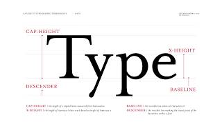 36
36
 37
37
 38
38
 39
39
 40
40
 41
41
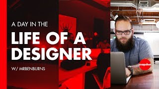 42
42
 43
43
 44
44
 45
45
 46
46
 47
47
 48
48
 49
49
 50
50
 51
51
 52
52
 53
53
 54
54
 55
55
 56
56
 57
57
 58
58
 59
59
 60
60

The Importance of Keeping a Journal—Track everything. Big Changes Start Small 📞 The Futur Pro Group
The Futur
🔴 How to Handle Bad Client Calls | The Futur Live
The Futur
What do companies look for in a design portfolio? How do you show passion?
The Futur
🔴 What Does it Mean To Be a Self Taught Graphic Designer? The Futur Live w/ Ben Burns & Chris Do
The Futur
How Your Beliefs and Behavior Define Your Personal Brand
The Futur
How do designers create solutions for business goals? How can I best empathize with my client?
The Futur
🔴 Logo Design Process— Live feat. Spartan Logo Design Challenge
The Futur
Is strategy for creatives who can't design? Is there too much hype around strategy? Pt. 1/3
The Futur
Is strategy HOPE for creatives who want to play a more important role with the Client? part 2/3
The Futur
Blair Enns Interview | Author of "Win Without Pitching Manifesto" 🎙 The Futur Podcast w/ Chris Do
The Futur
Design Strategy: Hope or Hype — The conclusion 3/3 | How do we market our creative services?
The Futur
🔴 Customer Service for Creatives - Live | Advice For Dealing With Difficult Clients
The Futur
Branding Identity Design w/ Yo Santosa 😊😂 AIGA LA Hecho en LA speaker series
The Futur
What is User Experience Design? What is the difference between UX Design and UI Design in 2018?
The Futur
Weighting Type | Art Center type & lettering professor, Nils Lindstrom, breaks it down for The Futur
The Futur
What Does It Mean To Be Passionate? Chris Do Explains | Motivational Video for Designers & Creatives
The Futur
🔴 Spartan Logo Design Challenge pt. 2— Recap and Critique Live!
The Futur
Never Too Late Or Old To Get Started In Design: CSUN portfolio review
The Futur
How to Deal with Defeat— Losing a Million Dollar Job (Pt.1) | Chris Do and Blind proposal postmortem
The Futur
Lettering 01 Course: Design Master Nils Lindstrom | Learn Typography From A Master Letterform Artist
The Futur
Tell your Brand Story. Increase your value exponentially 📈 Chris Do LIVE @ NAB 2017 in Las Vegas
The Futur
Amateur Mistakes That Experts Don't Make — Dealing w/ Defeat (pt. 2) Losing a $1 Million Proposal
The Futur
Trust Experts To Do Their Job— Dealing w/ Defeat (pt. 3) Losing a $1 Million Proposal
The Futur
Designer as Entrepreneur, Going Beyond Design: CSUN Portfolio review
The Futur
How & Why To Use Layer Masks vs Multiply? Adobe Photoshop Tutorial | Perfect grunge design texture!
The Futur
🔴 Year One of Growing Our Design Studio. How I Got Work & Built Relationships
The Futur
How To Make Your Type Look Distressed and Add Texture PSD Tutorial
The Futur
Motion Design Graduate Portfolio Review - Tips For Presenting Design Work During An Interview
The Futur
🔴 How to Qualify Design Clients & Position Your Work - AMA with Chris Do | Live
The Futur
Stop Selling. Start Closing. How To Win More Jobs Without Pitching
The Futur
Surfacing Unspoken Objections— No time to whine about a loss— The Conclusion pt. 4
The Futur
Win More Clients — Build Empathy to Earn Trust
The Futur
🔴 What is Strategy and How Do You Sell It? AMA w/ Chris Do live stream
The Futur
How Does Pitching Work When Trying To Get Work From Advertising Agencies?
The Futur
Typographic Terminology A to Z: Our list of typography terms that every designer should know.
The Futur
How To Run A Creative Business: In-depth breakdown w/ Melinda Livsey
The Futur
Creatively Recalculating | Overcoming The Fears of Being Creative - Von Glitschka
The Futur
Reinventing Creativity - An Evening With Von Glitschka Vector Logo Design
The Futur
🔴 RAW: First Client Meeting— What should you do? AMA w/ Chris Do
The Futur
Goal Setting and How To Achieve Your Goals (4 minutes)
The Futur
Day in the Life of a Designer - Digital Creative Director Ben Burns
The Futur
🔴 How To Get More Sales— Selling Through Curiosity
The Futur
Can You Charge To Diagnose A Creative Problem?
The Futur
🔴 Shift In Design Thinking and Problem Solving For Creatives
The Futur
🔴 RAW: Spartan Logo Design Winner Announcement & Design Critique
The Futur
Overcome Fears, Insecurity, Feeling Overwhelmed & Start Posting on Social Media
The Futur
How To Charge More For A Logo— Deep Dive ep. 4
The Futur
Document and Show Your Creative Process— Here's How in 3 Minutes
The Futur
🔴 The Importance of Being Perceived as Being Helpful
The Futur
🔴 How to Overcome Price Objections— AMA Marathon
The Futur
How Will Customers Find You— Build Awareness by Informing or Inspiring
The Futur
🔴 Mentorship - How To Find A Great Mentor
The Futur
Grow Your Business— Have Clear Goals Ep. 5
The Futur
Life Inside a Design Studio: Blind Ep 01
The Futur
Day In The Life Of A Designer - 24 Hours With Creative Director Greg Gunn
The Futur
Feeling Overwhelmed— Information Overload ep. 6 w/ Melinda Livsey
The Futur
🔴 RAW: Logo Pricing Challenges Roleplay & Selling Design W/ Social Proof | Live Stream
The Futur
Motivation, Focus & Grind - 7 Days Till Delivery
The Futur
How To Respond To A RFP (Request for Proposal)? What Should You Include In Your Proposal?
The Futur
How To Build A Social Media Following— Get Started
The Futur
Related Reads
Chapters (18)
11:30
Design Curriculum
12:00
Art Center Curriculum
16:11
Essentials for Design Education
40:50
and 43:56 AI shortcuts and Design/ Typography Tips
46:35
Contrast by Scale
49:58
Contrast by Weight
51:30
Contrast by Style
56:02
Contrast by Scale, Weight and Style
59:05
Type pairing for logo design, kerning and tracking
1:04:35
Where to practice kerning
1:05:03
Hanging Punctuation
1:07:10
Grouping with Rules/Lines
1:09:38
Lines in Paragraphs
1:14:39
Typography No No's (Shapes inside paragraphs and Widows)
1:19:37
Typography No No's (Quotes not prime marks)
1:27:14
Making a quick arrow
1:29:40
Tricks to make your work look like Chris'
1:37:40
What grids are for
🎓
Tutor Explanation
 DeepCamp AI