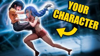
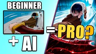
Extreme perspectives with Stable Diffusion and Photoshop / Full workflow
Key Takeaways
The video covers the process of creating an image using Stable Diffusion and Photoshop, with a focus on extreme perspectives and fine-tuning the generated image. The creator uses various tools and techniques, including POS my art, Pony XL, and Regional Promter, to achieve the desired result.
Full Transcript
sup everyone in this video we will be going over how to make the image that you saw in the thumbnail basically starting from the sketch which I'm doing right now and well and it it is finished this will be a long video I think the full process took like three and a half hours kind of like that and yeah this will be basically me going over the steps I did uh and explaining a little bit of my thought process and why I do what I do uh and that stuff basically starting with posing of course we will use POS my art which is the best website for this in my opinion like I know it was sponsored on the last tutorial well the tutorial for this video basically uh that you should check out if you want a faster paced version of this um I know I was sponsored there by them but I've been using this for years I used it even before a and now with a it's great because you can export your your death maps and open pose and whatever super super comfortably you can use blender as well but again it doesn't have the library of poses that this has I think opening blender and needing to learn how to use blender and all that stuff is very very annoying compared to just popping into your browser and doing everything here super fast um so yeah that that's why I love this page and you will see that here I'm trying to match my sketch as best as I can but it won't be super possible because my my sketch was flawed from the beginning uh the perspective I have in my sketch isn't really possible and it's not something that I really need to focus on I I didn't care that much uh I think the perspective 3D gave me is a little better makes more sense anyway so so yeah this is me struggling to rotate the character around and and yeah basically the sketch won't be followed to Perfection one because of that because of the perspective and the other one because of the Dutch angle I can't really make a Dutch angle in post my art without like grabbing everything in the scene and rotating it uh a few degrees to make it seem like the camera is tilting if you can tilt the camera please let me know I have no idea how to um but yeah now you will see that I export the the death maps and such as I said in the video if you don't want to see that video what I'm doing here is basically playing with that little slider down there to try to create the maximum amount of contrast for for both characters right so here I'm doing the girl or what will be a girl and and you will see that I want the feet from the well the foot that is close to the camera to be completely white because white means close to the camera and the one that's further away to be almost black to signify that it's very very very far away from the camera and that will basically allow me to get the poses right because if you have like a death map that is full wi everywhere you won't get like a good result ever so yeah I export three death Maps one for the guy one for the girl and now one for the floor as you can see and the floor helps me give AI a little bit more of a whole picture of what the images like right like where each character is positioned in space basically and the blade here you will see that I'm not trying to get a blade that's perfect I also move the camera around like accidentally which means that I will have maps that don't really match up they are a little different but yeah the SW as I said I won't get it into post my art directly because I want to draw it later to have this cature that I had in the sketch uh here I also fake the ddge angle and the perspective the the lens Distortion I mean uh by warping the image around and then I paint the the characters together so now I have the two death maps that I exported the man and the woman together that way AI sees contrast in both of them because if you try to get it with just one death map it is likely that one of the two doesn't have enough resolution right or doesn't have enough variation for AI to really understand what's going on which is why I export two of them uh basically and here I'm basically drawing the the sword uh with a little luck AI will get it uh spoiler alert it won't or at least not at the beginning um then I try to mask the feet to be on top of the sword and here I make my first mistake which is I only export two death Maps I export one death map for the uh woman and the man well this this death map basically I only export this death map when I should have exported another one that you will see later in why but yeah so I have this death map and now I have to open uh the open post reference and distort it as well because again I distorted the death map I need the open post to match up with it so that's what I'm doing right now and once we have everything distorted and in place we can move on with stable diffusion so here I'm going to import everything obviously open POS and depth which is the only things I have for now I will also use as the for the base image in this case or at least that will be my first attempt to use Pony XL for this so I need to use the the depth and open post for sdxl which are a little worse than the ones for SD 1.5 but Pony XL carries so much when it comes to foreshortening and images with this extreme perspectives it's it's incredible it's a very very good model for things like that so yeah I don't have to worry much and I will also use Regional promter so I will activate it and basically uh divide it uh as I want it I don't really use this tool so I make a mistake at the beginning or I don't use it much I guess I use it but not a lot for those of you who don't know this basically allows you to divide your prompting into parts so you can prompt for one side of the image and then the other or as many sides as you like really here there will be just two right so I want to divide my prompt between one man wearing an armor and then one woman from the back whatever whatever which we'll see now when I prompt but that's the main idea for this and the Bas you will see that we have three prompts we have the Bas and the other two the Bas is like a general prompt that you describe the whole image withth or the basis of the whole image with all right and here you will see that I'm pasting the style for Pony because Pony Excel needs this little tags at the beginning of the of the generation to make it better um which is weird I don't know why that happens but hey uh you follow it and it it works great so I'm not going to complain that model is is very very good uh anyway yeah this is where I prompt as you can see I'm not very deis on what I'm typing at the moment prompting is one of those things that I don't really care much about I don't prompt a lot so every time I need to prompt it's like oh here we go again what the hell do I type here but yeah and that's pretty much it I will make sure that I don't get nudes so I will put not sa for work and N in there just in case um and yeah for the man I just want the man swing as giant Sword whatever L Distortion and the key Parts I want here are the medieval armor and and basically if it can get me like the motion of swinging a sword that's good I don't expect the image that it generates to be a giant sword where I want it to be and whatever that that that's not going to happen ever so I I not really expect that I just put it in there so it knows what it's supposed to be and then for the moment I just the main focus is that she is from behind and not looking at the camera basically as well as having this for shortening and all that stuff I also use the weing aimono well you will see that it doesn't work but this base image is very very good like I it's unusual to have this good of a first image uh which you will see that I don't lose any time I just bring it directly into imp painting I'm not trying to play around with my luck and see if I get something better I do generate one another one just to have something generating while I input the controled models into image to image and such but you will see that I don't use it it's not a great image uh but yeah this one was pretty much perfect I start by prompting for the clothing on the woman uh as you will see using a low depth uh strength because I have a character that's already pretty well proportioned um from the GetGo which is very lucky by the way and yeah you will see that we get something very very decent directly here the only thing that's missing right now is the the high heels which I will fix with in sketch uh for those of you who are not using inaine sketch I'm very sorry for you um again uh inaine sketch is such a great tool if you're not using it you are either doing something wrong with your life or doing absolutely nothing wrong with your life because you don't have to fix anything but I do think that this is a very very good tool I use it all the time it's very easy to use you just draw some things with the with the colors around whatever you're drawing now um which by the way I'm I'm using the canvas Zoom extension that helps with that because you can color pick very accurately and then yeah just use a mask blur of one in this case some the noising strength that not enough so that the AI does whatever it wants but also high enough so that it doesn't look like a sketch and yeah with z. five it did a great great job and now I will use the same technique to try to add a blade on the other hand which we don't have at the moment and I want one um the issue for this is that I don't really know where my death model has the blade right so if I'm drawing the blade in a different position that my death model this won't work which is why I basically draw as you can see now the sky around it and that way I ensure that well if I'm missing with the main sketch maybe some of the part of the sky that I draw uh will get there because remember that even if the color itself doesn't change because you're using the same as the background um whenever you paint something it acts like the mask that you will use for in painting like for regular in painting I mean uh so yeah it basically you allow more parts of the image to change which kind of worked again this knife that we got here is not great it it doesn't look like we want it at all like what we wanted all sorry and that's fine we can in paint again uh with a base uh like this it will be very very easy to get a good sword um like we're seeing right now like this is kind of the shape that I want but the handle isn't there at all so I'm just going to impt the the blade itself without selecting the handle and that will give me a result that I like the thing is that I didn't import this as a base again before I started to to imp paint the next part so I will need to rescue this image from the sea of generations that I had to mix it later into the the base image but that that's fine we we do that a lot here I I forget to do this a lot of times and now well as you can see the other thing that I will do is basically imp paint the character to have a kind of better position better armor something that looks more like a character I also don't want a helmet by the way because I want the face to be visible and expressive it if possible uh which I try here with not um well not the best of lucks I guess so I just gave up here it it's something that You' uh after anyway because right now we don't have enough pixels to really focus on the on the head at least not on a head that's like that far away right so yeah as you can see now it's time for the blade uh this is the hardest part of image this will always be the hardest part of image the the part that's more or that's closest to the camera I guess will be the hardest part to fix most of the time because mainly if it's like super big uh in the image we mean so if the thing that you're trying to imp paint uh occupies the whole image and it isn't something that's like I don't know super basic like a background for example right like if I paint a castle on the background it will be big but it's something super basic that AI knows a lot but in this case a SW cutting the air with a woman standing on it and this close to the camera this distorted this curved and all that stuff it probably hasn't seen one uh ever or maybe it has like one image in the day data set of that so it's it's kind of rough for it to to get right so what you could do is try to do what I did in the image of the sniper girl in the video tutorial for this but since this is a blade that's like Allin one and it doesn't have like different parts like a sniper rifle Lo it is a little harder to do so that's why I'm struggling here and I this is the hardest part of the image again this is where I will spend most of the time uh fixing it and as you can see I'm trying to switch models I'm trying to go to Epic realism I'll try to use like uh tile model uh whatever all everything I can do I'll try basically to get this to work and here you can see that the Epic realism is getting me something closer to a sword it's metal at least it's not like reflective it's not something cool it looks more like some flooring made of metal but but yeah so the other issue that I'm finding here is that well I have feet on the on the blade and I'm saying okay yeah maybe this is confusing AI let's let's cover them up and I do that with um with control a tile and here I'm trying to demonstrate what I will do which is uh with the down sampling rate you can blur the image a lot right so here I will use a down sampling rate that's pretty high to blur this sketch that I did and to make it not look as not look as rough but at the end of the day what my issue was and it's something that I said earlier is that I didn't have a controled depth model for only the sword I only had a controled death model for the sword with feet on it and that's basically why AI was giving me those results even though I IM painted over the feet because it was detecting that my death map had something there that I didn't want so what I had to do is to redraw the sword basically because I forgot to save the selection that I originally made and had to redraw it again and then I will also add this little Extrusion not really that I care about it following the the real depth of it so I don't care that the color is perfect I don't care if if it works or not I just wanted to give a little bit bit of a I don't know how this is called in English okay it won't come to me right there but something of a dent to the blade so it knows that it has volume right that it's not like just a plane it it is something that has a little bit of volume and it kind of works as you can see it's not a blade right now what it's giving me it's more like a floor but but at least it has this little Extrusion that will work in our favor uh for sure so now what I'm going to do is basically uh go with again with uh sdxl and see if it works better than SD 1.5 and it kind of does not really it it is tough right like this again will be hard to get right I do attempt a lot of stuff this is basically me trying luck and you can see that it kind of works like it's not getting there yet it's not a blade but at least we have metal we have something here that we can work with you can see that I drag the images into image to image and try lock over the image that we had re regenerated again and now you saw me add a image of a sword into IP adapter I will it didn't work at all no way so I used like reference only and see if that works and I don't know to what extent that helps or hurts I guess I I really don't I just was was a h Mar but hey it kind of worked right like here this is basically what I will go for and I don't know if again I I have no idea if this image helped or not but at least we got something that's pretty good I would say the main thing that makes this good is that the details uh follow the death map right so closer to the camera you can see that there's more space between details there are more details and it's it looks larger and then as you go further away the details like lose intensity and you don't see them as much which brings this depth feel uh to the sword I guess it doesn't really look like a sword itself but just having that makes it worth it because it's metal it follows the perspectives it follows all that and again since the sword will have a motion blur we don't really care that much about details on it so yeah that's basically more than enough for now uh what I will do however is to place the woman again on top of the the sword because we took her out just for AI to be able to to generate the sword properly and now I will add some some attempt at Reflections and mainly ambient occlusion to make it feel like she's on top of the blade and not like a floating object that's over the blade and that it they are two separate entities that don't interact with each other right so this basically helps I understand that hey this two objects are interacting with them uh with each other I'm sorry uh and that will help a lot when we go to the iterating part of the of the process uh where we go with full image to image but yeah then I want to add this part of the video where I tried to change some stuff so for example here I said okay let's change the background and well I have that book happen which made me change my mind instantly because the background you don't usually change the background with imp pain sketch that's a little too much what I did try with impin Sketch was adding some flowing cloth because I felt like I don't know I wanted to feel the gaps a little bit on the image and maybe this was a good idea but one I don't know how to draw a flowing flowing cloth so it looked very very bad and to I remembered the actual purpose of this image like the actual idea I had in mind for this and that those spaces will already be covered up when we when we finish it so so yeah that's why I decided not to go forward with this and also because as you can see it doesn't look good at all not that you couldn't make them look good but I I didn't really care that much because it wasn't a good idea from the beginning so yeah we stopped this uh I think here I don't think I kept generating more and then we went to something a little more productive I guess uh which in this case is basically the background this time with Photoshop so the first thing I will I will do is mask the characters the the parts of the image that I already like and I don't want to change yet at least or not a lot uh I'm going to mask them so in this case the sword the the guy and the girl will be all masked and I will save this mask in a different layer just to have it because it will be used multiple times uh after this basically I clean up the base mask that uh Photoshop does with that like selecting tool that it has that it's very good actually and then I use my sketch as a reference to build upon the the new background like I draw basically the big wall the that my original sketch had and then I also draw some other parts that I think should go here like the floor and some little background on the right the where there is nothing drawn on the original sketch so I had to improvise there and this little lines that I'm drawing here are basically a very fule attempt at giving AI a base reference for the the perspective that it did not work at all I don't think uh so the main goal was to try and hit the eye like hey this is a fish SK lands it has some Distortion whatever but nah uh I don't think that worked at all so maybe just me but I wouldn't do that if you ever try something like this now I'm just erasing the the characters uh in a very very very vague fashion I just want to have um a way to recover the full uh background just in case the idea for this is that if the background isn't properly generated when I try what I'm going to try I have a a backup plan of just generating the background separately and adding the characters on top of it but what I'm going to actually try is the main idea which is basically masking the characters first uh like so and then using uh in paint upload to to only in paint the background right not everything but just the background and that way we can have something that's a little more cohesive that makes a little more sense now the first Dain that I did didn't really work that well I don't think Pony XEL is super great with with this type of imp painting like General imp painting of the whole image maybe I just don't know how to use it for that but as you can see uh I'm not getting good results so I switched to to SD 1.5 I do think that pony XL has to be good with that but I I haven't been able to get into that part of of Pon XEL yet so in any case I just used tile blur with with SD 1.5 and that will give me way better results like this basically this is not perfect at all right it's not super good but hey it's it's a little better than than what the other results were uh also one thing I'm going to do is actually switch to a realism model one because they are very good with backgrounds generally and two because I think they understand better what I'm going for or at least better than my anime models so that's why or another reason why you can also see that the fishy lens effect isn't there at all I needed to add it to a prompt who would have guessed but the images or the lines that I drew originally didn't help uh in the slightest uh I think I ended up going with this image yeah I did of course this isn't great this is actually a pretty bad I would say but I just need this as a base to get some death Maps out of it and maybe add some detail to my original drawing uh you will see that what I'm doing here is I'm using dep anything to create some dep maps and now I will combine them the reason why is because I don't have the castle on our original depth map that we exported from post myart so I need to create one with this I could also have painted it in myself but I think this way you actually get a more let's say precise result to what your actual image is because our image has changed slightly since the the first depth model that we exported so for example we have a high heel the blade is different and all that stuff so that's why I don't use our original one and I use uh one that's created with dep anything because it's actually pretty good that preprocessor now we want to prompt for anything this is the iterating part that I was talking about where we use a def map that is General a general death map and then I will use that to to create a new base image also well here what I'm doing is basically combining and mixing the the drawing that I originally had which I feel like follows the schedule a little better with some of the details of the new one but I don't really think that's useful at all I I don't think that was worth doing because as you can see it the new image doesn't follow that at all and here again as I said in the video it's just generating and generating and generating until you find something that works some combination that works here I thought that um DPM sampler wasn't changing the imag in off uh so I used the uer a uh the first image I generated it wasn't that great the second wasn't that great either but that castle on the right there I think like that's pretty good so I saved this image uh to use later also the wall itself had a pretty nice shape now you will see that I have activated origional prompter and the main reason why is because uh the the characters are not really what I want so for example the soldier is now a dude running away or something I didn't want that so original promter kind helps with it being a little more of what I'm describing right now the quality of the image isn't great now uh at the moment again as I was saying uh the the uh Pony XEL model is not great with image toage I think it's also a matter of using a higher CFG scale and all that stuff like I I need to play with it more but in this case I just ended up using Old Reliable SD 1.5 with some tile model um with the bmsd because as you can see you kind of changed the image a lot and after some generations uh I actually ended up going again into Photoshop and mixing them together which is something I do a lot every time I have three parts that I like I mix them together and go again with the process and in this case you can see that the castle that the image with no tile actually gave me uh was pretty cool I thought that those walls were were nice so I added them into the image and masked the character again fixing the blades that I thought were a little um broken at the moment uh just from the in painting and masking and then I also added this Castle as a background right there which I felt uh that matched pretty good with the image and it didn't distract a lot the first issue I have is the leg obviously and then the other issue was that the castle looked cool but it looked like there was some mismatch in the flooring and perspective which is what I'm fixing right now I'm adding a floor and I'm trying to close up the space so so that it doesn't feel like you can fall through there of course it doesn't matter but I think it closes the image a little bit more that's why I'm adding here this this little wall and and these trees and such right to to have a little more more closure on that part of the image uh here I'm using tile I think yeah I'm using tile which makes the the image very very detailed and in cases like this that's something I don't want because I feel like detail in one extreme of the image that isn't the main focal point just basically distracts the viewer from what you want them to look at and that's why I went with something that is not as detailed and now what I'm going to do is again the iterating step but this time with pony EXL if I can and and what I will do is basically fail first because I'm using in painting with nothing selected then I go to image to image and then hey there we go nope you don't have the depth anything pre-processor selected but now we're getting somewhere finally of course it's not great I think 065 was a lot uh also 050 I think was a lot I think I ended up going with something like 0.45 and that gave me a pretty decent result I think this is a pretty nice result overall and what I'm going to do now is try to fix the hands for that I'm going to try first with just regular imp painting and hold pictures if it helps or if it does something on its own and if it doesn't well then we're going to move on to the next attempt which will be probably in paint sketch right as I always say in paint sketch is great and for this things is is amazing right what I'm going to try to do is to give some basic blocks of what the hand will look like just drawing some very basic shapes of what the fingers will be where are the fingers what is the orientation of the hand right in this case the hand is seeing from from behind and that's very important and that's the main reason why I using paint sketch in this cases because you can give this initial orientation of course now you can see that I'm using um only masked because we need a lot of detail and that right there is a pretty great hand uh with no effort almost almost after that I move on with the other hand with exactly the same strategy even though I'm getting a bug as you will see that both hands are getting in painted even though I'm only touching one so I just send this to in painting and and in paint from there with the sketch done and that's yeah that's already a good hand right there so yeah that can happen sometimes with in paint sketch that the other uh in paintings that you did like remain and you can't really get rid of them that's very annoying but it happened but yeah so now we're going to pretty much correct the other character that is now a woman for whatever reason I will use uh only masked so that way we have a little more um resolution to start with and that way we have some characters that are more defined and I will basically just repeat this process until I found I find something that I like sorry I will also import the um the open post model that we had originally because I want the post to be correct as you can see one of the arms of this character is getting out instead of grabbing the sword which is not what I want because even if the poe is a little weird even in Poe my art I made that pose that it it didn't really work I didn't know how to pose it so even if that's weird in itself uh I think it's less weird than what we have right now so that's basically why I'm trying to reimport the dev map that we had originally as well as the the open pose trying to get a pose that muches better with what we had originally and that's actually something I want to talk about if I have something in the image that doesn't look right like for example the pose in this case I want it to be my fault it's me who post the character and that's why it looks weird it's I don't want it to be ai's fault mainly because if it's my fault it means I can control it right so what I want is to have full control of AI to an extent that what looks wrong in the image isn't because AI can't make it right it's because I can't make it right basically a skill issue so if the POS looks weird I'm actually fine with that as long as it's my pose right if that pose is something that I wanted to have and that my sketch didn't look weird in that way but when I made it through ai ai made it weird then I'll be sad because what that means is that I don't have control over a ey right what I want is to have controlled over ey to the extent that if something looks bad in the image it's my own fault and that's basically why I'm doing this and that's why I do all of these tutorials and all of this stuff to learn in the process how I can control AI to the fullest right and this is an example of that because I have a sketch that I'm trying to replicate I'm not just giving a prompt and letting it decide what it wants to do and as fun as that is to just let let AI iterate and do some random stuff that you really like with just a basic prompt uh I think that to me at least it's more satisfactory to just be able to draw something and bring that something to life using AI to help you in the process right so yeah it just makes it faster because maybe I could try to draw something like this but one my skills are not to this level at all like I would not be able to draw the anatomy I would not be able to draw the castle I would not be able to draw all of that and I would pretty much spend a whole week on something like this probably or even more so to me that's the fun part of AI and I'm talking about this while I try to fix the hands of this character and I actually just draw them kind of not really because again I don't know the post here I I didn't know how the man was supposed to to grab that sword um so I just they I iterate a lot here and that's why I decided to talk about this in this part of the video because I just iterate and iterate and iterate and I ended up going into Photoshop to draw a base because in in paint sketch I couldn't and with the base drawn in Photoshop I had this um stacked hands using uh the sword and I felt like that was the only possible option for a post like this to kind of work so I think I went with that basically uh then again Pony Exel is super good with hands the the fact that it came up with that it's crazy came up and you know you know what I mean so yeah once I had the hands I tried to imp paint a little bit of the hat did I say hat the head and try to you know get something that's better I also came up with the idea hey maybe this is not just a guard because it wouldn't make much sense that there's only one guard right maybe this is the king that there's nothing else in the castle there's no one else here to defend him so he goes out himself to try to defend it and it doesn't end up well for him I guess in any case this is where I find out that the image doesn't have enough resolution because I messed up earlier so you will remember that I upscaled this image uh before but when I was trying to mix the hands and paint the hands over uh what I actually did was import the image into a version of Photoshop that was the low resolution so I ended up lowering the resolution by mistake and this is me trying to upscale the image like okay well now that I messed up let's see if I can upscale the image uh and save some time but that's not the case that it's not going to happen uh so what I ended up doing is just mixing the low R image with the high res image and yeah that's it this is what this is basically you will see that the hands don't have enough resolution here I'll also uh just use this opportunity to fix some other stuff that I don't like or that maybe need some repairing uh basically right and yeah with that done we just go to stable diffusion again and this time I'm going to try to imp paint the character once again but with higher resolution I think this character I imp painted like 5,000 times at this point I don't know why I'm guessing that something we could learn from this that youo uh maybe you know wait until the end to really in paint something of this because I've had to change this 5,000 times at this point um but yeah that's pretty much it I just now iterate a little bit more to fix the arm the hands a more of the head try to get him a crown and such I also use of course only masked I don't know if I explain this I don't know if I need to at this point but yeah basically only mask serves as a way to crop the image while you imp paint so that way the the thing that you're imp painting has full resolution right so in this case I'm using 1024 by 1024 and the character when I imp paint will occupy like I don't know 80% of the image so 80% of the pixels go to the character when instead when you use whole picture uh you get the full context of the image so in this case I would have like I don't know 270 pixels but the character instead of the 80% of those 270 will only get like 10% right which means that it has less resolution and that's why you use only mask when you need to have more resolution and in this case using only mask served for me to get a pretty decent phase pretty decent armor uh Okay resolution and in this case well the phas is that one I think is the one I used so that's pretty much it at least for that yeah I I tried a little more but I didn't really like the results that I got because as you see the lack of context means that the character will look wherever they want but yeah now it's just a matter of dragging this image into the other one combining it with the hands that we had uh that weren't great because of the lack of uh pixels they had and now they will have those pixels and we will be able to get a better looking hand I guess I will use a very low the noising strength that way we basically have the same structure of the hand but just with more resolution and I think that worked pretty fast it's not like the best hand since it's something so so so small in the image I didn't really care that much uh so I didn't really bother fixing them super greatly I think whatever kind of works or look like looks like it works uh I left that there and that's it basically and now it's I think uh fixing time I will draw over the parts that I don't like including the leg uh this is something that gave me a lot of trouble because I didn't know the anatomy of this part of the leg I didn't know how to draw it so I spent a lot of time trying to draw it correctly and I couldn't I just left it at that I I I think that looks okay uh but yeah I also fix the the rooftop to give it a little more a little bit more shape and a little bit more definition not something so abstract I guess uh some parts will be abstract like this Tower here you don't really know what going on there but at least it's a little better than what we had initially I guess and yeah now I think it's just uh postprocessing left uh I don't think there's anything we really need more from AI I will use it again but not for like compositional reason or to imp paint or whatever here I'm just taking some of the detail out of the highlights of this character I felt like they were too bright but now if we flip the canvas horizontally I think that the composition loses a lot because the left side uh has lost a lot of weight and I think one reason is because the blade isn't as bright so you kind of lose the the blade and the other reason is well because of this I'm adding now I think think adding some other big shapes in those parts really give a lot to the composition it closes the image more and it makes the viewer stay inside the image a little more again I'm not a master of composition I'm not great at it but I really like uh looking at compositions and trying to figure ways to to make better compositions I think that's the part that I like the most about a ey uh not the eye images in general actually and the ey works pretty well with this because you can just generate a lot of images and study what the compositions are that's also something you can do or you can just study regular artist I guess uh here I'm trying to get the blade to look a little more distorted and not just like a little knife but instead something that goes uh away from the image right okay and now you might be wondering what I'm doing with AI and why I'm generating clocks well if you remember the thumbnail then you might not be wondering that at all but yeah the main idea here is to get some Holograms or some graphics to then add into our our image uh that's why I'm using some blue over black and that's why I'm generating a lot of images at random without really caring much and then yeah I save the ones that I like the most I just bring them into bring them into the image and that's it just try to find a good blending mode that works uh I will duplicate them I will basically move them around if one doesn't work like this one just take it out uh I don't really care it's not like we have a lack of images I generated like 20 in 5 seconds so it's not something I care about and the main idea for these clocks is to serve as Holograms that uh kind of represent time stopping right so I will add them um in all those little spots I drew uh as a way to represent that like a spell like a Time spell here I made a little mistake where I didn't uh duplicate the main image so that's why I'm going back again and now I did uh so with this I'm just going to duplicate this clocks uh maybe change them a little bit that's why we have multiple right and just place them around the image one at a time uh until I have all the ones that I want I don't think I add any extra ones from the things I I drew I think that stays pretty consistent some of them I do add some some blur to them that way they don't stand out as much but but yeah it's basically a do and repeat just importing uh blending mode duplicating and moving them around so that they look okay then I will add some more light to them I guess uh but for now this is okay I want them to look like clocks I want people to re realize that okay this is something to do with time um and then what is important about this is that they don't distract from the main action but that they are there and they are visible and that people can look around to find them right like it's not like it's hard to find them but you know that's the main idea that that I'm explaining postprocessing a lot here because I do think that this is the part that I have the most fun in uh because there's a lot of possibilities of from one image you can do a lot of stuff so yeah that's basically why and here you can see me that I'm playing a little bit with the values I flip back and forth with the image to that kind of refresh my eyes and see if okay this composition works I don't know I've been staring at this image for what would be like 3 hours now so I I'm kind of bored of it I need to flip back and forth to kind of refresh my my eyesight on it I used to have a a key bind it to to flipping the canvas but now I don't because it's a new pc so I can't do that or I I could but I'm too lazy to do that so yeah um anyway you can see that I'm playing with the values here I'm kind of adding some light removing some adding some motion blur uh in fact no I'm just adding blur I will add motion blur in a second which is what I'm going to do right now when I finish sorting out my images or my layers sorry and here I will add a blur for the for the blade with the path blur uh gallery or filter whatever this is uh basically this one will kind of simulate the motion of the blade towards the camera then I will add another blur to simulate the motion of the blade um swinging laterally but for now uh this is the one that I will add and of course I will mask it and just make it affect only the blade which is the important part for this uh while I was doing this I realized that there were some minor issues in these in these parts of the image that I was fixing right now fairly easily I read the the reflection and the ambiental cusion of the of the girl over the sword just to make it feel a little bit more on uh on the blade I will also add the Ambiance occlusion on the one that's closer of course remove some of the motion blur from the feet the feet aren't moving so they shouldn't have it and now we apply image again and I think I do add the motion blur laterally yeah this time I do this I think I read add one again just to make it a little more um exaggerated but yeah as you can see now it's basically just painting over the parts that I don't like so here for example the blade didn't really continue as it should so I'm just drawing over stuff and and trying to fix that manually because it's easier than going to AI just grab colors from the sides of the image and paint over it's not really not really something that's hard or time consuming and now I'm going to try to make uh the viewer understand who is this spell affecting right and who is casting it so now we have the clogs and we have all that and the little lights and whatever so but the thing is that you don't know what's happening it doesn't really make much sense and I hope that with this it may sense I don't know if it does it makes sense to me of course because I made the image right so what I'm going to do is basically uh desaturate the whole image make it look super muted super dead I guess and then I will select the the woman and I will make her not be affected by that right so the idea or at least what I hope this kind of signifies is that everything has stopped except here uh she is the one casting it she is the one that is in control in this situation and that's kind of the goal with with this uh layer of the saturation and now basically I will save the mask just in case I need it later which spoiler alert I didn't but basically because I had it in a different way that was more accessible not because I didn't reuse this mask but yeah now that's I think better I think this kind of represents a lot better what the what the spell does or what's going on in the image and there I fix some cloth that I didn't really like I also now spend a little bit more time on giving some parts of the image some color just so it doesn't look this dead because full full the saturation is bad in my opinion it's not like it's bad but you know it it kills the image very quickly it makes you look at it and get bored very fast so that's why I added some colors overall and the yeah that's basically it I revisit the clocks I revisit the the lights I revisit everything uh a lot of times I flip the canvas as you can see I I'm basically at this point experimenting trying what works what doesn't um I also add some blur to the background that way uh you kind of have some feeling of depth as well uh always uh keeping in mind that I want the blur not to affect the focal point right the parts that I want the viewer to spend more time looking at those places I won't blur uh because detail kind of attracts um where the eye will be looking at because there's more stuff to focus on I will also add some more color to the crown I think that something that doesn't really make that much of a difference but you know I think it makes it look more like a crown and you understand easierly is that a word I don't know no it is uh makes you understand what's going on uh faster I think which is good and yeah that's basically I don't think oh yeah no there's something more I want to do here in fact I'm just now playing seeing what filters go well with the image what works what doesn't kind of and going back and forth uh looking at this from a distance looking at this from closeup trying some LS trying some stuff like that and now you see what what's that why are you blowing the image up well the main reason for this is because I felt like the the woman was lost a lot if I looked at the image from far away and I'm going to try to add a rim light which is a light that comes from well basically that divides the character from the background a little bit and that's what I'm doing here I'm using the mask that we had before to try to draw a bit of the of this light on the Contour of the character and that way it stands out a little bit more and since I have the clocks and such that are blue I kind of have an excuse for this light it's not like it's coming out of nowhere I think it makes a little sense it's not directionally properly positioned because there's nothing that should give this this halo around here but but I think it's fine I think that that it Justified enough and I also had some other lights but that's basically why I also paint some lights on on the the background on on the image in general that kind of justify that these clocks are there in the image it's not like just an overlay because they have light that is affecting the image overall and other parts of the of the environment here I also saw that the blade was uh wrong because I think at some point I masked uh the blade uh in a way that I shouldn't have and then well that happened I and I tried to look what it was uh for what layer was causing it and I ended up just painting over it and it was faster then also just I don't know to clean up some parts maybe this light was a little bit too harsh so I eras it a little bit on the Contour and and that's basically it from now I think it's just adding some details looking at everything uh trying to get the hair to look right trying to get the main shapes to look right and some other thing I want to add here is at a do on ha the main reason for it is uh well wait this is basically me just correcting the color of the skin it was like super white while the hand was a little bit too too reddish so what I did is basically add a layer of color to it but yeah back to the tto the reason why I added is basically to further justify that she is the one casting the spell right she is the one that has um time abilities or time related stuff in here I guess right that's basically the main reason and you can say struggled a little bit mainly with masking because I didn't make a perfect circle so I had to mask it manually but yeah now I just added to I don't think it looks great it's something I need to to learn from for for the next time I guess uh because I don't think it sells it too well but it's all right it is what it is um and yeah then just add some finishing details to the image for now uh I will will also just bring the whole temperature of the image a little bit lower so that way the clogs feel like they are affecting the environment a bit more too um what else I also thought that the blades didn't really stand out which is why I'm adding this like lighting images or sorry lighting curves to to make the background a little darker and then the blades a little glowier or a little what's that what would that be well lighter yeah I don't know why I was strugling so much on that word but that's that's pretty much why I'm doing all that I also you know looking at The Rim light looking if it looks good um and I think that's where I left this image for that day and then the next day what I did is I looked at the image and I thought that from afar if you looked at this image from very far away the values of the dress for the woman and the vales for the sky were too close together so looking from very far away you couldn't distinguish what was going on which is why you can see me painting this sky with a little bit of white basically to make it lighter and uh make her stand out a little bit more and I think it works pretty well it's very very simple but it's super effective uh you just need to make it not seem uh super forced I guess um and even so if you justify it enough uh I I think it doesn't really matter and then I think I just added um some more motion blur to the blade and that would be it oh yeah I also did this yeah I corrected the shape of the blade I thought it was a little bit too uh deformed I guess and I tried to you know correct a little bit the the flow of it I think think it looks better now I'm not sure but yeah that's basically it yeah I think it looks better and with this I think the last step I will do is just add some more motion blur to the blade that way it looks like it's moving uh more on the part of the tip of the blade I it's not something I will add to the whole blade but only uh or mainly the the part that's closest to the camera and further away from the from the guy that's swinging so yeah that would be it for this image please let me know your feedback on the comments I would really like to know if you felt like this video was too fast too slow uh that I cannot talk uh improvising whatever right let me know and I hope you liked it see you
Original Description
Hi!!
In this video we will be creating the image you see in the thumbnail, step by step, as I comment my thought process and what I'm doing.
Hopefully you find this video helpful for your own projects.
This is a complementary video to this tutorial: https://youtu.be/E_-z0ed46Nc
I would appreciate some feedback on it, as I plan to do a video like this for each main tutorial I post. (Usually won't be this long, or at least they wont be the full process of the whole image start to finish. But more of a video focusing on expanding on the tutorial's topic. In this case since the tutorial was from 0 to 100%, the full workflow video had to be as well).
This is the first time I make a video like this, sorry if the commentary isn't too good. Need practice.
Watch on YouTube ↗
(saves to browser)
Sign in to unlock AI tutor explanation · ⚡30
Playlist
Playlist UU81KZMuh7RWo21Kk0CaS7eA · Not4Talent · 28 of 33
1
 2
2
 3
3
 4
4
 5
5
 6
6
 7
7
 8
8
 9
9
 10
10
 11
11
 12
12
 13
13
 14
14
 15
15
 16
16
 17
17
 18
18
 19
19
 20
20
 21
21
 22
22
 23
23
 24
24
 25
25
 26
26
 27
27
 ▶
▶
 29
29
 30
30
 31
31
 32
32
 33
33

Why your AI art prompts are FAILING and how to FIX them #shorts #part1 #ai #stablediffusion
Not4Talent
The ONE WAY to beat Concept Bleeding #shorts #part2 #aiairt #ai
Not4Talent
The better AI art generator? #shorts #ai #aiairt #stablediffusion #midjourney
Not4Talent
This are some must have models for stable diffusion 1.5! #shorts #ai
Not4Talent
STOP making BORING AI art
Not4Talent
Get FULL creative control over Stable Diffusion | Install + all models
Not4Talent
Easiest sketch to AI concept 🤯 #shorts #ai #aiarchitecture #controlnet #aiairt
Not4Talent
Prompting HACKS no-one talks about
Not4Talent
Next level AI art Control | My workflow
Not4Talent
Best Tools and extensions for STABLE DIFFUSION AI art
Not4Talent
sketch to final "time-lapse" #ai #aiairt #stablediffusion
Not4Talent
This ControlNet model is INSANELY useful!
Not4Talent
fix bad faces, super easy #stablediffusion #face #aiairt
Not4Talent
Create consistent characters with Stable diffusion!!
Not4Talent
LORA training EXPLAINED for beginners
Not4Talent
MONEY with AI art | ft. DupDub
Not4Talent
This prompting technique is so fun! #aiairt #ai
Not4Talent
Ultimate Guide to HANDS with Stable Diffusion! (Any pose you imagine)
Not4Talent
Complex INTERACTIONS with MULTIPLE characters | Stable Diffusion
Not4Talent
No one uses this CN model and they should! #controlnet #stablediffusion #aiairt
Not4Talent
I spent 3800$ on a new PC to use AI... Do I regret it?
Not4Talent
Full FACIAL EXPRESSION control for Stable Diffusion (+Lora Pack)
Not4Talent
Unlimited CONTROL with SLIDERS! (SPECIAL loras changed the game)
Not4Talent
Create CONSISTENT ENVIRONMENTS with AI (from multiple angles)
Not4Talent
Add characters to ANY environment with Stable Diffusion
Not4Talent
PIXEL ART with StableDiffusion + Tileset workflows??
Not4Talent
BREAK Posing Limitations with Stable Diffusion!
Not4Talent
Extreme perspectives with Stable Diffusion and Photoshop / Full workflow
Not4Talent
Why I am learning to DRAW as an "AI BRO"...
Not4Talent
Get instant-feedback on your art! (and learn faster) #digitalart #art #learningtodraw #ai
Not4Talent
Practice composition and storytelling, the fun way #art #ai #aiairt
Not4Talent
Can AI be a TOOL for ARTISTS? My workflow + Pros & Cons
Not4Talent
UPSCALE any image for FREE with AI | Stable Diffusion
Not4Talent
More on: Prompt Craft
View skill →


Related Reads
📰
📰
📰
📰
Three ranking currencies and zero overlap: what 2025 Juejin AI roundups actually disagree about
Dev.to AI
How to Use Poe for Case Studies in 2026
Dev.to AI
10 Ways to Make Money Using AI Tools in 2026
Medium · AI
I got tired of switching AI SDKs every time I wanted to try a new model
Dev.to · zhongqiyue
🎓
Tutor Explanation