Tableau Tutorial BI- Scatter Plot, Bar Chart, Histogram
Key Takeaways
Creates a scatter plot, bar chart, and histogram using Tableau for data visualization
Full Transcript
hey guys welcome to my discussion on visual analytics using tableau so today my agenda for the day will be I will talk about some basic charts like scatterplot bar graph histogram so let's start our discussions and let's start with the process of building a first basic chart that is scatterplot so what is a scatter plot scatter plot is basically used for establishing relationship between two variables so variables can be a independent variable and a dependent variable so what is an independent a dependent variable you know take make this concept more clear to you let's take a small example suppose there is an ice cream seller so he takes the note off his sales every day along with the temperature after few days he recognized that with the increase in temperature the sales of the ice cream also increases he notes that when the temperature is high for a particular day the number of ice cream sold is also high so over here we can establish the in incites that when the temperature increases the ice cream sales increases so over here the temperature is an independent variable and the sale of ice cream is a dependent variable so we can use scatterplot in order to visualize this kind of relationship between two variables either one of the variable can be independent or a dependent variable so let's take a small data set and let's work on that particular data set and see what kind of scatter plot we can develop for that data set over here we can see we are using a data set which is a Kobe 19 data yes I'm using this data set which is the which is presently the biggest threat the world is facing today so I have got this data set which actually shows the number of cases which have recovered the deaths and confirmed cases of Kovach 19 all over the world so we can use this particular data set and we can see how we can establish some relationship between two variables from this data set and create a scatter plot from that so this particular data set actually contains the observation date the province or the state from where the cases have been highlighted in terms of country and the confirmed cases deaths and recovered for those over 19 cases that is found all over the world so this particular data set is actually is a collated value of all the cases that are going around the world that has been confirmed in terms of death and also recovered so let's build a small scatter plot from this particular data set and we can see how we can establish a relationship between the confirm and the recovered cases of Kobe 19 to day in our world so in order to build a scatter plot we can click on this confirm case pill and you can also click on this recovered pill and you can see we've got two axis one with the confirmed and others recovered so what we can do we can edit this axis in order to get some accurate result so once you click on this edit access there will be a pop up window where you can choose to remove this zero from the axis and click on this fixed option and you can just set your fixed start as one and you can just reset the fixed and as 50000 close this window and you're recovered axes have been set from 1 to 50,000 of numbers the same thing we can do for the confirmed axis and we can choose to remove this 0 from here click on these fixed options click on fixed fixed start as 1 and reset the fixed end as 50,000 so we have recited this axis from 1 to 50 thousand for confirmed and recovered case we can also rename this chart as scatterplot for better understanding so in order to name the double rename this chart double click on the sheet 1 title and you can just mean in this rename this chart as scatterplot and you can just apply the changes.click on ok and your chart has been renamed with a scatterplot so we can also change this view from here whereas where you can have a better preview of the chart where the chart takes the whole screen in order to have a more accurate and a better interactive view of your visualization now coming to a point we need to show the confirm and a recovered case in terms of state so we can what we can do we can just drag this state option over the color mark and we can see as we put the state on the color mark we have got the state wise view of the recovered and the confirmed cases of Cove 819 we can also choose to remove this card from here you know so that we can have a proper view of the scatterplot that we have created now this is a simple scatterplot that I have created in terms of confirmed in recovered case now what are the things we can do you know to make this scatterplot more and more interactive so we can choose to have a different shape for a different state of Cove 8:19 for that we can just bring this state and drag this state option over the shape mark and we can see the moment you click for each state there is a designated shape of mark which represents the number of confirmed and recovered case of Cove in 19 for the whole world we can also choose to remove this or hide this mark for better view we can also create a relationship for each state where we can change or convert this particular mark into a line graph so in order to do that we can click on this automatic option over here and you can choose to select this line option now we can see for each state or for each province we have a dedicated line so that it is easy to understand so what which state is having how many confirmed case and how many cases have been recovered so for this particular line we can say it's for mainland China the province's state is honking this changes with as the line progresses the state name changes and the region name remains the same so it actually helped us to identify each state and region individually from this scatterplot we can also choose to change the line type from one shape to another so you can choose the line as per you wish and you can make your chart more and more interactive in in nature so this was a typical example which I took for the present scenario of that the world is facing today or to develop a scatter plot chart where I was as I'm trying to establish a relationship when I try to establish a relationship between confirmed and the recovered Kove in nineteen cases in terms of country and region and also I showed you how we can play around the shapes or how you can establish a relationship between the state in terms of the cases confirmed and recovered in my next discussion I will talk about some basic chart on this particular data set and see how tableau is helping us to draw more and more insights from particular data set and helps us to make a proper decisions thank you for watching this video
Original Description
Please join as a member in my channel to get additional benefits like materials in Data Science, live streaming for Members and many more
https://www.youtube.com/channel/UCNU_lfiiWBdtULKOw6X0Dig/join
Dataset link: http://tiny.cc/nr69lz
Please do subscribe my other channel too
https://www.youtube.com/channel/UCjWY5hREA6FFYrthD0rZNIw
Connect with me here:
Twitter: https://twitter.com/Krishnaik06
Facebook: https://www.facebook.com/krishnaik06
instagram: https://www.instagram.com/krishnaik06
Watch on YouTube ↗
(saves to browser)
Sign in to unlock AI tutor explanation · ⚡30
Playlist
Uploads from Krish Naik · Krish Naik · 0 of 60
← Previous
Next →
1
 2
2
 3
3
 4
4
 5
5
 6
6
 7
7
 8
8
 9
9
 10
10
 11
11
 12
12
 13
13
 14
14
 15
15
 16
16
 17
17
 18
18
 19
19
 20
20
 21
21
 22
22
 23
23
 24
24
 25
25
 26
26
 27
27
 28
28
 29
29
 30
30
 31
31
 32
32
 33
33
 34
34
 35
35
 36
36
 37
37
 38
38
 39
39
 40
40
 41
41
 42
42
 43
43
 44
44
 45
45
 46
46
 47
47
 48
48
 49
49
 50
50
 51
51
 52
52
 53
53
 54
54
 55
55
 56
56
 57
57
 58
58
 59
59
 60
60

Natural Language Processing|Stemming
Krish Naik
Natural Language Processing|BagofWords
Krish Naik
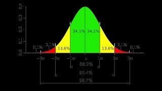
Gaussian distribution or Normal Distribution in statisctics
Krish Naik
Natural Language Processing|TF-IDF for Machine Learning| Text Prerocessing
Krish Naik
Log Normal Distribution in Statistics
Krish Naik
Covariance in Statistics
Krish Naik
Confusion matrix, Precision, Recall| Data Science Interview questions
Krish Naik
Tutorial 44-Balanced vs Imbalanced Dataset and how to handle Imbalanced Dataset
Krish Naik
Implementing a Spam classifier in python| Natural Language Processing
Krish Naik
Tutorial 11-Exploratory Data Analysis(EDA) of Titanic dataset
Krish Naik
Face Recognition using open CV and VGG 16 Transfer Learning
Krish Naik
Pedestrian Detection using OpenCV from Videos
Krish Naik
Face and Eye Detection from Videos using HAAR Cascade Classifier
Krish Naik
Reading, Writing and Displaying images with Opencv| OpenCV Tutorial
Krish Naik
OpenCV Installation | OpenCV tutorial
Krish Naik
Face and Eye Detection from Images using HAAR Cascade Classifier
Krish Naik
Car Detection using HAAR Cascade and Opencv from Videos.
Krish Naik
Using OpenFace for Face recognition in Keras
Krish Naik
OpenPose Tutorial with Tensorflow
Krish Naik
Multiple Linear Regression using python and sklearn
Krish Naik
Dimensional Reduction| Principal Component Analysis
Krish Naik
Movie Recommender System using Python
Krish Naik
TPR,FPR,FNR,TNR, Confusion Matrix
Krish Naik
Precision, Recall and F1-Score
Krish Naik
Artificial Neural Network for Customer's Exit Prediction from Bank
Krish Naik
GridSearchCV- Select the best hyperparameter for any Classification Model
Krish Naik
RandomizedSearchCV- Select the best hyperparameter for any Classification Model
Krish Naik
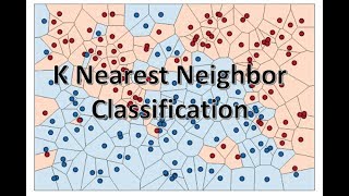
K Nearest Neighbor classification with Intuition and practical solution
Krish Naik
K Means Clustering Intuition
Krish Naik
Create custom Alexa Skill- Lambda function- Part2
Krish Naik
Hierarchical Clustering intuition
Krish Naik
Implement Transfer Learning with a generic Code Template
Krish Naik
Gender Classifier and Age Estimator using Resnet Convolution Neural Network
Krish Naik
Unlock Your Application With Your Face using OpenCV
Krish Naik
Draw rectangle from webcam and sketch process it on a live feed
Krish Naik
Complete Life Cycle of a Data Science Project
Krish Naik
How we can apply Machine Learning in Finance
Krish Naik
Deep Learning in Medical Science
Krish Naik
How to switch your career to Data Science.
Krish Naik
Linear Regression Mathematical Intuition
Krish Naik
Handle Categorical features using Python
Krish Naik
Machine Learning Algorithm- Which one to choose for your Problem?
Krish Naik
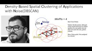
DBSCAN Clustering Easily Explained with Implementation
Krish Naik
Curse of Dimensionality Easily explained| Machine Learning
Krish Naik
Feature Selection Techniques Easily Explained | Machine Learning
Krish Naik
Tutorial 29-R square and Adjusted R square Clearly Explained| Machine Learning
Krish Naik
Cross Validation using sklearn and python | Machine Learning
Krish Naik
Handling Missing Data Easily Explained| Machine Learning
Krish Naik
Deploy Machine Learning Model using Flask
Krish Naik
Deployment of Deep Learning Model using Flask
Krish Naik
How to Visualize Multiple Linear Regression in python
Krish Naik
K Nearest Neighbour Easily Explained with Implementation
Krish Naik
Predicting Heart Disease using Machine Learning
Krish Naik
Predicting Lungs Disease using Deep Learning
Krish Naik
Stock Sentiment Analysis using News Headlines
Krish Naik
Random Forest(Bootstrap Aggregation) Easily Explained
Krish Naik
Voting Classifier(Hard Voting and Soft Voting Classifier)
Krish Naik
Credit Card Fraud Detection using Machine Learning from Kaggle
Krish Naik
Hyperparameter Optimization for Xgboost
Krish Naik
Tutorial 45-Handling imbalanced Dataset using python- Part 1
Krish Naik
More on: BI Tools
View skill →


Related AI Lessons
⚡
⚡
⚡
⚡
How to Create a Second Version of Yourself Inside Obsidian Using AI (Step-by-Step Guide)
Medium · ChatGPT
How to prepare for Spain civil service TIC exam using AI in 2026
Dev.to · David García
Going Viral! How I Created AI Kissing Videos Step by Step Easily Using AIAI.com
Medium · AI
How to prepare TIC teacher exams in Spain with AI (oposiciones 2026)
Dev.to AI
🎓
Tutor Explanation
