Unsupervised Learning | PCA and Clustering | Data Science with Marco
Key Takeaways
This video explores unsupervised learning concepts, including Principal Component Analysis (PCA) and clustering algorithms such as K-means, using tools like numpy, matplotlib, and scikit-learn.
Full Transcript
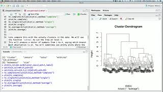
hi everyone and welcome to data science with marco today we're covering unsupervised learning methods and we'll mainly cover principal component analysis also called pca and clustering methods as always we have a bit of theory at the beginning and then we move on to coding those algorithms in a project setting let's get started let's cover some theory about unsupervised learning unsupervised learning is a set of statistical tools for scenarios in which we have features but no targets this means that we cannot make predictions instead we are interested in finding a way to visualize data or discovering a subgroup of similar observations unsupervised learning tends to be a bit more challenging because the analysis is subjective also it's hard to assess if the results are good or bad since there is no true answer in this tutorial we will mainly focus on two techniques principal component analysis or pca and clustering algorithms let's cover pca first pca is a process by which principal components are computed and used to better understand data they can also be used for visualizations now what is a principal component well suppose you want to visualize and observations on a set of p features you could do a 2d plots of each two features at a time but that's not efficient and unrealistic if p is very large with pca you can find a low dimensional representation of the data set that contains as much of the variance as possible that means that you will only consider the most interesting features since they account for the majority of the variants and therefore a principal component is simply the normalized linear combination of a feature that has the largest variance you see the equation here and that should remind you a bit of linear regression also this equation is for the first component the next one will be in a direction perpendicular to the first one and the third component will be perpendicular to the first two principal components in the equation phi is referred to as the loadings and they must maximize the equation you see on the screen and the sum of squared phi must be equal to one that's it for pca let's take a look at clustering methods clustering is a set of techniques for finding subgroups or clusters in a data set this helps us to partition the data into observations that are similar to one another and an application of that could be market segmentation in the context of marketing we will first explore key means clustering which partitions the data in a specified number of kick clusters and we will also look at hierarchical clustering which does not need a specific number of clusters instead we can generate a dendrogram and see the clusters for all possible number of clusters so first let's focus on k-means this method simply separates the observations into k clusters and we must provide that number k it assumes that each observation belongs to at least one of the k clusters and that the clusters do not overlap it is important to note that the variation within each cluster is minimized here you can see an example of how the number of clusters will affect how the data is partitioned feel free to pause the video if you want to study this a bit longer clustering is achieved by minimizing the sum of the square euclidean distance between each observations in a cluster as expressed by the equation below to do so the algorithm first starts by randomly assigning each observation to a cluster then for each cluster a centroid is computed which is a vector representing the mean of the features in the cluster then each observations is assigned to the cluster whose centroid is the closest the two steps above are repeated until the cluster assignment stops changing note that k-means will find a local minimum therefore it highly depends on the initial cluster assignment so make sure to run the algorithm multiple times to see if you always get the same results now let's learn more about hierarchical clustering as i mentioned the potential disadvantage of k-means is that you must specify the number of clusters and sometimes you simply don't know how many clusters you need this is when hierarchical clustering comes in because you do not need to specify the number of clusters the most common type of hierarchical clustering is called agglomerative clustering it generates a dendrogram from the leaves and clusters are combined into larger clusters up to the trunk here are examples of dendrograms we see the individual observations at the bottom and they are combined into larger clusters as you move up in the y-axis the algorithm is fairly easy to understand it starts by defining a dissimilarity measure between each pair of observations and it assumes that each observations pertains to its own cluster then the two most similar clusters are combined so there are n minus one clusters the next two are combined resulting in n minus two clusters and so on and so forth until all observations fall in one large cluster although simple how do we define the dissimilarity measure that depends on the type of linkage and there are four types complete single average and centroid complete is also called maximal inter-cluster dissimilarity it computes all pairwise dissimilarities in cluster a and b and records the largest one with single it's the opposite and we talk about the minimal inter-cluster or the similarity here the smallest of the sim the similarities is recorded and that can mean that single observations are fused one at a time then we have average as the name suggests the average of the pairwise dissimilarities is recorded and finally there is centroid which which computes the dissimilarity between the centroids of cluster a and b this is sometimes a problem as smaller clusters can be more similar to a larger one than to their individual clusters which can lead to inversions complete average and centroid are definitely the most popular types of linkage note that the final dendrogram highly depends on the linkage as you can see here average and complete are pretty similar but with single linkage the dendrogram is quite unbalanced and that's why this method is not used often you can also see the individual observations being merged into larger clusters so that's it for the theory let's get coding now let's apply what we learned in python now these exercises are available as examples on the sk-learn website i am simply reworking them a bit or explaining them here the links are in the description and the complete notebook on github is also in the description down below so we'll start off by importing some libraries we will need numpy we will also need matplotlib.pyplot as plt and finally from sklearn.utils we will import shuffle let's kick off this tutorial with a clustering we will do color quantization with k-means which is a technique to reduce the number of colors of an image while keeping the integrity of the image so to do that we will learn we will need from sklearn.datasets uh import load underscore sample underscore image and from sklearn dot cluster we will import k-means now after importing our libraries we will load the image of a flower so the flower will be equal to load sample image and we will pass in the name of the image in this case it is flower dot jpeg now we need to convert to floats and divide by 255 because colors are expressed as rgb right red green and blue with values from 0 to 255 so we need to normalize that so that the image displays correctly with matplotlib so this is what we are doing here so we convert two floats and we divide by 255 to normalize everything finally we can show the image with plt.mshow and we pass in flower now i have made a mistake here the name np is not defined that's because i did not import numpy as np sorry about that so after re-running this cell and re-running this cell here we finally get the picture of our flower and this is what you should get now we will change the image to a 2d matrix so width height and depth will be equal to original shape which is tuple of flower dot shape here uh d is the depth will be three uh because as i as i explained the earlier each layer will correspond to either red green or blue so three values in this case and now we reshape it so image array is equal to np.reshape flower and then we'll reshape with the width times the height and the other dimension will be the depth awesome now we will reduce the number of colors to 64 by running the k-means algorithm where k will be set to 64. so our image sample will be equal to shuffle the image array we'll give it a random state equal to 42 so that the results are constant whenever we rerun the cell and we'll take the first 1000 samples now we will fit the k-means algorithm and we set here the number of colors as i said this will be equal to 64. then k-means will be equal to k means we initialize the model we pass in the number of clusters which is the same as the number of colors in this case and again the random state equal to 42 because as you know from the theory part um k-means starts by randomly assigning uh each observation to a cluster so we keep the random state equal to 42 to give the same results every time and then we simply fit the algorithm then we get the indices for each color for the full image that will be useful when we need to reconstruct the image right so each pixel in the 2d array will be assigned to a certain cluster and that will help us to bring back the color and rebuild the image so it's simply the labels which is the prediction from the k-means now we need to write a function to rebuild the image so like i said each pixel is assigned to a cluster which corresponds to a specific color so we define reconstruct underscore image and we will need as parameters the cluster centers we'll need the labels and we pass in the width and the height of the picture so d will be equal to the cluster centers dot shape and we take d at index 1 then the image will be simply an array of zeros in this case and the shape will of course be the width the height and the depth the label index will start at zero and then for i in the range of the width and for j in the range of the height we write that image at index i j so this is the coordinates in the 2d matrix will be equal to the cluster centers at labels and that itself will be at the label index and then we increment the label index so plus equal one and finally we return the reconstructed image so that's it for this function now we are ready to display both the original image and the reconstructed one with only 64 colors so the first plot will be the original image so we'll turn off the axes and then plt.title will be the original image with 96 615 colors and then we will show the original image which in this case is simply flower and now our second plot so plt.figure 2. here we will display the reconstructed image so again turning off the axes the title will be here we will write a string actually while passing a parameter in this string so reconstructed image with n colors because you can change the number of colors we will do that after and then we show the reconstructed image so in here in there we will pass in our function we construct image and you pass in k-means dot cluster underscore centers underscore pass in also the labels and you pass in the width and the height that we defined earlier and you get the following result so as you can see the integrity of the image is kept actually the flower itself is very similar i would say that only the background is very different so let's go above and change the number of colors just for fun so let's say we want only four colors so we're running these cells um as you can see now with four colors the image is very different but you can see it's almost like a an artistic effect that you can play around with so feel free to play around with this number of colors with yourself now let's work with pca for dimensionality reduction here we will work with the iris data set this data set has four features about three different kinds of iris flowers and our goal is to visualize the data set in two dimensions so from sqlearn.datasets we'll import load iris and from masculine decomposition import bca now let's load the iris data set so iris will be equal to load iris the features is iris.data the target is iris dot target and then the labels or target names here is iris dot target underscore names awesome now let's initialize the pca algorithm and we will specify that we want only the first two principal components since we want a 2d plot then x underscore r is pca dot fit x dot transform x now let's actually print out the amount of variance that is explained by each principal component so the explained variance ratio from pca and you can extract this information from the pca object itself so it's pca dot explained underscore variance underscore ratio underscore running this cell as you can see the first principal component explains 92 percent of the variance and the second one 5 so that means that a total of ninety seven percent of the variance is explained with only two components so now we are ready to plot our data set into d and that data that newly transformed data contains about 97 percent of the variance of the original data set so here we'll just specify three different colors to distinguish between the three different kind of iris flowers so the final one will be ffa 600 and we'll set the line width equal to two then plt.figure and then for color in oh sorry so for color i target name in zip and we pass in colors we will pass in uh zero one and two and we pass in the target names so zero one and two here are simply the the classes right so we'll draw a scatter plot so plt.scatter xr when y is equal to i and zero and then x r when y is equal to i and one so this is basically the x-axis and then the y-axis and the color will be equal to uh the color at this point in the loop alpha will be equal to 0.8 and then lw is at it equal to lw that we specified above finally the label will be equal to the target name add that specific step in the loop now we will simply put a legend on our plot the location sorry location equal will be equal to best and we don't want any shadow finally let's set a title to our plot so pca of iris dataset running this cell as you can see now we get this plot right here and so you can visualize in two dimension a dataset that contained four features and three classes so now you could follow up with some classifier maybe decision trees on this transform data set to classify each kind of flower alright so that's it about unsupervised learning i hope that you learned something new and if you did please give a like to the video also subscribe to the channel as i have way more content coming up and we'll move on to more advanced techniques later on stay tuned
Original Description
🐍Code: 6:30
Full notebook on Github: https://github.com/marcopeix/datasciencewithmarco/blob/master/Unsupervised%20Learning.ipynb
In this video, we explore the concept of unsupervised learning by taking an in-depth look at principal component analysis (PCA) and clustering algorithms such as K-means. As always, we cover some theory and follow up with coding examples in Python.
Like the video and subscribe to the channel for more data science content!
Follow me on Medium: https://medium.com/@marcopeixeiro
Coding examples inspired by the following scikit-learn examples:
- Clustering: https://scikit-learn.org/stable/auto_examples/cluster/plot_color_quantization.html#sphx-glr-auto-examples-cluster-plot-color-quantization-py
- PCA: https://scikit-learn.org/stable/auto_examples/decomposition/plot_pca_vs_lda.html
Watch on YouTube ↗
(saves to browser)
Sign in to unlock AI tutor explanation · ⚡30
Playlist
Uploads from Data Science with Marco · Data Science with Marco · 6 of 38
1
 2
2
 3
3
 4
4
 5
5
 ▶
▶
 7
7
 8
8
 9
9
 10
10
 11
11
 12
12
 13
13
 14
14
 15
15
 16
16
 17
17
 18
18
 19
19
 20
20
 21
21
 22
22
 23
23
 24
24
 25
25
 26
26
 27
27
 28
28
 29
29
 30
30
 31
31
 32
32
 33
33
 34
34
 35
35
 36
36
 37
37
 38
38

Linear Regression in Python | Data Science with Marco
Data Science with Marco
Classification in Python | logistic regression, LDA, QDA | Data Science With Marco
Data Science with Marco
Resampling and Regularization | Data Science with Marco
Data Science with Marco
Decision Trees | Data Science with Marco
Data Science with Marco
Suppor Vector Machine (SVM) in Python | Data Science with Marco
Data Science with Marco
Unsupervised Learning | PCA and Clustering | Data Science with Marco
Data Science with Marco
Data Science Portfolio Project: Regression #1 | Data Science with Marco
Data Science with Marco
Data Science Portfolio Project: Regression #2 | Data Science with Marco
Data Science with Marco
What Are Time Series - Applied Time Series Analysis in Python and TensorFlow
Data Science with Marco
Basic Statistics - Applied Time Series Analysis in Python and TensorFlow
Data Science with Marco
Autocorrelation and White Noise - Applied Time Series Analysis in Python and TensorFlow
Data Science with Marco
Stationarity and Differencing - Applied Time Series Analysis in Python and TensorFlow
Data Science with Marco
Random Walk Model - Applied Time Series Analysis in Python and TensorFlow
Data Science with Marco
Moving Average Process - Applied Time Series Analysis in Python and TensorFlow
Data Science with Marco
Autoregressive Process - Applied Time Series Analysis in Python and TensorFlow
Data Science with Marco
ARMA Model - Time Series Analysis in Python and TensorFlow
Data Science with Marco
What is data science?
Data Science with Marco
Answering DATA SCIENCE questions #1 - Why learn SQL when Python and R exist?
Data Science with Marco
R vs Python in the Industry - Data Science Q&A #datascience #datasciencecareer #careeradvice
Data Science with Marco
Data science or data engineering - which is best for you? #datascience #datasciencecareer
Data Science with Marco
Where to find data for data science projetcs? #datascience #datasciencecareer
Data Science with Marco
Data science certificates on resume? #datascience #datasciencecareer #careeradvice
Data Science with Marco
Should you aim for data science or data engineering? | Data Science Q&A #1
Data Science with Marco
Don't waste time on this | #datascience #datasciencecareer
Data Science with Marco
Low-code AI tools - are they good? | #datascience #datasciencecareer #careeradvice
Data Science With Marco
How to grow as a data scientist after 2+ years of experience? #datascience #datasciencecareer
Data Science with Marco
Transition into DATA SCIENCE without a masters or bootcamp #careertransition
Data Science With Marco
How to improve your data science profile?
Data Science With Marco
How to learn Python for data science?
Data Science With Marco
Does Scrum/Agile work for data science?
Data Science With Marco
What are the major roles in analytics and how to choose?
Data Science with Marco
Thoughts and advice for a live SQL coding round
Data Science With Marco
Data science interview question: difference between type 1 and type 2 error
Data Science With Marco
Feature selection in machine learning | Full course
Data Science With Marco
Anomaly detection in time series with Python | Data Science with Marco
Data Science With Marco
Podcast - TimeGPT, predicting the future, and more
Data Science With Marco
Big announcement - Revealing my new book
Data Science With Marco
Get Started in Time Series Forecasting in Python | Full Course
Data Science With Marco
More on: Unsupervised Learning
View skill →


Related AI Lessons
⚡
⚡
⚡
⚡
Beyond the Elephant: On Manifolds, Projections, and the Hidden Assumptions of Neural Geometry
Medium · AI
Beyond the Elephant: On Manifolds, Projections, and the Hidden Assumptions of Neural Geometry
Medium · Data Science
Beyond the Elephant: On Manifolds, Projections, and the Hidden Assumptions of Neural Geometry
Medium · Deep Learning
Beyond the Elephant: On Manifolds, Projections, and the Hidden Assumptions of Neural Geometry
Medium · LLM
🎓
Tutor Explanation