Redesigning & Coding My Website #CreateICG
Key Takeaways
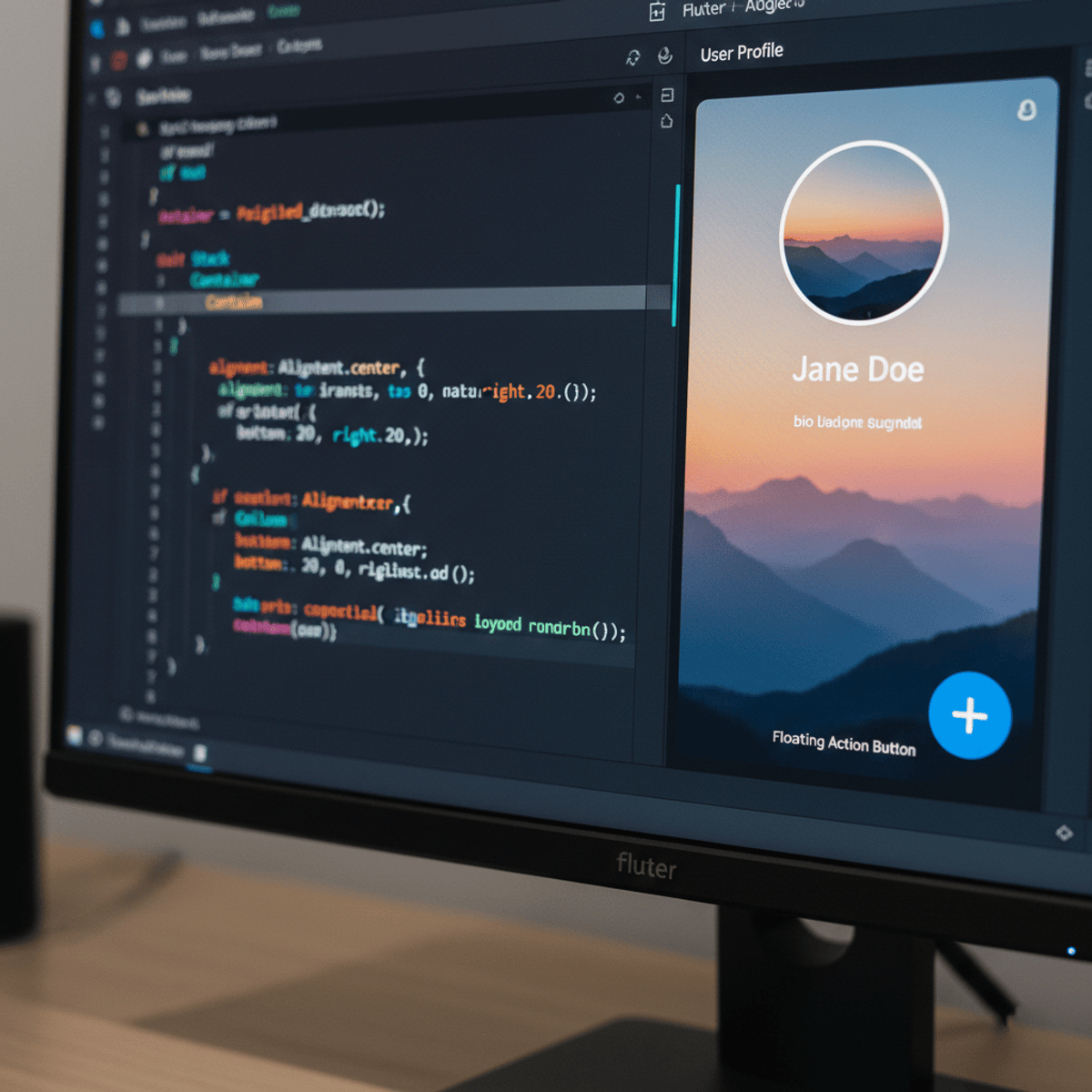
Kevin Powell redesigns and codes his personal website using a custom design in Photoshop and implements the design using HTML, CSS, and Sass, focusing on simplicity, white space, and responsiveness.
Full Transcript
hey guys and welcome to the video this week we're going to be doing something a little bit different it's the first time I'm going to be designing something so I'm making this video as part of the create ICG or it's a create Internet creators guild and there's gonna be a whole bunch of other videos based on that there's a link in the description below for the playlist of YouTube stuff and you can find it more at the website which is also linked down in the description below so for this video I thought it would be fun to redesign my homepage my homepage right now is based on a pretty standard WordPress template kind of boring I do web stuff I figure I should have a decent looking website so I want to do my own design on it instead of using a template I think it'll be a lot of fun to go through the whole process from design into the coding and seeing how I do the whole thing anyway that's enough talking let's just get into it alright guys so what I've decided to do is actually compress the whole thing do a bit of a speed design and speed coding just because it would have been like an hour and a half long video if not if I went through the whole thing and I didn't do the best job of explaining everything as I was doing it especially did the design I've never designed something and done it at the same time so right now I'm just setting up the document I went with 1600 pixels wide because it fits nicely on my screen and it's good to simulate a desktop and 4000 pixels tall just because it works well it gives me lots of room to work with in this one I'm not actually gonna use that much space but it's just sort of what I'm used to going with you can see I have some colors picked out on the side and a library in Photoshop there as well as two pictures that I'm going to be using now with this design I thought this would be a lot of fun for you know the create ICG to create my actual website and I wanted something that was really clean and simple and nice lots of white space lots of breathing room with a singular focus just on driving people to my YouTube page because really that's the main focus I have going on right now when it comes now to setting up the the text and all of that I'm really visual when I'm first doing it if I had had a really big website where I had I knew I was going to have an h1 and h2 and h3 and all of that stuff I'd probably be more focused on the ratio of the font sizes together but because I pretty much just have a title and then so a few paragraph text I just really I ball it and go with what I find visually pleasing for titles I usually just make it look good to begin with especially if it's an h1 or something like that I'm gonna focus on let's make this look good especially in the hero area where things tend to be even bigger and sort of on their own I'm gonna do it just based on I and then adjust a little bit from there just to make sure the ratios are okay but most of it's by eye you can see already I've put my main paragraph a nice big font size and then I've big space in between and then leading into my paragraph this is an image that I'm bringing in just a little thumbnail picture but I'm gonna turn that into an embedded video once I get into my actual design or the coding I found it looked a little bit boring I had a sketch originally for this and that I'm following along I had a whole bunch of sketches and this was sort of the one that I went with in the end and the sketch it looked fine on the layout but when I was doing it I found it looked a little bit boring I tried a box tried blending modes they all look terrible so then I said well what if I just make this type of box you know a stroked box instead and I thought that actually looked pretty good I just need to make a few adjustments to it to balance everything out and make it look good I want to make sure my spacing was equal and the picture was properly centered here and you know I wanted my eyes to be in the right spot my face that was kind of hard actually just getting them that to look good and again I'm just really focusing on trying to have lots of white space and a focus on what people are going to be looking at when they're here and making it easy for the eye to jump from one to the next to the next one problem people that often make when they don't have a lot of experience with a design as things get too cramped together there's too much going on in the page there's too much jumbled together there's not enough space either between paragraphs or just between different elements as well here with the text that I'm putting in I originally want to make it a little bit smaller because it was sort of my secondary paragraph text but then I realized I have almost no text on this website it's really really short I might as well just make everything paragraph text and make it all the same size make it nice and big and easy to read my focus really on this again is nice simple and clean there's not a lot of text so I can keep the font size big I decided to put a drop shadow on this what will be in my embedded video because I do want it to stand out a little bit I want it to pop off the page a little bit more than what it was doing when it was flat so yeah I just put a little bit of a drop shadow on there I wanted to make sure it was dark enough that you could see it well but not too dark you know I when you're doing a drop shadow in general subtlety is the key the more obvious it is sort of the they can be a little bit weird looking if you go too dark with them then I just went in a little button here that's gonna be finding me on YouTube nice and simple button just again I'm going for pure simplicity with this site so it's super nice and simple but now one thing I realized when I made this button is I didn't like that color blue as much as I thought I had when I picked my color scheme so don't be afraid of changing things along the way colors I find can be a bit of a problem as you work with them I find my colors I choose colors at the beginning and then sometimes I don't like them so much so here I realize that blue is really not working for me too well and I decided to come and change it I tried grabbing a color from the thumbnail but it looked ugly so I went with this sort of tealy color that I tend to like and I've been using a lot lately so I decided to go with that and you'll start to see I may have a few other things coming up later on that you might see that I use that too for that I also use that for right now what I'm doing is just organizing my layers just keeping everything nicely organized so I just did that and I my very very simple footer that's super super simple just with some social links in it and that's about it that's pretty much it for the website so you can see it's based again I'm gonna repeat myself but it's based on simplicity and lots of empty space and when you're designing things don't be afraid of the having the fact that you have room and think about what you want the person to be doing what's the the reason that are on your site and what are they going to be doing when they're on the site that you're designing so in this case really part of just my style is this clean nice look but what I find is a nice look so I definitely wanted that to come across in the feel the white space helps people focus on what are gonna be looking at and the colors I don't have a lot of color on this site but the color really is what leads the eye and helps things go along I was trying to see if I could add some color to my links down below but I just stuck with an underline in the end yeah and so I'm gonna scroll up now I think and just to show you that when you're on the site you see my name is Kevin you see the thumbnail you see the button that's the main things that people are going to be focusing on if you want to spend the time to read the text awesome most people don't spend a lot of time actually reading text on a site so I want to make my goal super obvious here on what I want people to be doing now jumping over to the code okay so the very first thing I'm gonna do now is just bringing my Typekit stuff so I can use the Proxima Nova on my site which is just copying that link the JavaScript link into there and now I'm just putting my design on the side because I like looking at my design as I'm coding things I find that's the easiest way to do it so first I'm just doing my markup right now I'm just throwing in a section for each thing it's not really a header per say there's no navigation or anything like that so I'm just building this out with a few sections this div sample video thing I'm gonna change how it's set up a little bit later I go through a few different options as I'm doing that my about me and then my footer down at the bottom I forgot to give it a class right now I come back and do that a little bit later on just pasting in all the text yet and just putting my links in now the text is done then there we go we take a look and mate just make sure everything looks like it's working and it does and so now I'm gonna go into my files and in this I end up with a lot of files I'm using sass to build this I'm just fixing those little things from the soft returns from Photoshop I get those little boxes showing up so it's just removing those and now I start just making my sass files that I'm gonna be using so I'm starting with my variable ones for colors and type and then I'm importing them into my main sass file I don't have a lot of variables to put in here I only have a couple of colors and the one font so these are pretty basic files that I'm going to do we'll see now for my type I made a little mistake here but it does I did verify that it was working I was a little distracted so I see that my font is working and then I realized I want to make this into a variable so I just called it font instead of font stack and I have my two font weights my normal a my bold it's such a simple site I wanted to keep my variables pretty simple and then I had to update it there and that's all for my colors I had my brand color which is that green color I was using my text color and the light gray that I wanted to use in my footer so I just called that one light gray in the end I know I called the BG color in the end so I'm just gonna throw those all in there we go so those are done then I got normalized and threw that in as a in my vendor folder and that should come in in a second there we go so normalize I used on all my projects I like always having it I should just automatically include it in my my folder then I realized I didn't have any container setup so I came through and put all my containers in there I'd complete I do this all the time I forgot to do my containers and then have to go back through and add them in and now I'm just in my base file setting up my container and there we go we can see that it's starting to work my image right now is not inside of a container so but then I Center aligned everything so that fixes that playing around with my font sizes a little bit just to get it looking more like what I wanted it to and now I start working on the hero section at the top so I'm just here I thought about doing a section of padding 5 m0 just to create the the spacing that I want but in the end I just realized that it wouldn't really work I ended up taking that out a little bit after I have some problem with my background position a different screen size it works perfectly at this screen size actually I think I go with our left I never end up fixing it in the video but I might get around to that 1.4 now it's still looking like that I'll get around to fixing that at one point and now I want to just typography I don't have a lot in here it's just setting up my font size I called it h1 do I keep I don't remember if I keep that as in each one or if I give it a different class name actually yeah so I originally I want to use the outline with the outline offset but then I realized that I can't with the offline out set you can't do different for right and left and top and bottom yeah I changed it to title box because I want to play around with it a little bit and I don't want I'm thinking in the future I might build out this website a little more add some more content to it I might have other H ones I probably don't want them all to have this box on it so that's why I gave it its own class playing with the line height a little bit just because my lines were really close together by default the default line height is usually not very good so I wanted to add to my default line height there now I'm in my component so I'm gonna build my button I believe Oh my video box sorry yeah so the video box first I tried a few different things for that that worked perfectly sort of for what I wanted to do but then I end up changing how I did that soon because I realize it doesn't quite work the way I want it to especially once I bring in some other stuff but anyway we'll see my final solution the translate is the big space on the bottoms because of the translate Y minus 50% it positioned the whole thing properly but yeah so now I just put the sample video on the picture itself instead of on the big div because that makes more sense but we'll see that causes problems once I bring in the iframe because iframes are funny that was when I realized I have that problem with the big space and the translate Y next I tried that which obviously was a bad idea and the padding clearly will not work so I think I end up taking a completely different solution with this yeah I just end up doing it differently with my padding and now on to my button text-decoration:none the buttons pretty simple so text-decoration:none inline-block some padding on there just to make it look good and the background color and then I just play with my padding until it looks nice there we go so I think that looks pretty good and then I do I oh I didn't do the hover effect yet I come back and do the hover effect a little bit later and now I build out the social thing down at the bottom which is super super simple that's pretty much it I'm just playing with my padding again just to make it look nice over here we go now I'm doing my buttons hover effect which I'd forgotten about originally so I want to I've thought about doing it oh I think I did I was gonna change the color of it but didn't like how it looked when I changed the color so instead I want to make it sort of get this like effect like it's moving up and down so I'm adding a drop shadow to it so when I hover on top it's gonna get a drop shadow but I'm also gonna have it move so I'm gonna use my transform scale I don't want to change the padding because that would shift the whole page around whereas the transform doesn't shift the page the transform sort of keeps everything where it was but it changes the size of it without pushing other things out of the way so that works better for making it bigger and then I just played around the speed of it my shadow and all of that until it looked a bit more natural I was also wondering I wanted the same angle on the video shadow and this other shadow but I wanted things to look proper and then my image wasn't resizing so it was causing lots of weird problems when I started trying to look at it responsibly so this is where I went and got my embed code from YouTube and tried to set it up and I ran into some problems here I won't lie to you so just going through I am if you're using an iframe controlling the width and the height can be a pain you have to give it a height if you're not you can't use height auto or it's gonna default I think 250 pixels so what I did is I put it in a wrapper so I have my sample video wrapper and I have my sample video and I'd found a trick that was supposed to work but that didn't work for me for some reason which you can see now a height of 0 with a padding ball which should set it up properly but that padding-bottom was all even was always going relative to the width of my page and it was just causing some problems it wasn't going if it was a full screen video it would have worked fine but because I didn't want it to be a full screen video it was giving you this black bar at the top and bottom and you can see I was I was getting kind of frustrated with this actually I came really close to just switching it to be an image that you'd click on and go to my page so you had 100% width it works perfectly fine I tried that in cheating with the scale to shrink the whole thing down actually is that what I ended up leaving it with I think so but then that cut yeah it got too big or it got too small so I had some issues with that too the scale did I started playing around with a whole bunch of stuff really to try and get this to work properly I was getting really frustrated with it at first that scale trick I thought was was perfect and the problem was it would just get too big at the big screen sizes I end up building some media queries into it I think because I liked it being a hundred percent at the small screen size that makes sense that it's the full screen and then at the large screen size it doesn't here I'm just fixing up a few things so I'm going into the what it would look like now on a phone size I'm setting it up properly for the phone now instead of the large screen size and I'm gonna start pumping in some media queries in a second so it looks pretty good up until now and then at my width of I think 750 I switched out the width of my sample video wrapper I give it a specific height and width that sort of locks it in and stops it from changing size and then I just played around with the sizes a little bit until I got the sizes that I want and here I was just checking what the dimensions are when you're embedding a video at the small screen size yep pretty much I was just playing around with the size to try and get it to be the size that I wanted to while keeping the right aspect ratio so I didn't get those black bars showing up I tried doing something for a second with the viewport width but I had a feeling that would screw everything up and there we go so I pretty much it grows with the page once you get to a larger screen size it gets locked in place and then I played around a little bit with the padding and everything so it overlaps the way I want it to and that was pretty much it I think yeah then and there's the site and as of this you can go to my site which is Kevin Powell dot Co and actually see it live if you want to check it out so thank you so much for watching I'm really happy you made it to the end of the video if you are here and you haven't already subscribed please consider subscribing if you've liked the video please hit the thumbs up and of course leave a comment below if you have any comments any questions whatsoever and yeah I hope to see you in my next videos
Original Description
As part of the #CreateICG week, I thought I could (re)create my personal homepage, as I wasn't very happy with what I had up there.
I sped up the design and coding, and narrate over the top to explain a bit of my process and what I'm thinking as I go through the whole thing.
Since this is not part of the ongoing series I have right now, it's a bonus video this week, the series will continue on Wednesday as usual :)
---
Find more contributions to #CreateICG here: https://createicg.wordpress.com/
And here is the YouTube Playlist: https://www.youtube.com/playlist?list=PLlDwZNRMgsJLOaYd8dqhqyHfkaIiyWrWV&jct=6yMH_KzjToDpUUkapxZlg5pMbt_2QA
Are you a creator too? Curious about the Internet Creators Guild? Find out more here: https://internetcreatorsguild.com/
Watch on YouTube ↗
(saves to browser)
Sign in to unlock AI tutor explanation · ⚡30
Playlist
Uploads from Kevin Powell · Kevin Powell · 45 of 60
1
 2
2
 3
3
 4
4
 5
5
 6
6
 7
7
 8
8
 9
9
 10
10
 11
11
 12
12
 13
13
 14
14
 15
15
 16
16
 17
17
 18
18
 19
19
 20
20
 21
21
 22
22
 23
23
 24
24
 25
25
 26
26
 27
27
 28
28
 29
29
 30
30
 31
31
 32
32
 33
33
 34
34
 35
35
 36
36
 37
37
 38
38
 39
39
 40
40
 41
41
 42
42
 43
43
 44
44
 ▶
▶
 46
46
 47
47
 48
48
 49
49
 50
50
 51
51
 52
52
 53
53
 54
54
 55
55
 56
56
 57
57
 58
58
 59
59
 60
60
How to create an awesome navigation bar with HTML & CSS
Kevin Powell
Improve your CSS by Keepin' it DRY
Kevin Powell
HTML & CSS for Beginners Part 6: Images
Kevin Powell
HTML & CSS for Beginners Part 7: File Structure
Kevin Powell
HTML & CSS for Beginners Part 4: Bold and Italic text and HTML comments
Kevin Powell
HTML & CSS for Beginners Part 5: Links
Kevin Powell
HTML & CSS for Beginners Part 3: Paragraphs and Headings
Kevin Powell
HTML and CSS for Beginners Part 1: Introduction to HTML
Kevin Powell
HTML and CSS for Beginners Part 2: Building your first web page!
Kevin Powell
HTML & CSS for Beginner Part 8: Introduction to CSS
Kevin Powell
HTML & CSS for Beginners Part 9: External CSS
Kevin Powell
HTML & CSS for Beginners Part 10: Divs & Spans
Kevin Powell
HTML & CSS for Beginners Part 11: Classes & IDs
Kevin Powell
HTML & CSS for Beginners Part 12: The CSS Box Model - Margin, Borders & Padding explained
Kevin Powell
HTML & CSS for Beginners Part 13: Background Images
Kevin Powell
HTML & CSS for Beginners Part 14: Style Text with CSS
Kevin Powell
HTML & CSS for Beginners Part 15: How to style links
Kevin Powell
HTML & CSS for Beginners Part 16: CSS selectors and Specificity
Kevin Powell
HTML & CSS for Beginners Part 17: How to Create and Style HTML Lists
Kevin Powell
HTML & CSS for Beginners Part 18: How Floats and Clears work
Kevin Powell
HTML & CSS for Beginners Part 19: Colors with CSS - hex, rgba, and hsla
Kevin Powell
HTML & CSS for Beginners Part 20: How to center a div
Kevin Powell
HTML & CSS for Beginners Part 21: How to create a basic website layout - the HTML
Kevin Powell
HTML & CSS for Beginners Part 22: How to create a basic layout - the CSS
Kevin Powell
How to Create a Responsive Website from Scratch - Part 1: The HTML #Responsive #HTML5
Kevin Powell
How to Create a Responsive Website from Scratch - Part 2: The Header and Hero area #Responsive #CSS3
Kevin Powell
How to Create a Responsive Website from Scratch - Part 3: The About Section #Responsive #CSS
Kevin Powell
How to Create a Responsive Website from Scratch - Part 4: Building a Responsive Portfolio Section
Kevin Powell
How to Create a Responsive Website from Scratch - Part 5: Call To Action and Footer #CSS #Responsive
Kevin Powell
Tutorial: Learn how to use CSS Media Queries in less than 5 minutes
Kevin Powell
End of the year upate and what's coming to my channel to start the new year
Kevin Powell
Create a CSS only Mega Dropdown Menu
Kevin Powell
CSS Tutorial: Outline and Outline Offset
Kevin Powell
CSS Blending Modes
Kevin Powell
Parallax effect | 2 different ways to add it with jQuery
Kevin Powell
CSS Units: vh, vw, vmin, vmax #css #responsive #design
Kevin Powell
How to Create a Website - Complete workflow | Part 01: Intro + Setting things up
Kevin Powell
100 Subscribers speed coding bonus video
Kevin Powell
How to Create a Website - Complete workflow | Part 02: The Markup #HTML
Kevin Powell
How to Create a Website - Complete workflow | Part 03: Sass Variables and a Mixin #Sass
Kevin Powell
How to Create a Website - Complete workflow | Part 04: Setting up the hero and header
Kevin Powell
How to Create a Website - Complete workflow | Part 05: Typography & Buttons
Kevin Powell
How to Create a Website - Complete workflow | Part 06.1: Building the navigation with Flexbox
Kevin Powell
How to Create a Website - Complete workflow | Part 06.2: Making the nav work with jQuery
Kevin Powell
Redesigning & Coding My Website #CreateICG
Kevin Powell
How to Create a Website - Complete workflow | Part 07: Starting the flexbox grid
Kevin Powell
How to Create a Website - Complete workflow | Part 08: Promo & Problem shooting!
Kevin Powell
How to Create a Website - Complete workflow | Part 09: The CTA and Footer
Kevin Powell
How to Create a Website - Complete workflow | Part 10: Making it responsive
Kevin Powell
How to Create a Website - Complete workflow | Part 11: Making it responsive con't
Kevin Powell
How to Create a Website - Complete workflow | Part 12: Putting the site online
Kevin Powell
Create a Custom Grid System with CSS Calc() and Sass
Kevin Powell
CSS em and rem explained #CSS #responsive
Kevin Powell
Should you use Bootstrap?
Kevin Powell
How to add Smooth Scrolling to your one page website with jQuery
Kevin Powell
Let's learn Bootstrap 4
Kevin Powell
How I approach designing a website - my thought process
Kevin Powell
Build a website with Bootstrap 4 - Part 1: The setup
Kevin Powell
Build a website with Bootstrap 4 - Introduction
Kevin Powell
Build a website with Bootstrap 4 - Part 2: Customizing Variables
Kevin Powell
More on: UI Design
View skill →


Related AI Lessons
⚡
⚡
⚡
⚡
A Young Designer’s Question: What Are Companies Actually Hiring For?
Medium · UX Design
Why Clear Calls-to-Action Are Essential for Business Websites
Medium · UX Design
AI in Design: The Skill That Gets Scarce When Making Gets Cheap.
Medium · AI
Sheba Manager Mobile Apps: Retail OS in the Palm of a Merchant’s Hand
Medium · UX Design
🎓
Tutor Explanation