How to Code a Card Matching Game
Skills:
Agentic Coding80%
Key Takeaways
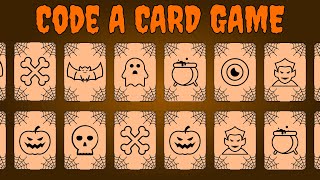
The video series covers the creation of a simple Halloween-themed card matching game using HTML, CSS, and JavaScript, with a focus on styling and animations.
Full Transcript
hello everybody my name is Kyle and this is web dev simplifier we make the web easy to understand and accessible for everyone so you can realize your dream of becoming a better web developer this is going to be a special two-part series where I work with port Exe in order to create this card matching game that you see here let me demo it real quick so first you clip to start and you'll hear some background music start playing and then you can click on any of these cards and another one will flip back over if you get an incorrect match and as soon as you find an actual match they'll just play a little animation here and you can continue to go until you either find all the matches and get a victory screen or until you don't find enough matches before the time runs out and you'll get a game over screen and then you can start the game over from that so in my video I'm going to be creating all the styles for this page we're going to lay everything out create all of the different card animations and the card images that you see here and then import exe video which is going to be the second part you're going to create all the different interactivity so in order to make the timer countdown the flips count up make the card support when you click on them all that fun stuff is going to be done in his video which is all going to be JavaScript elated so let's go start it into this right now to get started I have a project open in Visual Studio code with an empty HTML page that links our stylesheet a folder containing all the different assets we'll need for this project are cursors fonts images and audio and then lastly an empty style sheets CSS page that we can use in order to style our different elements so to get started let's create the HTML for the text that is going to be at the top of our page here the first thing that we want to do is we want to include an h1 which is going to include a title of our page mix a mix or match we're just gonna give it a class a page title so that we can selected in our CSS later and we'll put in here the text mix or a match next we want to include a container for our actual game so we'll give them here create a div give it a class of game container and this will contain all of our game information such as our time and our member of flips as well as all the cards for our game so then inside of that we'll have another div this one will contain our game information so we'll give it to the class of game information container action which is called game info container and this is what's containing our time and our number of flips and in here we'll have a divs so we'll have a div here this will contain our actual time give it a class of game info and in here we'll put our actual time as well as inside of a span with an ID of time remaining will flip the actual time value of 100 which is our starting time the reason that we're wrapping this inside of a span here is to that later import ax sees video he can select this value and change it inside of the JavaScript without having to rewrite this time section now we can copy this paste it down and do the same thing for flips so we'll say it flips here and we'll change our ID from time remaining to be flows lastly default value to zero and now if we open this up using live server we can see we have so far as you can see we have our title as well as the time remaining as well as our count of flips so now what's going to our stylesheet and style these different elements here the first thing we'll want to do if you see over here we have custom fonts for both of these so we're going to want to include the different fonts to be that we use the font face property and then we'll give our font a name using a font family in our case the first part that we're going to want to use we're going to call it creepy this is going to be the font but it's going to be for our title of our page we're going to give that font as source so in our case this source is going to come from our assets your our assets folder it's going to be from the fonts folder inside of that and it's called creepy right there and then we need to tell the format of this and in our case the format is gua this is a waffle file and we'll just do this again so go here copy this source paste it down and the same thing for our second file which is a wife to file that way we have support for both types of files depending on which browser supports which type and then that's all we need to do for this font face so let's copy this one more time because we have our second font which is called blueness scene and we can just copy that down here since we have a luna seal off and I'm going to see that whap - as you can see inside of this fonts folder here and now we have both of those fonts imported into our page and we can start using them the last thing that I want to do before we get started styling they should change our site to use the box sizing of border box which will make sizing our elements based on a certain width much easier to do next we can tackle the actual background color that you see here on our site as you can see it's not quite a solid color and it actually changes colors where it's dark on the outside and lighter on the inside of the screen so to do that we're going to select our body element and we're going to give it a zero margin so that our background will expand the very end of our page and we'll also give it a background here and we're going to use what is called a radial gradient a radial gradient the simplest form of it takes two values the first value is the color at the very center of the screen and the second color is the color on the very outside of the element so in our case we're going to use this orangist color for the very inside of our screen and then we're going to use this brownish orange color the outside of our screen if we say that and look at our view over here you'll see that we now have this different background being applied to our elements Bluebird eyes repeating all over our page based on the height of this section of our page in order to fix this what we want is we want our page to be the full height of the screen to do this we'll select HTML here we'll set the minimum height here to be 100 uhyes and now this means that our HTML will stretch to be at least the full size of the screen no matter what so there we go now we have the background done now let's work on creating the actual fonts and colors for our different titles here so let's first select our main title which is page title and inside of here we're going to give it very orangish color for our Halloween theme so we give it this color right here we want to give it the font family of that creepy font that we created and then we also want to give it a backup font for if this creepy font is not able to load so we'll just use a serve as our default fallback font next we want to just change the font weight to not be bold because each one's by default they're bolded we want to align this text in the center of our screen and then lastly we just want to increase the font size by quite a bit so we'll get at the font size of 60 M if we save that and go back over here you'll see that our title is now exactly how we want it to be the next thing we need to work on is creating the different styles for our game info here so to do that we'll select our game info class we'll give it a color here which is going to be a slightly wider version of that Halloweeny orange color that we've created up here and we'll increase the font size to be 40 M if you save that you now see that we have this nice-looking style here in order to apply our font we just need to do the same exact thing we'll reuse our font family and instead of using creepy we use that lunacy font that we created earlier and if you say that you now see we get that funky looking farm for our color here which is exactly what our font looks like over here and that's all the styling we need to do in order to get our fonts to look as we want them to the next thing we want to work on is creating the actual cards and laying out the different elements instead of air page to be in this 4 by 4 grid to prepare for that let's jump back into our index.html and start adding the different cards that we want to our container so inside of our game container here bushes add to do with the class of the card and we're gonna want to add 16 of these divs in our page since we have 16 different cards so let's do that real quick there we go we got 16 different cards inside of our container and inside of our style.css temporarily let's just create a style for our card where we give it a background color of black we're going to give it a height here of 175 pixels and a width of 125 pixels now if we save that look back you see that we just have a block of text right now which is fine because there's no spacing around our elements and in order to create a grid-like view here what we want to do is we want to select our game container that we created earlier that wraps all these different elements and we want to use what's called CSS grid in order to display this do that we just set a display of grid honor aged in order to create a grid layout and then we needed to supply the columns we want for our grid so we'll say grid template columns and we want to have a repeat of four times and we just want to auto size so we want four columns that will automatically size themselves to be whatever the size of the elements inside of them are so if we save that you see that we now have four different columns and in order to see the different elements let's add a little bit of a gap between our elements so with adding terrific at gap here 10 pixels and this essentially will add 10 pixels with spacing around all of our different elements and as you can see we now have our cards just like we want laid out in our grid will you'll see that our grid is not quite laid out where text is on the top and our cards are on the bottom to get around this let's select that game info container that we made earlier which wraps our different game info elements in order to tell our info container to take up the entire first row what we want to do is set the grid columns and we want to say that it should go from column number one to column number negative one which is the very last column so it'll span the entirety of this column if we say that you now see that this row takes up the entire first row and nothing else is allowed on there now to get our text to line up side-by-side we can just set the display here to flex we can use justify content space between in order to get our elements to be spaced out as far away as possible and now you can see if we have a nice four by four grid with all of our different cards inside of it the last thing that we want to do is actually style our grid container here to space our elements a little nicer one side a nice margin 50 pixels on all sides and then we're going to want to justify all of our content to this Center which will just send our line our grid inside of the screen now if we save that you see that our grid is nice and centered all of our elements are perfectly spaced out and our grid is starting to look a lot like our page over here the next thing we want to do is work on styling the actual cards themselves so if they're not just black rectangles in order to do that let's take a look at the different elements that make up our card as you can see we have these four different cobweb images in the corners as well as the spider image in the very center of our screen so let's go to our index.html page here and start styling what our card should look like we know that our card is going to have two different faces so inside of our carter element here was created it we're going to give it a class of card back and this is going to be where we style the actual elements for the back side of our card which you see here and we'll also give it a class of card face since we may want to share some styles between the front and back of our card then we want to create another div and this is going to be for the front of our card so we'll get a class here which is going to be card front as well as that card face class that we created up above and this will be for all the stuff on the front of our card as you can see when we flip our card over it has the same four cobwebs but it also has another icon inside of it and a scale is slightly differently when you hover over it so now inside of our card back what we want to do is we want to add the actual cobweb images inside of here so to do that we use an image tag we're going to give it a class of cobweb this is going to be a cobweb and another class of cobweb top left since we want this to be our top left cobbler next we're going to give it a source to image which is our acid images and it's cobweb PNG and there we go now we can just close out that image tag and we can copy this image tag four different times there we go and we want to use top left top right we want to use bottom left and bottom right and this way we'll have a cobweb in all four different corners of our screen and then lastly we need one more image tag here but instead of using a cobweb we're going to use the spider so this is going to have a class of spider instead of cobweb and it's also going to have our spider PNG instead of our cobweb PNG there we go and now if you save that and look what we have you see that it's not quite looking right we have our table images and they're all being stacked on top of each other instead of being stopped into the corners so let's use our CSS in order to change that the first thing we want to do is select the actual card face that we are going to be putting these elements inside of it so we use our card face selector here and we want to style all of our card faces very similarly first we want to position these card faces absolutely so that we can overlap them on top of each other since both the back and front of our card are going to be in the same space of our screen next we want to make the whip see 100% and the height 100% inside of this next we'll give it a justify or a display here of flex so that we can position our spider inside of our screen much easier and then we're going to want to justify and align our content into the center the gala line items line item Center so now everything will show up in the center and that's exactly perfect and we also need to make our card here position:relative so that way our card face will be inside of our card and there we go you can now see that everything is inside of our card and we can work on styling the actual cobwebs so that they don't just line up like this and that they position in the corners so first we're going to select our table up here and we're going to start applying some different styles to it first we want to position it absolutely inside of our screen so that way we can position it inside of the card we want to give it just a thick width of 47 pixels and a height of 47 pixels to fill up the available space that we want these cobwebs to take up and if you say that you already see that they're now overlaying over each other in the center of our screen we can now use our different selectors here for cobweb top left in order to style how we want our top left cobweb to look first we're going to want to rotate it because it's not quite positioned exactly right as you can see we want this vertex to be in the very corner of the top left so we're going to rotate it 270 degrees we're going to position it top of 0 and I'm left with 0 so I'll show up in the top left and there we go we have one cobweb down and we need to do the same thing for our other cobwebs so we have a top right which needs no rotation and a right of zero trying to do our next one which is going to be our bottom left and here we're going to use a bottom of zero and I left at zero and then we're going to run a rotate 180 degrees just like that whoops 180 degrees there we go and then lastly we're gonna use our bottom right cobweb here right and this one will be rotated 90 degrees and there you go we now have our 4 cobwebs positioned in the corners of our card exactly how we want the next thing we want to work on is stopping our actual spider so that it'll be positioned correctly as you can see over here in order to do that but select our spider element here and we're going to make it so that it aligns to the top of the screen so we'll use a lime self flex start that it's no longer in the center and it's at the top of our screen we also want to give it a transform and we want to translate it up negative 10 pixels so that way it'll be 10 pixels higher than it default is and if we say that you see that now we have it sticking out the top of our card a little bit in order to fix that we'll just go back to our card face there and we'll use it over both hidden so anything that flows over our cart will be completely removed next we want to do is we want to make us so that when we hover over our element the spider will move down slowly to do this we need to apply a transition this will allow us to make a smooth looking animation that occurs over a period of time we wanted over the transform property we wanted to last 100 milliseconds and we'll use easy out as our different linear technique for how our animation should look and then all we need to do is go down here and when we hover over the back of our card we want to move our spider so we say card back when we hover over it select the spider element inside of that card back and we just want to change our transform transform we want to change our translated Y to be zero so that it will move down those ten pixels and if you save that and hover over the spider look you know that it actually doesn't move even though you think it should and that's because if you look at our HTML here our card front is in front of our card back so it's taking all of the hover events itself instead of giving into the card back in order to fix this let's go up here to our card face and we want to rotate our card front so we'll say card front we want to transform again and we want to rotate on the x axis and we want to rotate this 180 degrees so that way our card face is going to be completely upside down for the front of our card and we come in here and we'll just use back face visibility of hidden to say that anything that is facing the back of us should act as if it's not there so now our card front is flipped over 180 degrees so the back of it is facing us so we can no longer interact with it and that when we hover over you'll see that our spider will move down with our animation this is exactly what we want while we're on our card face we should start styling what we want the actual card to look like because over here we you see that we have the bend corners along with the border applied to our different cards so to do that what's up I hear a border radius of 12 pixels we want to apply a border width of one pixel we want to make our border-style:solid and then there we go that's all we need to do in order to style the border and the background of our different element and you see that we have that border going around our element but our background is sticking out on the sides and that's because our background is on the card so we want to move just back on to our actual card back so let's select our card back we're going to give it that background color black and while we're at it we're also going to give it a border color and this border color is going to be the same orange color that we apply to our title so if we say that you now see that we get this nice orange border around our card and everything on this card works exactly as our cards over here except for the increase in size for our different cobwebs as you can see our cobwebs grow when we hover over the cards so now let's tile that on our card let's go down to our cobwebs here and we want to do the same thing will we apply a transition only on the width of our element so when our element is changing we want to change the width over 100 millisecond so to animate over 100 milliseconds we just in ease in ease out again and we'll do the same thing for the height of our element same thing with the ease-in ease-out and there we go and now when we hover over our comp web so if we hover over the cobweb we actually wanted to be on the card back because when we hover over the entire card anywhere on the back we want to select our cobwebs all of them and we want to change the width from 47 pixels to be 52 pixels and same thing with the height 52 pixels and now is that our cobwebs grow when we hover over our card which is exactly as they do over here which is perfect as exactly what we want to do so now we can work on styling the front of our card as opposed to the back let's go to our index.html here now let's look at what the front of our card looks like so as you can see we have our exact same four cobwebs inside of the front of our card but instead of using this black cobweb in engine we're using a gray cobweb image I have a file in here called cobweb gray which we can change all these to in order to show a great cobweb as opposed to this darker black table and the last thing we need to do is use another image here which is going to be whatever image we want to use so in our case we have a bunch of different image files in here as you can see so we'll just use the bat as an example where we want our front of our card to look like and then in order to view the front of our card let's create another class here called visible that we will apply to our card when we want the front to show in the back to hide when our card visible so you say card dot visible so when I has a visible class on it we want to make our card back rotate so we'll say transform rotate and we want it to be negative 180 degrees so that our card back is now no longer being showing it is flipped 180 degrees and we're gonna do the same thing so card dot visible here and we want the card front to be rotated so that's visible so we'll use a transform here rotating X and we use 0 the same thing here well actually gonna change all these to rotate wise so that it will rotate around the y axis so it'll look like a normal card flip and there you go now if we save that and look over here you now see that we have the front of our card being shown instead of the back which is exactly what we want and if we remove this visible class we get to see the back of our card if we put it back we'll see the front of our card but as it's active what we want and in the second part of this series with Port exe he's going to actually implement adding and removing this class so the card will become visible or not visible depending on this class being there so now what style our card front to look more like the card front over here in order to do that we want to do is we want to add a background color we're going to just use this slightly lighter color that we used on our text here for our background we want to give it a border color that's just going to be a darkish gray color and if you say that you now see that our card front looks exactly like our card front over here except for our image is no longer correctly positioned in order to change that let's go to our index here and let's add a class to our things so instead of having us a spider here we're going to change this to be card value now if you say that you'll see that it's centered properly like we wanted to and we can change our value for card value we can select that instead of our Styles s CSS in order to add this animation to make it grow and shrink when we hover over the card we need to select our card here so we say card front when we hover over the card front we want to select our card value and we're going to change the scale so transform scale and we'll say that the scale should be one when we are hovering over the card and then if we just select our card value normally without hover we can say transform scale and we'll say the scale should be 0.9 so it'll be a little bit smaller and as you can see our image is shrink and when we hover over it it grows and now all we need to do is that a transition so that it'll actually smoothly grow so we can just take our transition that we used earlier on our spider and we can copy that exactly to be used for our card value so our transform property should scale over a hundred milliseconds and now as you can see it grows exactly as you want it to you also noticed that our cobwebs are not quite growing like they should so if we look down here instead of using card back we should use card face so it works on both sides of the card instead of just the back our card now if you say that you said our cobwebs also go on the front of our card as well as on the back of our card which is exactly what we want now what we want to do is we want to make a star card will actually animate the flip properly instead of just being either visible or not visible in order to do that we need to use 3d animation which means we need to set a perspective on one of our elements so if we go up here to our game container all those here let's add a perspective onto this that is going to be 500 pixels so this tells us that our user is 500 pixels away from the game container for when we rotate things in three dimensions if you're a bit confused about this 3d rotations check out a video I made on how to create a 3d button that flips on hover because the concepts are going to be very similar to what we're going to be doing in this video to make the card flip in order to test this flipping what we want to do is instead of using visible down here we'll change this to hover so now when we hover over the card it is going to essentially apply the visible spectrum so if we hover you can see that it will flip to the front and back and vice versa as we uncover and recover it'll flip which is perfect but what we also want to do is we also want to make it about transitions properly so instead of our card face here let's add another transition to slow down our animation we'll do it on the transform property we're going to make it last five hundred mils so it's a bit slower and we use ease and I ease out and now when we hover you see that our card flips over and we uncover it flips back which is exactly what we want for this example now in the actual game we don't want this to happen on hover but on click so we're just going to change this back to be invisible so that we can fly this class on click inside of the JavaScript in the second part of this video and there you go now we have the actual visible being used to determine if the card should be showing or not now let's copy this so that we have our cards all being styled exactly the same instead of our index here let's go up to our card will remove this visible class will copy our card and we just want to paste this 16 times so we'll have 16 total cards now if you say that you see that we have 16 different cards and now all we need to do inside of each one of these different cards is we want to make it so that we have two of every single one of our images so we have to bat pngs here and then we can change this here to be bones so now we'll have two bones inside of these two cards and do this all the way until we have all of our different cards in style and there we go I just finished filing all those so that we have a different elements inside of it now if we go back here in order to see this let's just make it so that our cart is going to be rotated around so that we can just remove this visible class here change it to hover again is that what we can test this and now if you hover we have a bat bat bones bones Dracula Dracula colder and colder and so on we have all the different elements instead of our matching game on the page twice and easily sorted around randomly by the JavaScript in the second part of this video so now really the only thing that we have left to do to implement for these cards is as you can see over here if I get a match here real quick you can see that the actual card will animate in a little dancing animation so we want to add this dancing animation to our cards let's first change this back to be visible instead of hover so that we don't forget to do this later and then we want to select our actual card so let's do card and we're going to use a class called matched in order to determine if our card has a valid match with it we're going to select the card value which is the image on the front of our card I wouldn't want to do is you want to add an animation to it this animation we're just going to call dance we want the animation to last a total of 1 second we want it to be linear so that it will not have any slowdowns or speed ups throughout we want it to last infinitely so it'll continue to repeat and we also want to delay it 500 milliseconds and this is because it takes our card for 500 milliseconds to flip over and we don't want it to start dancing until the card is done flipping over so now we want to create the different keyframes for this animation so in order to create a keyframe all we do is use at keyframes here call it dance dispenses with our dance animation and we'll say at 0% and at 100% we want our dance to be transform rotate of a zero so essentially it'll start and stop at the very center completely upgraded next at 25% we want to rotate 30 degrees so we'll say rotate negative 30 degrees so it'll rotate 30 degrees in one direction remember transform there we go and then at 75% we want to get the same thing but we want to rotate 30 degrees in other direction so we'll use positive here instead of negative and in order to see that instead of using this masterclass will just use hover again and we'll go in here we'll change one of our cards that's very tough to be visible and so change this visible so we can see it and now when we hover over this you'll see that it applies our dance animation after 500 milliseconds of waiting we hover off it'll stop and so on so this is exactly what we want and this will happen when two cards are matched in the second part of the video for THC it will make us this actual animation will play one thing you may notice is that in the original version or our game we have this fancy little ghost cursor and we hover over at any part of our cards we'll get a second image for our cursor that tells us that we can click on it this is very easy to implement instead of our Styles so instead of our Styles for HTML element at the very top here we want to set a custom cursor so we'll say cursor it works just the same as a background image for example we give it a URL here so our URL is assets cursors and we want to use our ghost cursor and then we just add auto property here at the end and if you save that you'll now see that we have a ghost cursor when we hover over our page which is exact what we want and to get that special hover cursor when we hover over the different elements of our page all we need to do is we need to scroll down to our card we can just set it dot card face actually we just do that just a card on cover we want to change the cursor we want to use the URL so to say assets cursors and we want to use our hover cursor again put Auto at the end if you say that we now get that fancy cursor of the ghost when we hover over our card and the normal cursor when we hover off and that's very simple to setup and all we needed to do is have these different cursor files in our project which we luckily have in our assets folder over here and that's all we need to do in order to style the different cards for our element let's go down here where we used hover and change this back to be matched so that way port exe can add this class dynamically in his JavaScript as he needs to for us to say which elements are matched and let's also go into our index here and remove visible so that all of our cards start without having any visibility at all and the last thing we need to implement is the different overlays that you saw for the Start screen the GAMEOVER screen and the victory screen so in order to do that at the very top here we're just going to add some divs so we'll say a div here we're going to give it a class we're gonna say overlay text and we'll just use visible in order to indicate if we want this to be visible or not and inside of here we'll use click to start since we want this to be visible as soon as the page loads and this is our click to start overlay text as you can see this text is visible here but it takes some space inside of our document in order to get rid of that we can go under a style spoon select our overlay text and we can make it position of text instead of relative and this will make it so that our it stays in the exact same point on the screen no matter where you scroll on the screen and it won't be inside the document so you see if we scroll down that clip to start and moves with our page which is exactly what we want the next thing we can do is set the top left right and bottom all to be zero so that way our image or our text will spread out to be the entire height width and size of the screen at all times we also want to use flexbox here so we'll say display of flex justified content center and the line items Center this will make it so that our actual text is in the very center of our screen and then so that it shows up over top of our cards we'll just use a z-index here of 100 if we say that you now see that a text is showing up over top of our cards and we wanted to make it just a lot larger as well as make us as a color of our text it's properly what we want so we can say a color here is going to be this yellowy orange color that we used for all of our headers we want to change the font family to be that creepy font that we made earlier as well as a fallback of serif you say that you announce that we have that fancier looking font right there and by default we want to make it so that we use display:none so that this is overlay text is not showing unless we have that visible class on it so let's go down into style but a visible class will remove this display flex here will go overlay text dot visible so that's it has that visible class we then want to use display flex and we also want to use an animation to make it grow into size as well as give us a background to hover over all other stuff on our page so we'll call it over leg grow we want it to last 500 milliseconds and we use for us here because we want all of the properties from the end of our animation to apply to our overlay text let's create that animation we'll use keyframes here call it overlay grow and inside of our animation all we want to do is give it a from so it'll start here we want to start with a background color and we use our GBA and we just want to use a completely transparent black background just like that and we also want to use a font size of zero so that we have absolutely no font being shown at all and then we use the two in order to say what we want to go to so we'll say we want a font size of 10 a.m. so it'll be very large and we also want a background color here but instead of being entirely opaque we want it to be 0.8 so that it is mostly opaque instead of entirely transparent if you save that you now see that our text will grow as it comes onto the screen and make our browser a little bit larger so show up all on one line if you save it again you see that our text grows up as well as the background gets darker over time which is exactly what we want for all of our different overlays now instead of our index.html let's add the final overlays for our game over and our victory screen so we can just copy this to get started paste this down and we can take visible off of click to start in order to see what our game over would look like so I'm steady here we'll put game over and we want this overlay text to also have an ID so we'll give it an ID here of game over text this ID is there only so that it could be selected in the JavaScript later to dynamically hide and show that element and then what we want to do is you want to add a small bit of text to see that we want to be able to start the game so we'll say span inside of here give it a class of overlay text small and inside of there we'll just a click to restart now if you save that you see that we have this game over and the click to restart but we don't want it to be quite styled like this so let's go into our Styles dot CSS and style it how we want we need to first select our overlay text small and all we want to do is make the font size a 30% of the font size of the larger size text and we also want to use a display here we want to use flex direction of column so that our text will stack on top of each other instead of side-by-side maybe you say that you now see we have this nice looking game over screen with a a star so when we click on this it'll restart our game but that'll be done later in the second episode in the JavaScript lastly all we need to do is at a victory screen which is going to be almost identical to this game over screen so we'll copy that paste it instead of game over text which changes the victory text and we'll also change this game over here to be victory and now if we change this to be visible and not the game over so if we move visible from game over and save it you now see this as a victory click to restart which is perfect now we can move visible from all these add it back to our click to start so this is how our game should start and you can see now our game is almost exactly how we deem it to be the last thing that we can do is make it so that our screen will scale with the size of a browser as you can see let's remove this overlay text here if we shrink the size of our browser you'll see that our actual cards don't scale to fit inside of the browser and now we can no longer see all the cards and this is why we use CSS grid it makes changing this is so easy so let's go all the way to the bottom of our style sheet here we're going to use this called a media query which allows us to do certain styles only once certain criteria is met we'll say when the max width of our screen is 600 pixels so we are less than 600 pixels wide in our screen we want to supply some special styles so we'll say the game container I'm set up here will change apart column layout so it's your grid template columns and instead of using four columns we're going to use two columns so we'll repeat here to auto so we have two auto sized columns and if you say that you already see that we now have two columns which is great and to get our time and it flips to stack on top of each other like this all we need to do is select our game info container and we just want to change the Flex direction to be column based and we want to align the items in the center now if you say that you now see that our page will scale with our browser size so if our browser is small it'll like this and as our browser grows you'll see that our columns will change at 600 pixels wide which is exactly what we want this means that our paint view here can be used on a mobile screen when it's small like this or on a desktop if it's large like this and that's everything that we need in order to create this game exactly like this game for the styles in the next part of this video port Exe will take you through all the JavaScript that you need in order to make this work exactly like you see here with all the flipping the animations the styling all that fun stuff will be done in the second part of the video so all we need to do here make it so that our Start screen is visible just like this one we load over the game and then we'll pass this off to port Exe in the second video so I hope you guys enjoyed this rather long CSS walkthrough please make sure to check out port exe channel where you can learn all the JavaScript to make the game work as it should be intended because right now none of the functionality is there so please go check out his video and make sure you see how all this javascript can be written if you guys liked the video make sure to leave a like below and a comment letting me know if you like this longer-form video and if you like the collaboration idea using port Exe as the second part of this video so thank you guys very much for watching have a good day
Original Description
In this special two part video series we will be creating a simple Halloween themed card matching game. In this first video I will be explaining all of the HTML and CSS needed to create the animations and design for the game. In the second part of the video PortEXE will explain all of the JavaScript needed to make the card game interactive and playable.
I hope you enjoy the collaboration with PortEXE. I really enjoyed working with him, and hope to do more collaboration videos in the future.
All of the images and code are available on my GitHub linked below.
PART TWO (PortEXE Video):
https://youtu.be/3uuQ3g92oPQ
Code For This Video:
https://github.com/WebDevSimplified/Mix-Or-Match
CodePen For This Video:
https://codepen.io/WebDevSimplified/pen/EdEjyx
Twitter:
https://twitter.com/DevSimplified
GitHub:
https://github.com/WebDevSimplified
CodePen:
https://codepen.io/WebDevSimplified
#Halloween #WebDevelopment #Programming
Watch on YouTube ↗
(saves to browser)
Sign in to unlock AI tutor explanation · ⚡30
Playlist
Uploads from Web Dev Simplified · Web Dev Simplified · 27 of 60
1
 2
2
 3
3
 4
4
 5
5
 6
6
 7
7
 8
8
 9
9
 10
10
 11
11
 12
12
 13
13
 14
14
 15
15
 16
16
 17
17
 18
18
 19
19
 20
20
 21
21
 22
22
 23
23
 24
24
 25
25
 26
26
 ▶
▶
 28
28
 29
29
 30
30
 31
31
 32
32
 33
33
 34
34
 35
35
 36
36
 37
37
 38
38
 39
39
 40
40
 41
41
 42
42
 43
43
 44
44
 45
45
 46
46
 47
47
 48
48
 49
49
 50
50
 51
51
 52
52
 53
53
 54
54
 55
55
 56
56
 57
57
 58
58
 59
59
 60
60

Introduction to Web Development || Setup || Part 1
Web Dev Simplified
Introduction to Web Development || Understanding the Web || Part 2
Web Dev Simplified
Introduction to HTML || Your First Web Page || Part 1
Web Dev Simplified
Introduction to HTML || Basic HTML Elements || Part 2
Web Dev Simplified
Introduction to HTML || Advanced HTML Elements || Part 3
Web Dev Simplified
Introduction to HTML || Links and Inputs || Part 4
Web Dev Simplified
Learn Git in 20 Minutes
Web Dev Simplified
5 Must Know Sites For Web Developers
Web Dev Simplified
10 Best Visual Studio Code Extensions
Web Dev Simplified
Learn CSS in 20 Minutes
Web Dev Simplified
How to Style a Modern Website (Part One)
Web Dev Simplified
How to Style a Modern Website (Part Two)
Web Dev Simplified
3D Flip Button Tutorial
Web Dev Simplified
How to Style a Modern Website (Part Three)
Web Dev Simplified
Animated Loading Spinner Tutorial
Web Dev Simplified
How to Write the Perfect Developer Resume
Web Dev Simplified
Animated Text Reveal Tutorial
Web Dev Simplified
Learn Flexbox in 15 Minutes
Web Dev Simplified
Custom Checkbox Tutorial
Web Dev Simplified
Start Contributing to Open Source (Hacktoberfest)
Web Dev Simplified
JavaScript Shopping Cart Tutorial for Beginners
Web Dev Simplified
Responsive Video Background Tutorial
Web Dev Simplified
1,000 Subscriber Giveaway
Web Dev Simplified
How To Prevent The Most Common Cross Site Scripting Attack
Web Dev Simplified
Transparent Login Form Tutorial
Web Dev Simplified
The Forgotten CSS Position
Web Dev Simplified
How to Code a Card Matching Game
Web Dev Simplified
10 Must Install Visual Studio Code Extensions
Web Dev Simplified
Learn CSS Grid in 20 Minutes
Web Dev Simplified
Learn JSON in 10 Minutes
Web Dev Simplified
10 Essential Keyboard Shortcuts For Programmers
Web Dev Simplified
What Is The Fastest Way To Load JavaScript
Web Dev Simplified
Differences Between Var, Let, and Const
Web Dev Simplified
How To Install MySQL (Server and Workbench)
Web Dev Simplified
Learn SQL In 60 Minutes
Web Dev Simplified
How To Solve SQL Problems
Web Dev Simplified
What Are Design Patterns?
Web Dev Simplified
Null Object Pattern - Design Patterns
Web Dev Simplified
Your First Node.js Web Server
Web Dev Simplified
How To Setup Payments With Node.js And Stripe
Web Dev Simplified
How To Learn Any New Programming Skill Fast
Web Dev Simplified
Asynchronous Vs Synchronous Programming
Web Dev Simplified
JavaScript ES6 Arrow Functions Tutorial
Web Dev Simplified
Are You Too Old To Learn Programming?
Web Dev Simplified
JavaScript Cookies vs Local Storage vs Session Storage
Web Dev Simplified
JavaScript Promises In 10 Minutes
Web Dev Simplified
Builder Pattern - Design Patterns
Web Dev Simplified
JavaScript == VS ===
Web Dev Simplified
JavaScript ES6 Modules
Web Dev Simplified
8 Must Know JavaScript Array Methods
Web Dev Simplified
CSS Variables Tutorial
Web Dev Simplified
JavaScript Async Await
Web Dev Simplified
How To Choose Your First Programming Language
Web Dev Simplified
Easiest Way To Work With Web Fonts
Web Dev Simplified
Singleton Pattern - Design Patterns
Web Dev Simplified
Responsive Navbar Tutorial
Web Dev Simplified
CSS Progress Bar Tutorial
Web Dev Simplified
Learn GraphQL In 40 Minutes
Web Dev Simplified
What is an API?
Web Dev Simplified
Learn How To Build A Website In 1 Hour!
Web Dev Simplified
More on: Agentic Coding
View skill →







Related Reads
📰
📰
📰
📰
How I made a scroll-scrubbed video portfolio fast (Next.js 15 + GSAP + canvas)
Dev.to · Pratham Sharma
5 Reasons HTML Is About to Change Frontend Development
Medium · Programming
5 Reasons HTML Is About to Change Frontend Development
Medium · JavaScript
copilot browser tools make the frontend reviewable
Dev.to · Paulo Victor Leite Lima Gomes
🎓
Tutor Explanation

 DeepCamp AI