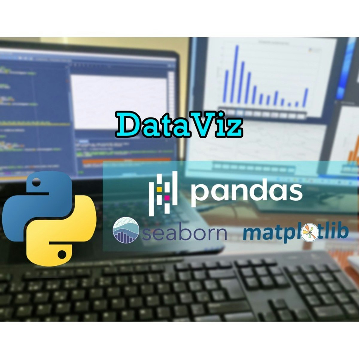
Visualización de datos con Python
Skills:
Data Literacy80%
Key Takeaways
Creates data visualizations using Pandas, Matplotlib, and Seaborn
Original Description
Este curso práctico te proporcionará las habilidades esenciales para empezar a trabajar con la visualización de datos. Comenzarás dominando la librería Pandas para la gestión de datos tabulados. Luego, explorarás Matplotlib para crear y personalizar gráficos básicos, entendiendo sus componentes clave de formato. Finalmente, simplificarás la creación de gráficos estadísticos con la potente librería Seaborn. Todos los módulos se basan en el uso de fuentes de datos reales.
Watch on External: Coursera ↗
(saves to browser)
Sign in to unlock AI tutor explanation · ⚡30
More on: Data Literacy
View skill →


Related AI Lessons
⚡
⚡
⚡
⚡
A Young Designer’s Question: What Are Companies Actually Hiring For?
Medium · UX Design
Why Clear Calls-to-Action Are Essential for Business Websites
Medium · UX Design
AI in Design: The Skill That Gets Scarce When Making Gets Cheap.
Medium · AI
Sheba Manager Mobile Apps: Retail OS in the Palm of a Merchant’s Hand
Medium · UX Design
🎓
Tutor Explanation