Typography for Developers Tutorial - Full Course
Skills:
UI Design80%
Key Takeaways
Covers typography for developers, including typeface selection and responsive typography
Full Transcript
this course is from treehouse instructor and senior product designer hope armstrong you'll learn all you need to know about creating good typography which is one of the most important aspects of good design [Music] hey i'm hope armstrong a teacher and product designer here at treehouse every day you see typography in action it's on the menu of that restaurant you love eating at it's on road signs you drive by and it's definitely all over that favorite site of yours which is let's be honest tree house of course all that to say typography is everywhere whether people realize it or not something so ubiquitous is often taken for granted but it's really powerful as designs are often mostly comprised of type there's so much to learn first we need to understand what typography is on matthew butterick's site practical typography he defines the term simply as follows typography is the visual component of the written word this means typography comes into play when words are visually displayed on surfaces like screens paper posters signs and more though the words or content of something might remain the same the typography can change let's take a look here's the text i shot the serif we can shape how it looks through typography for example we could increase the size of the text and align it in the center we could change the typeface from georgia to futura and set it in uppercase letters we could also adjust the letter spacing or tracking between characters we could go on forever making different adjustments but i wanted to give you a quick sample of typography and action if you don't know how to do any of these things don't worry we'll cover how to practically apply all of this and more later on in the course so far we've seen that typography involves changing arranging or ordering type but we wouldn't want to do this without a purpose or reason as to why a major purpose behind typography is utility this means presenting the text in a way that is useful clear and legible to its reader the content of a webpage could be incredible but if the typography is lackluster then it's going to be difficult for people to read and navigate they'll either struggle through it or quit along the way both situations are undesirable this is why typography as utility is extremely important to present text in a way that's clear orderly and legible for readers and users of your site another purpose behind typography is designing for an emotional connection type can have a personality or mood it gives off a certain vibe and conveys something to the reader before they've even digested a single word on the page the flavor of your typography should match the voice of your content you wouldn't want something that looks like chocolate ice cream to taste like tater tots let's say you have an official serious business document that's set in a fun quirky typeface although the content might send the right message the design or typography would not at all as you practice typography you'll want to make sure the design aspect of it enhances the message at hand it can keep readers engaged and also create delight in them because so many different things can come into play good typography might seem a bit tricky at first to execute i like to think of it as striking a balance between utility and designing for an emotional connection throughout this course we'll look at different ways to maintain that balance because typography is one of the most important elements of design next i want to make a distinction between typography and lettering these are two fields that are popular today but commonly confused in the industry both deal with letter forms but in different ways typography involves working with pre-made letter systems like typefaces and fonts to layout and arrange content whereas lettering involves crafting letterforms for a single use and purpose instead of utilizing a pre-made letter system this definition is based on joseph alicio's article and the teacher's notes it's great for further reading now that we understand the difference our focus for this course will be on typography and you'll be able to use those terms correctly in your industry lastly let's look at what a typeface is and the elements that define and shape it the terms typeface and font are commonly used interchangeably today but they are distinctly different a typeface is the design of a collection of characters so the term should be used when talking about the look of those letters numbers and symbols for example i dig futura it's such a good looking typeface a font is a single instance or embodiment of a specific weight width or style of a typeface for example the computer file for helvetica bold italic would be a font whereas helvetica would be the typeface next time you're out and about spot some typography you like and take note of what distinguishes it and how it makes you feel in the next video i'll explain how typography relates to the user experience typography makes or breaks a design when done well it elicits emotions and conjures an understanding or connection to a brand equally just as successfully it can slip away unnoticed as it makes reading so easy and pleasurable that the reader doesn't fixate on the letter forms themselves the typography communicates without getting in the way poor typography gives people a lower impression of a brand product or service and even worse it can make an experience difficult or confusing i'll cover three main ways that typography affects the user experience first typography is a major component of branding look at any product you use and observe the typography the company has chosen a typeface that aligns with the brand message it also aligns and differentiates itself from other brands typefaces conjure various connotations that are influenced by culture and cognitive biases and they affect how we feel about the brands second readability is important the shape of letters space between letters space between lines and width of lines all affect a person's ability to easily read text it's so common for us busy humans to quickly scan text instead of reading every word so improving the scan ability of text is something ux designers seek out third let's touch on accessibility accessibility is a core component of product design because it means to make a product or service easy to use designing for accessibility benefits everyone not just those who are differently abled remember that the people who use a product you're designing may have a physical cognitive language or learning disability they may have color blindness low vision or use a screen reader to navigate the web as far as the design goes if you adhere to the best practices of typography your design will naturally be set up to be quite accessible choosing a typeface with distinctive easy to read letters and appropriate contrast then correctly applying heading levels creating clear visual hierarchy maintaining proper alignment and making the text adequately sized will benefit everyone here are a few specific tips people with visual impairments use screen readers which read the text on the screen therefore for non-text-based media such as videos it's advisable to add a way to see the captions or transcripts the same is true for photos which should contain either visual captions or a description implemented with code don't bake text into images add text to websites and apps using markdown such as html so it's accessible to screen readers also text added and markdown can be enlarged whereas raster images get pixelated when enlarged if you must include text and images add the text to the image element with an alt tag when it gets implemented in code when conveying info such as state changes and actions don't rely on just one indicator for example when communicating a status such as a success or error include an additional design change beyond simply color when the design is implemented there are guidelines in place for developing accessible websites if you're interested in the coding details check out the teacher's notes in the upcoming video we'll learn some terms that will help us talk about typography and typefaces now that you understand what typography is let's talk about some of the terms used to describe its different elements this will include typefaces parts of letters layouts and more instead of ambiguously trying to describe something like that low swoopy part of the lowercase y these terms will make it much easier to know what you're talking about as we dive into typography let's look at the numerous elements that shape a typeface first we have the cap height this is simply the height of the capital letters next is the baseline which is pertinent to both the uppercase and lowercase letters as it's the guideline for which the majority of characters rest the height of the lowercase letter set is determined by the lowercase x so this is labeled as the x height the x height varies across typefaces and can greatly affect legibility let's look at that a high x height means the lowercase is larger in relation to the upper case whereas a low x height means the opposite it's smaller when smaller font sizes come into play a typeface with a high x height can help retain legibility because the lowercase is larger in relation to the upper case let's say you have two different typefaces and both are set at 12 point size one could be easier to read than the other due to the higher x height you'll also notice there are certain areas where some lowercase letters descend below the baseline and others ascend above the x height these are called descenders and ascenders respectively the p here has a descender and the d has an ascender you might be wondering how low can descenders go or how high can ascenders climb well that also varies across typefaces in some typefaces ascenders climb up above the cap height and others they sit below and in some cases the cap height and ascenders are aligned this last case though can affect readability and letter recognition for instance let's say you're using helvetica where the cap height and the ascender height are similar you're writing out a headline which includes the word ill the uppercase i and these two lowercase l's are hard to tell apart some might read that as ill but others might read it as the roman numeral three this would be even harder to decipher if the letters appeared mixed up in a coupon code where uppercase lowercase and numbers are present i'm not saying don't use helvetica or typefaces with a similar cap and ascender height i'm saying pay close attention to your ascenders and descenders and know what's at stake let's move on to the next term the typeface we are currently looking at has serifs on it serifs are projections that finish off the main strokes of a letter they can sometimes add legibility and letter recognition for example the problem we just encountered with the ill would not happen here because the serifs are distinctly different on those two letters distinctive character shapes help differentiate letters and serifs help letters flow the shape of letters particularly helps those with dyslexia and reading disabilities other typefaces forego serifs on their letter forms these are called sans serifs sans meaning without next let's talk about contrast contrast can relate to a few different things in typography the first deals with the actual letter forms in a typeface a typeface with high contrast would have thick vertical strokes and then horizontal strokes a typeface with low contrast would have little to no difference in stroke thickness contrast can also refer to the actual text and how it relates to the background pure black text on a pure white background creates high contrast whereas a light gray on a medium gray creates low contrast later we'll look at when creating high or low contrast is appropriate according to the wcag contrast guidelines body text color should have a contrast ratio of at least 4.5 to 1 when compared to its background color large text that is 18 points and larger should have a contrast ratio of at least three to one lastly let's discuss color like contrast color can mean a few different things in typography the first is the simplest and is probably what comes to your mind it's the actual color of text such as red blue yellow etc we can create page contrast with changes in color common color blindness conditions include red green and blue yellow people with color blindness have difficulty discerning the differences between the two therefore avoid pairing color text and backgrounds in those colors there are browser plugins and other tools which allow you to test how those with color blindnesses see your design check out the teacher's notes for links the second meaning refers to the overall density of ink or text on a page if we want we can utilize different weights of the typeface at different sizes to create even color on a page we have lighter weights at larger sizes and regular weights at smaller sizes or we can create uneven color by setting our headings to be bolder weights while keeping the paragraphs the same these heavy areas of color can create emphasis if needed when we use this term we'll distinguish its context to avoid confusion there are many other terms used to describe different parts of letter forms and typography if you're hungry for more you can also check out the teachers notes which includes links to a couple of glossaries with what we know now from this video we'll be able to better understand the different types of type in our next video now let's look at the different classifications or types of typefaces you might be wondering why is this important can't i just find something i like and use it well i'm glad you asked knowing different type genres will help you choose a proper typeface for the projects at hand and make you a better designer for instance if you're working with a client who wants the mood of their site to convey eloquence you need to know what classes or styles of typefaces lean towards that bent or if you're designing a site that's heavily influenced by a certain time period you should utilize a typeface that would have been appropriate to genres at that time as i mentioned earlier typefaces have a mood or personality the way their characters look conveys a message to the reader knowing these genres will help us see how our type is talking and what makes it distinct so without further ado let's dive in type has been classified in different ways over the years but for simplicity's sake we'll look at three major genres serif sans serifs and scripts along with their sub-genres up first we'll look at serif typefaces like we learned from our terminology typefaces can have serifs on their letter forms and this would place them in the serif genre simple enough but within this genre we have a number of nuances that will set apart different serifs into sub-genres the sub-genres we'll be covering are humanist old style transitional d-don and after the invention of the printing press in 1450 logically the creation of typefaces shortly followed humanist typefaces arose around the 1460s and 1470s with strong calligraphic influence printers were creating typefaces based on the strokes of a pen when drawing letter forms they tend to have diagonal stress lower stroke contrast and a relatively small x height serifs are not as refined these are not as common today but some examples are jensen kennerly and centaur old style came about next in the latter part of the 15th century the letter forms were getting more refined as type and less influenced by calligraphy we see less diagonal stress happening and the serifs have also changed to be more wedge-like some examples include gaudy old style palatino perpetua and plantain this brings us to the 18th century where we see transitional typefaces on the rise the trend of decreasing calligraphic flow continues and here we have vertical stress thinner and flatter serifs along with exaggerated contrast between thicks and thins some examples include baskerville bookmen and clearface itc next we have the done typefaces arriving in the late 18th century the influence of the pen is really nowhere to be found the serifs have become even thinner without any sign of bracketing contrast is taken to the extreme with thick verticals and ultra thin horizontals you might regard these typefaces as reminiscent of the high fashion culture they work great at large sizes with ample amounts of white spaces around them but as body copy at small sizes their serifs and horizontals can quickly get lost some examples include bodhani and dido now we'll head in the opposite direction with slab serifs who have extremely thick slab-like serifs and low contrast these came about in the early 19th century and were heavily used for headlines and advertising because of their bold look at me appearance most of these are utilized at large sizes but a few have been known to also work well in small text sizes some examples of these include rockwell claridin and egypteen next let's move into the new genre of sans serifs these typefaces do not have serifs on their letter forms or literally are without serifs we'll look at grotesque neo-grotesque humanist and geometrics in the late 19th century we see the rise of grotesque sans serifs though we see sans serifs as completely normal today don't forget that there wasn't much of a reference for them when they came about the design of an earlier one axon daw's grotesque has actually been theorized to be derived from didone because the typefaces have similar metrics when the serifs from d'done are removed as we'll see in other genres sans serifs are typically low contrast some examples of grotesque also include franklin gothic the neo-grotas then arises refining some of the peculiarities in early grotesques these are some of the more common sans-serif typefaces and helvetica fits right in there although there is a desire for simplicity here these aren't always great candidates for body copy because of simplicity and similarity in letter forms can often affect legibility at small sizes other examples include univer next we have humanist sands not to be confused with humanist serifs and these get back to some calligraphic roots with greater variations in line widths these are often the most legible of the sans-serif bunch hence their popular use as website body copy so you may be wondering why are they more legible first the modulation of the line thickness creates distinct character shapes this makes it easier to distinguish so it's easier to recognize words second humanist letter forms have wide apertures which for example helps us to avoid confusing a lowercase e as an o examples of humanist serifs include tahoma gill sands and fruity gear next we have our geometrics which are quite popular today as the name implies their letter forms are based on geometric shapes like circles and squares examples include futura bank gothic and gotham now we'll move into our final genre of scripts which are typefaces based on handwriting we'll subset this genre into formal and casual scripts formal scripts are based on letter forms from writing masters in the 17th and 18th centuries they have some contrast between thick and thin as they were inspired by the way a quill or nimble pen would handle the letter forms they tend to be more elegant and work well for events like weddings today casual scripts are a bit freer and well casual they tend to be more lighthearted or easygoing than their serious eloquent counterparts the contrast can range from low to high depending on the typeface they were often inspired by the way a brush or marker would handle the letter forms alright that was a lot to cover i hope it helps you get to know type a little better so we can make smarter choices down the road also think about if there is a certain genre that you naturally gravitate towards in the next video we'll look at designing for print versus digital when laying out or setting type for print the process yields a tangible document such as a piece of paper which has the text as ink on a page this final medium is quite different than a lighted screen displaying a certain amount of pixels to render type on a website now let's look at two main ways web typography differs from print and how we can smartly design with that in mind first let's talk about desktop fonts versus web fonts desktop fonts are used for print layouts and design they are fonts you install on your computer which gives you the ability to use them in word processing programs or design programs the final mediums they can end up on are pages of paper posters billboards jpegs pngs the list goes on desktop fonts were made with those mediums in mind web fonts are font files that are not intended to be used in the same way that desktop fonts are web fonts are created for the purpose of serving up a font on a website or app that might not be installed on a person's computer this is crucial when designing for the web we'll get into where to find web fonts in a bit but for now just know there are several websites that let you download web fonts for free or for purchase in the distant past when creating a website you could only use fonts that were already native to the person's computer also known as system fonts the upside of using system fonts is there's no loading time the fonts are designed for legibility on the devices and users have a familiarity with the font however it limits your choices because you have to use fonts that are native to multiple operating systems on windows and mac now that web fonts are common and well supported you have more control and customization over what your users see when designing for a mobile app the easiest option is to use a system font but if you prefer a custom font look for fonts with an app license this makes it easy to use the font across ios android and other digital publishing platforms when shopping for a web font be sure to inform the client about the ongoing cost some web font licenses are charged based on the number of monthly active users sometimes you'll have a larger budget for web fonts which provides you with some flexibility and options to choose from other times there might not be room in the budget for web font licenses or subscription models if that's the case try to help the client understand the benefits of good typography and why there is a cost associated with web fonts for example i might tell a client free typefaces are fine to use and i will happily go down that route if needed but be aware there's a relatively small number of really good versatile free fonts which limits our options because of that the good ones are often used on many sites which won't do us any favors in distinguishing your site to set your site and brand apart i would recommend going with a subscription web font model although there is some cost i think your brand and users will get much more mileage out of paid web fonts than if we went with free fonts after that sometimes a client makes room in the budget and sometimes they don't in the latter case we'll want to have all these principles we discussed in the back of our minds as we browse free web font sites to find good ones another thing to note about web fonts is this some popular typefaces have desktop licenses but may not yet be available as web fonts in this case you should reach out to the type designer or foundry to see if you can purchase a web font license or find out when one will be released do not try to use a desktop license font and convert it to a web font or serve up desktop font files on your site not only is this not smart but it's also breaking the license agreement for most typefaces lastly let's discuss another difference which is fixed layouts versus fluid layouts in print or graphic design you're designing for a fixed layout meaning the type and elements are arranged in a specific way that's locked into the medium for example if i was laying out a magazine article the type is set in a specific place with an exact width and link to the block of text once that magazine is finalized and printed the type and layout remain that way so you know exactly how the reader is going to see it with the web it's much different users may be viewing your site on a phone tablet or desktop which all have different screen sizes typography that might work great when viewing the site on a desktop computer could take a turn for the worse on a mobile phone with responsive design we can create fluid layouts so that our type and layouts can respond to a user's screen size this gives us a ton of control such as changing font sizes layouts widths and more at certain break points we'll discuss this more later that's it for now and good work finishing this stage i'll see you in the next stage where we'll look at how to choose and use typefaces [Music] with all this talk about fonts you're probably itching to get some new ones of your own you're probably familiar with the standard set of fonts that come on your computer these are called system fonts and android ios windows and mac each have a different selection these are immediately usable on your computer although there is a relatively small selection if you do decide to design with a system font when it's time to develop it with code you can either find a web font that allows everyone to see the font even if they don't have it installed or you can create what's called a font stack in your code it's a list that tells the browser which fonts to use for example you may prefer helvetica which is available on all macs but not all windows computers so you can add arial as a fallback which is available on nearly every windows computer luckily system fonts aren't the only option there are tons of fonts available for download and they're easy to install here's how to install a font find a font foundry or font distributor website then sort by the features you're looking for more on that later when you find the one download and install it on your computer you may notice there is more than one file per font style this can happen if there are different formats here are the common font formats open type truetype eot woof wolf2 and svg files with an otf extension are open type fonts this is the preferred format because it includes the most customization options and has widespread support across platforms files with a ttf extension are true type fonts this is what was used before the open type format while they still work well they don't have the extras that opentype fonts have files with an eot extension use a format created by microsoft they're meant to be used on the web however they only work in internet explorer wolf files are the preferred format for web fonts these files are compressed which means they load faster wolf 2 is a newer iteration of woof the difference is that they're more compressed it's well supported across all the major browsers if you're targeting internet explorer or older browser versions wolfe has the most support svg fonts are not recommended unless you're trying to support very old versions of safari check out the teacher's notes for websites where you can find fonts to download good typography starts with choosing a good typeface no matter how nice graphical elements look on a page a choice of a bad typeface can quickly ruin it when entering into the process of choosing a typeface first ask yourself where will it appear well on the web duh but where on the web what's the context will it be in the navigation or in the paragraphs or in the headlines or all of those answers to these questions will determine if you're looking for a text type face that is engineered for small sizes to a variety of settings or a display typeface which tends to be more flashy and works well at larger sizes these two descriptors deal with the size and function for which a typeface is intended in the next two videos we'll look at how to choose a text typeface and a display typeface it's often smart to choose a text typeface before a display because much of the copy on a site will be set in this choice in his pocket guide on combining typefaces tim brown calls on your anchor typeface because it acts as a reference point for every element in your composition he encourages you to make your body text the anchor if possible so when choosing a text typeface on the web your first priority is legibility if a site's body copy is hard to read then visitors won't stick around for long let's look at a few things to consider in determining if a typeface has good legibility and readability first does the typeface have a good x height an x height that's too low will make the lowercase letters hard to read and tell apart at small sizes an x height can also be too high if it's nearing the cap height making it hard to discern what's uppercase and what's lowercase a general measurement to go by is if the x height is around 60 to 75 percent of the cap height then you've got yourself a good candidate for a text-based next let's consider the white space around the letter forms and its impact on legibility if the space between letters also known as letter spacing is too narrow or too tight then at smaller sizes the letters can get muddled together which hurts legibility looser letter spacing also allows the letter forms to still breathe at small sizes while we do have some control over letter spacing with code it's not advisable to manually letter space body text find a typeface that already has proper looser letter spacing for text next you will want to make sure the typeface has overall even color as it balances the positive space of characters and the negative space of white space you wouldn't want your text to feel too dense in certain areas or characters which can break the reading flow a trick you can employ is to blur your eyes as you're looking at the typeface we'll manually mimic that here do any dark splashes or uneven places of color show up if so you probably want to mark that one off the list avenir next looks quite even though other areas that deal with white space are counters a counter is the fully or partially closed white space inside letter forms like o b or e large or open counters can also aid legibility because they are less prone to close up at smaller sizes let's look at nutraface tube by house industries as an example on x height and white space this family comes with a text and a display version both of them here are set at the same point size but we can immediately notice some differences though the cap heights are similar the text version has a higher x height which helps retain legibility at smaller sizes the letter spacing is looser in the text version than in the display version giving the characters encounters more room to breathe although the display face wouldn't work well at small sizes its lower x height and tighter letter spacing helps greater amounts of text fit into tighter spaces a trait that's beneficial for headlines next you want to think about the mood of the typeface matching the content at hand familiarize yourself with the content by taking the time to read it thoroughly then write down some ways to describe it in your own words is it serious light-hearted witty pointed classy as you peruse typefaces have these words in the back of your mind and see if a typeface speaks in that certain mood consider who your audience is and what kinds of styles of typefaces they might be accustomed to are they doctors lawyers kids are there certain genres that the target industry is known for you might not want to choose something that's been overused but you can still plan to these norms and create familiarity or untrust by choosing a proper type base that speaks in the right mood with text faces it should be noted that mood can be conveyed with the slightest subtleties in the letter forms a simple change in the way a serif is handled can mean the world of a difference in text because there's a lot of it on the page don't go for something that's overly ornate or has a lot of character as it'll have too much going on for body copy in any case the mood of the typeface should fit the content at hand but don't sacrifice legibility just because you like the mood of another typeface better don't forget to make sure the typeface has everything you need you would hate to get halfway through designing a layout and realize the font doesn't contain a certain character or symbol that's needed things to consider are does the typeface have a range of weights does the typeface have italic styles well we need different widths for versatility are small caps necessary what accented characters are included for language support and what kinds of numerical figures are needed to clarify that last note there are a few different styles of numerical figures we'll look at old style and lining figures old style figures vary in height and descend below the baseline at times these are nice for text and body copy as they flow well with the rhythm set by the text and they're necessary when using small caps lining figures all have the same height and baseline and are generally good for display headlines or setting with uppercase only that concludes how to choose a text typeface sometimes designers utilize a versatile text family that works for both small and large text sizes other times a single typeface won't work for all text sizes because weird intricacies can appear in the letter forms at different sizes also you might just want to have some variety with your type so in the next video we'll look at how to choose a display typeface for further study on choosing a typeface there's some great articles and resources in the teachers notes that influence what we discussed here and i highly recommend taking some time to read them now that we understand how to anchor our content with a text typeface let's see how to go about choosing a display face for the web as we saw earlier display typefaces are meant for larger sizes like big headlines site titles or pull quotes this allows for a bit more expressive and creative opportunities with letter forms nice intricacies like thin serifs would be lost at small point sizes but here they can shine big bold condensed decks with narrow counters would close up at body text sizes but here you can soak them all in a nice casual sign painter script would hardly be legible in paragraphs but here it can flow beautifully as a heading so how should we go about choosing one first make sure it's legible and readable just because the type is bigger doesn't mean that every character of a typeface will be legible if a person can't read a headline or a title then the message hasn't been enhanced by good typography it's been lost by bad typography although there's much more room for expression with display type make sure you're choosing a well-designed legible typeface just because something looks cool in a specimen image doesn't mean it'll be usable make use of the tests we talked about by blurring your eyes to see if a typeface has an even overall color in all of its characters most font sites include a type tester with their typefaces write out example headlines to make sure it's evenly spaced and see what sizes it works best at display type should have a bit tighter spacing than text typefaces other things that can help readability and display faces are short ascenders and descenders in the setting of headlines these features help reduce choppiness in the text again one of the big questions we'll want to ask is does the mood of the typeface fit the content for text faces we talked about channeling the mood with subtle nuances in typefaces with display we have a bit more room for expressiveness in the mood we can use the words we came up with throughout our content exercise in the previous video and apply them to our search for a display face that fits the right mood if you're creating a site that's set around a certain time period look for typefaces that are true to that period that will take some research but instead of choosing the mood we think the period should look like we'll be truly conveying what it was like jessica hish has some great thoughts on this which are linked to in the teachers notes next we'll again want to think about who are our readers or users if we're creating a site for people in a specific industry let's say web developers then that affects how we choose a typeface take for instance this example of how to play into the typographic styles people in the web design industry aren't accustomed to let's say we want to display snippets of example code in a blog post coding programs like atom or sublime text are used by web developers and default to monospace typefaces these are fonts originally created for typewriters whose characters all occupy the same amount of horizontal space they're great for code since it's easier to distinguish symbols and layout tabular data in plain text but they wouldn't be a great choice for body text due to decreased legibility and long paragraphs we can still play into that industry norm with our code snippets though by utilizing a mono-spaced font we can typographically make the snippet appear as it would in an actual code environment so take into account who your readers are and what styles of typefaces might be the right fit for their industry i won't fully go into the other priorities again as they were covered in the previous video but similarly to text typefaces take into account the budget and make sure a display face has everything you need in regards to weights styles or accents because display typefaces are used in fewer contacts there's a bit more flexibility here though you'd never want to set body text in all caps you can actually utilize a display face to great effect that only has uppercase characters also it's possible to have good typography with a single weighted font for your display face these situations might not be ideal but they can be worked through lastly there might be a scenario where you land a client who already has a typeface for their brands this process then is sometimes as simple as finding the webfont version of that typeface but other times there might not be web font licenses available for it yet in that case you want to find a typeface that channels a similar mood and style to the print version as you translate their brand for the web you could google alternative to insert typeface here but what's the fun in that utilize all the knowledge you've taken here to make a well-informed decision for an alternative that best spends the client you might arrive at a different conclusion than those online forums later on in the course we'll get into more details on how to pair typefaces but i hope this has helped distill some of the ambiguity around choosing a typeface for the web think about where it's going to live what makes it legible if it's mood matches the content and audience does it have everything you need and what factor will cosplay this is by no means an exact science so have some fun along the way the answers to these questions should help guide you in a good direction and leave room for your own personal taste and design choices next we'll take a look at weights styles and sizes [Music] now that we've looked at some principles and have a background in typography we'll get into how to practically achieve good typography on the web in the next few stages in the previous stage we learned how to choose fonts in this session we'll start with the basics of a font family's weights and styles like bold and italics first it'll be good to mention here that faux bold and faux italic are faux pas which simply translates to don't do them faux bold or faux italic means it is a false bold or fake italic these can occur when you only have one weight and style of a typeface design programs in css have the ability to fake the bold or italic style of that web font but believe me it ain't pretty and it can hinder legibility a faux bold is created by thickening up the original font this can create issues with legibility as counters close up dark patches of color can appear and letters get distorted type designers carefully craft their bold weights to correct these issues faux italic text is created by obliquing or slanting the original font to a certain degree at first glance you might think this looks okay but let's take a closer look italic versions of serif typefaces are actually created in a more cursive style they're not just slanted versions of their regular or roman counterparts their condensed sum and often their letter forms are entirely different altogether notice the changes here such as how the crossbar on the e becomes more fluid or how the f elegantly descends below the baseline because italics are often used for emphasis on the web true italics can better emphasize words or phrases than faux italics because of this for sans serifs this curse of nature is less accentuated so you might think that you can get away with the foe but you can't any time you oblique the font the weight of the letter forms gets unevenly distributed which creates uneven color also certain letters can change entirely in a true italic such as a two-story roman a changing to a one-story italic a again type designers meticulously build italic versions of their fonts correcting these issues so be sure to utilize fonts that have bold and italics instead of trying to fake it this not only gives the user a better experience but it also improves the legibility and readability be aware too that some typefaces online are sold as having italics but really they're just uncorrected oblique versions of their fonts this is why when we discussed using a typeface you'll want to make sure it's well built with all the necessary weights and styles let's unpack that sometimes typefaces have a basic array of weights like normal and bold but other times a family of fawns can range from thin to light to normal to semi-bold to bold to black let's look at the different weights of open sands using figma as you can see there's light light italic regular italic and so on some fonts have additional styles such as hairline which is even thinner than thin an ultra which is even thicker than extra bold or black for this entire text block the family name is said as open sans but the text within is a different weight and or style click into the text to see what it's set to if you see a message about missing fonts download all the styles of open sans from google fonts figma just has a few styles pre-installed in addition to those settings we can also make the text underlined we can format it in all caps this is preferable to typing it in all uppercase letters it's much easier to switch back to title case if you decide to change it later we can also format it in small caps but only if the font supports it we see here that open sans doesn't support small caps let's see it in playfair a google font that supports small caps be careful to not choose four small caps as we want the true small caps designed by the type designer great now you've gotten a handle on the basic formatting options next i'll introduce you to the design project we'll work on in this course as i introduce concepts i'll demo it in a design program called figma to follow along download the project files here we see copy from the science fiction book the war of the worlds i've also added some headings the text is set in alegria from google fonts i chose this typeface because of its roots and literature due to the continent hand being a book its diverse weights italics and the inclusion of small caps and other features we'll use this file to play around with type as you can see all the text is the same size which really flattens the hierarchy i can make the headings bold to stand out but there's even more we can do let's talk about text size when designing for screens in a design program you'll specify text in pixels a pixel is a fixed unit of measure that pertains to media with display screens such as a computer a good rule of thumb is to set your body text anywhere relative to 16 pixels to 24 pixels reader's eyes are usually a few feet away from the screen so these larger sizes are necessary for comfortable reading whereas smaller attacks can strain and tire their eyes this range is diverse too as every typeface is different as we've seen before the x height of a typeface can greatly affect its perceived size so use what you've learned and make a judgment call on what works best when in doubt lean towards the larger size to be safe as the design gets implemented with code the text size will likely translate to a non-fixed unit while pixels make it easy to create exact designs with a fixed unit designs are viewed on a broad range of devices out in the wild but because this is a fixed unit of measure it can create more work with responsive typography which scales text size up or down depending on the screen's size so pixels should be swapped out with responsive units like m's and rims which are relative units for font sizing this is incredibly helpful scalable and powerful for responsive typography but no need to act on that now we'll work in pixels as we design and if you decide to develop with code you can do so with relative units and minds once you've set your body text size it's time to adjust the rest of the text sizing your headings paragraphs and other text elements may seem a little tricky and it's not a great idea to just guess by shooting in the dark this can lead to inconsistent headings and paragraph sizes which is why following a typographic scale can help immensely a scale gradually increases at a certain rate to ensure consistent proportions for your font sizes the classic typographic scale increases in intervals of 1 2 3 and then 12. it's been used for centuries and is reliable to adhere to especially if you're using 16 pixels as your base size 16 pixels is great but i'd like to enlarge the body copy to 20 pixels that size is not in the classic scale but don't fret i'll look at typescale.com to build a typescale this site is incredibly helpful because you can set your base size test different scales and even import google web fonts our base size is 20 pixels let's choose the major third as i like its sizing and we can change the font family to alegria feel free to test out the different scales to see what they look like the perfect fourth and fifth are also commonly used we're now given some sizes in m's and pixels focus on pixels for now ms are important when it comes to implementing it code now let's set the font size for the headings here's the order of the headings by text size title paragraph headings and author name for simplicity i'll round down to the nearest pixel also note that you don't need to use the largest text size you can start and stop anywhere within the scale so long as you choose adjacent sizes the largest heading will be our h1 or heading 1 at 48 pixels the next will be our h2 at 39 pixels and the third will be our h3 at 31 pixels then i'll set the body text to 20 pixels i'll go ahead and create a text style for each heading this sets us up for quick edits later on and it keeps the text sizes consistent great now that's set up we still have a ways to go but getting a proper body size and scale is a great place to start once we get a good size for our body text we'll want to take a look at our measure and space we first talk about measure which is also known as line length because it deals with how many characters fit on each line of text then we'll discuss the space between letters these two concepts both work together to create readable layouts which give the type room to brief in elements of typographic style robert bringhurst recommends a measure of 45 to 75 characters per line for a single column of text a measure that's too long can tire out reader's eyes as they have to travel far across the screen and back multiple times when shifting to the next line below they can potentially lose their place a measure that's too short will have readers eyes quickly jumping back and forth to the next line which is again quite exhausting and jarring a measure that's just right will be comfortable to the user creating an enjoyable reading experience remember 45 to 75 characters works well with the mid 60s being ideal if you're working with multiple columns you can shoot for the 40 to 50 character range in our figma file our layout currently isn't very readable the lines of text span the whole page and the measure is well above what's recommended i've placed bold asterisks at the 45th and 75th characters we can remove this later but this guides us and gives us a good idea about where our line should break to determine character counts check out the teacher's notes for a tool if these two asterisks end up on the same line then we know we need to fix our measure now let's determine a good width for this text a good place to start is to multiply your body font size by 30. since the body font size is 20 pixels we could set a max width of 600 pixels the asterisks fall on two different lines which is what we want and the text width feels appropriate always take time to read through a few paragraphs to make sure the measure feels appropriate or needs adjusting although commonly confused tracking and kerning are two different techniques when it comes to typography they both deal with the space around the letter forms but in different ways we'll examine each one along with general rules of thumb for both tracking also known as letter spacing pertains to the amount of space between every character in a particular block of text you could increase or decrease the amount of tracking which will affect the text as a whole tighter tracking will result in a heavier feel whereas looser tracking gives it a lighter airier look for example let's set the title in all caps to make a bold statement now we'll want to tweak the tracking to make it easier to read we can set the tracking in our main title to be greater or less than the font's normal spacing let's add 3 percent to the heading 1 style notice how every space between every character is affected as it loosened up now let's change the value to a negative value of negative 3 which will track it inward looks good notice how this also affects how heavy the element feels on the page tighter letter spacing will result in heavier feel whereas looser letter spacing gives it a lighter airier look general rules of thumb are slightly reduce the tracking and headings by three to five percent as type gets bigger the tracking increases sometimes in headings it appears too spaced out tightening the heading to be more compact makes it more solid and more closely resemble the spacing of body type this is also commonly done to logo types do not change the tracking and body copy unless it's absolutely necessary to aid legibility don't track your type out too much as words and spaces will get muddled increase tracking in small caps or uppercase texts by five to ten percent this generally applies to uppercase headlines acronyms and long series of digits if your design program gives you the option of metric or optical tracking choose metric which uses character spacing information inside the font this is valuable information the font designer included optical spacing throws out that carefully crafted information and instead uses an algorithm that tries to guess the kerning of every character and often gets it wrong now let's look at kerning kerning deals with the amount of space between a specific character combination rather than the spacing of a whole body of text in a typeface a type designer sets the space for the left side of a letter and the right side of the letter so that it works best with all the other letters and their spacing certain character combinations can come up that are either too far apart or too close together such as uppercase av uppercase wa or uppercase t lowercase a with kerning character pairs are adjusted to be evenly spaced with the rest of the typeface generally you wouldn't need to adjust kerning if you have a well-designed font if you find off-balance letters you can manually adjust the kerning but if you find a lot then consider switching to a more balanced font so letter spacing affects the spacing of the text as a whole whereas kerning deals with the space between a specific pair of letters now let's move into talking about ligatures ligatures improve the appearance of text for letters that are too close together like the f and the i they create a smoother transition between letters by connecting certain character combinations they can also give the text a nice touch ligatures are mostly found in serif and script typefaces because they aren't as necessary in sans serifs so just because a typeface does not have them does not mean it's a bad typeface in order to utilize ligatures you'll need a typeface that supports them typeface specimen images will often showcase them or you can look through the character map on a typeface to see if they're available here i'm viewing brandontax font on myfonts.com under open type features i see it has ligatures to see it in action i can type the word figs see how the f and i letters combine the type designer decided to hide the dot of the eye when it follows a lowercase f this helps legibility and simplifies the text that's it for horizontal space stick around for the next video where we'll delve into vertical space now let's address the vertical space in our design by adjusting our line heights and looking at vertical rhythm leading also referred to as line height or line spacing deals with the vertical space between consecutive lines of text you might be familiar with it as single or double spacing and document editors like word for reference i've seen well-built typographic sites utilize line heights ranging from 135 percent to 185 percent for body text every typeface is different so line heights can vary 150 tends to be a good starting place and is commonly used figure out a good comfortable leading for your body copy first because it will be paramount to establishing vertical rhythm i'll use a hundred and sixty percent for the body text before we get into rhythm let's take a look at our headings i'll add a bit more text to make them break to the next line so we can set their line height a general rule of thumb is as heading sizes increase your line height should decrease the line height that worked for the body would most likely be too spacious for your bigger headings here i'm setting our heading 1 at 110 percent are heading two at 120 percent and are heading three at 130 percent different font sizes and families require different values so be sure to test what works best great now that those are adjusted we can look at our vertical rhythm the space between paragraphs is decent however there's more we can do with grids we'll get into that shortly the spacing between lines of text creates a rhythm that can balance a layout and enhance readability when we read we recognize patterns if a layout has a consistent line and paragraph spacing we develop pattern recognition after reading a few lines of text this will help us identify other identical spaces as part of the same pattern an unbalanced rhythm can disorient the reader vertical rhythm balances the spacing and arrangement of text as the user reads down the page every bit of text has a baseline it sits on if each line of text sits on the rhythmic baseline then you can say that it has consistent vertical balance or rhythm the concept of vertical rhythm applies first and foremost to paragraph text you can also utilize headings subheadings or images to flow in sync with your rhythm but it's often hard to perfectly execute unless a site's content is static robert bringhurst writes that headings subheads block quotations footnotes illustrations captions and other intrusions into the text create syncopations and variations against the base rhythm of regularly leaded lines these variations can and should add life to the page but the main text should also return after each variation precisely on beat and in phase that means it's okay if a heading or image breaks rhythm a bit but most important is your paragraph text returning to its rhythm after that element is introduced this offers consistent predictable line spacing as the reader scrolls through the content next we'll create a consistent rhythm using a baseline grid grids create a system for arranging content on a screen this results in layouts with an inherent rhythm when space is divided into boxes content can be contained in the rows and columns or spread to fill multiple rows and columns there's a long history of grid systems in graphic design and we see them in web and app design as well designing for the web often involves creating a design that will work across multiple devices as such while a website may allow for a multi-column design on a larger screen size such as a desktop the same website on a smartphone may render as a single column so it's easier to read within a limited space baseline grids divide the artboard in relation to the elements on the page we'll start by using layout grid and figma first select the frame now you'll see the layout grid module appear there are three different forms of grids to choose from grid column and row let's choose grid which is a uniform grid that includes columns and rows the size refers to how many pixels apart each baseline is this should correspond to the line height of our body text as mentioned before our line height is 160 and the text size is 20 pixels this means the line height comes out to be 32 pixels so that's what we'll want to set our baseline to notice how the lines of text are not sitting on the baseline but rather in between them and they're not consistently in the same place this is what we call poor rhythm let's change that to start let's get our title aligned next we need to adjust the rest of the text we're able to add 30 pixels of spacing in between paragraphs but that's the limit to the control we have if we keep all of this text in one text box so let's break these pieces out into their own text boxes for more control i've done that in this next artboard now we can align them to the grid just align them to the horizontal lines and don't worry about the vertical lines where the planet mars section starts notice how i skip two rows of spacing to give it extra vertical spacing this makes it clear a new section is starting and keeps the headline close to its corresponding intro paragraph if i had left one row before and after the heading i'd run into a ux issue called floating heading this occurs when the vertical spacing above and below a heading makes it difficult to tell which heading belongs to which series of paragraphs alright great we see our rhythm stays intact and we can easily notice where another paragraph starts a text indent is not necessary for leading paragraphs because their start already is noticeable let's take the baseline grid away to get a final look this page has much better rhythm now keep in mind if we were to change any font sizes line heights or margins that will affect vertical rhythm grids are a tool to help us make good design choices but it isn't fail proof something could be perfectly lined up to a baseline but that doesn't mean it feels right go with what feels right this does take some tinkering but don't lose sight of the forest for the trees keep in mind your first priority is making sure your body's rhythm works well with its line height and paragraph structure and as a final note break the grid when necessary this makes a bold statement and is a technique for making an element stand out have fun with it now that you have experience using a baseline grid let's delve deeper into setting paragraphs there are two main options for option one you can simply use an empty line to add space between the paragraphs that's how it is in our project right now as for option two you can indent the first line let's look at some pointers the recommended amount of indentation is 1m or in other words the base size of the body text and now for some don'ts don't indent the first line of the first paragraph after a heading or after an image or any other figure also don't add extra space in between the paragraphs let's see how this looks on our project now i have two paragraphs in the same text box but i just want to apply paragraph indentation to the second paragraph remember leading paragraphs don't get indented so i'll split the second paragraph into its own text box then i'll set the paragraph indentation to 20 pixels remember this matches the body text size and for good measure i'll remove the paragraph spacing then i'll turn the grid back on to align everything again it's up to you which option you prefer just be consistent throughout the design if you can get all these concepts down it'll be no time before you're creating typographically sound designs with good scale and rhythm alright i'll see you in the next stage where we'll get into the details of laying out type [Music] alright you made it this far good work if all this talk about type hasn't gotten you excited already then just you wait in this stage we'll look at the different ways you can layout type in a design first up is typographic hierarchy this concept is crucial to seamlessly guide readers through a page's content hierarchy helps users understand what information is most important to what's secondary tertiary and so forth in this video we'll look at how to do this with weight style size and position in the next we'll continue on the theme of hierarchy with color and pairing typefaces before we jump in let's check out all of these concepts in action at creativemornings.com let's say i wanted to watch this talk that meg lewis did in minneapolis immediately i'm presented with an array of information that's been arranged with hierarchy and minds first my eyes gravitate towards what's biggest boldest and darkest on the page the speaker's name this is the most important piece of information here and creative morning lets you easily know it next my eyes naturally continue reading and move downward to the title of the talk this is of next importance after the speaker name it's smaller but still prominent my eyes are then drawn to the bright block of color holding the white text of the city code it's a nice touch after i've taken all that in and considered if i'm still interested then i can make my way down to the smaller secondary information and read more about the speaker and where exactly the talk was and some more information about what the talk was about we see bold type multiple sizes different colors different positions and different typefaces utilized to convey the hierarchy of information on the page the combination is not only useful to the user it's also downright good looking these concepts can be incredibly powerful to create useful beautiful websites but they can also get out of hand pretty fast if we don't know what we're doing before you begin styling anything it's smart to familiarize yourself with the site's content to get an overall big picture of everything involved it's often helpful to sketch out a wireframe and then go about numbering content elements starting with one what's of most importance to what's of next importance and so forth until every piece of content has been labeled this system will inform us on how we can utilize typography to accentuate our different pieces of content we can create hierarchies simply by waiting certain blocks of text a reader's eyes will be drawn to the bolder elements on the page this hierarchy helps readers make connections between the content and relate certain sections speaking of sections typography is as much about the treatment of the text as it is with the space surrounding the text thus the importance of white space white space is empty space without content and it plays a key role in the readability of a design it gives the reader space to rest their eyes which reduces the feeling of information overload let's look at the white space of the left and right of our type margins or padding should be used to give your type room to breathe if a sentence comes too close to another element then it can disrupt the flow of reading white space is often underutilized in web design which results in cramped and cluttered layouts also it should be noted that white space doesn't have to be white if you have a dark background with lighter text we would still call that area around the text white space let's check out a good example of white space here's an article on it's nicethat.com a creative inspiration blog it's about polisher a renowned graphic designer notice how there are ample amounts of white space around the type the words are not closing in on borders they're given room to live and breathe as you can see white space can clean up a design and give it an elegant professional feel it can also emphasize content by framing it with an empty space now watch as the white space changes as i resize the browser window the content shifts into one column and the white space is maintained although and different proportions to fit comfortably on mobile alright now that certainly got me excited about hierarchy in the next video let's explore what we can do with style weight size and position typographic hierarchy seamlessly guides readers through a page's content bold weight text makes text stand out more while light text makes it recede in comparison an italic style can also be utilized to denote emphasis or set apart the text for example i can italicize the author's name to differentiate it from the other body text a different weight or italic style can be used to carry emphasis but if you overuse it you can end up with an unbalanced hierarchy and layout where everything is important so in turn nothing is important watch out for how dense your typographic color is on the overall page size is next and it can immensely help in guiding your readers through your content this is why headings have a larger check size than paragraphs while headings are often bold a bold weight is not always necessary to convey hierarchy when size is utilized base font sizes should be at least 14 pixels lastly let's look at how position can be utilized to present hierarchy when we're discussing position we're talking about the placement and space around the type in relation to the other elements or blocks of type around it let's look at a site that does this well here's a conference website for black futurism the name of the event is big and bold then my eyes are drawn to the dots where i can check out the program schedule the large days of the week make the daily schedules clear the spacing in between each session easily separates the events this is a great practical yet highly fun and bold take on conference website design next let's look at a more experimental design by jen simmons it utilizes the position of type to present hierarchy and differentiate elements when we arrive on the site we immediately see the large bauhaus headline then our eyes move to the german word for exhibition which is rotated 90 degrees in position to the right of the red square the intention of this design was to position type in a bold and unexpected way while using the red square as a grounding focal point which the typography dances around let's jump back into our example now so we're actually already utilizing position to differentiate our content and minor ways by separating our headings and paragraphs from one another when we looked at vertical spacing in the last stage i might want to accentuate our title and author name a bit more though so let's see what we can do with its position i'll center align them and give them some more padding great because of its position a reader can now engage this as separate from the main text which further establishes its hierarchy the center align style is also nice because it feels akin to the title of an old book cover positional hierarchy could also be accomplished with borders or line rules above around or below the type to separate a piece of content from the element around it the possibilities are really countless with hierarchy so remember to not make typographic choices just because a good designer knows when and why to say yes or no to an idea have a reason behind why you're bolding or italicizing text or why you're increasing sizes or why you're moving an element to a certain place while we're on the topic of positioning let's cover alignment text alignment can be justified or unjustified but unjustified is typically more readable justified text creates lines of text which evenly touch the left and right side of the column it's commonly used in newspapers since it's an efficient use of space however this can create large unsightly gaps throughout the paragraph these are referred to as rivers because the end result might look like several rivers of white space flowing throughout the text this makes it difficult for people with dyslexia it's not clear where a line of text ends which unfortunately causes them to switch to the wrong line if you must use justified text turn on hyphenation which allows words to break apart and prevent those awkward gaps left aligned text is the default the words evenly align on the left to form a hard line while the right edge is soft and ragged this allows the words to flow naturally but be aware of bad rags such as a wedge shape that creates an unintentional shape left align text can sometimes create rags on the right side which are uneven gaps often caused by long words minor gaps are expected but gaping holes should be taken into account there's really no easy way to prevent them but we can sometimes avoid them by adjusting font sizes and line lengths then there's right aligned text this is when words are evenly aligned on the right while ragged on the left since english is red left or right left align is more legible for this language while right align text can be a novel change from the usual it can be jarring centered text creates a ragged line on the left and the right if you use center text in a layout it's generally advisable to consistently center align all the text for long form text it can be difficult to read therefore i recommend that you don't center aligned paragraphs longer than three lines that's it for the first part of typographic hierarchy i'll see you in the next video as we dive more into the subject and look at caps and color we just looked at how we can create typographic hierarchy through weight style size and color now we'll continue with that theme seeing how we can establish it through caps and color first let's talk about caps and small cap characters think about an email or text you receive that was in all caps that probably felt like someone was either declaring something important or shouting at you right setting type and capital letters can create emphasis authority or hierarchy in your design if you overuse them or commit the hideous crime of setting all your body copy in them then legibility and readability will seriously be compromised they're best used in small doses like a short headline or a title and the navigation to give an official look we can also utilize small caps to spice up and add hierarchy to a design they're a little less in your face than all caps in case you're not familiar with small caps they look like uppercase characters created near a lowercase size often slightly above the x height of a typeface they're not just scaled down versions of the uppercase their weight and spacing have been finessed to match the overall font some design programs have a way to fake the small caps but i don't recommend it like faux weights and styles and ain't pretty small caps are used for abbreviations like asap official titles like the president of the united states headings like the title for a post or the opening line of a book chapter or blog article they work great with uppercase and lowercase letters along with old style figures they also flow great in body copy because of their less obtrusive nature due to their height being closer to the x height let's see them in action on jessica hish's site she uses small caps to grade a veil as she denotes the categories showcasing her recent work here she opens the paragraph with a line set in small caps and she also uses a nice job cap for the beginning letter of the text a drop cap is a large capital letter that typically spans the height of two or more lines of body text we'll take note of this to use in our design in just a bit but first let's look at small caps to use small caps first make sure the font includes support for small caps the good news is that alegria the typeface we've chosen has small caps available in its sister family alegria sc let's use jessica's site as inspiration and add small caps to the start of each paragraph small caps are typically applied to the first line or simply just the first complete thought in the first line with the text selected go to type details and choose small caps from the letter case section oh yeah this is starting to jive really well let's add a drop cap to our text to give it extra emphasis and style there currently isn't an easy way to do this in figma you have to craft each piece i started by breaking out the n into its own text block then i made its text size 108 pixels so it spans three lines of text next i duplicated the first part of the paragraph and cropped down the first three rows i positioned the rest of the paragraph underneath now it appears as if it's wrapping around the drop cap it accentuates the first paragraph but it's now the biggest piece of type on the page don't worry that'll soon change let's look at how to utilize color with type first you'll want to make sure the text color has good contrast with its background color if the contrast is too low then the type and its background color will start to blend together making it hard to decipher if it's too high then it can tire out a reader's eyes due to the bright nature of screens pure black and white work well together in print but on the web you should stick to a subtle black when set on a white background and vice versa on this example page the text has a hex color code of hashtag 333 which is a dark gray and the background is an off-white color at hashtag f9f9f9 almost all popular content heavy websites utilize a light background with dark text for their main body copy versus a dark background with light text don't forget to take into account colorblindness and accessibility with this concept of contrast look in the teacher's notes for a tool that will allow you to test for color contrast scores you'll want a score of aaa for maximum legibility which is especially helpful for long form texts to be read for a significant period of time a score of a a is a good goal for body text a a large is the lowest amount of contrast needed for headlines or texts around 18 pixels with typographic hierarchy more contrast will grab attention whereas subtler contrast will blend in another way to think about this is the primary or important pieces of content should be easily noticed whereas secondary pieces can blend more with the design alright let's jump back into the project i want to give our title and author name further distinction from the text to do this i'll put a dark background color behind the title i'll use a rectangle align it to the baseline grid and set the fill to pound 1e1e1e and more subtle black then i'll set the color of the type to pound f9f9f9 a more subtle white then i'll just align this text back onto the baseline see how that looks all right now i want to make the author name a bit less prominent by changing its color to do that i'll set it to pound 99999 which is a mid-gray it's more subdued yet still meets the accessibility guidelines for text contrast it scores at 5.85 great now our title is further accentuated because its color contrast is much higher than the author's name the page is getting there but let's spice it up a little more by adding a burnt orangish red color to our heading 2. with mars being the red planet i think it's fitting this color has good contrast with the background and distinguishes our headings further while adding some variety to the design i'll set the body text to a dark gray pound 333 pure black on a white background is hard on the eyes and the gray gives it some nuance i'm going to stop here with color as i don't want to go overboard too many colors can make it hard for users to understand typographic hierarchy and it can clutter up a design smart color hierarchy helps users recognize patterns within the page links should look like links and other elements should not if similar colors are used then users may think something is clickable when it in fact is not keeping heading colors persistent can also aid readers in recognizing them quicker just be sure to not only rely on color when signifying status or interactions multiple indicators make your design more accessible that's it for hierarchy remember it's all about balancing and utilizing these different techniques wisely block quotes headings metadata navigation and more are all at your disposal to style so design wisely with a clear hierarchy to close this session i want to give you some encouragement in an article on typekit frank chamero says i'd suggest that most great examples of fine typography are merely designs that have wise typeface choices savvy use of space and a clear hierarchy that's echoed through the structure and presentation of the text you now know how to do all those things with what you learned from the past few stages it'll take some practice for sure but the groundwork is there in the next video i'll cover layout treatments let's go beyond paragraphs any time there's a list you can opt to make it more engaging by styling it as a bulleted or numbered list and pull quotes help break up the monotony of long columns of text while bringing emphasis to a message punctuation requires characters to be positioned outside the margin edge this is commonly used for pull quotes and bulleted lists to create an even visual edge for example hanging quotes keep the left alignment balanced so it increases readability in the text a quotation mark that is flush with the text like we see here can interrupt the left margin and disrupt the rhythm for the reader compared to the one that is not to keep quotation marks clear of the edges we can give the text a negative text indent we also have the option to hang the list markers in lists which can help the flow of text because the margin edge is well defined and continuous compared to one that is indented either one is acceptable so it's really up to us to go with what feels right text and list items should also be consistently aligned if a list item runs more than one line of text and isn't aligned well then renek flow can be interrupted because our eyes look for straight lines make sure the list markers are away from the edges of text which will make for a much cleaner reading experience another layout trick is using horizontal rules to create clear sections of content a horizontal rule is a divider that can spread across a column it can spread the full width or only cover a portion it can be a simple line or something more ornate check out this example by jules forest the horizontal rule above and below the pull quote give the piece visual interest and emphasize the quoted text when combining text with an image play around with how the text wraps around the image in addition to forming rectangular paragraphs around an image you can make the text glide along the edge of the object in the image check out this design by jen simmons the text forms a rounded edge which wraps around the tomato finally the last example i want to show you is tables tables are an excellent way to show tabular data in columns and rows it helps readers compare content as it easily organizes data on the screen the trick with tables is to use borders sparingly check out the pricing table for slack the columns are subtle and the rows are more defined to help you compare the features lastly let's look at how we can establish hierarchy by pairing different typefaces we talked about how to choose a typeface earlier so we're working under the understanding that we should pair it based on the text typeface we've chosen typeface pairs aren't always necessary and beginners are sometimes encouraged to only use one typeface in order to really learn the ins and outs of good typography until they're ready to start pairing type you can start by staying within a typeface and choosing different weights or you can pair a sans serif with the sarah from the same family for example ff meta and ff meta serif typography gets harder to execute well once you throw two or more in the mix but it's well worth the variety here are some basic pairing rules to go by first pair typefaces with similar proportions this means taking into account what we learned about letter forms from our first stage a sans serif type base with a similar x height proportions and contrast to a serif type base can pair well together you can even utilize super families that have multiple weights of sands and serif counterparts that work great with one another pair typefaces with complementary personalities besides the fact that it's incredibly helpful one of the things i really like about hoffler and coast techniques for combining fonts is how they talk about their typefaces personalities or moods check out the link in the teachers notes as you pair typefaces try to classify the mood each one is conveying and see if they jive and play well together pair typefaces from the same historical period jessica hish whose immersive article on typography is linked in the teacher's notes has some great thoughts on this if you're building a site focused around a certain time period then research and find out as much as you can about typefaces in that era you might even find some pics of a storefront or sign with a great typeface pair for inspiration pair typefaces from the same designer type designers often have a certain style that can be found throughout each of their faces the style forms a common bond that holds the two or more together this especially works in your favor if they have a vast array of families to choose from lastly explore more try out different combinations sometimes you can stumble upon a typeface pair you wouldn't have imagined working it's like kale and frozen bananas you definitely thought they wouldn't work together but oh do they make a tasty smoothie a great site i love to peruse is called fontsnews.com it catalogs different typefaces used in print web and all types of media it's great for inspiration on different type combinations and pairs take a few minutes to check it out all right now let's look at our project one more time i've chosen a typeface for the title of our page whose personality i think pairs well with the theme of the content and our serif alegria it's called pathway gothic 1 and can be found on google fonts notice that it doesn't have a bunch of weights or styles but that's ok for this specific use i chose it due to its tall letter forms and no-nonsense look i mean if the worlds are at war then we're not messing around its tough and classy personality complements alegria's elegant and energetic letter forms i'll set the title in this font then i'll adjust our font size to 124 pixels as i want the title to really stand out on the page looks great i really like this typeface pair and feel like the body copy keeps our book vibe intact while the title gives it an authoritative look that fits the theme of the content it almost feels like a newspaper declaring a headline when you get back i'll be waiting for you in our next video on how to go even further with typography we'll talk about how to translate all of this to different screen sizes through responsive design discover more grid systems explore variable fonts and get into some finer details of polishing your typography [Music] what might be a joy to read on a desktop quickly becomes a burden for readers on smaller screens white space quickly decreases our large font sizes overtake the screen and the content gets cramped in this video we'll look at how to remedy those problems through responsive typography responsive typography is a subset of responsive design focusing solely on the typography as it responds to different screen sizes it's extremely important and its details are often overlooked creating a pleasant reading experience for desktop browsers is great but we also must account for the other ways someone may be viewing our site here are some pointers for how type to change from mobile versus desktop first text size generally from mobile and large body text size increasing the text size makes it easier to read on a smaller screen as for headings they're often too big on mobile so it's generally advisable to make them smaller for mobile to free up space and make more text fit comfortably on one or two lines tighten the leading since the screen is smaller you'll want to make the best use of that space by tightening the space between the lines since line length is naturally shorter on the small screen you can get away with tighter leading just be careful the leading is ample enough to be comfortable to read pay attention to line length on mobile the number of characters per line should generally fall within 30 to 40 characters adjust padding as necessary you may notice the padding between paragraphs of text is ample on desktop with the same amount of space on mobile creates awkwardly wide gaps ensure clickable elements such as links and buttons are large enough to tap with a fingertip in the human interface guidelines apple recommends a minimum target size of 44 pixels wide by 44 pixels tall in android's material design guidelines 48 by 48 dp is recommended dp stands for device pixels pixels and dp are different but similar dp is the resolution in relation to the physical size of the screen devices have different pixel densities check out a link in the teacher's notes to read more in summary as you practice responsive typography adjust the text size leading line length padding and clickable areas necessary your hierarchy might need rearranging so be sure to translate it clearly at different screen sizes lastly your headings are prone to be too big at small screen sizes so don't forget to give them some finesse i hope that clears up responsive typography for you and gives you some simple rules to guide you along as you practice remember to trust your gut too on what looks right in the next video i'll introduce more grid systems earlier you saw how to use a baseline grid to create rhythm and a design now we'll cover some other types of grids now that you know text is easier to read when it's in a column you may find yourself with designs that have white space how can you lay out the text and other content first up the multi-column grid multi-column grids allow you to create hierarchy and integrate text with photos or graphs you can define certain zones for photos and you can allow content to span multiple columns aim for an average of 40 to 50 characters per line back to our project here's an alternative way we could lay out the type in a multi-column grid to create this click the plus sign to add another layout grid you'll want to define the columns so they match up with the baseline grid so it's important to see both grids at once select columns and set it to 3 columns for the margin make it 64 pixels so it spans 2 32 pixel squares for the gutter make it 32 pixels this will work best in order to lay out the type with good measure then arrange the content to align the columns while maintaining alignment with the baseline grid for the headline you'll need to adjust the line height and remove any paragraph spacing if that happened to be set on the text box i added a photo of mars to spice up the white space as you work on it it helps to hide the grids to check out how the layout looks without the red guidelines second up is the hang line in the hang line grid you can divide the page horizontally to designate a given area of the page this is called the hang line the area often contains images footnotes asides and so on that complement the main text lastly the modular grid these were popular among swiss designers in the 1950s and 1960s in this style of grid the artboard is divided into consistent divisions horizontally and vertically content can span across sections as you wish that's it for types of grids keep in mind when you design for the web you want to prepare for a range of screen sizes for instance a mock-up for a responsive website design could be in three parts a desktop design with a three column grid a tablet design with a two column grid and a mobile design with a one column grid if you're interested in learning more check out designers gerschner and mueller brockman for inspiration i put some links in the teacher's notes stay tuned for the next video where we'll look at the super cool world of variable fonts variable fonts are another tool you can add to your responsive toolkit a variable font is a single font file that behaves like multiple fonts this is done with axes that can be adjusted to change aspects of the font common axes include weight width optical size italic and slant a variable font can have a single axis or multiple axes consolidating multiple fonts into one has a performance advantage as the file size is smaller and more efficient it also allows for more variations and type styles dynamically on the screen one use case for this is adjusting the font depending on the reader's device for example you could heighten the x height on smaller screens or you could condense and expand character widths as the viewport narrows and widens let's see some variable fonts in action 4day has the ability to adjust between serif and sans-serif designs as well as different weights devot vore oscillates between a geometric slab serif to a decorative and ornamental font and it can get even more experimental check out this font called in the pines which looks like branches growing i hope that inspired you to check out more variable fonts there are so many creative typographers in the world and i encourage you to be inspired by the fonts you can include in your next project i'll see you in the next video as we look into the finer details of typography now for the fine details of typography to really send your designs into a polished state 1. pay attention to danglies a dangly is a piece of text that awkwardly appears on its own line it can be a single word that wraps into the next line or a single line of text that flows to another column this imbalance can interrupt reader flow and impair readability historically these have been called orphans and widows although that's unkind terminology so i've switched to this inclusive language coined by design leader melee co for example let's look at this static headline that describes a section on a website the last word wraps to a new line on a common desktop screen size adjust the text box to allow it to flow in a single line keep in mind in a design program we have a lot of control over the layout but when it becomes a live product that people use it's not possible to fine tune it for every situation for example we can set these blog article headlines to a reasonable text size so that most headlines fit comfortably on the carts but in reality headlines of various text links will be inserted here and some will appear with a dangly dynamic content can only be controlled to a certain extent in addition there are a wide range of screen sizes and device orientations and it isn't feasible to perfectly plan the text wrapping for every scenario so avoid danglings wherever possible for common screen sizes but also accept that you can't completely eradicate them two use proper punctuation a few common pitfalls are not using the correct quotation mark apostrophe mark and dash the preferred quotation mark is called a curly quote this differs from straight quotes which are used in coding notice how the open and closed quotes are different design programs have an automatic way of turning quotation marks into curly quotes in figma go to the menu in the top left corner click preferences and make sure substitute smart quotes is turned on otherwise you can manually insert smart quotes with your keyboard check out the teacher's notes to see what keys to press if you need to interrupt the text do not use a hyphen a hyphen is the short line on your keyboard which is used in hyphenated words such as part-time musician then there are n and m dashes n dashes are a bit longer than hyphens and are used to indicate a range of time or numbers like one through ten m dashes are even longer and indicate a break in thought for example it's such a beautiful day in the park hey is that squirrel wearing a fedora check out the teacher's nose for the keystrokes another feature of open type is stylistic alternates when a font has this feature it means there is more than one option for a given character for example a font can have several different m's to choose from let's look at an example railway is a google font with this feature go to type details and toggle on and off the stylistic set 1. see how the letter forms change such as the uppercase w and g i put them next to each other so you can compare right you've made it in summary we analyzed the content chose a typeface pair to work with put together a color palette set up our web fonts and typographic scale laid out type with good measure and rhythm create a typographic hierarchy in the design and polished it responsively i hope you all leave this course with a better understanding of typography and know how to execute it well go forth creating designs with nice type [Music] hi i'm hope in this practice session you'll practice typography here's a design for a news article we'll be using this design to practice typography skills do you see anything that can be improved from a typography standpoint think about how you might improve it download the project files and you'll see a couple figma files open up the file that's labeled before and make the improvements if you haven't used figma yet you can open a free account when you have a solution check out the next video and i'll share my solution how did you do were you able to rework the typography let me show you what i did first i noticed the text was set in a single font ariel this is a generic font so it isn't giving the design much character it's also more dynamic to choose a pair of fonts that work together so i knew i wanted a bold display text for the header and an easy to read font for the body text i landed on patua one for the headline and meriwether for the body text which are both available for free via google fonts as a reminder to find an appropriate font for body text look for a font family that contains a range of weights including regular italic and bold also look for low to moderate stroke contrast meaning the text looks balanced and even with little variation of stroke width to further optimize for readability look for large counters and a tall x height for resources to find fonts and font pairings check out the teachers notes by the way let's briefly chat about typescales when i changed the headline to patua 1 i increased the text size because i noticed the design had a low type ratio the type ratio is the difference between the largest and smallest font size so in this case the largest was 30 pixels and the smallest was 12 pixels new sites are designed to grab attention therefore it's good to aim for a high type ratio so i made the headline 60 pixels next i wanted to make the body text even more readable by increasing the space between wrapped lines the 18 pixel body text was previously set to auto line height and i increased it to 30 pixels generally you'll want to set line height to 130 to 150 percent of text size although you can play around with it as it's not a hard rule i also softened the body text color it was all solid black which reads a bit harsh on the white background i knocked it down to a dark gray to retain the contrast while giving it a softer edge next i noticed the wide width of the paragraphs my eyes are working hard to scan back and forth over such a wide distance i shorten the paragraphs to a more comfortable width then i rearranged the images and related stories to fit in the white spaces created by the text columns at this point it was looking much better although i wanted to add more visual treatment to really spice it up i added a drop cap which is a classy old-timey print technique where the first letter of a paragraph is an enlarged capital letter the size typically spans two or three lines of text to ease the transition between the drop cap and the following text i capitalized the first significant series of words it's best to use small caps for this since they're specifically designed to be uppercase letters which scale down to lowercase height the meriwether font doesn't support small caps so i use regular capitals regular capitals make the text stand out a bit more than small caps but i like the charm this technique is adding to the design and is better than trying to do a faux small caps the last bit of flourish i added to the body text was the pull quote a pull quote is a statement that's emphasized in an article this breaks up long values of text making it more scannable and entertaining to read finally the last section i improved was the intro text the hierarchy of this text was unclear making it feel out of balance and difficult to decipher i de-emphasize the date and time by making the text smaller and lightening the text color i chose a gray which is lighter than the primary text color yet still dark enough to provide enough contrast i also moved it above the headline since i wanted to create a pattern which allows for a longer title to wrap i didn't want this text to get in the way as for the author's name i tucked it below the subheader to create a balanced layout and an appropriate hierarchy i also softened it by applying the secondary text color that's it for the changes by the way i recommend using styles and figma by defining text and color styles you can define styles once and allow them to trickle through the elements across multiple artboards this makes it much easier if you decide to switch fonts or tweak a color later on instead of changing it for each individual element you can adjust the style in one spot for more info on this check out the teacher's notes if my design looked really different from yours don't worry remember there are lots of different solutions to this and the important thing is to just keep practicing
Original Description
Typography is one of the most important aspects of good design. In this course, you'll learn all you need to know about creating good typography as a UX Designer: how to choose a typeface; what to look for when laying out type, how to create typographic hierarchy, laying out type, and creating responsive typography.
✏️ This course was developed by Hope Armstrong.
This course was made possible by a grant from teamtreehouse.com
⭐️ Course Contents ⭐️
👏 Thanks to JM G for creating these time codes.
⌨️ (0:00) Introduction: What is Typography?
⌨️ (4:11) Typography vs Lettering
⌨️ (4:58) Typeface vs Font
⌨️ (5:57) How Typography Affects User Experience (UX)
⌨️ (10:06) Elements of TypeFace
⌨️ (12:40) Serifs
⌨️ (13:20) Sans-serifs (Without serifs)
⌨️ (13:28) Letterform Contrast
⌨️ (13:54) Text Contrast in Comparison to the Background
⌨️ (14:40) Text Color Contrast
⌨️ (16:27) Typeface Genres (Types of Typefaces)
⌨️ (17:46) Serif Sub-genres
⌨️ (20:54) Sans-serifs Sub-genres
⌨️ (23:25) Scripts
⌨️ (24:39) Print Design vs Digital Design
⌨️ (27:00) Help Clients Understand the Benefit of Good Fonts
⌨️ (29:05) Fixed vs Fluid Layouts
⌨️ (30:28) Choosing and Using Typefaces
⌨️ (31:41) Installing Fonts
⌨️ (32:15) A word on Font Formats
⌨️ (34:45) Choosing a Text Typface
⌨️ (37:12) Counters (Enclosed whitespace in Text)
⌨️ (38:20) Typeface 'Mood' Matching the Content
⌨️ (41:37) Choosing a Display Typeface
⌨️ (46:35) Translating Text Typeface to Display Typeface
⌨️ (48:08) Weight, Styles & Sizes
⌨️ (48:33) Faux Bold & Italics vs True Bold & Italics
⌨️ (51:34) Font Weighting & Styles
⌨️ (53:14) Design Project using Figma
(More time codes to come.)
--
Learn to code for free and get a developer job: https://www.freecodecamp.org
Read hundreds of articles on programming: https://freecodecamp.org/news
❤️ Support for this channel comes from our friends at Scrimba – the coding platform that's reinvented interactive learning: https://scrimba.com/freecodecamp
Watch on YouTube ↗
(saves to browser)
Sign in to unlock AI tutor explanation · ⚡30
Playlist
Uploads from freeCodeCamp.org · freeCodeCamp.org · 0 of 60
← Previous
Next →
1
 2
2
 3
3
 4
4
 5
5
 6
6
 7
7
 8
8
 9
9
 10
10
 11
11
 12
12
 13
13
 14
14
 15
15
 16
16
 17
17
 18
18
 19
19
 20
20
 21
21
 22
22
 23
23
 24
24
 25
25
 26
26
 27
27
 28
28
 29
29
 30
30
 31
31
 32
32
 33
33
 34
34
 35
35
 36
36
 37
37
 38
38
 39
39
 40
40
 41
41
 42
42
 43
43
 44
44
 45
45
 46
46
 47
47
 48
48
 49
49
 50
50
 51
51
 52
52
 53
53
 54
54
 55
55
 56
56
 57
57
 58
58
 59
59
 60
60

React: Production Server Setup Part 2 - Live Coding with Jesse
freeCodeCamp.org
cookies vs localStorage vs sessionStorage - Beau teaches JavaScript
freeCodeCamp.org
Browser history tutorial - Beau teaches JavaScript
freeCodeCamp.org
Graph Data Structure Intro (inc. adjacency list, adjacency matrix, incidence matrix)
freeCodeCamp.org
React: Parameterized Routing with Next.js - Live Coding with Jesse
freeCodeCamp.org
React: Dealing with jQuery Issues - Live Coding with Jesse
freeCodeCamp.org
setInterval and setTimeout: timing events - Beau teaches JavaScript
freeCodeCamp.org
Browser and Device Testing - Live Coding with Jesse
freeCodeCamp.org
Last Minute Updates - Live Coding with Jesse
freeCodeCamp.org
Post Launch Updates - Live Coding with Jesse
freeCodeCamp.org
React: Setting Up Google Analytics - Live Coding with Jesse
freeCodeCamp.org
React: Masonry Layout - Live Coding with Jesse
freeCodeCamp.org
Load Balancing Digital Ocean Droplets - Live Coding with Jesse
freeCodeCamp.org
try, catch, finally, throw - error handling in JavaScript
freeCodeCamp.org
Load Balancing: SSL Passthrough Setup - Live Coding with Jesse
freeCodeCamp.org
Graphs: breadth-first search - Beau teaches JavaScript
freeCodeCamp.org
React: Masonry Layout Part 2 - Live Coding with Jesse
freeCodeCamp.org
React: WordPress API Live Search - Live Coding with Jesse
freeCodeCamp.org
Creating WordPress Custom Post Types - Live Coding With Jesse
freeCodeCamp.org
Dates - Beau teaches JavaScript
freeCodeCamp.org
Miscellaneous Front End Updates - Live Coding with Jesse
freeCodeCamp.org
Merging a Pull Request from GitHub - Live Coding with Jesse
freeCodeCamp.org
React + Prettier + Standard JS - Live Coding with Jesse
freeCodeCamp.org
React: Sortable Responsive Table - Live Coding with Jesse
freeCodeCamp.org
Geolocation Sorting by Distance - Live Coding with Jesse
freeCodeCamp.org
Tradeoff Matrix - Agile Software Development
freeCodeCamp.org
The Definition of Ready - Agile Software Development
freeCodeCamp.org
Getting first React job without experience - Ask Preethi
freeCodeCamp.org
React: Google Analytics Click Tracking - Live Coding with Jesse
freeCodeCamp.org
Submitting a PR to an Open Source Project - Live Coding with Jesse
freeCodeCamp.org
Should I go back to school to get CS degree? - Ask Preethi
freeCodeCamp.org
Hero Section CSS Changes - Live Coding with Jesse
freeCodeCamp.org
Working Agreement - Agile Software Development
freeCodeCamp.org
A day at Pennybox with Co-Founder Reji Eapen
freeCodeCamp.org
React: Sorting and Filtering Data - Live Coding with Jesse
freeCodeCamp.org
React: Sorting and Filtering Data Part 2 - Live Coding with Jesse
freeCodeCamp.org
React: Building a New UI - Live Coding with Jesse
freeCodeCamp.org
Definition of Done - Agile Software Development
freeCodeCamp.org
Getting started with jQuery (tutorial) - Beau teaches JavaScript
freeCodeCamp.org
Making a React Blog with WordPress Content - Live Coding with Jesse
freeCodeCamp.org
React, NextJS, CSS - Live Coding with Jesse
freeCodeCamp.org
jQuery events - Beau teaches JavaScript
freeCodeCamp.org
React/NextJS Routing and WordPress API Custom Types - Live Coding with Jesse
freeCodeCamp.org
React: Working with API Data - Live Coding with Jesse
freeCodeCamp.org
React: Refactoring Components - Live Streaming with Jesse
freeCodeCamp.org
jQuery effects - Beau teaches JavaScript
freeCodeCamp.org
More React Refactoring - Live Coding with Jesse
freeCodeCamp.org
animate in jQuery - Beau teaches JavaScript
freeCodeCamp.org
"Finishing" My React Site - Live Coding with Jesse
freeCodeCamp.org
Starting a New React Project (P2D1) - Live Coding with Jesse
freeCodeCamp.org
React Project 2 Day 2: Learning Material UI - Live Coding with Jesse
freeCodeCamp.org
The Agile Manifesto - Agile Software Development
freeCodeCamp.org
jQuery: get and set with http, text, val, and attr - Beau teaches JavaScript
freeCodeCamp.org
React Project 2 Day 3 - Live Coding with Jesse
freeCodeCamp.org
The INVEST approach to product backlog items
freeCodeCamp.org
React Project 2 Day 4 - Live Coding with Jesse
freeCodeCamp.org
Chickens and Pigs - Agile Software Development
freeCodeCamp.org
React Project 2 Day 5 - Live Coding with Jesse
freeCodeCamp.org
jQuery: add and remove DOM elements - Beau teaches JavaScript
freeCodeCamp.org
React Project 2 Day 6 - Live Coding with Jesse
freeCodeCamp.org
More on: UI Design
View skill →


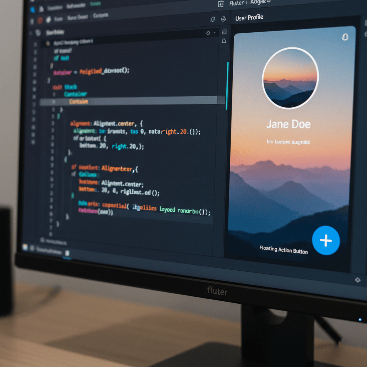
Related Reads
📰
📰
📰
📰
My Journey into UI/UX Design
Medium · UX Design
You reached for !important again. @layer is the real fix.
Dev.to · Parsa Jiravand
Top 10 UI Kits for Chrome Extensions in 2026 (Tested & Ranked) | ExtensionBooster
Dev.to · ExtensionBooster
How to replace Canva and Photopea with an open-source HTML render engine using Playwright
Dev.to · Mohamed Amine Ben Mallessa
🎓
Tutor Explanation

 DeepCamp AI