Interactive Statistical Data Visualization 101
Key Takeaways
Teaches interactive statistical data visualization using plotly express to create various statistical plots
Original Description
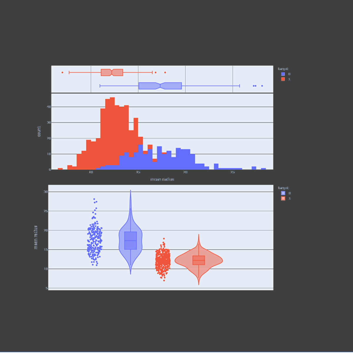
In this guided project, we will explore plotly express to visualize statistical plots such as box plots, histograms, heatmaps, density maps, contour plots, and violin plots. Plotly express is a super powerful Python package that empowers anyone to create, manipulate and render graphical figures. This crash course is super practical and directly applicable to many industries such as banking, finance and tech industries.
Note: This course works best for learners who are based in the North America region. We’re currently working on providing the same experience in other regions.
Watch on External: Coursera ↗
(saves to browser)
Sign in to unlock AI tutor explanation · ⚡30
More on: Data Literacy
View skill →


Related AI Lessons
⚡
⚡
⚡
⚡
Surviving the Data Science Behavioral Interview
Towards Data Science
Before I needed it, no one told me that "legacy tape management" was an entire industry.
Reddit r/artificial
Top 5 DBMS Concepts (2026) | Perfectnotes
Medium · Data Science
The Nervous System of the Telco: Unlocking the Real-Time Power of the Network Element Interfaces…
Medium · Data Science
🎓
Tutor Explanation
