How I Automate Data Visualization in Python
Key Takeaways
The video demonstrates a data visualization workflow in Python using tools like Kaggle, Pandas, and Matplotlib to create professional plots for clients, showcasing a step-by-step process to automate data visualization.
Full Transcript
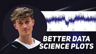
visualizing results is one of the key Parts in any data project in this video I'll show you how to create professional data visualizations within Python and turn that code into functions to automate the process [Music] over the years I've made countless visualizations for data projects and at first this took me a very long time I would spend way too much time trying to figure out how to change the small part of the graph to make it just perfect and I was getting annoyed by this so over the years I've developed a data visualization workflow to streamline this process which I will share in this video I use this exact workflow to create professional looking figures for my clients that can be used in reports so when it comes to data visualization this is the workflow I follow we start with number one Define an objective what do we want to visualize and why then we collect the raw data then we process the data potentially apply some kind of business logic we create the figures then we style the figures we export them we evaluate them and then we basically continue in this Loop because after evaluating we might discover that we have to process some more data or process it differently or you want to change the styling and we basically iterate with in this Loop until we are satisfied with the end result let's now hop into a hypothetical case study where we can apply this workflow and do it step by step and visualize the results within python okay so I found this data set on kaggle it's a sensor data from a pump and we'll be using this data set to apply the workflow to here is a quick snapshot of the data so we have a timestamp and then we have sensor 0 all the way to sensor 51 and we also have a machine status okay so as you can see from the data we can't really tell what each sensor refers to someone in the discussion try to make sense of all the sensors luckily for this hypothetical case study it doesn't really matter if we're that precise so we'll just use these as the column names okay so I've downloaded the data and created a subset this project will be on GitHub so you can follow along for this project I've defined the following objectives we have to create two figures for a report to evaluate the pump performance and the first figure should be the motor power which consists of four separate parameters and we want to visualize them in one graph and then the second figure that we have to create is the motor speed versus the pump temperature in celsius and now the temperature should be on a secondary y-axis this data set originated from the us so we have a problem here where the temperature is locked within Fahrenheit and we have to convert this to degrees Celsius to correct the unit and then visualize it so coming back to our workflow we now have an objective now luckily we already have the raw data because it was available on Google okay step three process the data this is where we can actually get to work so let's hop into Fierce code now I will go over this code very quickly because there's a lot to cover and I just want to show you the whole process for you so you can understand it see what you like and then take individual parts from it and apply it to your own workflow if there's anything that you don't understand feel free to leave a comment and I'll be happy to answer you okay so let's start off by reading the data into a bundle data frame read CSV now we load the data parse date on the First Column index by 0 will also immediately set it as an index then we can continue to The Next Step processing the data now having looked at the columns I know that we don't need all the data so there are a lot of sensors that we don't need we'll create a subset of the data so now our subset contains a timestamp and then sensor 0 to sensor 9 and sensor 49 then what we will do is we will rename the columns if we run this run subset at columns again we can see that everything is changed now all that's left to do is export this data and then run this and we'll use this file in the next script to continue okay now we jump into the next file so first we were in 001 process data within the data folder and now we go into features read the pickle file and here you can see well use why using pickle files is so convenient because when I load this data set it will be exactly the way we exported it now to save you some time I already figure out figured out how to convert Fahrenheit to degrees Celsius turns out how to do that is you take the degrees Fahrenheit you subtract 32 and then you divide it by 1.8 um so what I've done is I basically created a function and if we now run this over here we can see that it's now converted to Celsius where we range from 19 to 16 over here now we save it and now if we run it again we can see that we've created an additional column but now in Celsius so we'll do another two pickle export run it and we will use this as input for our figures alright so going back to our workflow we've now processed the data and we have applied some business Logic the conversion and now it's time to create figures so let's first start with the first objective and that was we have to create a figure of the motor power and then the four separate parameter monitors that say something about the motor power now if we go back over here and show the data we can see that we have motor active power motor apparent power motor reactive power motor shaft power so it will be these four columns that we're interested in okay so then we're going to create the figures and we'll start off with an empty canvas so let's see what this looks like all right we have an empty figure what we can do is we call x1.plot and then we input our index then our column of interest and then we also give it a label which in this case is the same so let's check what it looks like and if we run the two together we can see that we now plot one of the columns on this graph to speed this process up I've already created some of the other lines so we can do it like this and we have all the power over here so if the active apparent reactive shaft four times and now if you run this all at once and as you can see we have created a figure with all four power parameters into one figure so that was basically the objective of the first first figure but it still is quite an ugly figure it doesn't say that much of for example there are no labels no Legend there are no units so there are still some work to do here but then that's why if we go back to our workflow we have now created a figure but now we have to do some styling all right so now I'm going to introduce you to my secret sauce I've already shot this once in another video but as that is basically this file over here which contains some matplotlib plot settings these are RC params that you can set basically all the figures in that file that you create after setting these RC params will use the following style settings over here so I use this to basically always get the same template for my figures which is very nice and this is the template I use but of course you're free to to change this up and to change it to your specific needs so if we go to the multiple clip document station you can see there is a very long list of RC parameters that you can use but I'll show you what this looks like so I have these settings in a separate file and then over here what I do is I basically import this file over here so I import the system and then I append the parent folder to the path since we're in the visualization folder then we go up to the source and then we can import from utility the plot settings so basically what we do by running this we now have imported the settings over here and now if I run this again we all of a sudden have a plot that looks much different we're not there yet but this is a great starting point this is a format that's very convenient for reports because a report is usually in A4 format and you don't want a little square or almost almost Square graphs especially when you're dealing with time series data so I think it's much better to stretch it a little like this and you can also see that we've changed some of the styling where we have introduced a grid there's some more spacing on the x-axis there's also just because we made it wider but most of that comes from the ggplot style that we're using for matlablib now there are several so you can check them out I like this one and the settings over here okay so we've made some nice adjustments but we're not there yet the second thing that we're going to change is uh are the dates on the x-axis so for this we're going to use the the multiple of lip dates function and we basically set this to the day locator and we set the interval to one day and then we can also format this so basically what this does if you look at the dates right now and if I run this again you can see that we've nicely split it split it up by day so this is the first second third fourth now of course uh this could vary depending on uh what you want in your graph also depending on how many days you want to stretch if you look at one day you might want to include hours minutes Etc but for this graph I think it's nice to just go by day so as you can see this line over here is touching the bottom of the of the graph and we want to give it a little more space so we Define a minimum and a maximum value so let's just first do that and then what we're going to do is for the Y limit we set the Min and the maximum value and then what we're also going to do so wait let me first show you what this is so now we can see that we're ranging from 12 to 17 and what we can also specify is how many steps we want here so we can use the np.arrange and let me show you what what this does we can basically tell what y ticks we want to use here so this will result in 12 to 17 and that's why we use the minimum and maximum value when we do a plus one because it's not inclusive and this is the step size so we could also do it like this so make the step size a half and then you can see we have some more steps over here but for now I think it's fine to just go with one so let's just check this out Okay so we've now adjusted the y-axis converted the dates and also give the graph a little more space underneath and to the top now the next thing we're going to do is we're going to set the labels and with that we're also going to set the legend I'm just copying pasting this stuff over here but then I will briefly explain it so what we can do do so we can set a title and then for the X and the Y we can set a label and then also give it a color and then we also can specify where we want the legend so let me show you what it looks like so we can now see that on the Y over here we have the power in watts and then here we we can see that it's a timestamp and we also have the legend over here that corresponds to each color and now we can tell all the lines apart now of course this is all personal preferences and you can tweak this to whatever you want we've created them and we've also styled the figures to our liking and now it's time to export and I've also created a very awesome function to export figures which I will paste over here basically what this function does it only requires a file name and then it will create a folder within uh where our reports figures and then we'll it will create a folder for today's date and then it will put the file over there so you can look into it it's pretty awesome so how how we can use this is we can go over here and then we say export figure which is the name of the function and then we just import the file name and now if I clear this and then run all of this together we can see that it says successfully exported multipower feed care and here we get a preview of of the image and then if we go over here reports figures I can even open this in the finder so let's refill it make this a little bit bigger and now here we can see our image which is quite awesome so this basically ensures that we can create a nice plot and then also export it now all that's left to do is this back this up nicely into a function that we can call to automate this process now in order to do that I'm going to add one more command so we'll do a plt.show here and then basically what we can do is we can go all the way to the top Define a function that says plot motor power and then this takes as input our data frame we take air everything underneath and give it an indent to make sure it's within the function and now if we run this oh I see that I've made a mistake mistake here motor power now with one press we can create a nice figure and we can also export it how awesome is that okay so now coming back to the workflow we're almost coming full circle where we can evaluate our plots so we just had a look at them and maybe you want to change some things and then you you continue again but for now I'm happy with how this graph turns out so but this was not the only objective we had another one so coming back to a file over here so now we have this figure now we need the second figure so let's continue with that what I'm gonna do is I'm gonna instantly paste the function to create the second figure because it's quite the same it follows the same principles but there's one major change we basically do the same thing thing so we start with an empty canvas but now we also create a secondary axis and we do this with this command so we take X X1 and then we call this function twin X it basically mirrors it and then we have another x axis object that we can plot to the motor active power it's still the same but for the temperature We Now call X2 it's basically the same so it's index it's then the column then we give it a label but now I've added some additional styling over here so I'll also define the color the line style and the opacity of that color so this would be black at 25 turning it into basically gray but you can add many other parameters to the plot statements over here to tweak it even further if I now run this plot and then speed versus temperature and then we also throw in the data frame and then boom we have another nice and fancy figure that we can use and so the main difference over here is uh let me check we've also exported this one so if I refill this in the finder now we have it nice and big what we can see is so on the left over here we have the power in what and then on the right over here we have the temperature now if you want to take things one step further what you can do is you can create another file for example fishlice.pi and in there define a class and then put the functions in here so this is what I've done so if a class plot data and then we here we have the export figure we have the motor power and we have the speed versus temperature basically the same as we've just saw but we what we can now do if I open this file over here plot figures let me run this see how awesome this is now with three lines of code we can create these figures so how this works is first we create an instance of this class Plus data this is what we do over here so this is an instant of the class and then from that object we can call motor power which refers to this function over here and this takes the data frame uh as an as a parameter and now if we run this line of code we get the same figure and we also create an export now this is just awesome in my opinion we've basically boiled down all the work all the code that we did into a single line of code that we can now run to create a figure and that's just awesome so same for the speed versus temperature boom there it is nice graph and it's also exported to the reports figures and it even has a folder for the date now what the nice thing about this is is that most of the time when you're working in an organization you don't want just one graph it basically repeats itself every month every year every quarter stuff like that and you can basically use this workflow to set up data visualization pipelines to streamline this process and now all you have to do for example if the next month comes around and your boss asks you to create new figures for another report or another evaluation all you have to do is update the data set with the new data and then run this again so it's basically a whole Pipeline and then all you have to do is run this and you have new figures and they will be nicely over here within the figures folder within a new folder containing the new date so everything is nice and organized that concludes my data visualization workflow this is what I use to create visualizations for my clients and what I used almost on a weekly basis and of course you can adjust the individual steps within this workflow to fit your needs so for example you can of course change colors change fonts change sizes the principles will be the same well and that concludes this video I hope that you liked it I hope that you learned something and if that is the case then I would really appreciate it if you like this video And subscribe to the channel I'll be making more videos related to python data science and machine learning basically anything to help you become better at working with data so if that's what you're interested in you should definitely subscribe and then I'll see you in the next one [Music]
Original Description
Want to get started with freelancing? Let me help: https://www.datalumina.com/data-freelancer
Need help with a project? Work with me: https://www.datalumina.com/solutions
In this video, I will share my data visualization workflow in Python that I use to create professional plots for my clients. We will use the Pandas and Matplotlib library to create a class with functions to automate this process.
Link to project
- https://github.com/daveebbelaar/matplotlib-tutorials
Timestamps
00:00 Introduction
00:40 Workflow Overview
01:16 Introduction to Case Study
01:55 Objective
02:52 Process Data
04:00 Apply Business Logic
04:54 Create Figures
06:32 Styling Figures
11:22 Exporting Figures
12:30 Converting Code to Functions
15:10 Creating a Plotting Class
Matplotlib documentation
- https://matplotlib.org/stable/tutorials/introductory/customizing.html
- https://matplotlib.org/stable/api/matplotlib_configuration_api.html#matplotlib.rcParams
How to Set up VS Code for Data Science
- https://youtu.be/zulGMYg0v6U
The Best Way to Organize Your Data Science Projects
- https://youtu.be/MaIfDPuSlw8
Let's Connect
- Instagram | https://instagram.com/daveebbelaar
- LinkedIn | https://linkedin.com/in/daveebbelaar
- Twitter | https://twitter.com/daveebbelaar
Watch on YouTube ↗
(saves to browser)
Sign in to unlock AI tutor explanation · ⚡30
Playlist
Uploads from Dave Ebbelaar · Dave Ebbelaar · 12 of 60
1
 2
2
 3
3
 4
4
 5
5
 6
6
 7
7
 8
8
 9
9
 10
10
 11
11
 ▶
▶
 13
13
 14
14
 15
15
 16
16
 17
17
 18
18
 19
19
 20
20
 21
21
 22
22
 23
23
 24
24
 25
25
 26
26
 27
27
 28
28
 29
29
 30
30
 31
31
 32
32
 33
33
 34
34
 35
35
 36
36
 37
37
 38
38
 39
39
 40
40
 41
41
 42
42
 43
43
 44
44
 45
45
 46
46
 47
47
 48
48
 49
49
 50
50
 51
51
 52
52
 53
53
 54
54
 55
55
 56
56
 57
57
 58
58
 59
59
 60
60

How to Install Homebrew on Mac (Getting Started)
Dave Ebbelaar
How to Install Python on Mac (Homebrew)
Dave Ebbelaar
How to Install Anaconda on Mac (Getting Started)
Dave Ebbelaar
How to Set up VS Code for Data Science & AI
Dave Ebbelaar
How to Use Git in VS Code for Data Science
Dave Ebbelaar
Data Science Desk Setup to Maximize Productivity
Dave Ebbelaar
THIS Is How I Write Clean Data Science Code EVERY TIME
Dave Ebbelaar
Data Science Tutorial - Project Structure
Dave Ebbelaar
Changing rcParams for Better Data Science Plots | Matplotlib Tutorial
Dave Ebbelaar
How to Read Excel Files with Python (Pandas Tutorial)
Dave Ebbelaar
My Data Science Journey (Zero to Freelance)
Dave Ebbelaar
How I Automate Data Visualization in Python
Dave Ebbelaar
16 Apps I Use Daily as a Data Scientist
Dave Ebbelaar
How to Manage Conda Environments for Data Science
Dave Ebbelaar
How to Export Machine Learning Models in Python
Dave Ebbelaar
VS Code Speed Hack for Data Science
Dave Ebbelaar
17 VS Code Tips That Will Change Your Data Science Workflow
Dave Ebbelaar
How to Predict the Future with Python (Forecasting Tutorial)
Dave Ebbelaar
How to Use Python Environment Variables
Dave Ebbelaar
7 Data Science Tips for Beginners in 2023
Dave Ebbelaar
How to Effectively Use the Data Science Lifecycle
Dave Ebbelaar
Full Machine Learning Project — Coding a Fitness Tracker with Python (Part 1)
Dave Ebbelaar
Full Machine Learning Project — Processing Raw Data (Part 2)
Dave Ebbelaar
Full Machine Learning Project — Data Visualization with Matplotlib (Part 3)
Dave Ebbelaar
This Will Change Data Science as We Know It (ChatGPT)
Dave Ebbelaar
Full Machine Learning Project — Detecting Outliers in Sensor Data (Part 4)
Dave Ebbelaar
Full Machine Learning Project — Low-pass Filter & Principal Component Analysis (Part 5a)
Dave Ebbelaar
Full Machine Learning Project — Fourier Transformation & Clustering (Part 5b)
Dave Ebbelaar
Full Machine Learning Project — Predictive Modelling (Part 6)
Dave Ebbelaar
Automate Machine Learning with ChatGPT
Dave Ebbelaar
Scraping Web Datasets for Data Science Projects
Dave Ebbelaar
Full Machine Learning Project — Counting Repetitions (Part 7)
Dave Ebbelaar
How to Use GitHub Copilot for Data Science (Python + VS Code)
Dave Ebbelaar
Every Beginner Data Scientist Should Understand This
Dave Ebbelaar
Revealing My New AI-Powered Data Science Workflow
Dave Ebbelaar
Auto-GPT Tutorial - Create Your Personal AI Assistant 🦾
Dave Ebbelaar
Build Your Own Auto-GPT Apps with LangChain (Python Tutorial)
Dave Ebbelaar
Building Slack AI Assistants with Python & LangChain
Dave Ebbelaar
ChatGPT Code Interpreter - Goodbye Data Analysts?
Dave Ebbelaar
How to Deploy AI Apps to the Cloud with Flask & Azure
Dave Ebbelaar
How to Build an AI Document Chatbot in 10 Minutes
Dave Ebbelaar
Is Falcon LLM the OpenAI Alternative? An Experimental Setup with LangChain
Dave Ebbelaar
GPT Engineer... Generate an entire codebase with one prompt
Dave Ebbelaar
Pandas DataFrame Agent... the future of data analysis?
Dave Ebbelaar
OpenAI Function Calling - Full Beginner Tutorial
Dave Ebbelaar
How to use ChatGPT's new “Code Interpreter” feature
Dave Ebbelaar
LangChain just launched their new "LangSmith" platform
Dave Ebbelaar
How I'd Learn AI (if I could start over)
Dave Ebbelaar
I Used AI To Scrape The Web & Write PDF Reports
Dave Ebbelaar
LangSmith Tutorial - LLM Evaluation for Beginners
Dave Ebbelaar
7 Lessons for New AI Engineers - Beginner’s Guide
Dave Ebbelaar
The Rise of the "New-Age" Machine Learning Engineer
Dave Ebbelaar
OpenAI Assistants Tutorial for Beginners
Dave Ebbelaar
How To Connect OpenAI To WhatsApp (Python Tutorial)
Dave Ebbelaar
How to Build Chatbot Interfaces with Python
Dave Ebbelaar
PostgreSQL as VectorDB - Beginner Tutorial
Dave Ebbelaar
My MacBook Setup (as a coder & business owner)
Dave Ebbelaar
Easiest Way to Connect AI Chatbots to WhatsApp
Dave Ebbelaar
ClickUp Tutorial - What Is ClickUp Brain? 🧠
Dave Ebbelaar
My Development Workflow for Data & AI Projects
Dave Ebbelaar
More on: Data Literacy
View skill →


Related AI Lessons
Chapters (11)
Introduction
0:40
Workflow Overview
1:16
Introduction to Case Study
1:55
Objective
2:52
Process Data
4:00
Apply Business Logic
4:54
Create Figures
6:32
Styling Figures
11:22
Exporting Figures
12:30
Converting Code to Functions
15:10
Creating a Plotting Class
🎓
Tutor Explanation
