Data Visualization with Plotly Express
Key Takeaways
Creates interactive data visualizations with Plotly Express
Original Description
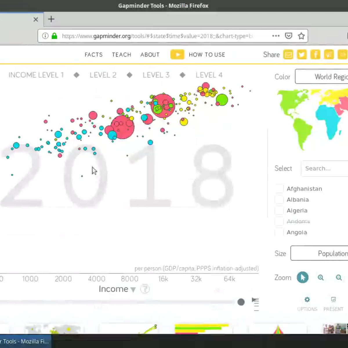
Welcome to this project-based course on Data Visualization with Plotly Express. In this project, you will create quick and interactive data visualizations with Plotly Express: a high-level data visualization library in Python inspired by Seaborn and ggplot2. You will explore the various features of the in-built Gapminder dataset, and produce interactive, publication-quality graphs to augment analysis.
This course runs on Coursera's hands-on project platform called Rhyme. On Rhyme, you do projects in a hands-on manner in your browser. You will get instant access to pre-configured cloud desktops containing all of the software and data you need for the project. Everything is already set up directly in your internet browser so you can just focus on learning. For this project, you’ll get instant access to a cloud desktop with Python, Jupyter, and Plotly Express pre-installed.
Notes:
- You will be able to access the cloud desktop 5 times. However, you will be able to access instructions videos as many times as you want.
- This course works best for learners who are based in the North America region. We’re currently working on providing the same experience in other regions.
Watch on External: Coursera ↗
(saves to browser)
Sign in to unlock AI tutor explanation · ⚡30
More on: ML for Analytics
View skill →


Related AI Lessons
⚡
⚡
⚡
⚡
Surviving the Data Science Behavioral Interview
Towards Data Science
Before I needed it, no one told me that "legacy tape management" was an entire industry.
Reddit r/artificial
Top 5 DBMS Concepts (2026) | Perfectnotes
Medium · Data Science
The Nervous System of the Telco: Unlocking the Real-Time Power of the Network Element Interfaces…
Medium · Data Science
🎓
Tutor Explanation
