Crash Course on Interactive Data Visualization with Plotly
Key Takeaways
Builds interactive data visualizations using Plotly Express
Original Description
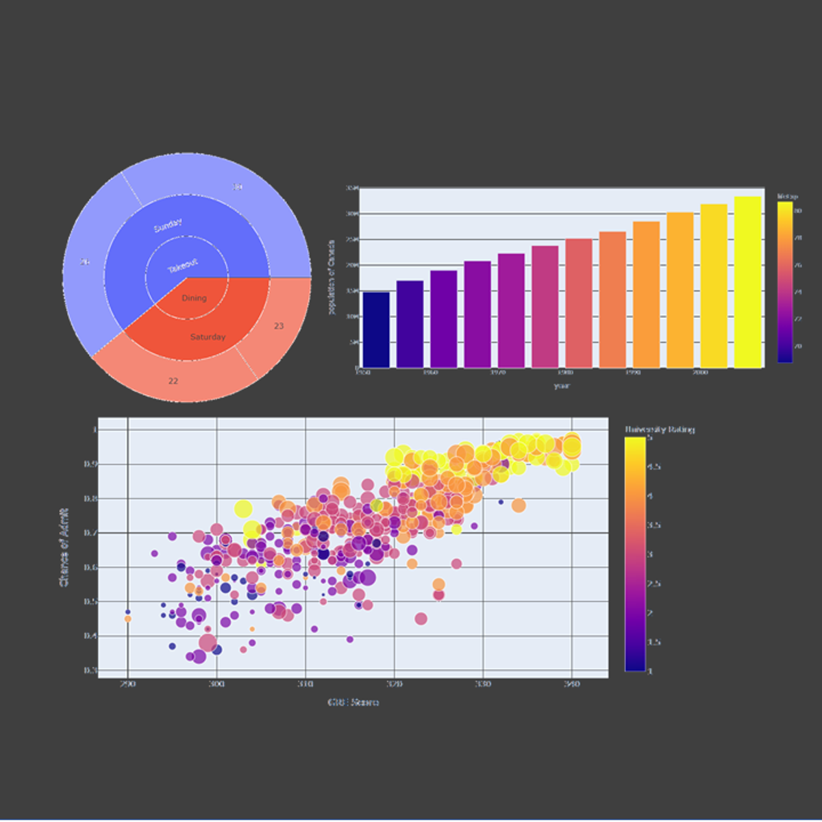
In this hands-on project, we will understand the fundamentals of interactive data visualization using Plolty Express. Plotly Express is a powerful Python package that empowers anyone to create, manipulate and render graphical figures with very few lines of code. Plotly Express is the recommended entry-point into the plotly package. We will leverage Plotly Express to generate interactive single Line plots, multiple line plots, histograms, pie charts, scatterplots, bubble charts, and bar charts.
Note: This course works best for learners who are based in the North America region. We’re currently working on providing the same experience in other regions.
Watch on External: Coursera ↗
(saves to browser)
Sign in to unlock AI tutor explanation · ⚡30
More on: Data Literacy
View skill →


Related AI Lessons
⚡
⚡
⚡
⚡
Müşteri Değerini Anlamak: RFM, CLTV ve Tahmine Dayalı CRM Analitiği
Medium · Machine Learning
Müşteri Değerini Anlamak: RFM, CLTV ve Tahmine Dayalı CRM Analitiği
Medium · Data Science
Müşteri Değerini Anlamak: RFM, CLTV ve Tahmine Dayalı CRM Analitiği
Medium · Python
Surviving the Data Science Behavioral Interview
Towards Data Science
🎓
Tutor Explanation
