Full Transcript
Hello everyone, welcome to my channel. This video is a complete tutorial on machine learning. In this video, we'll cover important topics such as regression, cann decision trees and many more. So without a further ado, let's start our video. So what is machine learning? Machine learning often called as ML is a branch of an artificial intelligence that enables a system to learn autonomously from data and make decisions without being explicitly programmed to do so. The performance of machine learning model can be improved by providing large data sets and let the model figure out the patterns. Let's imagine how we teach a child to recognize a dog. We don't tell them proper rules to recognize a dog but we show them many dogs and say this is a dog. Therefore over time they learn how a dog looks like. So machine learning works the same way. We train the machine by showing it with lots of examples and it learns how to make decisions based on that. Traditional programming versus machine learning. Now let's compare machine learning with traditional programming. In traditional programming, we write a set of predefined instructions and the computer follows those instructions in order to perform the task. Whereas in machine learning, we give set of examples that is huge amount of data plus our expected outputs. And in machine learning, the computer learns the rule automatically and figure out how to accomplish the task. Therefore, machine learning is very versatile and powerful as it learns from the data and improve its performance continuously. So why machine learning matters? As we know there are lots of data these days and machine learning can handle this large set of data, analyze it and find a proper value as an output. Machine learning is also leading to the exciting innovations. It is the heart of many technologies we use today such as drones, VRs, robots and many more. It can contribute to business, finance by fraud detection, detecting security threats, disease diagnosis and so on. Therefore, machine learning is at the heart of many technologies we use today. It helps machine to read like spam detection and machines to see such as object detection, face recognition. Similarly, it helps machine to decide on fraud detection, choosing recommendations and it also helps to hear by choosing voice assistance such as Alexa or Siri. It helps machine to create by generating images, text, videos and so many things. Therefore, machine learning is very important as it is transforming various industries in near future. Now, let's understand the basic flow of machine learning process. The step one is problem statement. In order to decide which category of machine learning models we use at first we should have a deep understanding of our problems. The next step is data collection where we collect all the data like emails, numbers, photos and so on that is required for our models. And the next step is data processing. This step is very important part in the machine learning. It is like cleaning the data by correcting errors, scaling and removing duplicates and so on. The fourth step is to choose the right model. We should choose proper machine learning model for our clean data. Step five is to train the model. Once we decide machine learning model, the next step is to train the model. Training process is feeding the data to a learning algorithm. Once we train the model, the next step is to test the model and see how well it predicts a new and unseen data. The next step is to tune and optimize the model by using more data or better methods. The last step is deployment where machine learning model is tested in production environment. Types of machine learning. Machine learning is divided into supervised learning, unsupervised learning and reinforcement learning. Supervised learning. Supervised learning models learn from the label data. That means we provide input plus correct output. The goal here is to predict future output. Examples are object detection, spam detection, forecasting and so on. Next we have is supervised learning algorithms. There are different algorithms in supervised learning like linear regression, logistic regression, decision trees, support vector machines or SVM, K nearest neighbors KNN, random forest, n algorithm. So we will discuss about supervised learning in our upcoming videos. Now let's move to the unsupervised learning. Unsupervised learning. Unsupervised learning models learn from onle data. That means we only provide lots of input data and we do not give known output to the model. The goal here is to find structure in data and provide us the proper output. The examples are recommendation engines, anomaly detections, medical imaging and so on. Next is unsupervised learning algorithms. We have hierarchal clustering, fuzzy means, K means clustering and so on. Reinforcement learning. In reinforcement learning, the model learns by doing and through various trials and errors. The examples are game AI like chase, robotics, self-driving cars and so on. Now reinforcement learning is rapidly growing with huge potential and we will experience more groundbreaking innovations in near future. Applications of machine learning. Machine learning is almost everywhere now like in self-driving cars, security, recommendation systems, customer service, voice assistance, fraud detection, digital marketing, search engines and face recognition. supervised learning. So let's get started. So what is supervised learning? Supervised learning is a type of machine learning where the model is trained using label data where each input has a corresponding correct output. Here the label data means a data set which contain lots of examples. As shown in the figure, we have animal database which contain different types of animals which are labeled and stored. And in supervised learning, the trained model learns to predict the output from the input by finding patterns of the structures in the data. Supervised learning example. This is the example of supervised machine learning algorithm. So here in input side we have collection of raw data that is large set of tigers, camels, horses which are labeled according to their names. Then the algorithm is trained with this information and the processing happens. So machine would find a way on its own to identify which one is tiger or camel or horse and finally we'll get our expected output. So this is supervised machine learning and it is most commonly used method supervised learning process. Now let's work through a basic supervised learning workflow. First is collect data. We perform data collection such as images, text, numbers and so on. And the next is label the data where we add correct labeling to our data. For example, cat, dog if we are training for that. And another is split the data. Here we split the data into training data set and testing data sets. And next we have it choosing a model. We have to choose a model such as logistic regression or decision tree or any other that is fit for our model. And the another is to train the model. Here the model is fed with the training data. So it learns the patterns and relationships between input data and the output data. Another is evaluate the model. We evaluate the model by using our test data to see performance of our model and finally use it. Once we find the model is accurate then we use it for predictions on new data. Therefore this is the basic flow of supervised machine learning. Now let's see the types of supervised learning. Types of supervised learning. There are two task of supervised learning. One is classification and the another is regression. Classification. In classification, the models learn to assign labels and the output is a categorical variable. The examples are emails are classified as spam or non-spam emails. Similarly, the model can classify an image into a dog image or a cat image. Linear classifiers, support vector machines, decision trees and random forest are the common types of classification algorithms. Regression. In regression, the model learns to estimate a value. Therefore, the output is a continuous variable. For example, regression models are useful for predicting house prices, forecasting sales, estimating temperature and so on. Linear regression, logistic regression and polomial regression are some of the regression algorithms. Supervised learning applications. Supervised learning is everywhere. Therefore, let's look at some of the example. It is applicable in stock predictions like predicting stock prices based on past data. Fraud detection. Supervised learning is used for fraud detection on banking to identify whether the transaction is legitimate transaction or not. It is also used for medical diagnosis such as images labeled as cancerous or healthy. Another is spam detection. As I said earlier, emails can be labeled as spam or non-spam by the use of supervised learning. Next is voice assistant such as recognizing sounds like play music or stop the music. Therefore, these are some of the practical examples of supervised machine learning. Supervised learning algorithms. Here are some commonly used algorithms in supervised learning. Decision trees. Decision tree is a type of supervised learning algorithm where flowchart like models is used for decision making. Linear regression. Linear regression is a type of supervised learning regression algorithm that is for predicting numbers. Logistic regression. Logistic regression is a supervised learning classification algorithm which is used to predict binary classification. Random forest. Random forest are made of a group of decision trees which work together to make predictions. K nearest neighbor that is knn classifies based on the closest data points. NAB base algorithm. NAB base algorithm is a supervised learning algorithm based on B theorem. SPM or sport vector machines is great for separating two classes. Hence, we use these types of supervised learning algorithms according to the data set and the problem we are solving and I will definitely make detailed videos on each topics in my upcoming tutorials. So, keep watching my channel. In today's video, we'll break down unsupervised learning in the simplest way possible. So let's get started. What is unsupervised learning? Unsupervised learning is a type of machine learning algorithm where the model learns from the on level training data sets. This algorithm discover hidden patterns, structures and relationship within the data without any prior knowledge of the outcomes. That means the model has only input parameter as we don't provide output parameter to our model. So the model is basically learning without supervision. Let's see an example of unsupervised machine learning algorithm. So for input we have collection of large set of tigers, camels, horses data set. But these data are unlabeled. Then algorithm is trained with these raw data sets. In the interpretation stage, the model figure out how to organize raw data sets based on inherent patterns and structures. Then algorithm is all about choosing unsupervised learning algorithms such as clustering, anomaly detections or other in order to find the patterns in the data. After that the processing happens where the algorithm is applied on the data and a machine would find which one is tiger, camel or horse. Then finally as a result we'll get our expected output. Unsupervised learning process. Now let's discuss a basic unsupervised learning process. The first is collect data. At first we collect raw data like text, numbers, images and so on. Then pre-processing. We clean the raw and unlevel data by handling missing values, removing repetitive data, normalizing and so on. Then there's a model selection. We choose machine learning algorithm such as clustering. After that we have model training. Here the model is fed with the training data. So the algorithm find the patterns or the structure in the data. And next is evaluation where we evaluate the model to see its performance. And then finally we use the model. Since there are no correct outputs to compare, we don't use accuracy like in supervised learning. So this is the basic flow of unsupervised machine learning. Now let's see the types of unsupervised learning. Types of unsupervised learning. There are three main types of unsupervised learning. Clustering, association rule algorithm, dimensionality, reduction. Now let's go and see each of them. Clustering. Clustering is grouping of unlabelled data into clusters based on their similarities or differences. The goal of clustering is to identify patterns of the structures in the data. The real world examples are pattern recognition, image segmentation, customer segmentation and so on. Association rule method. An association rule is a rule-based technique for discovering relationships between parameters in large data set. They are used for market basket analysis. Market basket analysis is a data mining technique which is used for better understanding of customer purchasing patterns based on the relationship between different products. For example, the customer purchase patterns. Different shops use this algorithm to find the association among the seller of one product with respect to another product according to customer's behavior. For instance, if a customer buys shoes, then he or she may also buy socks or slippers or boots. It's same like in Amazon's Tom that these customers who bought this item also bought. Dimensionality reduction. Dimensionality reduction is a technique used for reducing the number of features or dimensions in a data set while also preserving the integrity of data as much as possible. This feature is used when the number of features in data set is large and this process is typically used in pre-processing stage. This process is performed because visualizing data in more than three dimensions is very difficult. If the dimension is reduced from high to low then it also lowers the computational load and it increases the speed and efficiency. The example is like in visualizing highdimensional data or the data compression, image recognition and so on. Unsupervised learning applications. The applications of unsupervised learning are in recommendation systems for various products and services, customer segmentation for personalized marketing, natural language processing to categorize articles, anomaly detection in cyber security and finance, computer vision for object recognition, medical imaging for image detection, segmentation and so on. climate support for weather analysis, data compression and feature extraction in deep learning. Therefore, these are some of the applications of unsupervised learning. Now, let's move to the next chapter. Unsupervised learning algorithms. Now, let's see some popular algorithms used in unsupervised learning. In clustering, we have Cayman's clustering, hierarchal clustering, density based clustering, spectral clustering, gossian mixer models. In association rule method we have a priori algorithm, a clat algorithm, FP growth algorithm and in dimensionality reduction we have principal component analysis PCA, linear discriminant analysis, LDA, factor analysis, autoenccoders and so on. So these are some of the unsupervised learning algorithms and each algorithm has different strength depending on the data set and the goal. In today's video we are learning about regression. So let's get started. So what is regression? Regression is a supervised learning technique used to predict continuous numerical values based on one or more independent features. It helps to make better decisions by finding relationships between variables. There are two types of variables in regression. One is independent variable and another is dependent variables. For example, regression can be used to predict a stock price, house price and so on. It helps to answer questions like what will be the value of X given Y. Types of regression. Now let's talk about the types of regression. The first is linear regression. It assumes a linear relationship between dependent and independent variables. The example is like predicting height from A's, weight from A and so on. The next is multiple linear regression. This is same as the linear regression but with multiple input variables. The example is like predicting the price of house based on multiple features like location, room size and so on. The third is polomial regression. It is used when there is nonlinear relationship between variables. The example can be modeling growth cops in biology. Another is r and lasso regression. These are regularized version of linear regression. They help avoid overfitting by adding penalties to the model. Support vector regression SVR. SVR has same concept as support vector machines but it is for predicting continuous values and it tries to fit the best line within a margin of error and it is good for highdimensional data. Decision tree regression. It uses a treel like structures to make decisions. Random forest regression. It is an ensemble method which built multiple decision trees and averages their predictions. It reduces overfitting and increases accuracy. Regression evaluation metrics. Here are some of the evaluation metrics for regression. Mean squared error MSE. It is a squared difference between actual values and the predicted values. Root mean square error RMS. It is a square root of mean squared error. Mean absolute error M AE. It calculates the average absolute difference between predicted and the actual values. R squar core coefficient of determination. It measure how much of the variance in the target variable is explained by the model. Higher values is better fit ranging from 0 to one. Regression workflow. Here's how a regression model works. The first is collect the data. Here we gather data that is independent variables and dependent variables. The second is pre-process the data. We handle the missing values, normalize and split into train and the test data sets. And the third is train the model. We use an algorithm like linear regression to learn patterns in the training data. The fourth is make prediction. The model predicts new outputs based on onseen inputs. The last is evaluate the model. We evaluate the model to measure how accurate the predictions are. So this is the workflow of regression. The real world applications of regression are in finance such as predicting a stock prices, interest rates and so on. In energy such as forecasting electricity demand in business such as inventory planning, sales and revenue forecasting. In healthcare such as predicting patent result or recovery time in agriculture such as estimating crop production. Advantages. Let's see the advantages of regression. So it will be easier to understand when to use it. The first is it is easy to understand and implement. So it is great for beginners. Fast and efficient. It is fast and efficient because regression models can train fast even on huge data sets. It works well for linearly related data. Disadvantages sensitive to outliers. They can be sensitive to outliers. Can only fit complex data. Simple regression models may miss patterns in complex data sets. That's why it can lead to low accuracy. Need attention in pre-processing. There needs an attention in pre-processing because regression is affected by missing values, non-normal data and so on. Today we are going to learn about linear regression. So without a further ado, let's start our video. So what is linear regression? Linear regression is a type of supervised machine learning algorithm where the model learns from the label data and identify patterns from those data to make predictions. And there is a linear relationship between input and output. Which means if we give some input data then it will try to predict an output number such as in predicting the price of house. And it's like drawing a straight line through our data and finding the best possible relationship between the inputs and the outputs. Let's see an example. Suppose we are trying to predict a student's score based on number of hours they have studied. It is obvious that if a student study for more hours then they will get better marks. Let me explain this. For example, I have some data like this. Here we have two variables. One is independent variable X which is study hours and the another is dependent variable Y that is score. So let's assume if the student study for 1 hour they will score 54 and if they study for 2 hours they will score 60 and if they study for 3 hour they will score 66 and 4 hour they will get 71 and if they study for 5 hour they will get 79. So this is our data set and if we plot this in graph we will see like this. So see here we get a straight line and the score changes at a constant rate as the input changes. That is if a students study for more hours then they will get more score. Hence this is what simple linear regression looks like. Linear regression applications. It is often used in predicting house prices. For example, linear regression helps us to create a model to predict the price of the house based on its size. Bigger the house, higher the prices. It is used in education to predict student performances. In finance, to predict stock prices. In marketing, for example, a company wants to know how much to spend on ads to increase sales. In that case, linear regression helps them to forecast sales for given ad spins. It can be used in agriculture. For example, farmers can use data such as temperature and rainfall to predict crop LS and so on. Therefore, these are some of the applications of linear regression as we are dealing with numeric and continuous values which is exactly what linear regression is designed for. Mathematical expression. Mathematical expression or the best fit line for linear regression with one independent variable is given by y = mx + b where x is the input that is independent variable. y is the predicted value that is dependent variable. m is the slope of the line that is how steep or how much y changes for a unit change in x and b is the intercept that is when line cuts y-axis or the value of the y when x equals to zero. The goal of linear regression is to find the best values for M and B that fit our data. Let's see the real example and calculate slope M and intercept B. So I am going to take the earlier data set. We have study hours as X a dependent variable and the another is scores that is Y which is independent variable. Now let's calculate the mean of X as shown in the table. We add all the values of X and divide by five. Then we'll get the mean of x that is 1 + 2 + 3 + 4 + 5 and then divide by 5 and the result we get is 3. So this is our mean and we represent it as a xdash. Similarly we calculate mean of y and as shown in the table we get the value 66. Next step is to calculate the deviation of x that is x dash which is our mean value minus x. Suppose 3 - 1 = 2, 3 - 2 = 1 and so on. Then we calculate the square of deviation of x that is square of 2 is 4, 1 is 1, 0 is 0, - 1 is 1, - 2 is 4. And next step is to calculate deviation of y that is y dash - y. Then we calculate x dash - x into y dus y. And as a result we get like 2 into 12 that is 24 1 into 6 that is 6 and so on. And at last we calculate the sum of product of deviations that is 24 + 6 + 0 + 5 + 26 that is equal to 61. So these are our calculations. The formula to calculate slope is m = to sum of product of deviations divided by sum of square of deviations of x. that is 61 / 10 equals to 6.1. So this means if I change the value of x by 1 unit then the value of y changes to 6.1. And the formula to calculate intercept b is b = to mean of y minus slope into mean of x that is 66 - 6.1 into 3 that is equal to 66 - 18.3 which is 47.7. Hence this is the value of B. The intercept B is the value of Y when X equals to zero. That means in this example 47.7 could be the base score when a student studies for 0 hours. Now we want to know how much a student scores if he or she studies for 6 hours. We have our equation y = to mx + b. And here we have calculated all the values needed. So y = to mx + b that is 6.1 into 6 + 47.7 = to 84.3. Therefore if the student study for 6 hours he or she will score 84.3 marks. So this is the best case scenario. Let's see the example of linear regression in Python code. So first let's import our libraries. This is step one. and then import numpy as np. Numpy is used to create data arrays and it is for numerical operations. Now let's import another import matt plot live dot pi plot s plt. So mattplot leave.pip plot will help to visualize the data and the fitted line. Next we will skarn linear model and then import linear regression. So we import linear regression which is the regression model from scikit learn. Next we are step two like this and then then step two is about creating data set data set right and then we'll create the data set of X and Y where X is the study hours. So has study hours and then variable x equals to and p array and let's give our data that is 1 2 3 4 5 and then close the parenthesis. this and dot sorry dot reshape and -1 comma 1. So here x is the hours studied which is our input and this is independent variable. So this will recept the data into the column vector. Another we have is scores. So scores and then y equals to np dot arrays and then we have the max is 54 60 66 71 79 and Then so y is a scores obtained which is the output and this is a dependent variable. So this is our data set. Now let's create and train the linear regression model. That is step three. Create and train the model. So model equals to linear regression and then this. So we have created a linear regression model. Now we will train the model. model dot fit x comma y. So this fit trains the model using the data. Next step is to make prediction. Let's say we want to predict the score for a students who have studied for 6 hours. Therefore, step four is like make a has sorry make a prediction. So score predicted equals to model dot predict and then we want to predict for 6 hours. So predict six will provide the predicted score for a student who have studied for 6 hours. Now let's print the result. print and then score predicted for 6 hours of study and then score underscore predicted and then I zero. Okay, now let's run this code. I got the error. Ah, skarn dot linear. Oh, too many errors. Track NP is 1 2 3 4. Sip. Sorry. Okay. Score predicted for 6 hours of study is 84.3. Now let's visualize our result. Therefore the step five would be uh let me write here okay # step five equals to um visualization and then I'll plot plot scatter x comma y comma and let's give color like blue and then a label equals to um actual data and then close this. Another is plot dot plot X comma model dot predict uh X and then color equals to red and comma label equals to regression line. Okay. So here the scatter plots the actual data points and in blue color whereas the plot draws the regression line predicted by the model in red color and let's give x and y like x label uh then study hours and 10 lot at Y label equals to scores and then plot title study hours versus scores and then plot dot dot lesson and then plot dot show. So labels and the titles are added for clarity and so we'll display the plot. So let's run this. See we get our result. So this blue dots are the actual data and the red line represent the regression line and we have predicted the uh scores for 6 hour is like 84.3. Advantages very easy to implement results are easy to interpret great for small data sets computationally fast. Disadvantages of linear regression. They are sensitive to outliers. They assumes linearity and it doesn't perform well on complex or nonlinear data and it can only predicts numbers. Types of linear regression. Simple linear regression. If there is only one independent variable then it is known as simple linear regression. Multiple linear regression. When there are more than one variable then it is known as multiple linear regression. So that's it for linear regression. We have learned what is linear regression, how it works, math behind it and how to implement in Python and its advantages and disadvantages. So if you found this video helpful, do not forget to like, share and subscribe my channel. Share it with your friends who are studying machine learning. Welcome back everyone. We are at day six of our machine learning series. In today's video, we are going to learn about polomial regression. So let's get started. What is polomial regression? Polomial regression is an extension of linear regression where the relationship between the dependent variable and independent variable is more or less nth degree polomial. In many real world scenarios, the relationship between variables is often nonlinear. Polomial regression helps us to model this kind of co data points by adding higher degree power of x. Polomial regression equation. The equation of linear regression is y = to b 0 + b1x + e where x is the independent variable, y is the dependent variable, b 0 and b1 are the coefficients, e is the error. Similarly, the equation of polomial regression is y = b 0 + b1 x + b2 x² + b3 x cq plus bn xn plus error where x is the independent variable, y is the dependent variable, b 0, b1 to bn are the coefficients of polomial, n is the degree of the polomial and e is the error. Example, let's consider an example of predicting house prices where we analyze the relationship between the price of the house and the size of the house. The relationship between these two factors might not be linear. So let's see this table. Here we have two parameters. One is house size and the other is house price. As soon in this table we see from 20 square m to 70 square m the price of the house increases very fast. Whereas after 70 the price of the house slows down. Now let's plot this in graph. So this is our data. When we see these data points we realize that a linear or the straight line won't fit well in this situation. Therefore for this type of data we need polomial regression. Quadratic polomial regression equation. Now let's apply polomial regression to model the relationship between the size of the house and the price of the house. Suppose if we try a quadratic model that is degree equals to 2 which include both linear and the quadratic terms for better fit. The quadratic polinomial regression equation is y = to b 0 + b1x + b2x². So by using this polomial regression equation it allow the cob to bend and fit the data better. In this way, it will capture the nonlinear progression of the house price and its size. Now, let's implement this and see in the Python code. Now, let's practice polomial regression in Jupyter notebook. So, has polomial regression. At first, we'll import libraries. So, import libraryies. import numpy as np. So numpy is used to create data arrays and it is for numerical operation. Another is import uh mattplot lip pip plot as plt. So mattplot lib.pipplot Piplot will help to visualize the data and fitted line. Next is I will write from sklearn dot linear model import linear regression. So in this case we will import linear regression which is the regression model from scikit learn. Another is from skarn dot preprocessing uh sorry import polomial features. So here we import polomial features class from the skon preprocessing model in scikitlon. The next step is to create the data set. So create data set. The one parameter we have is house price, right? House price. And then I will represent is x and then np dot array. here and I will give the data like 20 30 40 50 60 70 80 90 and then close this parentheses and then I will reshape and -1 comma one and parentheses. So, x is the house size which is our uh sorry this is house size. Okay. So, x is the house size which is our input and this is independent variable and another is house price. that is y = to np dot array and then I will give the values like 155,90 220 245 and then 260 and then 265 5 270 and closing the parenthesis. So, so this is y where we store our house prices. So, these are the data and this uh dot reset minus one comma 1. This code will reset the data into a column vector. The next step is to transform features into polomial degrees like transforming uh features into polomial polomial and then the degree is let's say 2. So I will write poly equals to polomial features and then I will mention the degree equals to two. So this line means we are creating a polomial features object named poly. degree equ= to 2 means it is for quadratic and it will use like 1 comma x² and if it is three then it's for cubic model. So we will use like 1 comma x comma x² x cq but if it is 1 then it is for linear and the next line is x poly equals to poly uh dot fit transform and then x. So this will transform input data into polinomial form. Next step is to train the model. So train the model. Model equals to linear uh regression and then this. So this line will create a linear regression model object. Even though we are doing polomial regression, we'll still use linear regression because technically polomial regression is equal to linear regression on polomial features. And then another is I will write model dot feet and then uh I'll give sorry x poly and then y. So this fit means to train the model. Another step is to make prediction. So prediction y pred prediction equals to model dot predict and then x only. So after training the model, the model has learned the best equation for our data and this dotpredict is used to make prediction using that equation. Another step is to visualize. So has visual lies. So plot dot scatter and then x comma y comma and then I will give color equals to blue comma label equals to um actual data and then close the parentheses. So this scatter plots the actual data points and in the blue dots and another is plt dot plot and then x comma y red and then color equals to red and then label equals to polomial regression. So this dot plot will draw the regression line predicted by the model in red. And then plot dot x label and equals to like house size and in square meter. S² m and then okay this x label is for labeling x-axis another is for labeling y-axis y label and this is like house price and in $1,000 and okay now let's do plt do. And then plt dot so okay this so will display the plot. Now let's run this code and see what is the result. Here is error xore poly. Okay, this one poly.fit transformx. So here is the error I think. F O R M. Yeah. So yeah, this is the result. See, we get the curve line. But if the you know degree of the polomial is one let's see and run see we get the linear line so it does not cover all of the data points that's why we do the polomial regression like this polomial regression advantages more flexible that means it is more flex Flexible 10 linear regression better fit. It is better fit as it can capture nonlinear trends in the data. Polomial regression disadvantages complex. They are more complex and computationally expensive for highderee polomials. Overfitting highderee polomials can bend too much and fit noise. Hello everyone, welcome back to my channel. In today's video we are going to learn about logistic regression in machine learning. So without further ado, let's get started. So what is logistic regression? Logistic regression is a supervised machine learning algorithm that helps us to predict categorical outcomes such as yes or no. Logistic regression is not used for regression problems. Instead, it's used for classification problems. Example of logistic regression are it helps us to predict categories such as whether an email is a spam or not. Whether loan is approved or not, whether a student passes a fails. Therefore, logistic regression has output probabilities between zero and one that are converted to either yes or no or zero or one. Equation. The logistic regression model uses the logistic function to predict the probability. First let's see the linear equation. Linear equation equals to z = to b + b1 x where x is the input variable. B is intercept and b1 is the coefficient. So to squeeze this z into a probability between 0 and 1, we use sigmoid function. Logistic regression equation. So this is the formula of the sigmoid function where p is the probability of dependent variable. B not is the intercept, B1 is the coefficients, E is the base of the natural logarithm, X is the independent variable. So if we plot this logistic regression equation, we'll get an S cob. This is called sigmoid co. You can see logistic regression function returns only values between zero and one for the dependent variable. We divide into two categories, class one and class 2. 0.5 is the point to divide between two classes. Therefore, if P is greater than 0.5, then we predict it's class one or pass or else. Similarly, if P is less than 0.5, then we predict it's class two, which means fail or no. Let's see an example of logistic regression. Suppose we decide the result of exam based on study hours. So here we have our data. Here input is hours studied and output is result that is pass one or fail zero. As we see the probability of passing is near one if a students study for longer hours whereas the probability of passing is near zero if the student study for short hours and around 3.5 or 4 hours the probability crosses 0.5 and that is called decision boundary. Now let's practice logistic regression in Python code. Let's see how we can implement logistic regression in Python. First let's import some libraries. So has importing libraryaries. So import numpy as np. So numpy is used to create data arrays and it is for numerical operation. Another is import math plot lib dot pi plot s plt. So this is to visualize the data from sklearn dot linear model import logistic regression. So this line will import logistic regression. Now let's create a data set. Therefore has data set and x equals to np dot array and then I'll give 1 1 2 3 4 and then five and dot resave -1 comma 1 and then close the parentheses. So here x is the house study which is our input and this is independent variable and another is y = to np dot array and and I will give z sorry 0 comma 0 comma 0 comma 1 comma 1 comma 1 and then this. So here y is where we store the results based on the study hours. Next is to create and train the model as creating and training the model. mode equals to logistic regression and then so this line will create logistic regression model object. Then another is mode dot fit and then x comma y. The mode that fit is where training happens and after training the model knows more study hours has high chance of passing. Next step is to predict. Therefore has predicting uh let's say for 4 hours for 4 hours. So probability equals mode dot predict underscore pro and then I will give four. So this will get the probability for 4 hours. Another is to print like proability of passing for 4 hours of study and then I'll give probability sorry zero and then one close this parenthesis. So this uh probability 0 and one it gives the probability of uh class one that is pass. So this line will predict our result. Next step is visualization. So visualization plt dot scatter and then x comma y comma and we'll give the color equals to blue and comma we'll label and let's say actual data and then parentheses. So this line plots the actual points and it is denoted by blue dots. Another is plt dot plot and then x comma mode dot predict and underscore proba and x comma 1. Okay. Comma color equals to red comma label equals to uh logistic curve. So this plot will draw the regression line predicted by the model and it is denoted by the red line. Next is plot dot x label and then study hours. So this is the representation for x-axis. Next is plot dot y label and then pass probability. So this is to denote y-axis and let's do plot dot lent and plot dot. So, so this line will display the plot. Now let's run this code error here. Plot mode dot fit xy. Okay, there is error. Let's fix this. Mode dot fit xy. I think this is right. Ah, I got this. This is six. Let's run. Okay. Next is Okay, for this error, I think I forgot to give parentheses. Okay, let's run and see. I'm sorry. So let's fix this. Let me do like this. Now let's run. So this is our result. The probability of passing for 4 hours of study is 0.63 that is equal to like 63%age. So this is the example of logistic regression. Yeah. Now let's move to the another chapter. Types of logistic regression. There are three main types of logistic regression. One is binary logistic regression. Multinnomial logistic regression. Ordinal logistic regression. Now let's see each of them. Binary logistic regression. This is used when the dependent variable has only two possible outcomes. And this is the common type of logistic regression. The examples are we can categorize results as spam versus not spam. Similarly, pass versus fail or yes versus no. Multinnomial logistic regression. This is used when the dependent variable has more than two categories unordered. The examples are the predicting the types of vegetable like broccoli, beans, eggplant and so on. And another is predicting customers preferred payment method either cash or card or online. Ordinal logistic regression. This is used when the dependent variable has three or more categories with order. It takes order of categories into account. The examples are customer satisfaction. We can categorize as poor, average, good or excellent. Similarly, we can categorize hotels ratings as one star, two stars, three stars, four stars or five stars. Advantages. The advantages of logistic regression are it's good for binary classification. It's a simple and easy to understand. It is fast and efficient. It provide probabilities not just class labels. Disadvantages. The disadvantages of logistic regression are it's not good for very complex data. Similarly, it is difficult with multiclass problems and it only works well when the relationship is roughly linear in the log ods. Applications. Logistic regression is widely used in medical field, banking, marketing, email filtering, fraud detection, weather forecast, remote sensing, insurance company and so on. Okay, that's all for logistic regression. So today we have learned that logistic regression is used for classification and it uses sigmoid function to output probabilities and it is very simple and widely used in real world applications. Today we are learning one of the most fundamental algorithms in machine learning that is the decision tree. Now let's start our video. So what is decision tree? It's a supervised machine learning algorithm and it is a flowchart like model which makes decision step by step and at the end of each path there is either a decision or a prediction. Let's see its example. Imagine a scenario where we are deciding whether to play outside or not. So first we might ask is it raining? If yes then stay inside. If no then we may check another condition like temperature. So if temperature is greater than 24° then play outside otherwise stay inside. Therefore this is how a decision tree works by asking questions and splitting the data step by step. Decision tree structure. A decision tree is like a flowchart used to make decisions. There are different parts to it. We have root node. This is the topmost node of the tree and is the starting point and it represent entire data set. Decision node. These are the decision points inside the tree and each node test the conditions such as age is greater than 20 or study hours is greater than 40 something like that. And based on the test the data is split into different branches. Branches. A branch represent the outcome of test. It connects one node to another node. Leaf nodes, they are the end points of the tree and a leaf node gives the final prediction or a decision. How does a decision tree work? The first step is to define the problem. For example, we want to predict will a person buy a car or not. We have data such as income level and credit score. Let's start with the root node. At first, the algorithm looks all the features and decide which one to split. Suppose if the west feature is income level then root node equals to income level then let's create a branches from the root node from the income level feature we can branch into high income low income and medium income if high then a person will buy a car if there is a low income then he or she will not buy a car but if the income is in the medium range then we need to check another factor that is credit score. It will be like a person will buy a car if there is a medium income and good credit score otherwise he or she cannot buy a car. At the end of every branch we get a final decision in lift node. High income yes to buy a car low income no medium income plus good credit then yes and medium income plus bad credit then the result is no. So this is how a decision tree works like. Let's see the tree with a real example. We have data such as a person with income equals to medium and credit score good. Then the tree will check if income is medium then go to the credit score branch. If the credit is good then the final decision that is to buy a car. Therefore the tree keeps splitting the data step by step until it reaches a clear decision. Entropy. It measures uncertainty and randomness in the data. The higher the entropy, more the information content. And the formula to calculate entropy is like this. Here P1 and P2 are the probabilities of classes. When a data set has all the same outcomes or belong to one class, then the entropy is zero, which means pure that is there is no uncertainty left in predicting the outcome. Similarly, if the outcomes are evenly splitted or equal number of yes and no, then the entropy is one or high because we don't know which outcome to predict as it is uncertain. The example is like tossing a coin. We can get probability of tails like 0.5 or the probability of heads 0.5 and then if we calculate entropy in this case, it is equal to 1. Hence there is a maximum uncertainty as we cannot predict when it is head or tail. But if we have 90% head or 10% tails then at that time the entropy calculation equals to 0.469 which means it is less uncertain to predict than the earlier case. Information gain information gain let us know how much entropy is reduced after a split. The formula to calculate information gain is like this. Here S is the original data set. A is the feature. SV is the subset after splitting. So we calculate information gained for each feature. And to split we pick the feature with the highest information gain. Let's see an example of information gain. Suppose we have 10 students and six are passed and four are failed. Therefore, entropy before the split can be calculated like this and it is 0.97. Now, if we split on study hours, we can group like group one and group two. Group one is a student who study more than 5 hours and in that group we have five pass and one fail and its entropy calculation is 0.65. Similarly, group two has the entropy at 0.81 81 and the weighted entropy after the split is 0.71. Therefore, the information gain is 0.97 minus 0.71 that is 0.26. So, this tells us study hours is a good feature to split on. Let's see another example. Our data set is to play tennis based on the weather. So, this is our data. We have total samples eight and we have here five yes and three no. And if we calculate the entropy then entropy equals to 0.95. Now if we split by the weather for sunny we have three samples two no and 1 s. Therefore the entropy will be 0.92. And for cloudy there are two samples both are s then the entropy is zero. And for rain there are three samples 2 s and one no. And the entropy calculation is 0.92. So if we calculate the total entropy then it is equal to 0.69. Therefore the information gain is 0.95 minus 0.69 that is 0.26. Hence the weather is a good splitting feature. Advantages it works for the classification and regression. It's easy to understand and visualize. It handles both categorical and numerical data. Disadvantages it is biased towards features with more labels such as ID numbers unstable that means small changes can alter drastically in this video I will explain the decision tree example in Python code so let's start our video now let's practice decision tree in Python code first let's import the libraries so step one is import library from sklearn dot tree import decision tree classifier and then plot tree. So this decision tree classifier it builds the decision tree model and plot tree it draws the tree so we can visualize it. Next is import matt plot leave dot pip plot s plt. So this will show the image. The step two is creating a small data set and let's say features are like weather and then sunny equals to zero and rainy equals to 1. And let's say another feature is wind and if it is weak it is zero and if it is strong equals to 1. So x equals to um 0 comma 0. So this means sunny and then weak. Similarly 0 comma 1 it means sunny comma strong. Another is 1 comma 0 and then it means rainy and weak. Next one comma one is it is rainy and then strong. Another is let's say our target is to play tennis and here yes let's say yes equals to 1 and no equals to zero that is equals like sunny A is equals to like yes and one. Similarly rainy is equals to like no which means zero. y = 1 comma 1 comma 0 comma 0. So x is our input feature. Here each row is a scenario like weather and wind where y is the output level whether to play tennis or not. And here we want the Sony that is to play which is S and uh rainy that is don't play which is no. Then step three is create and train the model. model equals to decision tree class fire and then CR equals to entropy. Okay, so this criterion equals to entropy will tell the model to use the information gain to decide the splits. Next is model dot fit and then x comma y. So this will train the tree using our data. So it will learn the pattern and the tree now learns the rule son equals to yes and re equals to no. The step four is step four is to make a prediction. prediction and then prediction equals to model dot predict and then 0 0. Let's take this one and this means sunny and weak, right? and print print and then we'll play tennis. We'll ask we'll play tennis and then question mark and then sorry if yes if prediction um zero uh equals to 1 else. Uh, no. Okay. So, we'll ask the model if weather equals to sunny and wind equals to week that is 000 can we play the tennis like that then it predicts yes since sun equals to play. We'll see in the result later on. Now step five is to visualize plot dot figure and then figure size equals to 5 comma let's say four and so this will draw the decision tree Another is to plot underscore tree and then model comma feature underscore names and then I will write here um weather and wind and close this. And then comma class names equals to and no. Yes. And I will close this one and field equals to uh true. Okay, so this feature names will label the node with the weather and wind and class names will label the result as yes or no and then field equals to true will uh color the boxes to show the decision. Then plot dot show. So this will display the image. Now let's run this. Yes. So here the root node is a weather and the leaf nodes are the final prediction that is yes or no and wind feature is not needed. Therefore this is how we first made a tiny data set that is weather and wind. Then trained a decision tree and we tested it. Finally, we drew the tree to see how the decision was made and it is yes to sunny and week. Now let's see if it is like one comma one. Let's run this. So it is also no because the one one means like rainy and strong wind. We are at day 10 of our machine learning series. In this video we are going to learn about random forest which is one of the most popular machine learning algorithm. So let's start our video. So what is random forest? Random forest is a supervised machine learning algorithm. It can be used for classification and regression problems in machine learning. Random forest are in symbol learning method as they are built from multiple decision trees. Random forest help to improve accuracy and reduce error as compared to single decision tree. That means the greater the number of the tree, the more accurate and the stronger the model will become. So this is how a single decision tree looks like. However, the random forest looks like this. It's the combination of multiple decision trees. Why random forest? because it has higher accuracy. The final prediction is usually more accurate as the prediction come from different trees. It reduces overfitting. First, let me explain what is overfitting. Suppose we have a single decision tree which has every detail of training data and it perform well on this data. However, it may fails on the new data. This problem is called overfitting. Random forest reduces overfitting because it has many trees and each tree is trained on different random data set and its features. When it is combined then the error or the noise cancel out making our model work better. Random forest works for both whether it is classification problem like predicting yes or no decisions or regression problem like predicting continuous numbers. Next is feature importance. Random forest tells which variable are more important in our data set. And the last is it handles missing data and noise. Random forest handles missing data and noise. In some cases, trees might have incomplete data. However, the forest as a whole still makes a good prediction. History of random forest. In 1996, Leo Braman introduced bragging that is bootstrap aggregating to improve decision trees. In 2001, Raymond introduced random forest combining bagging with random feature selection for better accuracy. How random forest works. So this is the structure of random forest. Now let's see step by step. First is to create multiple decision trees. That is each tree is trained on bootstrapping. That means randomly selecting samples with replacement to create subset. That's why each tree gets different data sets like class one and class two. Another step is to select random feature. At each split only a subset of features is considered and this step prevent all the trees from being identical and it reduces the correlation. Another step is to build trees and make prediction. So grow each tree fully so that each tree independently makes its predictions. and finally combine all the predictions. So for classification problem we choose the majority part whereas for regression problem we take the average of different trees outputs. That means from this figure we have final predictions like class one and class two. But here is the majority is class two. So for instance if it is a classification problem then our final prediction is class two. Hence this is how the decision tree works. Now let's see the limitations of random forest. First is training time. The training time of random forest can be slow for huge data sets or large number of trees. Next is bias with certain features. It can be biased with certain features such as trees with so many categories as well as highly correlated features can sometime dominate the splits. The third is complexity and memory. As compared to a single decision tree, random forest has large memory uses and they are complex. So it has a lower training and prediction period. Overfitting possibility with noisy data and very complex trees. It can still overfit slightly less interpretable. It is difficult to visualize and explain the random forest as compared to a single decision tree. Okay, that's all for random forest tutorial. We understand that random forest is a powerful and widely used in machine learning. It reduces overfitting and works for both classification and regression problem. In the next episode, I will explain the random forest with its example in Python. In the earlier video, we learned what is random forest in machine learning. In this video, we're going to see the Python implementation of the random forest. So, let's start our video. The first step is to import the libraries. So step one is to import libraries from skarn dot insemble import uh random forest classifier random forest rest classifier. So this line will import the random forest model class. And next is from sklearn dot model and then selection import train test and then split. So this will split the data into training set and the testing data set. Next we have is from sklearn dot matrix import accuracy score. So this will import a function to measure the accuracy like how many predictions the model got right or not. Next is import pandas spd. So this library will create and manipulate the table data. Now the next step is to create the data set. We are going to write a code to check whether a person can buy a car or not based on the parameters like age or the salary. So let's create the data set. The step two is to creating a data set. So our data set equals to we'll create here a dictionary that's why like is one of the parameter is and then I will give the is like 20 21 24 27 31 34 41 44 and 51 56 62 to 65. So these are the ages and another is salary and then I will write here 22,000 25,000 30,000 35,000 40,000 45,000 50,000 55 5,000 60,000 and then 70,000 75,000. Let me check. 1 2 3 4 5 6 7 8 9 10 11 12 3 6 9 65. Okay, here 65 one data is missing. That's why. Okay. Next is our is to buy car and then like zero or the one. Zero means no and then one means yes. So let's write here one one one one and then one one one. Okay this is it. So here yes means one and then no means zero. So let's close this and then so this will create a Python dictionary containing a salary and the buy columns. Another is df equals to pd dot data frame and then data set. So this will convert the dictionary into p pandas table. Next is x = to df and then sorry and we have a is I'm defining x and the y and here salary and y equals to df by are right. So X has the input features like age and salary that the model will use to learn and Y is the target vector that we want to predict. If it is a zero then it is yes. If it is uh sorry if it is one then it is yes. If it is zero then it is no. Next step is to split the data set into training and the testing data. So step three equals to splitting data set into train training and testing data. So let's give here x train comma x test comma y train comma y test equals to train like the earlier were split and then x comma y comma comma and I will keep the test size equals to 0.3 comma and then random state. So equals to 42. Okay, let me explain this. This train, test and split. It will split the data into training and the testing data set. And then this test size equals to 0.3 means 30% of the data is used for the test data whereas 70% of the data is for training data. And here another we have is random state 42. That means if we set the random state uh like example 42 then we are fixing the randomness so that the results are always reproducible. That means the same trees same split and the same accuracy. But if we do not set the random state every time we run the code we might get the different results. So due to uh like different split different forest and slightly different accuracy. Overall it returns the four objects that is X train X test Y train and Y test. The next step is to create the random forest model. So step four is to creating random forest model. Now model equals to random forest classifier. Forest classifier. And then I will give n equals to 10 and then random state equals to 42. So this will create the random forest object. Here n estimators equals to 10 means build 10 trees in the forest. And then random state equals to 42. it will fix the randomness as I explained earlier. So this is how we create the random forest model. Now let's move to the training step five. Okay. dash training the model model dot fit equals to x train x train and then y train. So now this line will train the random forest for all the trees and once the model is trained it will learn the pattern from the training data and the next is the prediction. So step six equals to like making sorry predictions y prediction equals to model dot predict and then x test So this model.predict uses the trend forest to predict the level for new X test data and yred is an area of the predicted levels that is zero or the one for the test data. Then we'll check the accuracy. So step seven is checking the accuracy. Print uh accuracy is and then I'll give the accuracy score. could receive a score and then I will give input as test and y will spread right so this combine the predicted level y bread to the true levels that is y test and print the accuracy and another step is to check for the new data let's say steps eight and then is like predicting for a new data. Let's say is equals to 31 comma 35,000 and then closing the parenthesis. new data equals to 31 comma 35,000 um okay another is I will write prediction equals to model dot predict and then new data Okay. And print then will he slash C by a car? Yes. If prediction zero is one, else no. and then close this. So here new data is to create the new sample and model.predict it will predict whether this person will buy a car or not and finally print the result is yes or no. Now let's run and see this code. Here is error. I don't need this. Yeah. Again there is error. Ah here is also. So this is the result. Here the accuracy is one that means 100%. And will he or she buy a car? The result is no. Here we have given 31 a and then the salary is 35,000. So if I do like here like 35 and then salary is also a little bit more like 60,000 then let's see. So the answer is yes. So this is the example of the random forest in Python. I hope you like this. In today's video we are going to learn about one of the simplest algorithms in machine learning that is K nearest neighbor or KNN. So without further ado, let's get started. So what is K nearest neighbor or KNN? KN&N is a supervised machine learning algorithm used for classification and regression. It works by finding the K closest data points to new data point based on a distance metric like uklidian distance. It then make predictions based on majority vote for classification or average for regression. It is also called as a lazy learner because Kenet does not build a model during training process. It just stores the data and makes prediction when it is required. Let's see an example of KN&N. Suppose we have clusters of data like this. Here are two types of data that are blue circles and orange diamonds which are labeled as class one and class two. Now if we have a new data like this and we have to find out in which class it belongs to for that we have to find its nearest neighbor as shown in the figure. To calculate the nearest neighbor we have different types of distance metrics which I will discuss later on. So these are the nearest neighbors of our data. After that we have to decide the value of the K. If it is three like this then the majority will decide. Here majority is two which are of class one. Therefore our data also belongs to class one that is blue circle. Hence this is the basic concept of KN&N. What is K in KN&N? In KN&N K is the number of nearest neighbor the algorithm considers while making a prediction. Let's see an example. If you want to predict whether a new student plays basketball or tennis based on his or her height and weight. So if k equals to 1 we look at the closest student only and if that student plays basketball then it will predict basketball. But if k equals to three we look at the three closest student. If two students play basketball and one plays tennis then the majority is basketball. Therefore we predict basketball. Hence the value of the K can be adjusted according to the type of our data and choosing the right K is important. The small K is more sensitive to noise and can overfeit whereas the large K gives smoother decision but it may lead to underfeit. There are different distance metrics for different types of data. The most used formula in KN&N is the uklidian distance. Similarly we have Manhattan distance minoski distance. The most used formula in KN&N is the oludion distance. And the choice of the distance metrics affect the KN&N performance. The formula to calculate distance is like this. And using this formula, we calculate nearest neighbors. Cann algorithm. The first is the collection of data and then choose the number of neighbors that is K. The third is calculate the distance between new point and all existing data points. And the fourth is sort all the data points based on distance and then choose the k nearest neighbors. Choose the majority class among neighbors if it is classification. If it is regression, take the average of neighbors value. So this is the kn algorithm. Mathematical explanation. Now let's see kn with some real example. Suppose we want to predict whether a person will buy ice cream or not based on temperature and humidity. Here is our data. One is temperature and the other parameter is humidity. And in buy ice cream column if it is 1 then it is yes. That means he or she can buy ice cream. If it is zero then it's no. Now we want to predict for the condition if temperature equals to 24 and humidity equals to 57. First let's calculate equilibrian distances. For example, when the temperature is 40 and humidity is 70, we consider this as x2 and y2 and our x1 and y1 are 24 and 57. Then let's use the oludian distance formula and get the result as 20.65. In the same way, we calculate for all data and get like 13.60, 3.16 and 7.61. Now if k= to 3, then we choose the nearest distances as 3.16, 7.61, 61 and 13.60. Here two values has no and one is for yes. That's why our prediction is also no because majority vote goes for no. Therefore a person cannot have ice cream on the condition where temperature is 24 and and humidity is 57. So this is how we can make prediction in KN&N. Advantages it is very simple and easy to implement. It is versatile as it works with classification and regression. There is no training required because it is called lazy learner. It works well with small data sets. Disadvantages cause of dimensionality that means it doesn't work with highdimensional data. Choosing the value of K can be tricky slow with large data sets as it computes distance to all points. It can be prone to overfeeding. Real life applications of KN&N. It can be used for recommendation system for suggesting products by history of other users purchase. Another is customer segmentation. We can group customers and analyze their shopping behaviors. It can be used for medical diagnosis for identifying different diseases based on various health measurements. Another is scanning can be used for spam detection. If there is a new email then it is compared with existing spam and non-spam emails. After that it decides whether it is a spam email or not. So these are the some of the applications of CANN. There are so many other use cases of CANN in real life. Okay, that's it for KN&N. We learned that CANN depend on its neighbors. That is why choosing the value of the K is really important. It is great for a smaller data sets. In the next video, I will come with its implementation in Python. Hello and welcome back to the channel. In the earlier video, we learned about KNN or K nearest neighbor. In this video, we are going to practice CANN in Python code. So, let's get started. The first step is to import the libraries. So, let's import libraries. Step one is importing library race from skarn dot neighbors import k neighbors k neighbors classifier neighbors classifier is the CANN algorithm for scikit learn. Another is from sklearn dot model selection import train test split. So this will split the data into training set and the testing set. Next we have is from skarn dot matrix import accuracy score. So this will measures how well the model predicts. And last is import pandas as pd. This will help to create and manage the data set in the table format. Step two is creating a data set. Step two uh creating a data set. data equals to this one. And then our first input is temperature. So in this example, we are going to predict whether a person will buy an ice cream based on the temperature and the humidity which I have explained in my earlier video. So let's give the input for that condition. So temperature is one of the uh input and here I will give 30 25 20 22 28 35 and then 40 and comma. And next is like uh humidity humidity and sorry 70 and then 65 and then 60 uh 50. These are random data. 25 80 85 and then close. And next is the buy ice cream. Nice cream. One one zero zero one one one. Okay. And finally I'll close this braces. So here we make a data set with temperature, humidity and whether a person buy ice cream or not. like one means uh uh yes and zero means no. df equals to pd dot dataf frame and then data. So df is a table of uh this data x = to df and then temperature. Another is humidity. Humidity. and y equals to df and then buy ice cream. Buy ice cream. So here x is input that is temperature and humidity and y is the output that is by uh ice cream or not. Next step is to split the training and the testing data set. So step three is train and test uh split. Okay. Then X train and then Y sorry X test and then Y train Y test. Y train Y test equals to train test split and then X comma Y comma test size um equals to I will give 0.3 and then random state equals to 42. Okay. So this will split the data into 30% for testing set and 70% for training the model. Next is step four is for creating the CANN model. So model equals to uh k neighbors classifier classifier and then underscore neighbor equals to three. So this creates a CANN model with K equals to 3. This will source for the three nearest neighbors to decide. Another is fit. Sorry model dot model dot fit and then x train comma y train. So this will train the model using the training data. Step five is prediction. Now let's do the prediction. So y bread pred equals to model dot predict and then we will give the x test. Then we will print print accuracy comma accuracy score accuracy underscore score and then Y test Y bread Y Okay. So this will predict the labels for the test set and the first one and the accuracy score. You will compare the prediction with actual answers and this will print the model accuracy. Step six, predict for new case. So prediction equals to model dot predict and then I'll give the input like 24 temperature and the humidity is 57. Okay. Then print uh will buy ice cream. Question mark, yes. Uh and then if prediction uh zero equals to 1 else no. So this will predict for a new input that is temperature equals to 24 and humidity is 57. Then if the model is output then a person will buy ice cream. If it is zero then a person won't buy ice cream. Now let's run and see. See we get the accuracy score at 0.66 and in the will buy ice cream the answer is no. Therefore the result is zero. That means a person will not buy ice cream at the temperature 24 and humidity 57. Now if I change the data into like temperature 31 and then humidity is like 71. Let's run. So it is yes in this condition. What is support vector machine or SPM? It is an algorithm that classifies data by finding the optimal hyper plane which maximizes the margin between different classes. The larger the margin, the better the model performs. A support vector machine is a supervised machine learning algorithm used for classification and regression task. Now let's see how support vector machine work. For example, we have a data set of two classes. One is blue, another is orange. Now we have to find out our new data is either blue or orange. But we can have many decision boundaries like these lines. Therefore we have to find which is the best decision boundary. For that the main objective of SPM is to find the maximum distance from both the classes and that is our optimal hyper plane. There are some key concepts of SPM. One is hyper plane, support vector, margin, hard margin, soft margin, kernel, C parameter, hinge loss, dual problem. Now let's discuss each of them. Hyper plane, it is a decision boundary that separates different classes of data. Here the green line is a hyper plane. It is represented by the equation wx + b = to0 in linear classification. In 2D it is a straight line. Whereas in 3D it's a plane but in higher dimension it is called the hyper plane. Support vectors are the closest data points to the hyper plane and they define the position of the hyper plane. Margin it is the distance between the hyper plane and support vectors or the closest data points from each class. SVM tries to maximize this margin to make the model more robust. Hard margin. In hard margin, there is no misclassification allowed. That is, it only works if the data is perfectly separable. Soft margin. In soft margin, it allows some misclassification for better generalization. It is a technique to handle nonlinear data by transforming it into a higher dimension. C parameter. It controls the trade-off between maximizing the margin and minimizing classification error. Small C means wider margin that is more classification. Large C equals to narrow margin means fewer classification. Hence loss it is the function that SPM uses to measure error. Loss equals to zero if point is correctly classified and outside margin. Loss is greater than zero if point is mclassified or too close to the boundary. Dual problem. It is an alternative way to solve SPM using optimization. Here only support vector matters in this form making SPM efficient workflow of SPM. First is input data that is to collect and prepare the data set such as features and labels. For example, temperature and humidity are the features whereas buy ice cream is the labeling. Next is feature scaling. SVM is sensitive to scale of the features. Thus, it has to normalize the data so all the features contribute equally. The third is choosing cornal function. It decides how to separate the data. Linear cornel is used if the data is linearly separable. Polomial or RVF cornel is used if the data is nonlinear. Setting parameters C regularization control margin versus error trade-off. Gamma controls the influence of each data point for RVF control. Training the model. SPM finds the optimal hyper plane that maximizes margin and it identifies the support vectors that define the boundary. Prediction. In prediction, it use the trained SVM to classify new data points. For example, to decide which side of the hyper plane they fall on. evaluation. It measures the performance with metrics such as accuracy, precision, effort score. Therefore, this is the workflow of SPM. Now, let's move to the another chapter. Types of SPM. Linear SPM, nonlinear SPM, SPM for regression. Linear SPM is used when the data is linearly separable. That is when the data points of different classes can be separated by a straight line or a hyper plane. Nonlinear SPM it is used when the data is not linearly separable between two classes by a straight line. Nonlinear SPM applies the cornal functions to transform the data into higher dimension where it can be separated. SPM for regression instead of classification. SPM can be adapted for predicting continuous values. For example, predicting house prices. Why SPM matters? Robust to outliers. SPM focuses only on the closest points. So noisy points far from the margin don't affect the model too much. Effective in high dimensions, SPM works very well in high dimensional space. That is when the number of features are large even if there are few data points. That's why it is great for image classification. Versatile SVM can handle nonlinear data using kernel functions like RVF and polomial. Maximizes margin. SPM reduces the risk of overfeitting by finding the hyper plane that maximizes the margin and it also improves the prediction on new data. Applications. The applications of SPM are in various field. Some of them are in biioinformatics. SPM can be used for classifying genes or DNA sequences such as predicting protein function from genetic data. Face recognition. It can be used for verifying faces in security systems. Text classification. SPM can be applicable for classifying emails as spam or non-spam emails. Image classification. SPM is used for classifying objects and images such as detecting tumors in MRI scans. Handwriting recognition. It can be used for recognizing digits or letter from scan documents. Okay, that's all for support vector machines or SPM. We understand that SPM is a supervised learning algorithm that finds the best boundary between classes and it works by finding support vectors and maximizing the margin. It can be used in real life scenarios such as medical diagnosis, sperm detection and so on. Thank you. In this video, we are practicing SPM in Python. So without a further ado, let's get started. Now let's import the libraries. Step one is importing libraries. import pandas as pd. So this library is used to handle data in table format. Another is import numpy s np. So numpy is used for numerical operation and grid creation. And another is import matt plot div by plot as plt. So this is used to create visualization. Another is from sklearn dot SVM import SVC. So this support vector classifier helps build an SVM model for classification problem. Next is from sklearn dot modell selection import train test test split. So this helps to split our data into training and the testing sets. Next is sklearn dot matrix import accuracy underscore score. So this will check how accurate are the models predictions. So this is how we import libraries and uh now we are going to create a simple data set of students and we want to find out whether a student will pass or fail and our data set will include study hours, sleeping time, pass or fail data of the students. The more they study there is a high chance of passing. However, if they sleep more and study less then there is a high chance of failing. So let's write here step two creating data sets. data equals to one is we have a study hours and let me give 1 2 3 5 6 7 8 9 and then 10 then comma another is sleep hours. 9 8 7 6 5 4 3 and then comma pass equals to like 0 0 0 0 1 1 and then one sorry one again one. Okay. So this is our data set. Here is study hours. So how many hours the student have studied and sleep hour is how many hours the student slept and pass it will determine whether they pass or not. If it is one then yes and if it is zero then it's a no. Now let's convert this dictionary into pandas data frame. DF equals to PD dot um data frame and then data. Okay. Next step is splitting the features and the target. Next is step three. Step three, splitting features and target. So x = to df and then uh study hours, and then sleep hours. Okay, here x is a feature uh that is the input values like study hours and sleep hours. Similarly, y equals to df and then pass. So here y is the target that is the output label we want to predict such as pass of the fail. Now let's split the data into training and the testing sets. So step four splitting the data. X train comma Y sorry X test Y train comma Y test equals to train test split it. And then x comma y comma test uh size equals to 0.3 comma random state equals to 42 and then close this. So here we have splitted the data into 70% for the training the model and 30% for testing its accuracy and random state equals to 40 ensures the split is always the same. And the step five is creating and training the sorry training the model model equals to SVC kernel equals to linear here. Sorry. And then close this and model dot fit and then x train comma y train. So here SVC creates a support vector classifier and Cornell is linear means the model will try to separate data using a straight line. So this will train the model with the training data and SPM will try to find out the best line which separates the pass and fail students with the maximum margin as possible. That means the line should be uh as far as possible. So after training let's make prediction for the testing data set and find its accuracy has step six and then making prediction and finding accurat bread equals to model dot predict and then x test. So here the model predicts the outcomes for the test data that is X test and I will print um accuracy accuracy and then accuracy score of like Y test and y bread. Okay, so this will calculate the accuracy of the model. It compares predicted results Y bread with actual result Y test. So if the accuracy is high, then our SPM is correctly classifying the students. Now let's predict for the new data. Step seven, new prediction. Okay. New data. So I'm giving here new data like 4, 6. So here we are trying to test the model with a new student data such as study hour equals to 4 and sleep hour equals to 6. And then I will just prediction equals to model dot predict and then new data new data and I will print this print like student bus And yes, if let me write here. Yes. If prediction zero equals to 1 else no. Okay. So here the model will predict if the output is one then it is yes which means uh that student will pass but if the output is zero then it is no that means student will fail and then model will decide based on which side of the decision boundary the point lies in. Another is visualization. So step 8 equals to visualize the decision boundary. Okay. So plot dot figure sorry figure and then I'll give the figure size equals to 8. So here we are plotting the figure. Here 8 and six are the width and height of the plot area. And next is plot scatter like plot dot scatter. And then uh x train and study hour and x train sleep hours. Sorry. sleep hours and then y = to I will explain this later y train c map equals to cool warm and s = 80 and label equals to training data. Okay, this is the function that creates the scatter plot. We know X train gives the X-axis values that is study hours and X train sleep hours is the Y-axis value. The color C of each point depends on its class label. Example zero or the one. Hence the point belonging to different classes have the different colors. C map equals to cool means it defines the color palette and S equals to 80 is the size of the point and the level equals to training data gives the level name for the plotted data. Therefore basically this draws a scatter plot showing student data. Now another is here x min max equals to x study hours dot dot min -1 comma x and then sleep hours uh dot max + one. Sorry, here should be study hours. Study hours. Okay. Max + 1. Similarly, let me copy this and then I will write here y min y max x sleep hours dot min -1 x sleep hour dot dot max + 1 and then xx comma y y equals to np dot maze grid and then np dot arrange and then x min comma x max comma 0.1 comma and np dot arrange y min y max comma 0.1 and then this. So this will create a grid covering the entire graph and each point on the grid will be used to determine if it is pass or failed region. Okay. Next is Z equ= to model dot predict np dot C underscore xx dot sorry dot rival and then y dot ribal Okay, this is to predict the class is a pass or fail for every point on that grid. Next is Z equals to Z dot reset and then XS dot shape. Okay, this will resets for displaying as a smooth background color. Next is plot dot contour and then xx comma y y comma z comma c map equals to cool warm and then alpha equals to 0.3. Okay. Plot dot x label equals to study hours and plot dot y label equals to sleep hours. Okay, I will not give like this and plot dot le and then plot dot. So, okay. Okay. And now let's run this. Okay, we get the result like this. See, we get the boundary line. The red reason depicts the student who pass that means who who studied more and sleep less. And the blue reason uh means who fail that is the students who studied less and slept more. And the decision boundary here is like uh you know 50/50 around and our new data four and the six falls just near the border. Since it's slightly towards the past reason then the model predicts the you know yes here and the accuracy is one which means the model correctly predicted all the test cases. Okay, this is the example of SPM in Python. Today we are going to explore about PCA or principal component analysis. This is one of the most popular techniques in machine learning. So without wasting our time, let's start our video. Principal component analysis or PCA. It is a statistical method that reduces the number of dimensions in a data set while preserving the most important information in a data set. PCA is an unsupervised method that means there is no need of label data to find the patterns. In simple terms, it takes large data with many variables and find how those variables relate and then it creates new variables called principal components which are the combinations of original features and the most important features in the data. Here is the example of PCA. Suppose we have 100 students with features like study hours, attendance, exam scores. Here all of these features are related to each other. Therefore, instead of using all three separately, PCA can combine them into one principal component and that represent the overall performance of each student. This one feature can describe all and it reduces the complexity in the data set. Now let's see why we need principal component analysis or PCA. We need PCA to visualize highdimensional data. As we know that we humans can only visualize data in 2D or 3D. PCA can be used to visualize highdimensional data into 2D or 3D. Therefore, it will be more easier to understand and it is commonly used for exploratory data analysis. Another is to simplify the models. When the data sets have too many features, models can become complex and the time required for training becomes larger. Therefore, PCA helps by reducing the number of features while preserving the important information. Next is to prevent overfitting. Sometimes highdimensional data can lead to overfitting. That is like when model becomes complex and fit the noise in the data. Hence reducing dimensions through PCA helps model generalize better. We need PCA to remove redundancy. Many data sets may contain similar or noisy data. This kind of redundancy can be removed using PCA filters without significant loss of information. Hence these are some of the reason that we need PCA or principal component analysis for handling various data sets in machine learning. How PCA works. The step one is to standardize the data and the step two is compute the co-variance matrix. Step three is compute on values. Step four compute igon vectors. Step five sort vectors by igon values. Step six, choose top K components, select principal components. Step seven, transfer the data. Now let me explain this by giving the real example. Suppose we have a simple data set like this. Here we have X1 is 2 0 3 4 and X2 is 0113. Now let's see how to compute PCA for this. As I explained earlier, the first step is to standardize the data. The formula is like this. Different features might have different measuring scales. Therefore, we have to normalize the data first. This ensures every features has a mean equals to zero and a standard deviation equals to 1. Now, let's compute mean of each features. We have this original data as x1 and x2 and x1 bar = to 2 + 0 + 3 + 4 by 4 that is 9x4 which is equal to 2.25. Similarly x2 bar = 0 + 1 + 1 + 3x 4 that is equals to 5x4 which is 1.25. Therefore, our mean vector xbar is 2.25 and 1.25. Next is to subtract the mean. So, we have to subtract the mean from each data. That is x new equals to x - xar. Here each row is the original point minus the mean. So, we use this for both x1 and x2 data. Hence, the x new matrix is equals to 2 - 2.25. the first column and 0 - 2.25 3 - 2.25 4 - 2.25 and the second column is 0 - 1.25 1 - 1.25 1 - 1.25 3 - 1.25 and the resulting matrix X new is like -0.25 - 2.25 0.75 1.75 and another column is - 1.25 - 0.25 - 0.25 25 1.75. So this is the X new matrix and the step two is to compute the coariance matrix. The formula to calculate covariance matrix is like this. So in order to calculate the coariance matrix, we have to do the multiplication of X new matrix with its transpose. Here X new is the data set matrix and XT new is the transpose matrix and N is the number of elements. We have n= to 4. So n minus one is 3. Therefore we divide by 3. Calculating this we get c equals to this matrix. These values are rounded to 8 decimal. Hence we get c11 = to 2.9167 that is variance of x1. C22 = to 1.5833 variance of x2 and c12 and c21 = to 1.25 25 that is covariance between x1 and x2. The step three is to compute on values using the equation determinant of c minus lambda i = to0. Here lambda is the igon value and i is the identity matrix. And the solving this the result is like this. And if we calculate this matrix we get two values. Lambda 1 equals to like this and lambda 2 equals to like this. Now it is very important to think which on value is used to find on vector. Here lambda 1 has more variance than other. That's why we choose this value to find out igon vector. Now step four is to find corresponding igon vectors. So here is the equation for this. Here v_sub_1 and v_sub_2 are the igon vectors and we put the value of lambda 1 or lambda 2 which we chose earlier in the equation and we get the value for v_sub_1 and v_sub_2 by solving the shown matrix. Step five is to find the principal components. First sort vectors by descending on value. Put them as columns of matrix w and the matrix is like this. Therefore the principal component is the multiple of X new and the W and then PC equals to the multiple of two matrices. Computing this we get this new matrix PC equals to -0.8575 - 2.0580 0.5145 2.410 4010 and the next column is -0.9432 0.9432 -0.602 0.602 6002 the first column is the coordinate along PC1 that is the most important direction and the second column is the coordinate along PC2 dimensional representation using only PC1 is the first column of PC that is minus0.8575 2.0580 0.5145 2.410 4 0 1 0. Therefore, we reduce this original X1 and X2 features into single dimension that is the X1 and X2 are reduced to PC1. So, this is how we calculate PCA. The applications of principal component analysis or PCA are data compression. It is like reducing the dimensionality of data such as of images while keeping important information. Data visualization. It can be used to visualize multi-dimensional data. Noise reduction. PCA helps to remove noise by selecting important features and excluding others in the data set. Bioinformatics. It can be used to analyze highdimensional gene structures. Pattern recognition. PCA can be helpful to find patterns of the data in large data set. Okay, that's it for principal component analysis. If I summarize it, PCA helps us to find the most important patterns and compresses the information into fewer dimension. That means it reduces the dimensionality while preserving the most information. It is very useful for improving machine learning model performances. In this video, I'm going to explain PCA in Python code. Without a further ado, let's get started. As we have learned in our previous video that principal component analysis or PCA is a dimensionality reduction which simplifies complex data set by reducing the number of features. Now let's implement principal component analysis in Python. I'm going to use a simple data set with two features. One is height and another is weight. Now let's start. The first step is to import necessary libraries. So step one is importing library. import pandas as pd. Another is import numpy as np from sklearn dot prepprocessing import standard scalar and from skarn dot decompo O position import PCA import Matt plot le dot by plot as plt. Now next step is we'll make a small data set with two features that is height and weight. So step two creating a simple data set. data sorry data equals to and then I will write height ST and then I will give the data is 1 149 1 5 0 1 5 1 53 1 6 0 1 7 0 1 8 0 1 9 0 And then weight is 50 50 52 55 60 65 80 85 and then close this. Let me check. 1 2 3 1 2 3 1 2 3 1 2 Okay, nice. Now next is DF equals to PD dot data frame and then data and let's print DF. Okay, now let me run this. Okay, here we have our original data. See this shows that as height increases weight also increases that is a positive correlation. Next step is to standardize the data because the features of height and weight have different scales. PCA it works best when the data is scaled that is uh when equals to zero and standard deviation is equals to one. So let me write here again. Step three is standriseize the data. Scalar equals to standard um scalar and then scaled data equals to scalar dot fit transform and then df and I will Print standardized data slash N and then scaled data. Let's run this. So this is our scale data and our next step is to apply PC algorithm. Step four applying PCA alorithm. we are applying PC algorithm to reduce to one principal component uh that captures most of the important information. ends like PCA equals to PCA and then I will give the N underscore uh components components equals to 1 and then principle components uh equals to PCA dot fit transform form equals to scaled data print and then principle components and then uh I'll copy this one and then print principle components let's run so these are the principal components here basically PCA it finds a new axis that is principal component one which explains the maximum variance in the data and we also reduce the two dimensional data to one dimensional since both features height and width are strongly correlated. Now, next step is to visualize the original data and the PCA line. So step five is visualization plot dot figure equals to figure size equals to 8 and six. the original data plot dot scatter and df height and then df wait and color equals to blue, comma, s equals to 100 and then label I will give like original data points. And then this one has plotting ACA direction. So that is the first principal component and mean I'll calculate mean np dot mean and then I'll give a scaled underscore data uh xis equals to zero and then vector equals to pca.com components underscore0. So I will draw drawing PCA direction PCA direction line scale factor equals to let's like 50. So this scale factor just stretches uh out you know visually so we can see clearly where PCA is pointing and we can adjust to the value and then plot dot arrow mean zero comma mean one and Then vector 0 into scale factor vector 1 scale factor and then color equals to red comma width equals to 0.5 label equals to PCA direction. Now plot dot x label and then stand standard dice height and then plot dot y label standardize size. Standard size weight plot dot title PCA vis visualization plot dot send plot dot grid and then I'll give a grid true sorry true here and then plot dot so okay okay now let's save and run this program. Okay, this is our PCA visualization. Here this red arrow shows the principal component direction that is the line of maximum variance and the blue points are original standardized data and the PCL line shows where the onedimensional projection lies. Next is to find the explained variable. Next is to find the explained variance. So step six uh is explained variance. Print xplained variance ratio PCA dot explained underscore variance underscore ratio. Okay. Now let's run and see. So our variance ratio is 0.9954477. This means that 99.5 of the total variance is obtained by one principal component. Hence, we have successfully reduced the dimensionality without losing much information. Okay, this is the example code of principal component analysis or PCA. We got to know PCA helps in dimensionality reduction. It finds new features called dimen It finds new features called principal components and this can be used for data compression, noise reduction and visualization of highdimensional data. Today we are learning one of the most powerful machine learning algorithms that is nbase algorithm. So let's get started. Now let's understand what is nave base. Nave base is a supervised learning algorithm and it is a probabilistic classifier that makes prediction using B theorem and it assumes that features are independent of each other. Name base uses probability to make decisions. For example, while finding an email spam or not, we can use like is this email spam or not spam. Similarly, in classifying reviews, we can use such as is this review positive or negative and it picks a class with the highest probability. Why it is called nave? Because nave base makes one strong assumption that is all features are independent of each other. That means the presence of one feature does not affect other features. For example, in a spam detection, if an email contains the word such as money, free, win, discount, nave base assumes these three words are unrelated to each other. But in reality, they are strongly related to each other. This assumption is nave. But surprisingly, the algorithm still performs extremely well in real applications, especially in text classification. Base theorem. The mathematical formula for B theorem is as shown in this expression. Here Py is prior probability. The initial probability of Y before seeing any evidence. PX is the marginal probability of observing X. Probability of X by Y is likelihood probability of observing X given that Y is true. P Y byX is posterior probability that is the probability of hypothesis Y given that X is true. N base picks the class with the highest posterior probability. Why NA base works even when the assumption is wrong. Even though the features are not independent to each other, n base still works because it reduces the model complexity because of independence assumption. For large text data sets, work dependencies matter less. The algorithm focuses on relative probabilities rather than perfect mathematical accuracy. It performs well even with the small data sets and it is very fast and that's why it is good for large data set. Therefore, n base is used in spam detection, sentiment analysis, topic classification and so on. Types of nape base. Gossian neb base. It is used when features are continuous such as temperature, height, weight and so on. It assumes data follow a gossian or normal distribution. Next is multinnomial name base. It is used when features represent counts or frequency of occurrence. For example, word counts in NLP in a spam detection process. Boroly nave base. It is used for binary that is yes or no features for example to classify whether a word appears in an email or not. Therefore these are the types of nas. Now let's move to the another chapter advantages. It is extremely fast as training time is just counting the features. It requires very little training data. So it works even with small data sets. It can perform well for highdimensional data. That means it is great for data sets with thousands of features like word frequencies. It performs great for text classification. That's why it is used in spam detection, sentiment analysis and so on. Disadvantages, it assumes feature independence but in reality features are really independent. It has zero probability problem and this is solved by using smoothing. This method struggles when the features are highly correlated. Here continuous data must follow the normal distribution. If the distribution is different, performance drops. Applications. It is used in a spam detection such as counting how often words appear in spam or not spam and recommendation system. It is used for predicting user interest based on their behavior. Sentiment analysis. It can be used for classifying reviews such as positive or the negative. It is also used in document classification such as to classify news articles into sports, politics, tech and so on. Similarly, it can be used in medical diagnosis such as predicting disease based on their symptoms and face recognition, weather prediction and so on. Okay, that's it for NAB based algorithm. We understand that nave base is a simple and powerful machine learning algorithm especially for text processing. In the next video we'll implement n base in python and explain every steps. In the earlier episode we discuss about nbase algorithm and how it works. In this video we are implementing name base in python. So let's get started. In this Python code, we are writing code for predicting whether to buy ice cream or not based on the temperature. Hence, the first is to uh import the libraries as step one is to importing libraryies from sklearn dot nave_base import um gossian NB. So here we choose Gsian NB because our feature that is temperature is a continuous numerical data. So N base is perfect. Step two is uh creating a small data set data set. So that first we have like temperature in Celsius. So temperature is a feature and we give like x = to um some values like 32 comma and then another is 21 comma that's 22 comma 25 comma um 17 sorry and then 27 and 40. Okay, this much. So these are the temperatures. Now let me give y uh as whether to buy ice cream or not. That's why um by ice cream if it is S then equals to 1. If it is no equals to zero here. Okay. So, y = 1 0 0 1 0 1 comma 1. Okay. If temperature is 32 then it is yes. If temperature is 21 no 22 no and then 25 yes 17 no 27 yes and 40 yes. So this means if the temperature increases people are more likely to buy ice cream. Next step is to create and train the model. So step three creating and training the nave base model. Okay. Then we have model equals to uh goian nv and this. So this creates name base model and then next step is to model dot feed and then x comma y. So this is for training. This will learn how temperature affect the buying behavior or the relationship between temperature and buying ice cream. And next step is step four is to make prediction like making a prediction and then prediction equals to model dot predict and then I will give some value like 24. Okay. So this helps model predict. Now I can print like print you know like buy ice cream at 24 and then I will write like this and if it is yes then prediction sorry if prediction prediction and then zero equals to 1 else no. Okay, sorry. So here we ask the model if the temperature is 24 will people buy ice cream or not? The model returns zero and one. Next step is step five finding the probabilities of yes and no. Okay. Then probe equals to model dot model dot predict and then probar and then I will give of 24 Sorry. Okay. And this will you know I will print the probability of the no and then s. Okay. Probability of no is probab zero and then okay similarly pro bab sorry Sorry. T of Yes. Pro and then sorry zero and then one. Okay. So this will give me the probability of the no and then S. Let me run this. Yes. So I had questions will will we buy ice cream at 24° C? Then the answer is yes because the probability of yes is higher than the probability of the no. Now let me check for 17. uh 17 here also. Let me write 17 and then 17. Now let's run and see. See I get no as answer because the probability of the no is greater than the probability of yes. So this is how we use n base algorithm in python. Today we are going to learn about Kins clustering. So without the further ado let's start today's video clustering. Before explaining the C means clustering first let me explain what is clustering. Clustering is basically grouping similar data together based on their patterns or structures. The real life examples are grouping flowers by their shapes or grouping customers by buying habits. K means clustering. K means is an unsupervised machine learning algorithm. It divides data into K clusters and each cluster has a center point called centrid and points belongs to the cluster whose centrid is closest to them. K means algorithm. Now let's see the basic algorithm of K means clustering. The step one is choosing the number of clusters K. For example, the clusters can be k= to 4, 3 or any number. Next step is to initialize the centrid. That is we randomly pick k points as the first centrid. And the third step is assign points to the nearest centrid. That means for each point we find distance to each centrid and then assign it to the closest one. The distance is calculated using equidian formula. Then step four is to compute new centrids. Again here the centrid is calculated as the mean of all points in that cluster which is given by this formula. Step five is to repeat step three and step four until the centroid's movement is very small. Last step is to get final K clusters. Therefore this is the basic algorithm for K means clustering in machine learning. How to choose the correct K? As we know that in K means clustering deciding the correct K is not that easy. So let's see how to choose idle K. The first step is to run K means with assigning K equals to 1 to 10. Then we plot the within cluster sum of squares or W C SS against increasing K values. And then the next step is to find the elbow point where improvement slows down and that K is the best. So this is how we choose the correct K in K means clustering. We use K means clustering for image compression that is to reduce number of colors in an image using color clusters. Next is for document clustering such as to group similar articles of sports, politics, tech and so on. Next is for market basket grouping such as grouping products bought together. And last we have is for customer segmentation. For example, banks and stores classify their customers based on their spending. Therefore, we use CINS clustering for these reasons. Advantages of C means it works well on large data sets. It requires low memory uses. It is easy to interpret. It is simple and fast. It can find well separated clusters. Hence these are some of the advantages of K means clustering in machine learning. Now let's move to its disadvantages. Disadvantages of K means. It is sensitive to outliers. K means fails when clusters have different sizes. Random initialization in K means can affect final results. In K means, we must choose the value of K manually. Therefore, these are some of the disadvantages of K means which we should be aware of. That's all for C min clustering. We understand that K means is an unsupervised clustering algorithm and it divides data into K groups using distance. It is fast, simple and widely used in the industry. In the earlier video, we have learned about C means clustering. In this video, we are going to implement CINS clustering in Python code. So without a further ado, let's get started. Now let's import the important libraries. hash sorry importing the library race. First is import numpy as np. So we use numpy to store our data. Next is import matt plot live dotpip plot s plt. So we use this to draw clusters and centers. And from sklearn dot cluster import kins. So we import the k means algorithm from scikitlearn. So we can easily run clustering. Next step is to create the data set. So has creating a data set. So we are creating three clusters. X equ= to NP dot array and then I will give like cluster one it's like 1 comma 2 and then comma 2 comma One. So these are the data for the cluster one. Now let's give data for the cluster two. Cluster two. So these are the data for the cluster two. Now let's give for cluster three. So basically this line creates a data set with 18 numbers and each point has x uh and y coordinates. These numbers are separated into three groups. Cluster one numbers from 1 to 3. Cluster two numbers from 7 to 9. Cluster three numbers from 14 to 15. So the the model can clearly find the three clusters here. Now next step is to create the k means model. as creating the K means model and then K means equals to K means and N clusters equals to three. So here we are asking K means to find three clusters in our data. Now next step is to train the model. Training the model K means dot fit and then X. So this is the most important step here. The process of CIS algorithm happens actually like choosing three random points as cluster points and then assigning every data point to the nearest center then moving each center to the average position of its points and then repeating until the center stops changing. Basically here the algorithm of the K means clustering happens. Next step is getting each points cluster number like getting each points cluster number. labels equals to K means dot labels and then underscore. After this we get the cluster centers. Getting the cluster centers. centers equals to K means dot cluster underscore centers. Yeah. So this keeps the middle point of each cluster. Next we will draw the data points. So drawing the data points I'll use the scatter plot scatter and then x comma zero comma X colon 1 comma c equals to labels. So here this means all the x values whereas this means all the y values and this will so this means the color points based on the cluster number. Basically this draws all the data points in three colors. Next step is to draw the cluster centers as drawing the cluster centers plot dot scatter centers colon zero and then so this means the xcoordinate of the centers this and where is I will give for so this shows the y-coordinates of the center s = to 200 and then marker equals to anything like x and Then okay this S is equals to 200 it makes the points large whereas this marker it shows the center as like X. So this mark shows it entrate clearly. Now sewing the final plot plot dot. So this display the full clustering. Now let's run. Something is missing here. Okay. Here is error. H I forget to close this. Let's run again. I think it's okay. Oh yeah. See, we get this final result. So we have three clusters here and with a different colors like this one green and yellow and we have these big X markers that's it is a cluster center and you know data is nicely separated into three groups. So this is the example of the Cayman's clustering in Python. In this video, we'll discuss about hierarchical clustering. Now, let's dive into it. Hierarchical clustering is an unsupervised machine learning algorithm and this groups data points by building a treel like structure called dendrogram and it shows how clusters are formed step by step. The main thing about hierarchical clustering is instead of fixing the number of clusters in advance, it shows all possible groupings from a small cluster to one big cluster. Types of hierarchical clustering. There are two main types of hierarchical clustering. One is eglomerative hierarchical clustering which is bottom up approach and the next is divisive hierarchical clustering which is top down approach. Now let's discuss each of them. Aglumerative hierarchical clustering. It starts with each data point as its one cluster. Then it repeatedly mors the closest clusters and finally it end with a one large cluster. And the merging process is based on distance measures such as single linkage, complete linkage or WS method. And this is the most commonly used hierarchical clustering. Now let's see how it works. Here each data point is a cluster. Then we find the two closest clusters and then we merge them. We'll repeat this process until we get one cluster. As shown in this figure here A B C D E F are the cluster and we see that D and E are the nearest cluster that's why we will merge them into DE. Similarly B and C are the nearest cluster and we will merge them into into BC. Then next in the lower part we'll merge D E and F together as D E F. And from the upper part B and C will come and we'll merge them into BCD F. And finally we'll merge with A to make A B CDE E F. So this is how the elomerative hierarchical clustering works. This is another visual representation of aative hierarchical clustering. As I mentioned earlier here A, B, C, D, E, F, G, H are the clusters. And here B and C will come merge to new cluster that is BC. And D and E will be merging to D, E. And F and G will be merging to FG. B, C and D will be merged to BCD. And here again a will be merged with BCD and to become A B CDE E. And on the other side FG will be merged with H to get F G. And finally it will become A B CDE E F G H. This is how the aumerorative hierarchical approach is performed. The next is divisive hierarchical clustering which is a top-down approach. So it starts with all points in one cluster and it repeatedly split clusters and it end with each point as its one cluster. So this method is less used because it is computationally expensive. Now let's see how it works. First all data points it starts together. Then we split the cluster into two. And then we keep splitting until we get our desired cluster. So as soon in this figure A B CDE E FG the top one will be splitted into FG and A B CDE E and then A B CDE E it will be splitted into BCDE and A cluster. Similarly FG will be splitted into H and FG cluster. Here again FG cluster it is splitted into G and F and D will be splitted into D individual cluster and then and then BC cluster will be splitted into B and C and then we have the A cluster. So this is how the divisive hierarchical clustering happens. So what is dendrogram? Dendog is a tree diagram which shows which clusters are merged and at what distance they are merged and how many cluster exist at different level. So this is the figure of dendrogram. Here the data points a b cde e f are all separated which are at the bottom of the dendrogram. The closest points are merged into a single group as we go up and the lines connecting the data points means how they are progressively merged according to their similarity. Next is the height at which they are connected. It shows how similar the points are. We choose the number of the clusters by drawing horizontal cord across the dendrogram. Advantages of hierarchical clustering dendrogram. It gives clear visual explanations of hierarchical clustering. It is better for small to medium data sets. There is no need to choose number of clusters in advance. It captures hierarchical relationship. It is easy to interpret results. Disadvantages of hierarchical clustering. Once cluster are merged, they cannot be undone. High memory uses. Choice of linkage can change results. Slow for large data sets. It is sensitive to noise and outliers. Applications of hierarchical clustering, document and text clustering, gene expression analysis, image segmentation, market research and product grouping. Okay, that's all for hierarchical clustering. We understand that hierarchical clustering builds a tree of clusters. There are two types of hierarchical clustering. One is a llomerative hierarchical clustering and another is divisive hierarchical clustering. It uses linkage methods to measure cluster distances. And there is a dendoggram which helps to decide the number of clusters. In this video, we are going to see an example of how hierarchical clustering can be implemented in Python. So without wasting our time, let's get started. First, let's import the necessary libraries. So step one equals to importing the libraryies import numpy as np. So this is for numerical data and another is import matt plot live dot pip plot s plt. This is for visualization and from scicluster dot hierarchy import dendrogram link. So this is to create the hierarchical tree. Another is from sklearn dotcluster import agulative clustering. So this is to form the final clusters. I'm sorry here it should be small letter. Okay. After this now let's create a simple data set has step two is like creating a data set. So x equals to np dot array and then I will give some data like 1 comma 2 comma uh two comma 3 and then 3 comma 2 comma and then let's say another is 8a 7 sorry and then 9A 8 and then 8 comma 9. Okay. And let's close this. So here each row is a data point. And the first three points 1 2 3 are close to each other. This one and the last three points like 7 8 9 are close together. So we expect that there uh are two clusters. Now let's plot this original data first. That's why step three is plotting the original data. I will write plot dot scatter and then x cola 0 and then x cola 1 and then s = 80. So basically we're trying to show the original data before clustering and another is plot dot title and then original data and next plot dot x label x-axis This and another is plot dot y label equals to y dashis and then plot dot show. Okay. So this will uh help us to understand the grouping of the data visually. Now next step is to create the dendrogram. So step three equals to creating the dendrogram. So linked equals to link sorry linkage x comma method equals to word. So here word it minimizes the variance within the clusters and another is plot dot figure and then figure size sorry size equals to 8a 5 and then close address and dendrogram linked. So this dendagramgram it will show how clusters are merged and plot dot title equals to dendrogram and then I'm we are doing the hierarchical clustering Okay. And then plot.x label is data points and plot doty label is distance and then plot dot. So okay so this will create the dendrogram right now next step is to apply a glomemerative clustering. So step five is applying a glomeative clustering model equals to eommerative cluster ring And then I will give number of clusters equals to two linkage word and then labels equals to model dot fit _ predict and then x. Okay, here we choose n_clusters equals to two and the model uh it assigns a cluster label to each data point. Next is to visualize the final cluster. That is step six. And then visualize the final clusters plot dot scatter and then x cola 0 comma x colon comma 1 C = to labels, comma, C map equals to rain rainbow. S = 80. plot dot title and then final clusters hierarchical clustering and then okay plot dot x label And then x-axis where is that? Similarly plot dot y label and then y access and then plot dot. So okay, I hope I have written all the code. So now let's run this. Oops, there is error here. plot dot scatter. Where this one? This one. Right. Plot dot scatter x. Oh, I missed this one. And this is capital. Okay. Now let's save again and run this. Yeah, we get the result. So this is the original data. All the points these these points are near to each other and these points are near to each other. Second, we had plotted the dendrogram. So this is the dendog of hierarchical clustering and this is the final clusters. So here the points with the same color belongs to the um same cluster and it also confirms the separation is seen in the dendog. Therefore this is the example of aative hierarchical clustering. Today we are learning about DVC scan clustering. So without a further ado, let's start our video. So what is DVC scan? DVC scan it stands for density based spatial clustering of applications with noise. It is unsupervised machine learning algorithm. DVScan groups data points based on density or how densely they are packed together and it automatically detects outliers that do not belong to any cluster. Key idea behind DVC scan in fact DVC scan does not look at the distance to a center like K means or we can say DV scan does not require us to specify the number of clusters beforehand. Instead it asks are there enough nearby points around this point? If it is yes then it belongs to a cluster. If no it is a noise. Therefore this makes DV scan very powerful for real old data. Parameters in DVC scan algorithm. DV scan depends on two parameters only to detect clusters. One is epsylon and another is minimum points. Now let's learn each of them. EPS epsylon EPS defines the radius of the neighborhood around each data point. In simple words, EPS tells DVScan how close points must be to considered as a neighbors. Let's imagine drawing a circle around a data point. So the radius of that circle is equal to the EPS. Next is minimum points. Minimum points decides how many nearby points are needed to form a cluster. It defines the density. So here the minimum points is three points in DV scan. Core point, border point, noise point. So here minimum point shows the minimum number of points required inside the APS circle. If a point has at least minimum points neighbor, it becomes a core point. Then core points form clusters. Points with fewer than minimum points neighbor may become border point or noise. Now let's see how DB scan works. We start with any unvisited point in the data set. That is picking a point that has not been checked yet. Next is finding all the points within EPS distance of this point or look for nearby points inside the EPS circle. The third step is to check neighbor count. If neighbors are less than minimum points, then mark it as a noise. And if neighbors are greater than equals to minimum points, then mark it as a core point and start a cluster. The next step is to expand the cluster. First add all the neighbors to the cluster. Then for each neighbor if it also has greater than or equal to minimum points neighbors add its neighbor. Then repeat the process until no more points can be added to the cluster. After that move to the next unvisited point and repeat the steps from 1 to 5. Finally we'll finish all the steps of DVC scan and the points never added to any cluster. It remains at a noise. So this is how DVC scan algorithm works. So these are the important points in DVCAN. Advantages of DVCAN. It automatically finds number of clusters. There is no need to specify the cluster centers. It detects outliers naturally. It is robust to noise. It works with irregular cluster sets. Disadvantages of DVC scan. It is not idle for highdimensional data. It is sensitive to EPS value and choosing parameters can be tricky and there's a struggles with varying densities. Applications of DV scan, customer behavior analysis, geographic data analysis, fraud detection, sensor and IoT data, anomaly detection, image segmentation. Now let's learn when to use DVC scan. We can use DVC scan when we don't know number of clusters or clusters have arbitrary shapes or we can use DVC scan when we expect noise or outliers. Similarly, we can use DVC scan when the data is spatial or distance based. Now let's see the summary. We understand that DVC scan is a density based clustering. It uses EPS and minimum samples or minimum points as a key parameters. Then it finds cluster plus noise and there is no need to specify K in this method and it is powerful for real world data. In this video we are going to implement DVC scan in Python. So let's start our video. Now let's import the libraries first has importing libraryaries import numpy snnp import matt plot leave dotpot is plt And then from skarn dotcluster import DV scan as I have explained in every video that numpy is used to create numerical data. Mattplot live is used to draw the scatter plots and here DVC scan is the clustering algorithm. Next step is to create a data set with some noise. So let's create data set. Create a data set. So I will give x equals to np dot array and then and I will give some data sorry 1 comma 2 2 comma 2 and then 2 comma 3 uh 3 comma 2 and let's say 3A 3. Okay, let me assume this is a cluster one and I will give another cluster like 8 comma 7 and then 8 comma 8 and then 7A 8 and then 9 comma 8 and then let's say 8a 9 8 comma 9. Okay, this is cluster 2. Then I will give some point which are far from the one and two like 20 comma 20 and then 22 comma 22 and okay these are noise points or outliers which are bit far away. I think this data set is perfect to understand DVC scan. Now let's apply DVC scan algorithm has applying DV scan algorithm and then I'll write DV scan equals DV scan and then I will give the EPS equals to 1.5 and mean uh let's say samples equals to 3. So here equals to 1.5 is the radius around each point and the points within the distance of 1.5 are considered as neighbors. Another is minimum sample equals to three means at least three nearby points are required to form a cluster. Next is labels equals to DB scan dot fit and I'll predict and X. Okay, this uh you know fits the DV scan model and predicts the CL clusters. Now let's understand what is level here. So knowing the labels so I can print sorry print labels let's run and see this one sorry does not match the opening closing parentheses does not match with the opening parent is. Okay. Oh, I missed here. Okay, now it's okay. Yeah. See, we get this here. Zero means cluster one and one means cluster two and minus one it means noise or outliers. Therefore, uh DV scan it automatically find like two clusters here and two noise points. So there's no need to tell the number of the clusters over here. Now let's visualize the result. I will write here again. So visualizing the result and I'll write plot dot scatter and I will zero um sorry and X comma 1 C = to labels comma C map equals to let me write rainbow and then yes comma yes equals to 80. Close this. And then I will plot the title as DB scan clustering and plot X label equals to X and then plot doy label. table equals to y and then plot dot show. Okay, now let's save this and run this. See each cluster it has one color that is green and then red and this purple and noise points you know it it appears in different color that is purple and here we can see there are two dense cluster and one is isolated noise points. So DVC scan performed its algorithm internally and we see this result. Therefore we understand DVC scan is a density based algorithm and it uses like EPS and mean points. It can find clusters and noise and it is better than K means clustering for messy data. In this video we'll learn about overfitting and underfitting in machine learning. So without the further ado, let's get started. Now let's understand what is underfitting and overfitting. When we train a machine learning model, we want to create a model that can predict accurately for new data. In order to test our model's performance, we split our data into training set and testing set. Training data set is used to train the model. Whereas the testing data set is used to evaluate the model's performance. However, sometimes our machine learning model fails to make an accurate prediction and this is due to underfitting or overfitting problem as model learns either too much or too little. Therefore, to make a good model, we must be careful to find out the right spot. What is underfitting? Underfitting occurs when a model is too simple to capture the underlying structure of the data. That means the model has a high bias and it fails to know the relationships between input and the output features effectively. The graph of underfitting goes like this. So as shown in this figure, the output result is so simple that is a kind of a straight line. So it fails to capture the complexity of the data and it misses the data. Therefore, it has large errors on both training and the testing data set. The key features of underfeitting are it has low training accuracy, low testing accuracy, it has high training error and the model predictions are so simplistic and underfitting occurs when there's a high bias. What is overfitting? Overfitting occurs when the model learns the training data so well including noise and outliers. That is like the model memorized the training data instead of recognizing the patterns in the data. Therefore, it leads to poor performance to new test data. This happens due to high variance in the model. This is the graph of overfitting. It has high variance. Here the model capture every training data point. Therefore, it is complex. Instead of capturing the true patterns, it also captures all the noise or the outliers. Key features of overfitting. Overfitting occurs when the model is too complex. When it has poor generalization, that is it captures noise and outliers instead of true patterns in the data. Next is it has high variance and the model has too many features. So these are the characteristics of overfitting. The bias variance trade-off explains why underfitting and overfitting happens. High bias underfitting. So underfitting mainly occurs due to high bias. High bias means model makes strong assumptions about data and it fails to capture the patterns. Variance is low here because the model gives similar kind of outputs even if the input data changes. Therefore, underfitting it is equals to high bias and low variance. High variance overfitting. Overfitting is mainly caused by high variance. High variance means model is too sensitive to small changes in the data. It learns noisy patterns. It has low bias as the model is too flexible. Therefore, overfitting is low bias and high variance. Hence from this we can understand that a good machine learning model is an optimal balance between bias and variance. Here is the underfitting good fit and overfitting graph and good fit curve means that it captures the data trend as well as it avoid the excessive complexity. So in good fit it has a low bias and low variance. How to fix underfitting? For underfitting, we can increase the complexity of the model. We can add additional new features to improve learning. And if regularization is too strong, then it may simplify the model overly. Therefore, we should reduce the regularization. Next is some models may require more training period in order to learn patterns more effectively. So, we have to train the data for longer. Last one is we can scale the features properly. How to fix overfitting? We can use more training data. We can apply regularization. We can perform feature selection. We can use early stopping. There can be cross validation. We can simplify the model. Okay, that's all for overfitting and underfitting in machine learning. We understand that overfitting and underfitting are not useful for good machine learning model. Therefore, the goal is generalization and hence the bias variance trade-off is an important part for machine learning model and a good machine learning model is one that perform well on an onseen data by balancing both bias and variance. In this video, we are going to learn about evaluation metrics in machine learning. Now, let's dive in evaluation metrics in machine learning. After we built our machine learning model, it is equally important to evaluate the performance of the model correctly. For that, we use different evaluation metrics for different types of problems in machine learning. Types of evaluation metrics. There are three types of evaluation metrics. One is classification metrics. Another is regression metrics. And next is clustering metrics. Now let's see each of them. In classification metrics, we have different evaluation metrics such as accuracy, precision, recalls or sensitivity, F1 score. Now let's discuss each of them. Accuracy. The formula for accuracy is the number of correct predictions divided by total number of predictions and it measures overall correctness of the model. The main advantages of using this metric is it is useful when classes are balanced and the limitations are it fails in imbalanced data sets as it assumes all errors are equally bad. But in reality this is not true. Precision. The formula for precision is precision equals to true positives divided by true positives plus false positives. And the measures is precision gives an answer to the question like when the model predicts positive or how often it is correct. And the use cases for this is precision is used when the false positives are costly. For example, spam detections or fraud alerts. Recall or sensitivity. The formula for this is recall equals to true positives divided by true positives plus false negatives. Meaning out of the positive cases, how many did we detect? That means recall measures how many actual positive cases the model successfully captured. The use case of recall can be when false negative are dangerous. That is like in detection of disease such as cancer detection. F1 score. The formula for F1 score is 2 into precision and recall divided by precision plus recall. Meaning harmonic mean of precision and recall. That is the F1 score balances the precision and recall using the harmonic mean. Use cases. We use this metrics when you need a balance between precision and recall. For example, spam filters. Next evaluation matrix is regression matrix and it can be divided into mean absolute error ME, min squared error MSE, root mean squared error RMS, R squar or coefficient of determination. Now let's see each of them. Mean absolute error M A. This is the formula for mean absolute error. Mean absolute error is the average absolute difference between actual and predicted values. The use cases can be in the house price predictions. Advantages. It is easy to interpret. Disadvantages. This matrix treats all errors equally. Mean squared error MSE. This is the formula for MSE. Meaning the average of squared difference between predicted and the actual values. The use cases can be when large errors are highly undesirable. For example, in stock price forecasting root mean squared error or RMSSE. So the formula is square root of MSE. Therefore the meaning of RMSSE is the square root of MSE and it brings error back to the original unit scale. The advantage of using this matrix is it is easy to interpret and it penalizes the large errors. R² or coefficient of determination. The formula is like this meaning it measure proportion of variance explained by the model. The advantages of this is it explains variability in the data. Disadvantage is it is not good for nonlinear models. Next is clustering matrix that is silhouette score. Now let's see what is silhouette score. The formula for silhouette score equals to B minus A divided by max of A and B. A is the average intracluster distance. B is average nearest cluster distance. The meaning this measures how well data points are clustered. And the use cases is like in customer segmentation metric selection guide evaluation metrics quantify model performance and choosing the correct metrics is always important part. Therefore here are some of the examples. For the problem like balanced classification we can choose accuracy metrics. For fraud detection we can choose precision metrics. For imbalance classification, we can choose either precision or recall or F1 score metrics. For business forecasting, we can choose MAE. For regression, general type, we can choose RMSSE. For medical diagnosis, we can choose recall. Therefore, first we have to find the type of the problem and then we can choose the appropriate evaluation metrics. Okay, this is all about evaluation metrics. We understand that no single metric is universally the best. Sometimes accuracy can mislead and we should align metrics with our objective. Hence, choosing the right metric is as important as building the model itself. Okay, that's all for today. We have learned machine learning topics like regression, decision trees, random forest, cannon and so on. I hope you like this video. If you think this video is really helpful, please do not forget to like, share, and subscribe my channel and comment down if you want me to cover new topics. Thank you for watching. I will see you in the next episode.







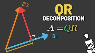
 DeepCamp AI