Advanced Styling with Responsive Design
Skills:
UI Design80%
Key Takeaways
Applying advanced styling with responsive design
Original Description
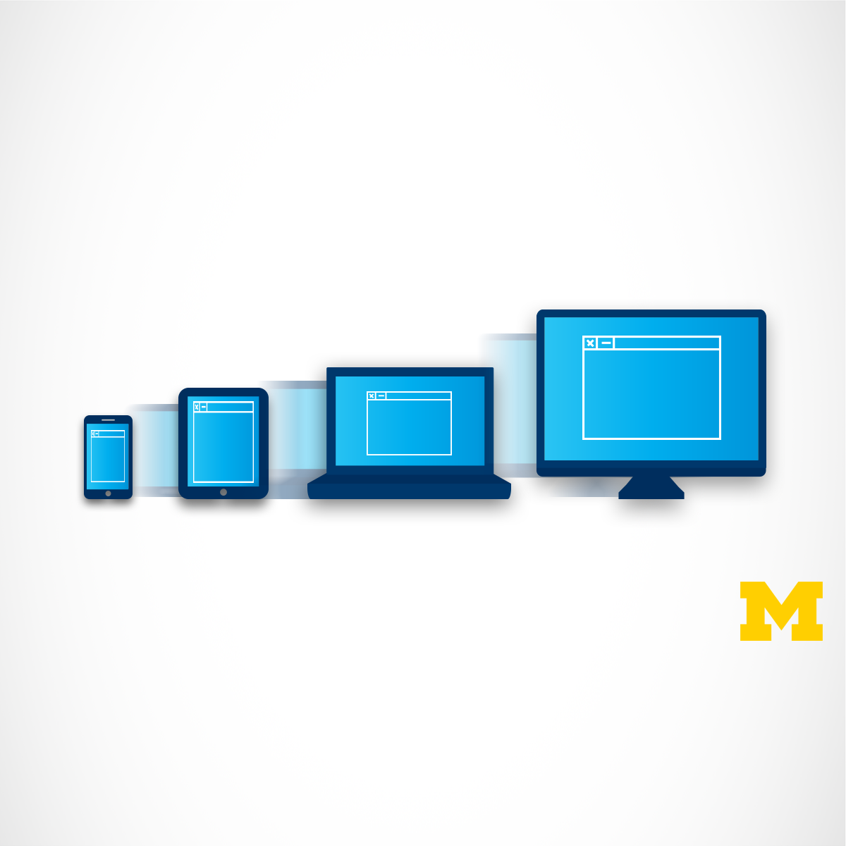
It used to be the case that everyone viewed web pages on about the same size screen - a desktop computer. But now it is just as likely that someone will be using a smart phone, tablet, or assistive technology to access the Internet. Therefore, people viewing your site will now expect that it will perform regardless of the device (smartphone, tablet, laptop, desktop computer, or screen reader) AND take into account some common personal settings such as color schemes. This ability to respond to any platform and user preferences is called Responsive Design.
This course will expand upon the basic knowledge of CSS3 to include topics such as wireframes, fluid design, media queries, and the use of existing styling paradigms. After the course, learners will be able to:
** Explain the mobile-first paradigm and the importance of wireframes in the design phase
** Create sites that behave across a range of platforms
** Recognize existing design frameworks such as Bootstrap
A basic understanding of HTML and CSS is expected when you enroll in this class, so it can be taken third or fourth in the Web Design for Everybody specialization. Additional courses focus on adding interactivity with the JavaScript Programming Language and completing a capstone project.
Watch on External: Coursera ↗
(saves to browser)
Sign in to unlock AI tutor explanation · ⚡30
More on: UI Design
View skill →


🎓
Tutor Explanation

 DeepCamp AI