
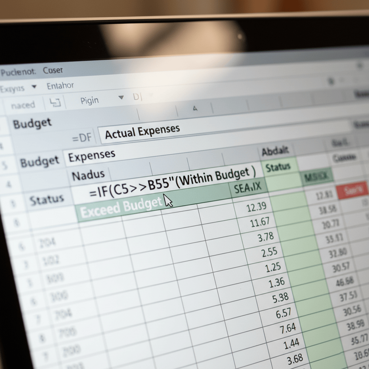
Excel Charts and Pivot Tables
Skills:
Excel & Spreadsheets90%
Key Takeaways
Creates various types of charts and pivot tables using Excel
Original Description
Unlock the power of data visualization and analysis with Excel! In this course, you will learn how to create various types of charts and pivot tables to turn raw data into actionable insights. From basic column and pie charts to complex combination and gauge charts, you’ll gain the skills to represent data visually in a way that tells a compelling story. As you progress, you will also master pivot tables, including techniques for grouping, filtering, and creating multi-level data analysis to enhance your decision-making.
Throughout the course, you will follow a structured journey, first mastering Excel’s charting tools, including column, line, bar, and scatter charts. You’ll then delve into advanced chart options such as combination and gauge charts, and learn how to add trendlines and error bars for more in-depth analysis. The course also covers pivot tables in detail, where you will learn to structure and filter data, create calculated fields, and use slicers to make data analysis more dynamic. By the end, you will be capable of confidently navigating Excel’s powerful features and applying them to real-world data analysis tasks.
This course is perfect for anyone looking to enhance their Excel skills for data visualization and analysis. It is suitable for beginners looking to learn the basics as well as intermediate users wanting to deepen their knowledge of Excel's advanced charting and pivot table functions. No prior advanced Excel knowledge is required, but familiarity with basic Excel functions is helpful. The course is designed to accommodate all skill levels.
By the end of the course, you will be able to create and customize various chart types, build and update pivot tables, use slicers for interactive data filtering, and generate advanced visualizations that inform key business decisions.
Watch on External: Coursera ↗
(saves to browser)
Sign in to unlock AI tutor explanation · ⚡30
More on: Excel & Spreadsheets
View skill →


Related Reads
📰
📰
📰
📰
Tracking Macroeconomic Indicators with the Finance Toolkit
Dev.to · Jeroen Bouma
Pydantic for Data Engineering: Schema Validation in ETL & Pipeline Contracts
Dev.to · Gowtham Potureddi
Half of Data Engineering Jobs on LinkedIn Aren't Real
Dev.to · DataDriven
Evolutionary Data Through Schemaboi: Achieving Forward, Backwards, and Sideways Compatibility
InfoQ AI/ML
🎓
Tutor Explanation