Developing Responsive Web Pages Using HTML5 and CSS3
Key Takeaways
Develops responsive web pages using HTML5 and CSS3
Original Description
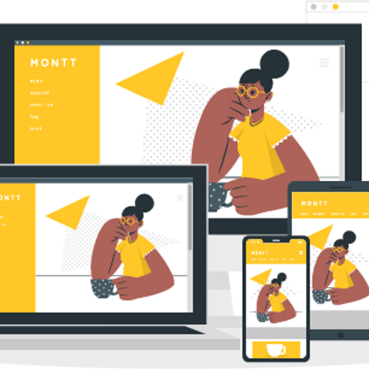
The number of mobile users has increased exponentially over the past few years. Shopping, social connect, entertainment and other activities are just a few clicks away for these mobile users. A responsive web design adjusts the layout and appearance of the web pages to suit the resolution and width of the screens. This makes a web page look attractive on devices with diverse screen sizes. Designing a well-organized, responsive, and user-friendly web page has therefore become the need of the hour.
This course will guide you to develop websites that adapt to the device size of the visitor’s viewport and provide users an optimal experience.
Watch on External: Coursera ↗
(saves to browser)
Sign in to unlock AI tutor explanation · ⚡30
Related AI Lessons
⚡
⚡
⚡
⚡
A Young Designer’s Question: What Are Companies Actually Hiring For?
Medium · UX Design
Why Clear Calls-to-Action Are Essential for Business Websites
Medium · UX Design
AI in Design: The Skill That Gets Scarce When Making Gets Cheap.
Medium · AI
Sheba Manager Mobile Apps: Retail OS in the Palm of a Merchant’s Hand
Medium · UX Design
🎓
Tutor Explanation
 DeepCamp AI