Create an Affinity Diagram Using Creately
Key Takeaways
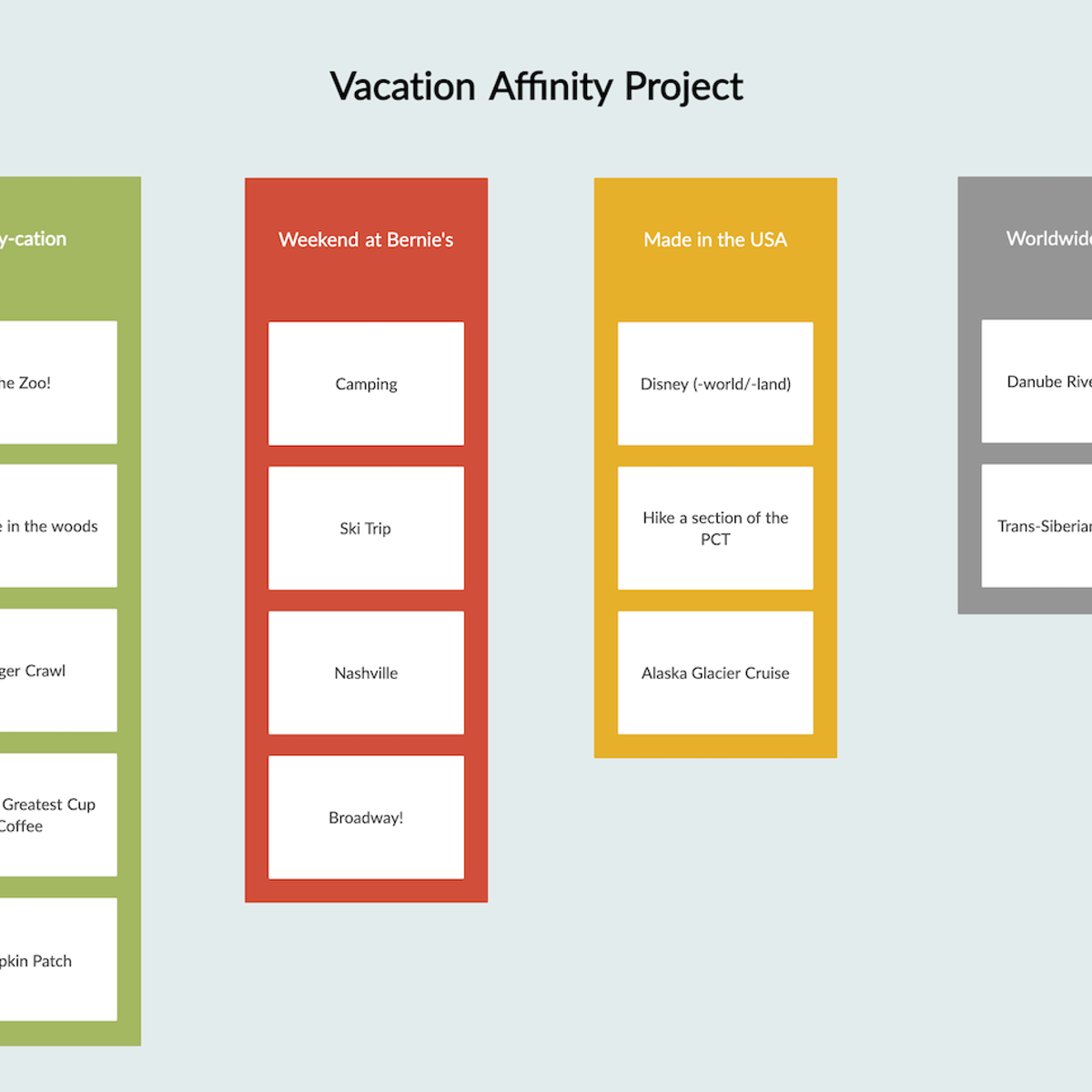
Creates an affinity diagram using Creately for idea organization and teamwork
Original Description
By the end of this project you will create an affinity diagram using Creately.com. Learning to collect and organize ideas and information increases productivity and fosters positive teamwork. Learners will engage in the Affinity process to develop an understanding of how to spark, gather, consolidate, sort and present ideas and information.
Watch on External: Coursera ↗
(saves to browser)
Sign in to unlock AI tutor explanation · ⚡30
More on: AI Productivity Tools
View skill →


Related AI Lessons
⚡
⚡
⚡
⚡
How I built the OSS alternatives directory: GitHub ETL, Turso, and the UPSERT trap I hit
Dev.to · MORINAGA
Apache Iceberg in Production: Compaction, Catalogs, and the Pitfalls Nobody Warns You About
Dev.to · Gabriel Henrique
Your First Task as a Data Engineer in a New Company? Make the ETL Pipeline Testable
Towards Data Science
From DataStage and Informatica to Databricks Medallion Architecture: Why Migration Is More Than Code Conversion
Dev.to · Amit Kumar Singh
🎓
Tutor Explanation