Analyze Employee Performance Using Excel Pivot Tables
Key Takeaways
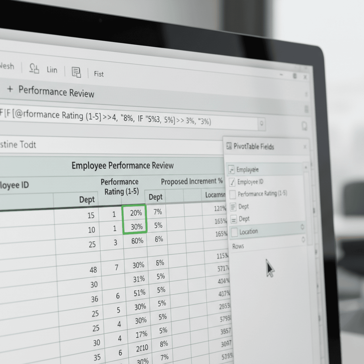
Builds a Pivot Table using Excel to analyze employee performance data
Original Description
By the end of this course, learners will be able to analyze employee performance data, calculate performance-based increments, build and refine Pivot Tables, compare results across departments and locations, and evaluate budget deviations to support data-driven decisions.
This course provides a practical, hands-on case study focused on employee performance ratings, designed to help learners move beyond basic Excel functions into real-world analytical thinking. Learners will begin by understanding and preparing a structured dataset, applying formulas to compute performance metrics, and visualizing data relationships. The course then guides learners through constructing Pivot Tables to answer business questions, perform comparative analysis, and uncover meaningful performance trends.
What makes this course unique is its end-to-end, scenario-based approach. Instead of isolated Excel features, learners work through a single, coherent business case that mirrors real workplace analysis. Each step builds progressively, reinforcing analytical skills and practical problem-solving.
Upon completion, learners will gain job-relevant Excel skills, improved confidence in performance analysis, and the ability to transform raw HR data into actionable insights—skills directly applicable to roles in business analysis, HR analytics, and operations.
Watch on External: Coursera ↗
(saves to browser)
Sign in to unlock AI tutor explanation · ⚡30
Related Reads
📰
📰
📰
📰
GBase 8a unpivot Function: Turning Columns into Rows
Dev.to · Michael
Bulut Bilişim ve Veri Bilimi: Model Eğitiminden Canlıya Uzanan Bootcamp Yolculuğu
Medium · Data Science
10 Benefits of Enterprise AI Analytics Every Organization Should Know
Dev.to · Ravi Teja
Your rolling_std Is Lying — The 21,000× Error You Can’t See
Medium · Data Science
🎓
Tutor Explanation