Analyze and Build Dashboards Using AWS QuickSight
Learners will understand the fundamentals of AWS QuickSight, analyze datasets, apply data visualization techniques, and construct professional, insight-driven dashboards for business decision-making. By the end of this course, learners will be able to transform raw data into meaningful visual insights using industry-standard business intelligence practices.
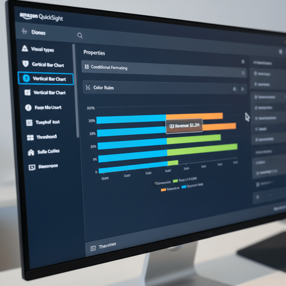
This course is designed to provide a structured, hands-on learning experience with AWS QuickSight, starting from project orientation and core concepts to advanced visualizations and dashboard design. Learners will gain practical exposure to adding datasets, creating charts, working with multiple sheets, applying themes, using tables and conditional formatting, and designing dashboards tailored to different audiences.
Completing this course equips learners with in-demand data analytics skills that are directly applicable in real-world business environments. Unlike theory-heavy programs, this course emphasizes practical workflows, guided demonstrations, and best practices for building scalable, cloud-native dashboards. Whether learners are aspiring data analysts, business intelligence professionals, or working professionals seeking to enhance reporting capabilities, this course offers a clear, job-relevant pathway to mastering AWS QuickSight and delivering actionable insights with confidence.
Watch on Coursera ↗
(saves to browser)
Sign in to unlock AI tutor explanation · ⚡30
More on: BI Tools
View skill →


Related AI Lessons
⚡
⚡
⚡
⚡
I Tried to Find Out How Close I Am to the CEO of Roblox. The Answer Was Three.
Medium · Data Science
The Dying Symphony of Nature :
How climate change silences Cultures, Species, and Nature.
Medium · Data Science
Student Mental Health Analytics: An Interactive Dashboard in R Shiny
Medium · Data Science
Building a US choropleth in Python with plotly express, using a real fragrance dataset
Dev.to · ahmad-khan-97
🎓
Tutor Explanation